Domain experts aren't always expert users
It's not because someone is an expert in their field, that they are (or will become) expert users of your product. In fact, they might not even be confident with technology at all. But often people seem to assume the opposite.
They probably know a lot about what they'll be working with and understand the core functionality quite well. But that doesn't always mean they're familiar with your product, or the latest and greatest technology or design trends. In fact, there's a good chance they're used to doing their work using either very outdated software, excel or command line.
So it's still important to keep the interface clean and easy to use. And user tests, testing for both general usability and core features, should be done frequently.
Experts don't know everything either
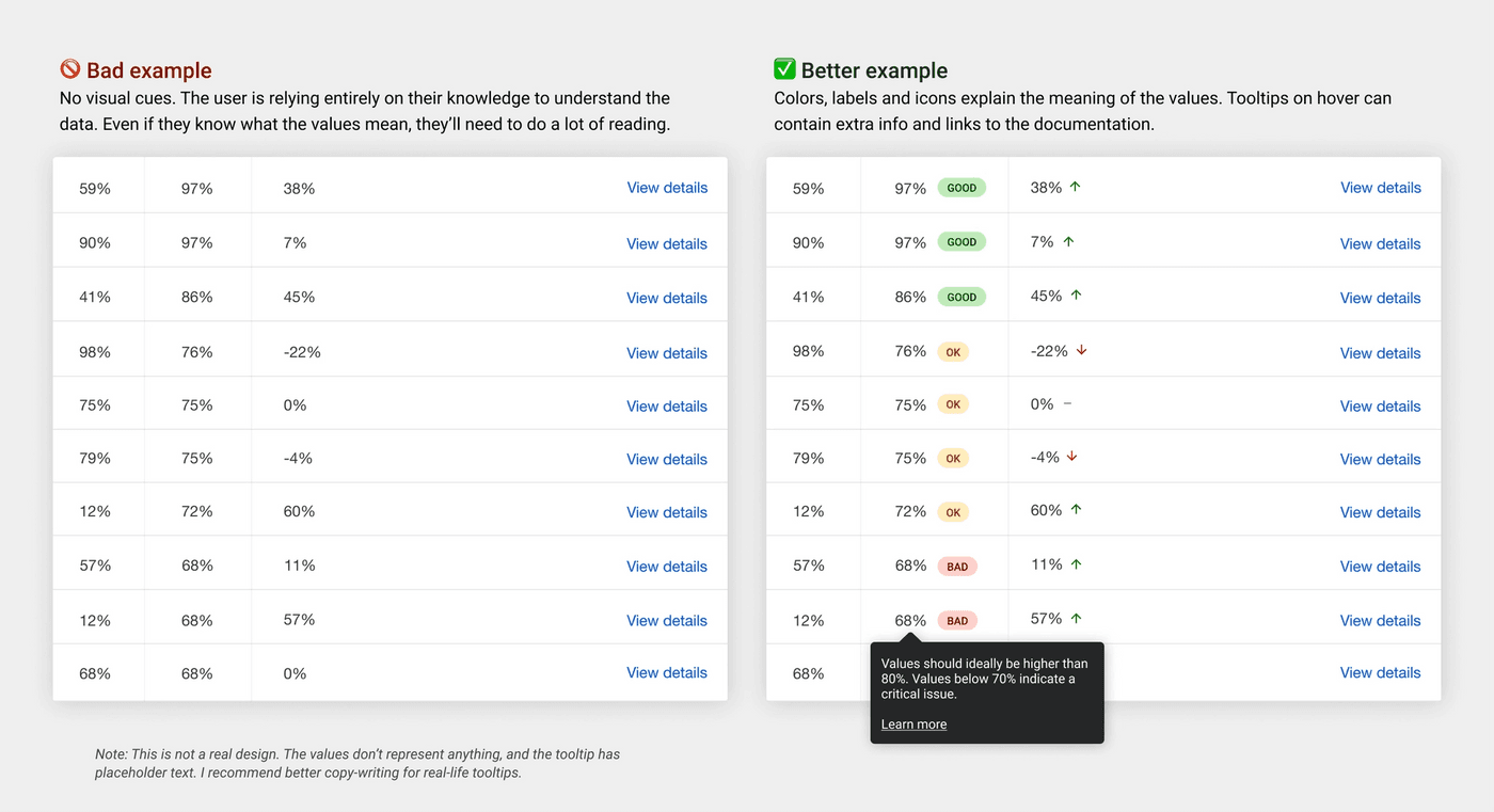
In one of my previous jobs we were visualizing very specific data in a table. Our users were very familiar with the data, so at first we assumed our interface wouldn't have to focus on explaining the data to them.
It was true our users didn't need explanations to understand the data, but they were afraid of making mistakes, and were used to different software.
After one round of user tests it became clear they needed visual explanations of the data (color-coding, icons, labels, warnings and tooltips) to become confident using the software.
There's also the fact that people change jobs and tools frequently, and some industries move quite fast. Your users might not be familiar with the latest tools or terminology.
It's good if there are in-context tooltips with more information, an on-boarding guide and documentation, but don't just rely on those either. No matter how much is at stake, there's a good chance your users will not read the manual.
User experience is down-prioritized too often
Especially because of misconceptions around the two previous points (assuming experts will understand everything that's going on), usability risks being down-prioritized. This isn't necessarily the fault of the designers, I've often seen management put way less design resources on the project than they should have.
Something else to keep in mind is that your users might be experts in their domain, but you are the expert in yours. Do listen to them when they come with requests, but try to understand why they want that specific functionality. Don't just design around their suggestions, design around their needs.
Needs change as experience is gained
While experts may need less help understanding the core functionalities, other needs such as speed, efficiency and automation are likely to be more important for for them.
Something I've heard a lot during user interviews is "I know how to do this manually already, why would I pay for specialized software if it's not going to do part of the work for me".
It doesn't mean all functionality should be automated, but features such as suggesting actions to the user, summarizing and highlighting data, grouping and sorting relevant info, etc. can make a big difference already.
Accessibility is important, but easily forgotten about
One of the worst statements I heard on the job must be "we don't need to focus on accessibility, our users are smart". It's an incredibly ableist statement, having different accessibility needs has nothing to say about someone's intelligence, and it excludes an entire group of people from using your product.
Accessibility should be a priority both in the design and development process. There are lots of helpful design tools out there, and I recommend reading up on the Web Content Accessibility Guidelines as well. The earlier you think about accessibility in the process, the easier it is to include.
Also make sure to include disabled people, people of color, queer people and other minoritized groups in your user tests and personas - or better, move away form personas entirely.
Understanding the domain is an advantage
The thing that helped me the most while designing products for admins, cancer researchers and teachers, was actually learning about their field myself as well.
I'm not saying you should become an expert yourself, but knowing about the fundamentals can take you a long way. Especially for products where there's a lot at risk, understanding what impact each piece of information will have is crucial.
An app for doctors might never end up in a patient's hands, but patients will be affected by the decisions doctors make based on your product. A confusing interface might lead to mistakes that seriously harm a patient.
We should design for sub-optimal conditions
No one works under perfect conditions all of the time. We don't have to look far as designers - loud open office spaces, @channel slack notifications, deadlines, reply-all emails, back-to-back meetings, overtime and a whole lot more can make work really stressful.
But user tests are usually not conducted under those real-life stressful conditions. In fact, they're often done off-site or in a meeting room. And if you're like me, you might even have taken snacks along or blocked out more time than you needed so you don't have to rush things, all to make the users feel more comfortable.
It's great to create stress-free user testing environments like that, but we should also keep in mind under which conditions our products will be used. Doing user tests or observations in the user's working environment can be really helpful for that.
If that isn't possible, try to dedicate part of the user interviews to understanding how they work, where they work from, and what their current pain-points are. I often ask users to walk me through a typical workday, and try to get an understanding of their full workflow (even the offline parts).
Hi! 👋🏻 I'm Sarah, a self-employed accessibility specialist/advocate, front-end developer, and inclusive designer, located in Norway.
I help companies build accessibile and inclusive products, through accessibility reviews/audits, training and advisory sessions, and also provide front-end consulting.
You might have come across my photorealistic CSS drawings, my work around dataviz accessibility, or my bird photography. To stay up-to-date with my latest writing, you can follow me on mastodon or subscribe to my RSS feed.
💌 Have a freelance project for me or want to book me for a talk?
Contact me through collab@fossheim.io.
Similar posts
Saturday, 21. December 2019
Tools for designing good-looking accessible interfaces
Thursday, 16. July 2020