It's important for me that everything I design is both accessible, ethical and user friendly. And to be fair, the three really go hand-in-hand. A product cannot be friendly if it's harmful or inaccessible.
Interfaces can be aesthetically pleasing, while also remaining accessible. And luckily, these days there are a lot of tools out there to help us achieve that!
Figma plugin: Color Blind
Color blind for Figma is one of the best tools to test how designs look for people with different types of colorblindness.
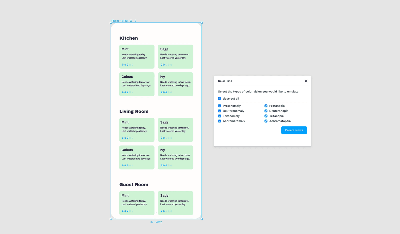
It's free and very thorough, but the only downside is that it doesn't work for images. And you have to re-run the plugin and create new copies whenever you make changes.
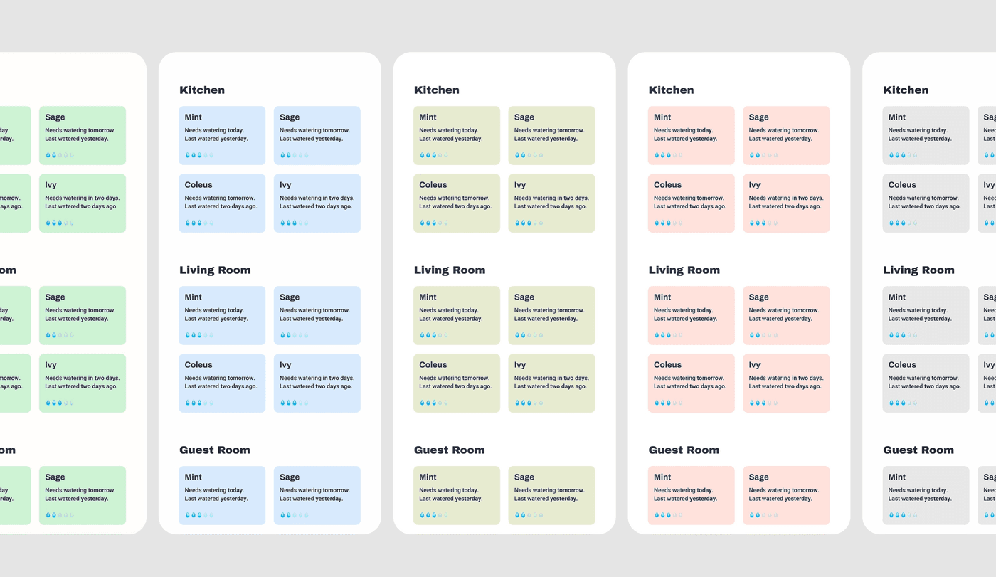
t's easiest to create a separate accessibility page and run the plugin from there. That way old versions can be kept for comparison without making the main "working" page too cluttered.
Alternatives
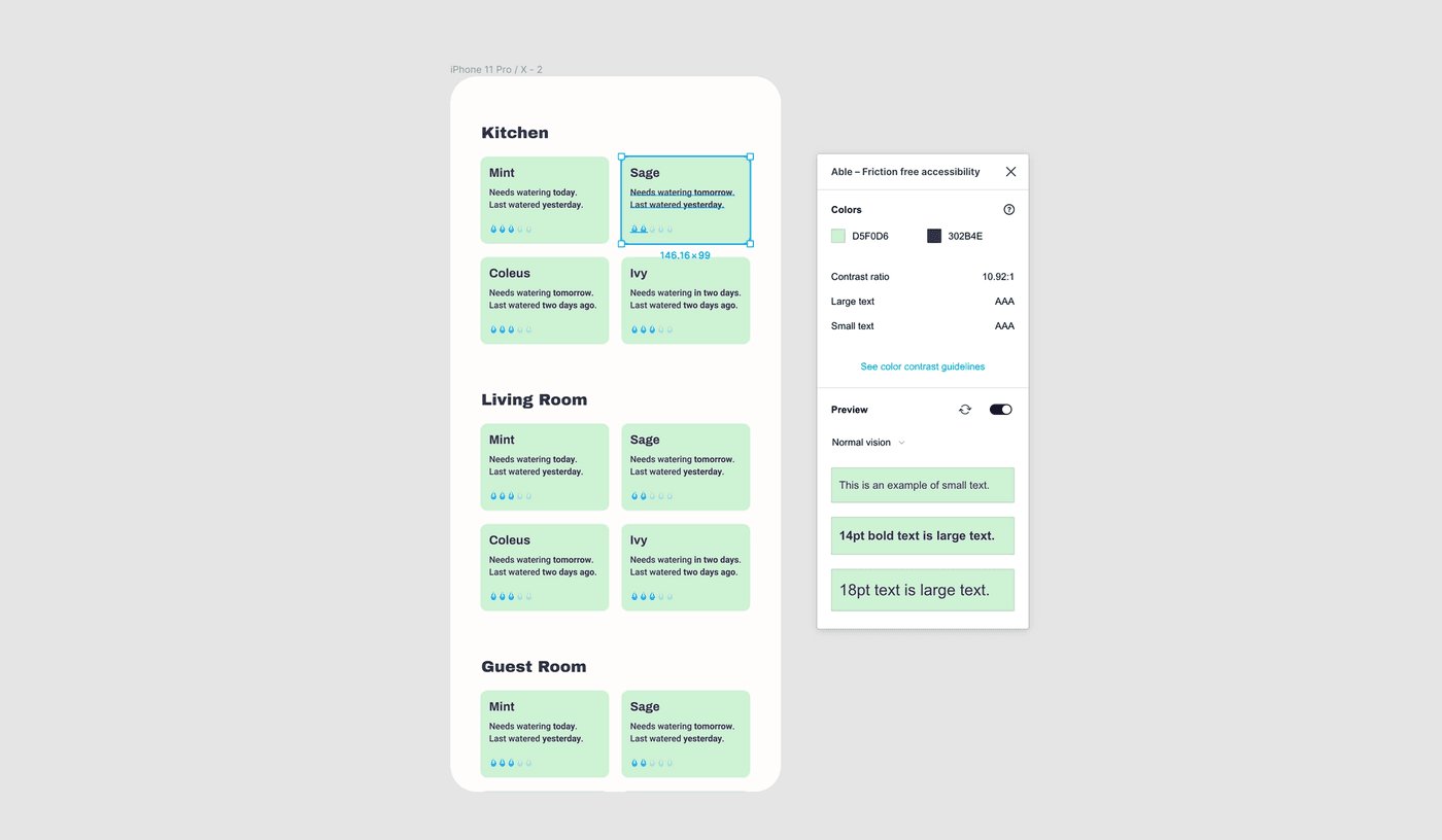
Figma plugin: Able
Able is a great option for checking the contrast of text. Select two layers and the plugin will tell you what the values are and whether it passes WCAG accessibility guidelines or not.
Alternatives
Color inspiration
At first it might feel a bit overwhelming or intimidating when finding out your colors need more contrast, but that doesn't mean you have to go for "ugly" or "boring" colors.
You shouldn't pick the first high-contrast color combination that you come across. In fact, even if a color combination passes the WCAG guidelines, it still might not be fully accessible. For example a combination of very bright colors might have enough contrast, but could become painful on the eyes over time.
Testing colors against accessibility guidelines should happen early-on in the process, enough time should be set aside for it.
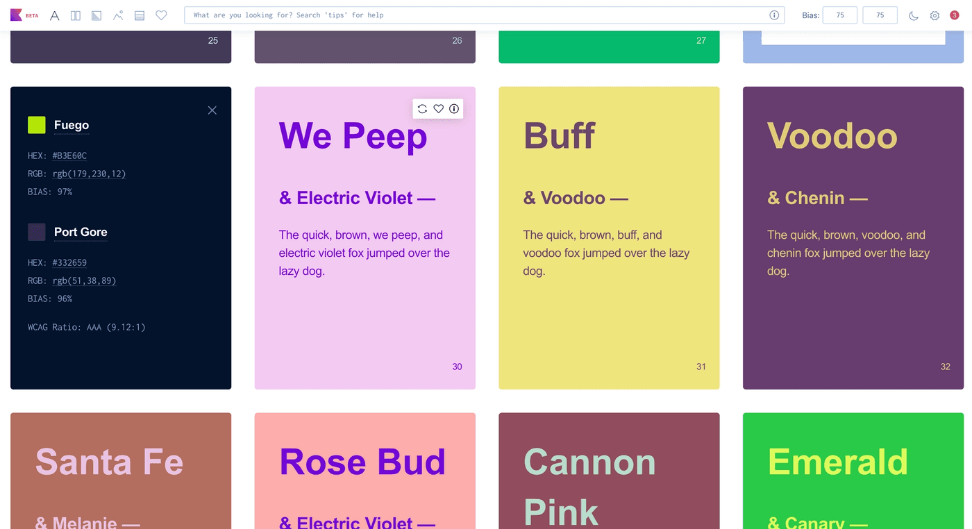
Colorable
I often use color palette generators in combination with Figma's accessibility plugins when deciding on color schemes. They're good for inspiration and push me to explore combinations I usually wouldn't think of.
Colorable is really useful one for that. It randomizes predefined color combinations and includes pass/fail scores for the WCAG accessibility guidelines.
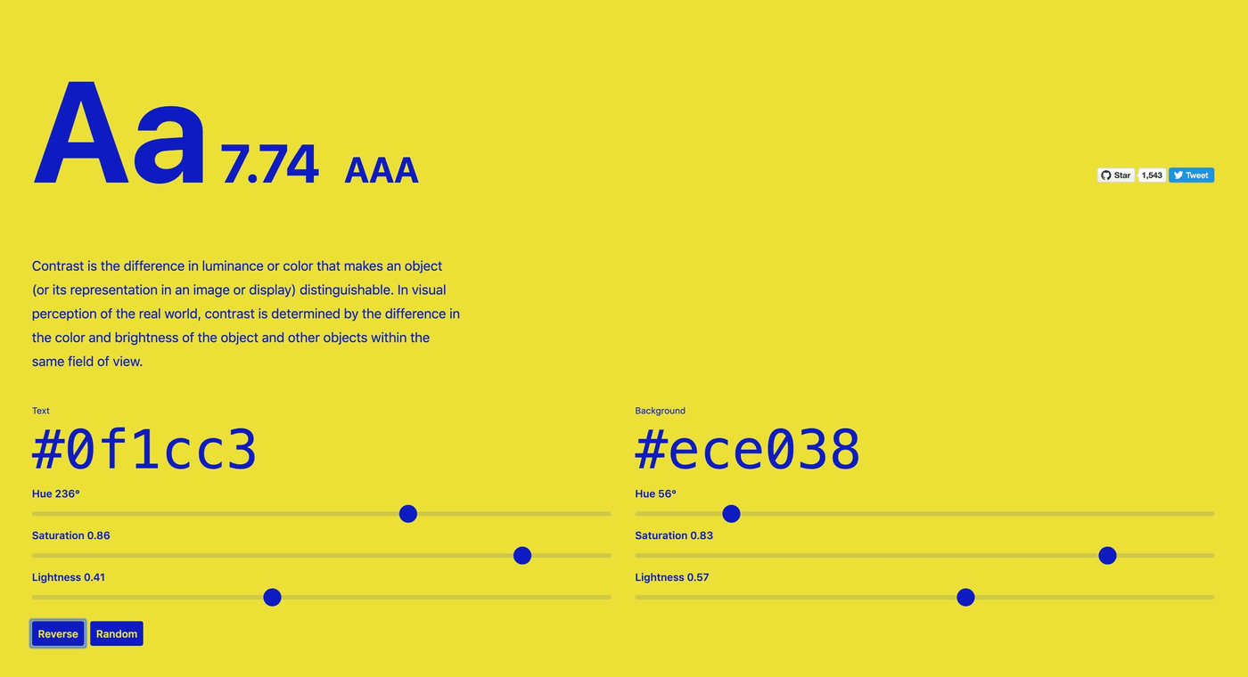
Instead of using the randomization functionality, you can also paste your own color codes, or modify the hue, saturation and lightness.
The scores get live-updated accordingly, so it's a very easy and user-friendly way of experimenting with different color combinations.
Khroma
Another good color generator is Khroma. It generates an infinite amount of color combinations based on colors you like, and also includes values with regards to the WCAG.
They do still show combinations that fail the guidelines, so make sure to always double-check the values in the info panel.
If in some case an accessible color scheme doesn't meet other (branding) requirements, a possibility is to create "accessibility settings" where people can choose a different color scheme, font or text size.
More than just color
This article mainly focused on tools and resources for color and contrast, but accessibility is a lot more than that.
Font-size, language, animations, scrolling behavior, sounds, patterns and so much more all influence how accessible something is for a wide variety of people.
While I haven't found any tools that can test or automate feedback on those aspects of design, I did compile a list with tips and guidelines that include those aspects as well:
- Do and don'ts on designing for accessibility.
- Accessibility for teams.
- Web Content Accessibility Guidelines.
- Accessible color systems.
- Why accessibility drives aesthetics.
- AccessAbility Handbook.
- Inclusive and accessible user interfaces.
- a11y style guide.
- Reading grade.
- a11y project.
For developers
There are good accessibility tools out there for developers as well, but I'll write a separate list on how I work with accessibility when coding.
As a start, try to navigate your product with VoiceOver on, and turn off css now and then to see if your content is still understandable without it (for example, where do absolutely positioned blocks of text end up when css is turned off).
Hi! 👋🏻 I'm Sarah, a self-employed accessibility specialist/advocate, front-end developer, and inclusive designer, located in Norway.
I help companies build accessibile and inclusive products, through accessibility reviews/audits, training and advisory sessions, and also provide front-end consulting.
You might have come across my photorealistic CSS drawings, my work around dataviz accessibility, or my bird photography. To stay up-to-date with my latest writing, you can follow me on mastodon or subscribe to my RSS feed.
💌 Have a freelance project for me or want to book me for a talk?
Contact me through collab@fossheim.io.
Similar posts
Monday, 23. November 2020
How (not) to make accessible data visualizations, illustrated by the US presidential election.
Sunday, 12. January 2020