
<feed xmlns="http://www.w3.org/2005/Atom">
  <title>Sarah Fossheim's Blog</title>
	<subtitle>I&#39;m an experienced independent developer, designer and educator. I specialize in building accessible and inclusive products, and have a particular focus on dataviz accessibility.</subtitle>
	<link href="https://fossheim.io/"/>
  <link href="https://fossheim.io/feed.xml" rel="self"/>
  <updated>2024-12-02</updated>
  <id>https://fossheim.io/</id>
  <author>
    <name>Sarah L. Fossheim</name>
    <email>collab@fossheim.io</email>
	</author>

  
    <entry>
      <title>Dataviz accessibility principles, demonstrated by the 2024 presidential election dashboards.</title>
      <link href="https://fossheim.io/writing/posts/2024-dataviz-a11y-elections" />
      <updated>2024-12-02</updated>
      <id>https://fossheim.io/writing/posts/2024-dataviz-a11y-elections</id>
      <content type="html">
        <![CDATA[
          <p>In 2020 I <a href="/writing/posts/accessible-dataviz-us-elections/">reviewed the dataviz accessibility of the US presidential election results</a> (spoiler: it was bad), and in 2023 I did the same with the <a href="/writing/posts/dataviz-accessibility-review-norwegian-elections-2023/">dashboards used for the Norwegian government elections</a>. So naturally, I had to inspect the accessibility of this year's US election graphs as well.</p>
<p>Just like in 2020, I discovered quite a lot of accessibility issues for all of the dashboards. Most of these were the type of issues I frequently encounter when doing dataviz accessibility audits and reviews. For example: content that's not zoomable, interaction that's not available for keyboard users, insights that don't get communicated to screen reader users, lacking text alternatives, semantic errors, or missing explanations.</p>
<p>This time I also ran <a href="https://www.deque.com/axe/devtools/">axe DevTools</a> at the end of the review, which picked up between 3 (NRK) and 62 (Fox News) errors against WCAG 2.1. When including tests against best practices, a total of 870 issues were found on Fox News, 206 on the Washington Post, 24 on Reuters, and 70 on NRK.</p>
<p>These findings aren't surprising, as according to a 2024 <a href="https://webaim.org/projects/million/">WebAIM study</a> around 96% of tested home pages had accessibility issues, with an average of more than 56 errors per page.</p>
<h2>Scope</h2>
<p>For this article, I manually tested data visualizations on the following news websites:</p>
<ul>
<li><a href="https://www.washingtonpost.com/elections/results/2024/11/05/president/">Washington Post</a></li>
<li><a href="https://www.bloomberg.com/graphics/2024-us-election-results/">Bloomberg</a></li>
<li><a href="https://www.foxnews.com/elections">Fox News</a></li>
<li><a href="https://edition.cnn.com/election/2024/results/president?election-data-id=2024-PG&amp;election-painting-mode=projection-with-lead&amp;filter-key-races=false&amp;filter-flipped=false&amp;filter-remaining=false">CNN</a></li>
<li><a href="https://www.nbcnews.com/politics/2024-elections/president-results">NBC</a></li>
<li><a href="https://abcnews.go.com/Elections/2024-us-presidential-election-results-live-map">ABC News</a></li>
<li><a href="https://www.reuters.com/graphics/USA-ELECTION/RESULTS/zjpqnemxwvx/">Reuters</a></li>
<li><a href="https://www.wsj.com/election/2024/general">The Wall Street Journal</a></li>
<li><a href="https://www.nrk.no/spesial/presidentvalget-i-usa-_-resultater-1.17110820">NRK (Norwegian)</a></li>
</ul>
<p>At the end of the review I also ran tests with axe DevTools, to get an idea of how many issues automated tests could detect on each of the dashboards.</p>
<p><em>Note: this is an article for my blog illustrating some dataviz accessibility principles and common mistakes against them; this is not a detailed review or audit of these platforms. For that reason, I didn't test every single chart on these dashboards, and only tested certain aspects of them. For the same reason I focused on MacOS and VoiceOver (since that's my main device), and if I encountered any particularly weird behavior, I re-tested it with NVDA on Windows as well.</em></p>
<h2>Is the content still accessible when zoomed in to 400%?</h2>
<p>It should be possible to zoom up to 400% into a page and visualization without losing any functionality, and without any content being obscured.</p>
<p>My eyes have gotten to the age (aka: I'm over 30 🫣) where I frequently end up having to browse the web at 200% zoom, so it's an accessibility requirement I unintentionally end up testing on a lot of websites I visit.</p>
<p>And unfortunately, almost every single election dashboard I checked out had issues when zoomed in.</p>
<p>All of the dashboards had <strong>sticky or fixed</strong> headers. Some of them had double headers, and some combined their fixed headers with floating buttons or fixed footers.</p>
<p>When zooming up to 200% and 400%, those sticky, fixed and floating elements start taking up a lot of the page's real estate, sometimes even hiding the actual content of the page completely.</p>
<div class="img-gallery">
  <img src="/static/sources/2024-dataviz-a11y-elections/fox-zoomies.png" alt="Fox news zoomed in: heading menu takes around half of the vertical height, part of a map is showing underneath (400% zoom)">
  <img src="/static/sources/2024-dataviz-a11y-elections/wp-zoomies.png" alt="Washington Post zoomed in: heading menu takes up the top half of the screen, subscription ad banner is taking up the bottom half of the screen, leaving literally no space at all for actual content (400% zoom)">
</div>
<p>The sticky navigation bar at Fox News took up almost half of the page, and The Washington Post hid <em>all</em> of the page's content behind the header and footer.</p>
<p>Another example of this is NBC News. They didn't just have one, but <em>three</em> navigation bars overlayed on top of the screen, and in addition to that the table headers were also sticky.</p>
<div class="video-wrapper large">
  <video width="100%" height="auto" controls>
    <source src="/static/sources/2024-dataviz-a11y-elections/nbc-zoomies.mp4" type="video/mp4">
  </video>
  <p class="transcript">Video description: At 200% there's a double sticky header obscuring around a third of the page. Once the user scrolls to the results table, the table's sticky header takes up almost all the rest of the view. At 400% zoom, the sticky page header takes up most of the height of the screen, only leaving a small band with content at the bottom, which gets completely blocked once the table with sticky header is reached.</p>
</div>
<p>NRK did it differently: no sticky navigation bars that take up all of the space, but instead a small fixed progress bar with the results itself:</p>
<div class="img-gallery">
  <img src="/static/sources/2024-dataviz-a11y-elections/nrk-zoomies-1.png" alt="NRK zoomed in to 200%, showing a small progress bar sticky on top of the page, divided in blue (Harris) and red (Trump) indicating the proportion of their votes. Underneath is the map with the results, showing blue and red states on the map.">
  <img src="/static/sources/2024-dataviz-a11y-elections/nrk-zoomies-2.png" alt="NRK zoomed in to 400%, showing a progress bar sticky on top of the page, with the same map underneath, taking up around a fifth of the vertical height of the screen.">
</div>
<p><em>Personally</em>, as a zoom-user, I wasn't bothered by NRK's sticky progress bar when at 200% zoom on my 13&quot; MacBook, although it started limiting the content a bit already. But at 400%, the progress bar took up around a fifth of the height of the page, restricting the available space for the rest of the content quite a bit more.</p>
<h2>Is data explained through more properties than just color?</h2>
<p>All of the maps I inspected had a similar design: the states were color coded in blue (democrat), red (republican), or gray (no results yet), and swing states had an additional pattern.</p>
<img src="/static/sources/2024-dataviz-a11y-elections/reuters-color.png" alt="Map of the United Stated, with states colored in red (for republican wins) or blue (democrat wins), and with a pattern if they're swing states. The west-coast and northern part of the east coast are blue, the center and south is more red.">
<p>Red and blue are generally considered a &quot;color blind friendly&quot; combination, but for example, people with achromatopsia perceive everything in black and white/different shades of gray.</p>
<p>For example, on the map used on the Reuters dashboard democrat and republican states become the exact same shade of gray when using a color blindness simulator.</p>
<img src="/static/sources/2024-dataviz-a11y-elections/reuters-bw.png" class="large" alt="Color blind simulation of the map of the United Stated with the election results. All the states are medium gray, with barely any difference in contrast (republican and democrat are the same gray), making it impossible to read the results.">
<p>Additionally, people using monochrome displays or grayscale plugins will also not perceive the colors, and will benefit from additional cues.</p>
<h3>Are the fallbacks accessible too?</h3>
<p>Some might argue that there <em>is</em> in fact a fallback: when hovering over a state, the maps show a tooltip stating who won that state, and how many votes they received.</p>
<p>However, for the absolute majority of maps tested for this article, these tooltips were not keyboard or screen reader accessible.</p>
<h2>Can all content be navigated to and interacted with through keyboard interaction?</h2>
<p>As already brought up in the previous section, any interaction that can be performed through mouse/trackpad/touch, should also be accessible through keyboard interaction.</p>
<p>Lots of the election charts had some level of interaction connected to them, either tooltips that appeared on hover or new pages that opened when clicking a state, but very few made this interaction accessible by keyboard.</p>
<p>For example, CNN showed tooltips containing the winner and amount of votes when hovering over a state. But when using the <code>TAB</code> key to navigate the page, the focus indicator jumped straight past the map, to a carousel underneath.</p>
<div class="video-wrapper large">
  <video width="100%" height="auto" controls>
    <source src="/static/sources/2024-dataviz-a11y-elections/tab-cnn.mp4" type="video/mp4">
  </video>
  <p class="transcript">Video description: First the user hovers over states on the map, and tooltips pop up. Then the user starts using the TAB key, and the browser's default focus indicators highlight which object is in focus, showing the map/interactive states are not part of the focus order.</p>
</div>
<p>Over at Reuters, the tooltips were successfully exposed when receiving keyboard focus (🎉), but the tab order was completely random.</p>
<div class="video-wrapper large">
  <video width="100%" height="auto" controls>
    <source src="/static/sources/2024-dataviz-a11y-elections/tab-reuters.mp4" type="video/mp4">
  </video>
  <p class="transcript">Video description: The user repeatedly and quickly presses the tab key, shifting the focus between the different states on the map. When a state is in focus, a styled tooltip/pop-up with more info (state name, electoral votes, number of votes for each candidate, % of votes counted) appears. The states get focused in random order, going from New Mexico to South Dakota to California to Kentucky to Alabama, and so on.</p>
</div>
<p>The states on Bloomberg's map were focusable, but besides receiving a focus outline, nothing else happened. Pressing <code>ENTER</code> (one of the typical keys to activate a link or button) opened a new page where. There it was possible to find the same info as in the tooltip, but that's a lot of extra back-and-forth to get to the same data as a mouse user.</p>
<div class="video-wrapper large">
  <video width="100%" height="auto" controls>
    <source src="/static/sources/2024-dataviz-a11y-elections/tab-bberg.mp4" type="video/mp4">
  </video>
  <p class="transcript">Video description: The user first hovers over the progress chart, where a tooltip shows how many votes each candidate received in each state. Afterwards the keyboard is used to tab through the interactive elements on the page, and every single small square on the progress bars (each square representing an electoral college vote) is part of the tab order. No tooltips appear. Afterwards the user keeps tabbing through the map, where the states receive focus, but also don't show a tooltip.</p>
</div>
<p>Another issue with keyboard navigation on Bloomberg's charts was found in the progress bars showing the electoral votes per candidate. Each bar was made out of small squares, one square representing one electoral vote. Each of the squares was wrapped in its own link (<code>&lt;a&gt;</code>), meaning all of the squares were part of the default focus order on the page and became individually focusable when pressing the <code>TAB</code> key. With 538 votes available, that means 538 links to tab past.</p>
<h2>Are data, insights, trends, and patterns accessible to screen reader users?</h2>
<p>People who use assistive technologies (like braille or screen readers) should have access to the same information, including trends, patterns, and other visually apparent features.</p>
<p>This can be done in a variety of ways, for example:</p>
<ul>
<li>Turning the chart into an <strong>image with alt text</strong>.</li>
<li>Providing an <strong>accessible table alternative</strong>, close to or linked to from the visualization.</li>
<li>Making the <strong>elements within the viz</strong> accessible to screen readers (eg. turning the chart into a list or table by adding roles and other ARIA).</li>
</ul>
<p>Which method is most appropriate depends on the type of visualization, interaction attached to it, as well as the purpose, the way it will be used/conditions it will be used in, and the target audience.</p>
<h3>Are the text alternatives useful, with relevant and accurate information, providing equal value to what's visualized?</h3>
<p>When using the <code>&lt;img&gt;</code> element alt text can be added in the <code>alt</code> attribute. Elements that are turned into images by adding <code>role=&quot;img&quot;</code> can have their alt text set through <code>aria-label</code> or <code>aria-labelledby</code>.</p>
<p>Whether or not these attributes are set is something that can be detected by automated accessibility checkers (like <a href="https://www.deque.com/axe/">axe</a> or <a href="https://developer.chrome.com/docs/lighthouse/overview">Lighthouse</a>), linters, or unit tests. But the quality and usefulness of the text is something that requires a human touch.</p>
<p>As a result, when performing accessibility reviews, I often come across images that actually have alt text, but where the alt text doesn't accurately describe the image at all or leaves out vital information. This was the case with a lot of the tested election graphs as well.</p>
<p>Several of the election maps I encountered were programmatically turned into an image with alt text, but left out the actual results.</p>
<img src="/static/sources/2024-dataviz-a11y-elections/nrk-map-img.png" alt="Map of the united states, with the different states color coded in blue/red to indicate who won (the map is overwhelmingly red, with blue areas around the west coast and east coast). VoiceOver is active and reads the map as 'Kart over USA som viser antall valgmenn per stat', translates to 'Map of the USA that shows the amount of electoral college votes per state'." class="large" />
<p>Like this example from NRK, the Norwegian state media, where the alt text of the map translates to &quot;Map of the United States that shows the amount of electoral college votes per state&quot;.</p>
<p>When looking at the map, sighted users get to see which states voted for which candidate, and how red or blue the map overall looked like.</p>
<p>For example, I can tell at a glance that the westc oast and north east mainly voted Democrat, the center and south voted Republican, Harris won 54 electoral votes in California, while Trump got 30 of them in Flordia.</p>
<p>Blind people using screen readers, however, are only told there's a map with results, without any further information.</p>
<p>CNN used a canvas, labelled &quot;Map&quot;, which was the only information available.</p>
<img src="/static/sources/2024-dataviz-a11y-elections/cnn-map-img.png" alt="Line chart on the Bloomberg website (timeseries with red and blue lines, they all start around the 50% mark, but the blue ones go down and the red ones go up over time). The code inspector is open. The chart is an svg, with an img role attached to it, and aria-describedby that refers to a visually hidden text element with the following text: Multi-series line chart showing the odds Vice President Kamala Harris and former President Donald Trump will each win the presidency. These three prediction markets will be charted: Kalshi, Polymarket and PredictIt.">
<p>Bloomberg did something similar with their <em>Live Prediction Market Odds</em> line chart, where the text alternative was <em>&quot;Multi-series line chart showing the odds Vice President Kamala Harris and former President Donald Trump will each win the presidency. These three prediction markets will be charted: Kalshi, Polymarket and PredictIt.&quot;</em>,. The type of data and chart was explained, but the actual results were not.</p>
<p>Similarly, ABC News's map announced the geographical position of the state that was focused <em>(eg. &quot;New Mexico. Colorado is north. Oklahoma is east. Texas is south. Arizona is west.&quot;)</em>, but did not announce the actual electoral votes <em>(visually available as text)</em> or winner of the state <em>(visually available through color)</em>.</p>
<div class="video-wrapper large">
  <video width="100%" height="auto" controls>
    <source src="/static/sources/2024-dataviz-a11y-elections/abc-reader.mp4" type="video/mp4">
  </video>
  <p class="transcript">Video description: The user moves the focus around between the different states on the map using the arrow keys. Each time a state is focused, VoiceOver announces the name of the focused state along with the bordering states. Using the right arrow moves the focus to the state bordering on the east, down arrow to the state bordering south, and so on.</p>
</div>
<h3>How are SVG elements handled in the code?</h3>
<p>SVG elements are not accessible by default. So when creating data visualizations using SVG, additional work will always be needed to make the expeience more accessible for assistive tech users.</p>
<p>The Wall Street Journal showed all the states, in comparison to the amount of electoral votes they had to offer, each state represented by small squares. The squares were color coded in blue and red to represent the candidate that won the state, and on hover the distribution of votes was shown in a tooltip.</p>
<img src="/static/sources/2024-dataviz-a11y-elections/wsj-squares.png" alt="Legend of the WSJ election result map: each state is built out of blue or red colored squares. The amount of squares represents the amount of electoral votes, the color refers to who won the state and received the votes. One of the squares has a black outline with an annotation saying '1 square = 1 electoral vote'. At the bottom of the map there's a legend explaining the color." class="large">
<p>When using VoiceOver with Safari, each of the individual squares (<code>&lt;rect&gt;</code> elements) were announced as images without alt text, after which all of the text elements were announced. There was no information about who won the state or how many votes they received, and the tooltips could not be accessed with a screen reader either.</p>
<div class="video-wrapper large">
  <video width="100%" height="auto" controls>
    <source src="/static/sources/2024-dataviz-a11y-elections/wsj-imgimgimg.mp4" type="video/mp4">
  </video>
  <p class="transcript">Video description: VoiceOver is used to go through the contents of the map. First VoiceOver announces a title for the map ("Cartogram of US Presidential Electoral Map. Each small block represents 1 electoral vote, with 538 total, each grouped by state. States colored by candidate leading or won. Blue indicates Democrat and red indicates Republican."), afterwards each individual little square on the map gets read as "image" without context (1 square = 1 electoral vote, so 538 squares, at elast 538 "image"s).</p>
</div>
<p>Because all screen readers treat SVGs slightly different, NVDA didn't announce the squares as images without alt text, it just skipped the squares, but the rest of the experience was pretty much the same: the text elements were read in the order they appeared in the DOM, and no additional info was included.</p>
<div class="video-wrapper large">
  <video width="100%" height="auto" controls>
    <source src="/static/sources/2024-dataviz-a11y-elections/wsj-grouping.mp4" type="video/mp4">
  </video>
  <p class="transcript">Video description: NVDA is used to go through the contents of the map. No title is announced for the map like on VoiceOver, and the graphical elements are not treated as images either. Instead, NVDA reads all the state abbreviations without any further context ("Clickable, Ala., Tenn., Miss., Fla., etc.), and some of them are there twice.</p>
</div>
<p>Bloomberg's map offered a similar experience. Theirs was made out of two different SVG elements, each of them containing:</p>
<ul>
<li>text elements (<code>&lt;text&gt;</code>) with the state name abbreviations, as well as</li>
<li>color-coded squares (<code>&lt;rect&gt;</code>) wrapped inside links (<code>&lt;a&gt;</code>), representing the amount of electoral votes.</li>
</ul>
<p>As a result, VoiceOver on Safari announced the abbreviations for all the States, followed by a bunch of empty links.</p>
<div class="video-wrapper large">
  <video width="100%" height="auto" controls>
    <source src="/static/sources/2024-dataviz-a11y-elections/bb-weird.mp4" type="video/mp4">
  </video>
  <p class="transcript">Video description: Moving through Bloomberg's map with electoral votes with VoiceOver. First the abbreviated states on the east of the Mississippi River are announced, afterwards empty links for the clickable areas on the east, then the annotation of the Mississippi River, then the abbreviated state names on the west, and finally a group of empty links for the clickable areas on the west. The legend is made out of 3 tables.</p>
</div>
<p>You may notice that all of these Bloomberg examples contain two sets of text elements followed by links.</p>
<p>That's because the graph was made out of two SVGs: one for the states East of the Mississippi River, and one for those West of the Mississippi River. I only realized this when inspecting the code, as the grouping was not explained anywhere.</p>
<p>The sorting of the text elements did not match the sorting of the links, both sort orders seemed completely random, and no information about the sorting or grouping was included.</p>
<img src="/static/sources/2024-dataviz-a11y-elections/bb-unordered.png" alt="Code screenshot of the inspector, showing an SVG element with a group with labels, where the first elements are: Wis., W.Va., Vt., Va., Tenn., S.C., R.I., (and so on). Underneath there's a group called 'races' with links, there the first states are: Maine, Rhode Island, New Hampshire, Delaware, Connecticut, Massachusetts, (and so on). The order does not match. There is no additional ARIA.">
<p>On the state-level dashboard at Bloomberg, the text labels on the &quot;Race &amp; Ethnicity&quot; and &quot;Educational Attainment&quot; charts were read, but in an order that didn't match the visuals, and without the actual associated values.</p>
<div class="video-wrapper large">
  <video width="100%" height="auto" controls>
    <source src="/static/sources/2024-dataviz-a11y-elections/bb-details.mp4" type="video/mp4">
  </video>
  <p class="transcript">Video description: VoiceOver reads all the elements on the chart, but without extra context and not always in a wat that makes sense. For Race & Ethnicity: "Image", "White", "Image", "Black", "Image", "Or Latino", "Hispanic", "Image", "Asian", "Image", "American", "Native", "Image", "Other", "0", "25", "25", "50%", "50%". Something similar happens with the educational background chart.</p>
</div>
<p>In order to make visualizations like this more accessible, the developers would <em><strong>at least</strong></em> have to:</p>
<ul>
<li>be mindful of the <strong>order of the elements</strong> in the DOM,</li>
<li><strong>hide duplicate</strong> and decorative elements from assistive tech, and</li>
<li><strong>provide more information</strong> (through roles, <code>aria</code>, visually hidden text, etc.) for assistive tech users where needed.</li>
</ul>
<h3>Is there an accessible table alternative?</h3>
<p>Tables are a robust, precise, and universally recognizable way of communicating data. As a result, having a table alternative is almost always a good idea, and often a necessity, especially when visualizing more than a handful of datapoints.</p>
<p>For something like the map overview, a table with the candidates as the column headers and the states as the row headers would be a good alternative view.</p>
<img src="/static/sources/2024-dataviz-a11y-elections/nbc-table.png" alt="Table with 6 columns (state, number of electoral votes, percentage of people who voted Harris, percentage of people who voted Trump, percentage of people who voted for others, percentage of votes counted) and a row for each of the states." />
<p>NBC did show the results in a table, although since some of the column headers contain a lot of information (candidate name, party, total amount of votes, total percentage of votes), navigating between the cells in a row can become quite verbose. Another item for improvement there could be to add row headings, so that the corresponding state gets announced when navigating the table vertically.</p>
<div class="img-gallery">
  <img src="/static/sources/2024-dataviz-a11y-elections/nbc-vo-harris.png" alt="VoiceOver screenshot, with focus on a table cell, announcing the following: D, Harris, 48.3, and 75,700,293 48.5%, column 3 of 6" />
  <img src="/static/sources/2024-dataviz-a11y-elections/nbc-vo-trump.png" alt="VoiceOver screenshot, with focus on a table cell, announcing the following: R, Trump, 49.9, and 77,133,674 50.7%, column 3 of 6" />
</div>
<p>Fox News provided a list of race calls as a list of cards, each of which contained a table with the results for that sate. None of these tables had captions, and each table had three more tables nested inside, resulting in a very long list of unnamed tables in the tables VoiceOver menu.</p>
<div class="img-gallery">
  <img src="/static/sources/2024-dataviz-a11y-elections/fox-tables.png" alt="Grid of cards on the Fox News website. There's a card for each state, and each card contains a table with the results for that state" />
  <img src="/static/sources/2024-dataviz-a11y-elections/fox-tables-vo.png" alt="VoiceOver screenshot, showing the tables menu with a long list of unnamed tables, all along the lines of: '3 columns, 1 row' and '1 column, 4 rows'" />
</div>
<h2>Do the semantics match the element's functionality and visuals?</h2>
<p>The type of HTML element used determines what kind of styling, keyboard interaction, and screen reader experience it will have by default.</p>
<p>For example, headings (<code>&lt;h1&gt;</code>, <code>&lt;h2&gt;</code>, etc.) give structure to the page, <code>&lt;button&gt;</code>s are focusable by keyboard and can be activated through the space or enter key, and <code>&lt;table&gt;</code> elements let screen reader users browse data two-dimensionally.</p>
<p>When using the &quot;wrong&quot; elements, or using elements differently than intended, we create a mismatch between what the element looks like and how it works, and often strip away important default styling or interaction.</p>
<p>Bloomberg used the <code>&lt;table&gt;</code> markup to style their legend, even though the legend contains no data.</p>
<img src="/static/sources/2024-dataviz-a11y-elections/bb-table-legend.png" alt="Legend of the Bloomberg election result map, along with the Safari code inspector. There are three blocks with color (blue = democrat, red = republican, yellow = independent), each in two shades (light for leading, dark for won). The code inspector shows that each of these blocks is its own table, with two rows and four columns. The first row contains the labels lead (column 2) and win (column 3), the second row the candidate name (column 1) and two colors (column 2 & 3). The fourth column on both rows is empty." class="large">
<p>Reuters nested buttons (<code>&lt;button&gt;</code>) inside link elements (<code>&lt;a&gt;</code>), which is both invalid HTML and something that can make the interaction unpredictable. When using the keyboard, buttons can be activated through the space and enter key, links can only be opened by pressing enter.</p>
<img src="/static/sources/2024-dataviz-a11y-elections/reuters-links-result.png" alt="Page navigation with items that look like links: President (underlined), senate, house, governor, state results" class="medium">
<img src="/static/sources/2024-dataviz-a11y-elections/reuters-links-code.png" alt="List of links (<a>) with a button (<button>) inside each of the link elements." class="medium">
<p>Another example is Fox News using a checkbox for something that visually looks like a toggle button group. Buttons, checkboxes, and radio buttons all have different keyboard interaction and screen reader controls.</p>
<p>Sighted keyboard users may expect this component to function like a button, which can be confusing when it ends up behaving like a checkbox. Additionally, while the checkbox <code>input</code> was programmatically linked to a <code>label</code>, the label didn't have any accessible name and was just given a <code>title</code> element.</p>
<img src="/static/sources/2024-dataviz-a11y-elections/fox-toggle.png" alt="States/Counties toggle button. 'States' is white text against a black background, next to it is 'Counties' in a white rounded cell with black text." class="xsmall">
<pre><code>&lt;div class=&quot;map-toggle&quot;&gt;
  &lt;input id=&quot;countyToggle&quot; type=&quot;checkbox&quot;&gt;
  &lt;label for=&quot;countyToggle&quot; title=&quot;Toggle states and counties&quot;&gt;
    &lt;div class=&quot;map-toggle__switch&quot; data-checked=&quot;Counties&quot; data-unchecked=&quot;States&quot;&gt;
      ::before
      ::after
    &lt;/div&gt;
  &lt;/label&gt;
&lt;/div&gt;
</code></pre>
<p>And ABC News added a <code>role=&quot;menu&quot;</code> to their page navigation. The menu role is intended for action menu types of components, not site navigation (for that the <code>&lt;nav&gt;</code> element exists).</p>
<img src="/static/sources/2024-dataviz-a11y-elections/abc-menu.png" alt="Page navigation containing links like 'Video', 'Live', 'Shows'. The code inspector is open, and shows that the div containing these elements has been given a role='menu'" class="medium">
<h2>Is the chart's interaction explained?</h2>
<p>The interaction on each of the maps <em>may seem logical</em>, so explaining something along the lines of &quot;click on a state to open a dashboard with a breakdown of the state-level results&quot; could be thought of as excessive while designing. However, almost all of the maps repsonded differently to a state being <strong>clicked</strong> on:</p>
<ul>
<li><strong>NBC</strong> <em>(US-level)</em>: opened state breakdown in a new page</li>
<li><strong>NBC</strong> <em>(state-level)</em>: nothing on click, tooltip on hover</li>
<li><strong>CNN</strong>: zoomed in on the state and showed a breakdow next to the map</li>
<li><strong>NRK</strong>: highlighted the state and showed a beakdown below the map</li>
<li><strong>Reuters</strong>: nothing on click, tooltip on hover</li>
<li><strong>ABC</strong> <em>(US-level)</em>: highlighted the state and showed a breakdown next to the map</li>
<li><strong>ABC</strong> <em>(state-level)</em>: highlighted the county, breakdown updated for the county</li>
<li><strong>Fox News</strong>: zoomed in on the map, no text breakdown</li>
<li><strong>Bloomberg</strong> <em>(US-level)</em>: opened breakdown in a new page</li>
<li><strong>Washington Post</strong>: nothing on click, tooltip on hover</li>
</ul>
<p>So even though the maps all look similar, they behave slightly differently. This makes the interaction less predictable, and suddenly explaining the interaction makes a lot more sense.</p>
<p>Can I click on a state? If so, will clicking on the map trigger a tooltip? Will a new page open? Or will the map zoom in on the state? Will other visualizations on the page be updated? And can I undo this action?</p>
<p>Setting the right expectations avoids confusion and makes the navigation a lot smoother for everyone. And in the case of elections, it becomes one less piece of frustration and stress to what for many is already a period of heightened anxiety.</p>
<img src="/static/sources/2024-dataviz-a11y-elections/fox-explanations.png" alt="Map of the US election results, with counties being colored in dark red or dark blue according to who won. Underneath the map is a text description explaining that more info can be shown by hovering or tabbing on the states.">
<p>None of the maps had any information about the interaction added, aside from the one by Fox News. They wrote <em>&quot;Hover over states on desktop or tap on mobile to see the latest data as results come in throughout the evening.&quot;</em> in the description underneath the map.</p>
<h2>Are additional explanations or more context about the data and visualization needed?</h2>
<p>An important part of making data visualizations more understandable is providing legends or other ways of explaining visual elements.</p>
<p>Most of the election graphs had their colors and patterns explained, and some added annotations with more info.</p>
<img src="/static/sources/2024-dataviz-a11y-elections/legends-ex.png" alt="A collection of legends and annotations from the different dashboards, explaining that blue = democrat, red = republican, and pattern = swing state" />
<p>But there's more that goes into explaining data visualiations than explaining the <em>visualization</em>. Understanding what the <em>data</em> means and understanding the context behind it is just as important.</p>
<p>For non-Americans, the way the voting system works might not be very clear, and not everyone abroad (or even within the US) is up-to-date about what the candidates stood for this election, what swing states are, or which states are typically democrat/republican-leaning.</p>
<p>But all of this is usefull background information to have when reading the election result map. A historically democrat state voting republican for the first time means something else than a historically republican state still voting republican.</p>
<div class="img-gallery">
  <img src="/static/sources/2024-dataviz-a11y-elections/nrk-swingers.png" alt="Collapsible/expandable questions and answers to questions like 'What is a swing state', 'Why are swing states so important?' and 'Map of the swing states' (all in Norwegian). The last two questions are expanded, showing an explanation and a map.">
  <img src="/static/sources/2024-dataviz-a11y-elections/nrk-cali.png" alt="List of results per state. The state of California is expanded, showing a breakdown of how the state voted this year (58.5% or 9 249 261 votes to Harris; 38.3% or 6 050 902 to Trump; visualized in text and with a progress bar), two paragraphs with information about the state (there's a lot of tech, liberal abortion and drug laws, Harris was born there and went to college there), and a breakdown of how Californians voted the previous years.">
</div>
<p>NRK, the Norwegian news, went for a solution that focused on explaining the elections and putting the results in context.</p>
<p>They had a carousel with cards explaining the different &quot;technical&quot; aspects of the election, dropdowns with background information about the different states, &quot;frequently asked questions&quot;, video explanations, and a link to a follow-up article explaining how the outcome could affect Norway and the world.</p>
<div class="img-gallery">
  <img src="/static/sources/2024-dataviz-a11y-elections/nrk-carousel-1.png" alt="Card in a carousel explaining the american election system in Norwegian. This is card 1, where text and an image show there are 538 electoral votes to get, and a candidate needs 270 to win.">
  <img src="/static/sources/2024-dataviz-a11y-elections/nrk-carousel-2.png" alt="Card 3 of the carousel, explaining in text and image that it's an all or nothing system. For example in 2020 in Georgia, Biden received 49.5% of the votes and Trump 49.3%, so Biden received all 16 electoral votes.">
</div>
<h2>A few final thoughts on these issues.</h2>
<p>Comparing the outcomes of my tests from 2024 with those from 2020, it feels like not much has changed. The charts are still not accessible to people using assistive tech, interaction is not accessible to keyboard-only users, the layouts are not zoomable, there are issues with the colors, explanations are lacking, and some of the dashboards had up to 800+ automatically detectable errors.</p>
<p>What I don't want to do with this article, however, is putting (all) the blame on the individual contributors (aka the developers and designers) of the dashboards.</p>
<p>When asking my audience during workshops and talks what their biggest accessibility blockers are, I commonly get answers along the lines of &quot;someone higher up is not letting us prioritize accessibility&quot;, &quot;we're overworked&quot; or &quot;I don't know enough and am not given the time at work to learn more&quot;.</p>
<p>While we as developers and designers do carry a responsibility to make the products we work on as accessible as possible, accessibility is a <em>group effort</em> and when accessibility issues make it into production, it's typically an indicator of issues with the processes, planning, and culture within a company. For example, when automated tests pick up on 807 issues on a single page, it shows me there's no consistent accessibility testing going on.</p>
<p>Fox News gets <a href="https://www.similarweb.com/website/foxnews.com/#overview">over 200 million website visitors</a> each month, CNN nearly <a href="https://www.similarweb.com/website/cnn.com/#overview">600 million</a>, Reuters <a href="https://www.thomsonreuters.com/content/dam/ewp-m/documents/careers/en/pdf/fact-sheets/reutersfactsheet_spring2018.pdf">35 million</a>, and <a href="https://fido.nrk.no/7b22a3da7a41df4569937fa3aab286a0a53c1c7db4cfee04cc53a51566600123/nrks_allmennkringkasterregnskap_2020_del_%202_statistikk_2.pdf">around half of the Norwegian population</a> reads NRK daily.</p>
<p>Combine that with the fact that according to the CDC <a href="https://www.cdc.gov/media/releases/2024/s0716-Adult-disability.html#:~:text=The%20latest%20data%2C%20from%20the,having%20a%20disability%20in%202022.">1 in 4 Americans have a disability</a> (according to WHO it's <a href="https://www.who.int/health-topics/disability#:~:text=Disability%20is%20part%20of%20being,the%20prevalence%20of%20noncommunicable%20diseases.">16% worldwide</a>), laws like the <a href="https://www.ada.gov">ADA</a> and <a href="https://ec.europa.eu/social/main.jsp?catId=1202">European Accessibility Act</a> exist, and disabled people have a <a href="https://www.weforum.org/stories/2023/12/driving-disability-inclusion-is-more-than-a-moral-imperative-it-s-a-business-one/#:~:text=The%20World%20Health%20Organization%20estimates,spending%20power%20of%20%2413%20trillion.">spending power of 13 trillion USD</a>, there definitely should be enough financial and legal incentive for these companies to prioritize accessibility, in addition to it being a human rights issue.</p>
<p>And given the fact that for example <a href="https://www.statista.com/statistics/1270363/fox-corporation-revenue/#:~:text=The%20revenue%20of%20Fox%20Corporation,almost%2014%20billion%20U.S.%20dollars.">Fox News made over $10 billion</a> in revenue in 2024 and <a href="https://nypost.com/2024/11/15/media/how-cnn-might-find-its-way-to-the-auction-block/#:~:text=Analysts%20believe%20CNN%20makes%20what,news%2C%20meaning%20declining%20cable%20fees.">CNN made over $750 million</a>, they have little to no excuse to not put resources towards accessibility testing, training, and remediation.</p>
<h2>Want to learn more about dataviz accessibility, wondering how accessible your dashboards are, or looking for help with making them more accessible?</h2>
<p>I'm a freelance accessibility specialist, and can be hired for (dataviz) accessibility reviews/audits, training, and guidance, and have occasional availability for front-end engineering projects (with a focus on accessibility) as well.</p>
<p>I'm also open to talk about accessibility and inclusive design at conferences, schools and meetups.</p>
<p>Interested in collaborating?
<br /><span aria-hidden="true">→</span> Check out <a href="/work">my services</a>, drop me a message on <a href="https://www.linkedin.com/in/sarah-fossheim/">LinkedIn</a>, or send me an <a href="mailto:collab@fossheim.io">e-mail</a>.</p>
<p>Want to keep in touch?
<br /><span aria-hidden="true">→</span> Follow me on <a href="http://front-end.social/@fossheim">Mastodon</a> or <a href="https://bsky.app/profile/fossheim.bsky.social">Bluesky</a>.</p>
<p>Want to see birds instead?
<br /><span aria-hidden="true">→</span> See <a href="https://fossheim.photography">fossheim.photography</a> or <a href="https://mastodon.art/@fosstography">@fosstography</a>.</p>
<h2>Resources</h2>
<h3>Guidelines</h3>
<ul>
<li><a href="https://chartability.github.io/POUR-CAF/">Chartability workbook</a></li>
<li><a href="https://www.w3.org/TR/WCAG22/">Web Content Accessibility Guidelines (WCAG) 2.2</a></li>
<li><a href="https://www.w3.org/WAI/WCAG22/quickref/">WCAG 2.2 techniques &amp; failures</a></li>
</ul>
<h3>Tools</h3>
<ul>
<li><a href="https://webaim.org/resources/contrastchecker/">WebAIM Color Contrast Checker</a></li>
<li><a href="http://datavizcontrast.com">Dataviz Contrast</a></li>
<li><a href="https://projects.susielu.com/viz-palette">VizPalette</a></li>
<li><a href="https://www.deque.com/axe/">axe DevTools</a> (by <a href="https://www.deque.com/">deque</a>)</li>
<li><a href="https://www.figma.com/community/plugin/1085612091163821851/axe-for-designers-a-free-accessibility-plugin">axe for designers</a> (by <a href="https://www.deque.com/">deque</a> for Figma)</li>
<li><a href="https://accesslint.com">AccessLint</a></li>
<li><a href="https://marketplace.visualstudio.com/items?itemName=deque-systems.vscode-axe-linter">axe Accessibility Linter</a></li>
</ul>
<h4>Libraries</h4>
<ul>
<li><a href="https://www.highcharts.com/blog/accessibility/">Highcharts</a></li>
<li><a href="https://github.com/visa/visa-chart-components">VISA Charts</a></li>
<li><a href="https://github.com/cmudig/data-navigator">Data Navigator</a></li>
</ul>
<h3>Dataviz accessibility tips</h3>
<ul>
<li><a href="https://github.com/dataviza11y/resources">Dataviz accessibility resources</a></li>
<li><a href="/writing/posts/accessible-dataviz-us-elections/">How (not) to make accessible data visualizations, illustrated by the US presidential election.</a></li>
<li><a href="https://www.elsevier.com/connect/making-charts-accessible-for-people-with-visual-impairments">Making charts accessible for people with visual impairments</a></li>
<li><a href="/writing/posts/dataviz-accessibility-review-norwegian-elections-2023/">Dataviz accessibility review: what we can learn from the Norwegian 2023 election graphs</a></li>
<li><a href="https://observablehq.com/@frankelavsky/chartability-contrast-series">Introduction to Accessible Contrast and Color for Data Visualization</a></li>
<li><a href="https://nightingaledvs.com/designing-for-neurodivergent-audiences/">Designing for Neurodivergent Audiences</a></li>
<li><a href="https://observablehq.com/@frankelavsky/no-use-of-color-alone-in-data-visualization">What is &quot;No Use of Color Alone&quot; in Data Visualization? (with examples)</a></li>
<li><a href="https://www.urban.org/research/publication/do-no-harm-guide-centering-accessibility-data-visualization">Do No Harm Guide: Centering Accessibility in Data Visualization</a></li>
<li><a href="https://www.highcharts.com/blog/tutorials/10-guidelines-for-dataviz-accessibility/">10 Guidelines for DataViz Accessibility</a></li>
<li><a href="https://medium.com/nightingale/writing-alt-text-for-data-visualization-2a218ef43f81">Writing Alt Text for Data Visualization</a></li>
<li><a href="https://adrianroselli.com/2021/04/sortable-table-columns.html">Sortable table columns</a></li>
<li><a href="https://thevizcollective.starschema.com/posts/accessibility-and-data-visualization">Accessibility and data visualization</a></li>
</ul>
<h3>More about accessibility</h3>
<ul>
<li><a href="https://practical-accessibility.today">Practical Accessibility Course</a></li>
<li><a href="https://tink.uk/perceived-affordances-and-the-functionality-mismatch/">Perceived affordances and the functionality mismatch</a></li>
<li><a href="https://ashleemboyer.com/blog/an-accessibility-bookmarklet-for-testing-200-percent-text-size">An Accessibility Bookmarklet for Testing 200% Text Size</a></li>
<li><a href="https://webaim.org/standards/wcag/checklist">WCAG 2 Checklist by WebAIM</a></li>
<li><a href="https://www.a11yproject.com">A11YProject</a></li>
</ul>

        ]]>
      </content>
    </entry>
  
    <entry>
      <title>Dataviz accessibility review: what we can learn from the Norwegian 2023 election graphs</title>
      <link href="https://fossheim.io/writing/posts/dataviz-accessibility-review-norwegian-elections-2023" />
      <updated>2023-09-13T13:41:00.000Z</updated>
      <id>https://fossheim.io/writing/posts/dataviz-accessibility-review-norwegian-elections-2023</id>
      <content type="html">
        <![CDATA[
          <p>During the 2020 presidential election night in the United States, I <a href="https://fossheim.io/writing/posts/accessible-dataviz-us-elections/">reviewed the data visualizations used by the major US news networks</a>, and used it to illustrate some dataviz accessibility dos and don’ts.</p>
<p>Now that Norway had its local elections (we were voting for a new regional and city government), it's time for a repeat of the concept and take a closer look at the dataviz accessibility of the graphs used in the Norwegian media.</p>
<p>Earlier this week the Norwegian news NRK reported that <a href="https://www.nrk.no/innlandet/kommunane-sine-nettsider-er-for-darleg-lagt-til-rette-for-svaksynte_-blinde-og-dyslektikarar-1.16544231?fbclid=IwAR2fER5zytJ41NmDGjHCtfFSrJZ-TzvzhzUQWitVfJOSENkJqkoYOMyoN8w">none of the Norwegian municipalities were conforming to web accessibility requirements</a>, so I was definitely curious how the different charts would perform.</p>
<h2>Scope</h2>
<p>During the election night, I inspected the following websites:</p>
<ul>
<li><a href="https://valgresultat.no/valg/2023/ko">valgresultat.no</a>, the official results page by Valgdirektoratet (the electoral directorate)</li>
<li><a href="https://www.nrk.no/valg/2023/resultat/">NRK.no's dashboard</a>, created by the state-owned public broadcast</li>
<li><a href="https://www.vg.no/valgnatt/2023/ko">VG's dashboard</a>, a popular privately-owned newspaper</li>
<li><a href="https://www.aftenposten.no/norge/politikk/i/gEAOe9/valg-2023-valgresultater-fra-kommunevalget-og-fylkestingsvalget#/norge">Aftenposten's dashboard</a>, another popular private newspaper</li>
<li><em>Note: I don't currently work with/have a relationship to these companies, I picked their dashboards because they're popular websites and the first ones that up when I looked for the election results.</em></li>
</ul>
<p>And paid attention to:</p>
<ul>
<li>Screen reader (VoiceOver) behavior</li>
<li>Focus order and keyboard interaction</li>
<li>Visual elements such as color contrast</li>
<li>Semantics, labels, names, and ARIA best practices</li>
<li>Understandability of the data and interactions</li>
<li>Chart controls</li>
</ul>
<p>For client work I would test and review these areas in-depth, each with their own set of criteria, relate them back to WCAG where relevant, and also assess how the page frame and other elements on the page influence the chart accessibility.</p>
<p>For this article, however, I mainly focused on finding examples that:</p>
<ul>
<li>Illustrate some of the important dataviz accessibility best practices, or</li>
<li>Highlight common or interesting accessibility mistakes, or</li>
<li>Explain certain accessibility concepts</li>
</ul>
<p>And to not overcomplicate the article, the websites were only tested in Safari and with VoiceOver.</p>
<p>Now, let's dive into some of the findings 👇🏻</p>
<h2>Data visualizations require accessibility work</h2>
<p>When it comes to web accessibility, writing semantic HTML will get you a long way already.</p>
<p>For example, if you develop a website and do things like picking <code>&lt;button&gt;</code>s for buttons, adding <code>alt</code> text to your images, structuring your content with heading elements (eg: <code>&lt;h1&gt;</code>, <code>&lt;h2&gt;</code>), then you have already started the work of making your website more accessible.</p>
<p>It won't necessarily be WCAG compliant or lead to a good and equal experience for disabled people. Typically more accessibility work is needed for that (and not just from the development side), but it does create a solid base. For example:</p>
<ul>
<li><code>&lt;button&gt;</code>s can by default be activated by clicking them, pressing enter <em>(key down)</em>, or releasing space <em>(key up).</em></li>
<li><code>alt=&quot;...&quot;</code> text on an <code>&lt;img&gt;</code> elementgives blind people and those with low vision (and others using assistive tech like screen readers) a description of the image and access to the same info.</li>
<li><code>&lt;table&gt;</code>s come with their own screen reader navigation: when testing with voice over, I can use <code>cmd</code> + <code>shift</code> + <code>up</code>/<code>down</code>/<code>left</code>/<code>right</code> to move the screen reader focus/cursor between the cells in both dimensions.</li>
</ul>
<p>With dataviz accessibility, however, the situation is a bit different.</p>
<p>Most visualizations are built using <code>&lt;svg&gt;</code>s. With SVG, we use elements like rectangles, circles, or paths (<code>&lt;rect&gt;</code>, <code>&lt;circle&gt;</code>, <code>&lt;path&gt;</code>) to build our visualizations. Those elements carry no semantic meaning to assistive technologies, and come with no out-of-the-box keyboard interaction. The same is true when building visualizations from <code>&lt;div&gt;</code>s and <code>&lt;span&gt;</code>s.</p>
<p>Data visualizations typically are inaccessible by default. If we don't actively curate accessibility of our charts, we will end up with visualizations that are varying levels of inaccessible.</p>
<h3>Graphical elements that carry meaning need text alternatives</h3>
<p>Let's take a look at this chart from Aftenposten:</p>
<div class="video-wrapper"><video width="100%" height="auto" controls><source src="https://cdn.sanity.io/files/njlrbdui/production/9a7b7cfa864c7ecea0b4bbc8efbd54b0975bed62.mov" type="video/mp4"></video><p class="transcript">Video description: Bar chart showing the shift in votes for each party compared to last elections. The category labels (logos of the parties) are displayed vertically. If a party has a negative shift, the bar is displayed on the left side, positive shifts to the right side. I'm using VoiceOver on the page, and the only items on the chart that are reachable by screen reader are the values next to the bars, but not the party names.</p></div>
<p>The only thing read out are the text elements (<code>&lt;text&gt;</code>) which contain the numbers.</p>
<p>The logos are added as an SVG element consisting only of <code>&lt;path&gt;</code>s, which by default do not contain any info for screen readers to parse. As a result, only the result numbers are announced, not the parties they correspond to.</p>
<p>This makes the entire chart inaccessible to screen reader users. It's just a sequence of unlabelled numbers.</p>
<h3>We may need to provide additional context and structure to the data to make it screen reader accessible</h3>
<p>Let's take this example is from VG.</p>
<p>Here the screen reader announces all the images and text elements (in itself this is fine), but there is no extra info about what the numbers represent, how they relate to the images, or how the parties are structured.</p>
<div class="video-wrapper"><video width="100%" height="auto" controls><source src="https://cdn.sanity.io/files/njlrbdui/production/f42bcc574c7d7cd63290f9800c94637a08a1fee4.mov" type="video/mp4"></video><p class="transcript">Video description: Comparison/progress chart showing how close the red coalition and blue coalition are to the 30 mandate majority. A screen reader is used to navigate between the different text elements of the chart, which are announced in the following order: left candidate picture alt text, the candidate name, party, amount of mandates on the left, the label "30 mandates", amount of mandates on the right, a list of text labels that just contain party abbreviations ("R", "MDG", "V") from left to right, right candidate picture alt text, the candidate name and party.</p></div>
<p>Visually, we have:</p>
<ul>
<li>The left / red parties, on the left side of the graph</li>
<li>The right / blue parties, on the right side of the graph</li>
<li>Name, party, and picture of the main person on either side</li>
<li>Total amount of mandates for either side, written next to the name</li>
<li>How close either side is to the 30 mandate majority</li>
<li>Underneath each side (red/blue), which parties belong to them</li>
<li>The amount of mandates for each of the parties</li>
</ul>
<img src="https://cdn.sanity.io/images/njlrbdui/production/06d70162eaa71454541a2094c4dddd6137e60f56-1804x1052.png?w=1200" alt="Comparison/progress chart showing how close the red coalition and blue coalition are to the 30 mandate majority, through a bar that's filled with red on the left, gray in the middle, and blue on the right.   There's a &quot;30 mandates&quot; text label in the middle. On either side of the bar there's the name and picture of their main candidate, the name of the main party, and the amount of mandates the coalition has. Underneath each coalition the parties that belong to it are listed, along with the amount/proportion of mandates that belong to them (1 square in their party color per mandate, grouped in colored areas with a text label on top). Underneath the chart are tickboxes for each party. On top of the chart there's a main title and a description explain the chart, a location title, and percentage of votes counted." class="small" />
<p>The screen reader announced, in this order:</p>
<ol>
<li>Image description of the candidate on the left</li>
<li>First name, last name, party of the candidate on the left</li>
<li>Mandates of the left (without label, eg. just &quot;27&quot;)</li>
<li>&quot;30 mandates&quot;</li>
<li>Mandates on the right (again without label)</li>
<li>Initials of all the parties, from left to right</li>
<li>The full name, party, image description of candidate on the right</li>
</ol>
<p>Without any of this data being structurally grouped, and without any additional labelling, this doesn't tell us the same as the visuals.</p>
<p>We're not told any info about the size of the parties or which side they belong to, and the number of mandates for the right side is not announced along side its label (the candidate name and picture).</p>
<p>Some of the following could be done to improve this:</p>
<ul>
<li>Grouping and/or connecting the candidate name, party and amount of mandates. This includes tidying up the order of the elements.<br>
<em>Eg: &quot;Raymond Johansen, AP:  28&quot;, &quot;Eirik Lae Solberg, H: 30&quot;</em></li>
<li>Grouping the parties by left/right side, and labelling each side.<br>
<em>Eg: &quot;Red block&quot; (unordered list) and &quot;R&quot; (list item), &quot;SV&quot; (list item), etc.</em></li>
<li>Adding the amount of mandates to each of the parties.<br>
_Eg: &quot;R: 4 mandates&quot;,  &quot;SV: 6 mandates&quot; _</li>
</ul>
<p>The chart is interactive, and parties can be toggled on/off to see how many mandates each side would have, and how that changes who has the majority of mandates. Those updates are communicated visually, but screen reader users also need to know:</p>
<ul>
<li>Which of those parties are toggled on/off when going through the visualization of the parties and their amount of mandates</li>
<li>What the tick boxes are meant for (a label to explain their purpose), and also that the visualization updated after (un)ticking a box</li>
</ul>
<h3>Similar charts can have different valid solutions</h3>
<p>NRK's results have a similar percentage-based visualization as VG. NRK's isn't interactive, however, and so they can take a different approach to it: turning the visualization into an image with alt text.</p>
<p>The alt text says the % of votes for the red parties, % of votes for the independent parties, and % of votes for the blue parties. This is the same as what's represented visually.</p>
<div class="video-wrapper"><video width="100%" height="auto" controls><source src="https://cdn.sanity.io/files/njlrbdui/production/fd1adcf1f4127430b948a24533a5a73fbb5d385d.mov" type="video/mp4"></video><p class="transcript">Video description: I'm using the screen reader to navigate between the elements on the page. There is a list of visualizations showing the percentage of votes the red block (on the left) has compared to the blue block (on the right). The charts are announced as images with alt text, like for example: "Red block: 45.8%, Independent parties: 1.7%, Blue block: 52.5%. Red block. Blue block.". They're wrapped in links, along with the name of the city and the % of votes counted.</p></div>
<p>Even though there's a small bug with it <em>(the actual &quot;red parties&quot; and &quot;blue parties&quot; are not announced, but their subtitles are)</em>, alt text like this can be sufficient for this type of chart in the way NRK used it.</p>
<p>The Aftenposten example from earlier used the same chart type and same data as NRK, but has interaction attached to it <em>(tickboxes on the bottom that filter results within the chart)</em>, and also visualizes the party names according to the amount of mandates they have. This will also lead to different screen reader solutions, since turning the chart into an image with alt text would take some of that functionality away.</p>
<h3>Not testing visually hidden labels can lead to incomprehensible data</h3>
<p>A mistake I often come across in reviews is improper labelling elements.</p>
<p>Sometimes people do indeed add screen reader alternatives, but either use the wrong properties, or add information that's incorrect or not useful.</p>
<p>Often those type of issues happen because if you don't use assistive technology yourself, you won't notice the content and behavior of visually hidden labels until you inspect the code, test the page with a screen reader, or otherwise try to assess the accessibility.</p>
<p>One of the charts where I suspect this type of testing was lacking is this distribution graph by Aftenposten.</p>
<div class="video-wrapper"><video width="100%" height="auto" controls><source src="https://cdn.sanity.io/files/njlrbdui/production/fe8f21b1b1a1a1f58fbfa731940648bc3fc554df.mov" type="video/mp4"></video><p class="transcript">Video description: The screen reader focus is moved down a list of cities. For each city, the percentage of mandates each party has is visualized, and grouped by coalition. All the cities are announced as links with the following label: "Trondheim, 100% opptalt, parti navn,  parti navn, parti navn, parti navn, parti navn, parti navn, parti navn, parti navn, parti navn, parti navn, parti navn".</p></div>
<p>It shows the distribution of mandates (per party, grouped by left/right coalition) for all of the major towns in Norway, all the parties were <code>aria-label</code>led by (I assume) their placeholder text: <em>&quot;Parti navn&quot;</em> aka <em>&quot;Party name&quot;</em>.</p>
<p>As a result, VoiceOver announced results like: <em>&quot;Trondheim, 100% opptalt, parti navn,  parti navn, parti navn, parti navn, parti navn, parti navn, parti navn, parti navn, parti navn, parti navn, parti navn&quot;</em>.</p>
<p>One of the other things that's missing here as well is, again, the number of votes connected to each party.</p>
<img src="https://cdn.sanity.io/images/njlrbdui/production/63b7678a62db70266833aa23dcfe42dd50dd5e10-1694x1160.png?w=1200" alt="How the mandates are distributed in the major cities. For each city, a horizontal list of colored bars (in the colors of the corresponding party) is shown, grouped by block/coalition (red/left or blue/right). The coalitions with the least votes have their colors dimmed. Next to each city it shows the % of votes counted, and there is a vertical line going through the middle of the chart, labelled &quot;majority&quot;, to indicate which point either side has to cross to reach a majority." class="small" />
<img src="https://cdn.sanity.io/images/njlrbdui/production/3746daa3c2adc75d9923c9b51ef764778a14e9a8-1731x859.png?w=1200" alt="Safari inspector showing the HTML structure of the chart. There's an unordered list containing an h6 and vertical separator (the majority label), and links with a href and title property set. Each link contains a list item, with several nested divs inside of it. One of the divs contains an em that has an aria-label (parti navn) set, and has the amount of mandates inside as text." class="small" />
<p>Some issues can always go past us for several reasons <em>(everyone I know in tech is overworked and tired)</em>, but to me, bugs like these potentially highlight an issue with (or a lack off) accessibility processes, because:</p>
<ul>
<li>Accessibility linters may or may not pick up on some of the issues connected to this</li>
<li>Code reviews (by team members that are accessibility-aware) increase the chance of these getting caught early</li>
<li>An accessibility focus in the content review process can discover issues with the alt text</li>
<li>Testing features with a screen reader would definitely flag these</li>
</ul>
<p>So if those exist in production, it means that either the team isn't doing some/any of the above in their process, or they do a fair share of accessibility testing, but don't get the time to actually fix the issues that were raised.</p>
<h2>Graphical elements require 3:1 contrast with the background</h2>
<p>Most of the news media did actually fine when it came to the color contrast of the text. The main body text was black on a white background (or light text on a dark background in dark mode).</p>
<p>The text elements within the data visualizations generally had sufficient (4.5:1) contrast with their background as well, although there were a few hiccups.</p>
<p>For example, Aftenposten's green text showing a positive shift between now and the last election does not have enough contrast against white.</p>
<img src="https://cdn.sanity.io/images/njlrbdui/production/1fccd87396566b14af206fbd07aaabe5beba39bd-2408x1442.png?w=1200" alt="Bar chart with small green text that only has 2.59:1 contrast with the white background." class="small" />
<p>But overall, the text color contrast requirement seemed well understood.</p>
<p>Elements like bars on a bar chart, lines on a histogram, icons, and other graphical objects require a contrast ratio of at least 3:1 to make sure they're accessible to folks with low vision.</p>
<p>This was something most of the charts didn't accommodate for.</p>
<p>Aside from Valgresultat, all dashboards went for colors similar to the party's brand colors in their charts. That's good for cognitive accessibility, since people may recognize those already.</p>
<p>Some of those party colors are light, and for those NRK changed the font color for the overlaying text is changed to be at least 3:1 with the party color. That's good, and really improves the readability of those icons.</p>
<img src="https://cdn.sanity.io/images/njlrbdui/production/60d3f9eb2f25ba659caa0038490ee6547fe72df5-2848x1382.png?w=1400" alt="Dark green text against light green background: 8.42:1; Dark teal against light teal: 6.91:1" class="large" />
<p>However, the same brand colors are used on the bars, which are graphical elements that require 3:1 contrast with the background. For example, SP's light green (#BBCB4D) has a color contrast of 1.79:1 against the white background, which is too low.</p>
<img src="https://cdn.sanity.io/images/njlrbdui/production/5e463d7ebfd573cf24425ea9e9128e21c5090ae2-2848x1382.png?w=1400" alt="Light green bar against the white background has 1.79:1 contrast, light teal bar 2.18:1" class="large" />
<p>Additionally, all the dimmed versions of the brand colors (that visualize the numbers from last election) lack color contrast agaisn the white background.</p>
<p>The other newspapers had similar contrast issues. The bright green and yellow that Aftenposten used had less than 3:1 contrast with the white background, and VG's blue was at 2.63:1 too low to be used for both the text and chart elements.</p>
<img src="https://cdn.sanity.io/images/njlrbdui/production/f6eb14b92976e541625d630b65b5597bdd3525ef-2408x1112.png?w=1200" alt="Blue text and bar chart that's 2.63:1 color contrast" class="small" />
<h2>The page itself needs to be accessible too</h2>
<p>It's great if a visualization is accessible, but if it exists within a page filled with accessibility issues, then people may not even reach the chart at all.</p>
<h3>
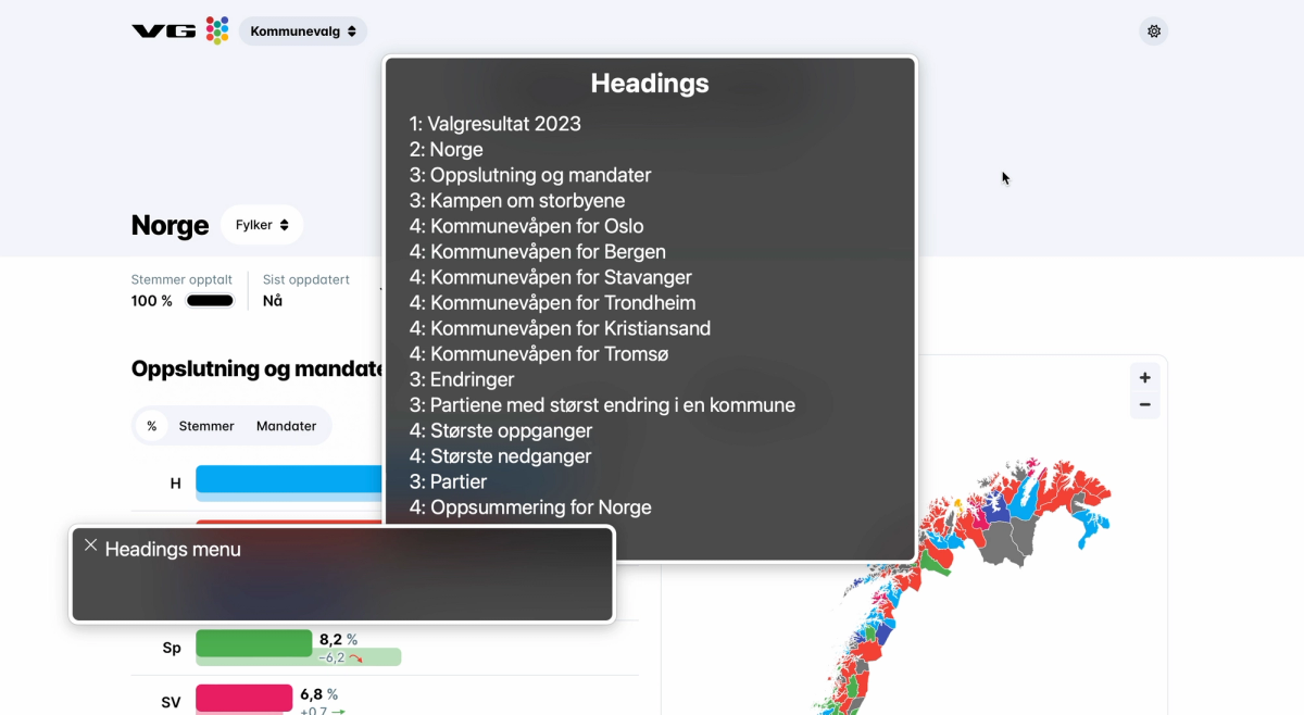
Heading levels are important for explaining the structure and relationships of the content</h3>
<p>Using subtitles/headings on a page introduces, structures, and sometimes summarizes the content. The text sets the expectation of what you're about to read, and the styling (font-size, weight, position, etc) of the headings says something about the relationship they have to each other.</p>
<p>Semantically, this structure and relationship is communicated by using heading elements with the correct heading level (<code>&lt;h1&gt;</code>, <code>&lt;h2&gt;</code>, <code>&lt;h3&gt;</code>, etc).</p>
<p>Valgresultat used an <code>&lt;h1&gt;</code> for all of their subtitles, not just the main page title. This took away the structure for screen reader users, and announces the page title on the same level as the subtitles in the footer, for example.</p>
<img src="https://cdn.sanity.io/images/njlrbdui/production/c4610e9d078e016a0cbebce72efcb9d7cae4c911-1310x680.png?w=1200" alt="Headings menu in VoiceOver showing 7 heading elements, all level 1 (h1): valgresultat, lanfsoversikt, eksport av data for landsoversikt, adresse, postadresse, lenker, kontakt" class="small" />
<p>
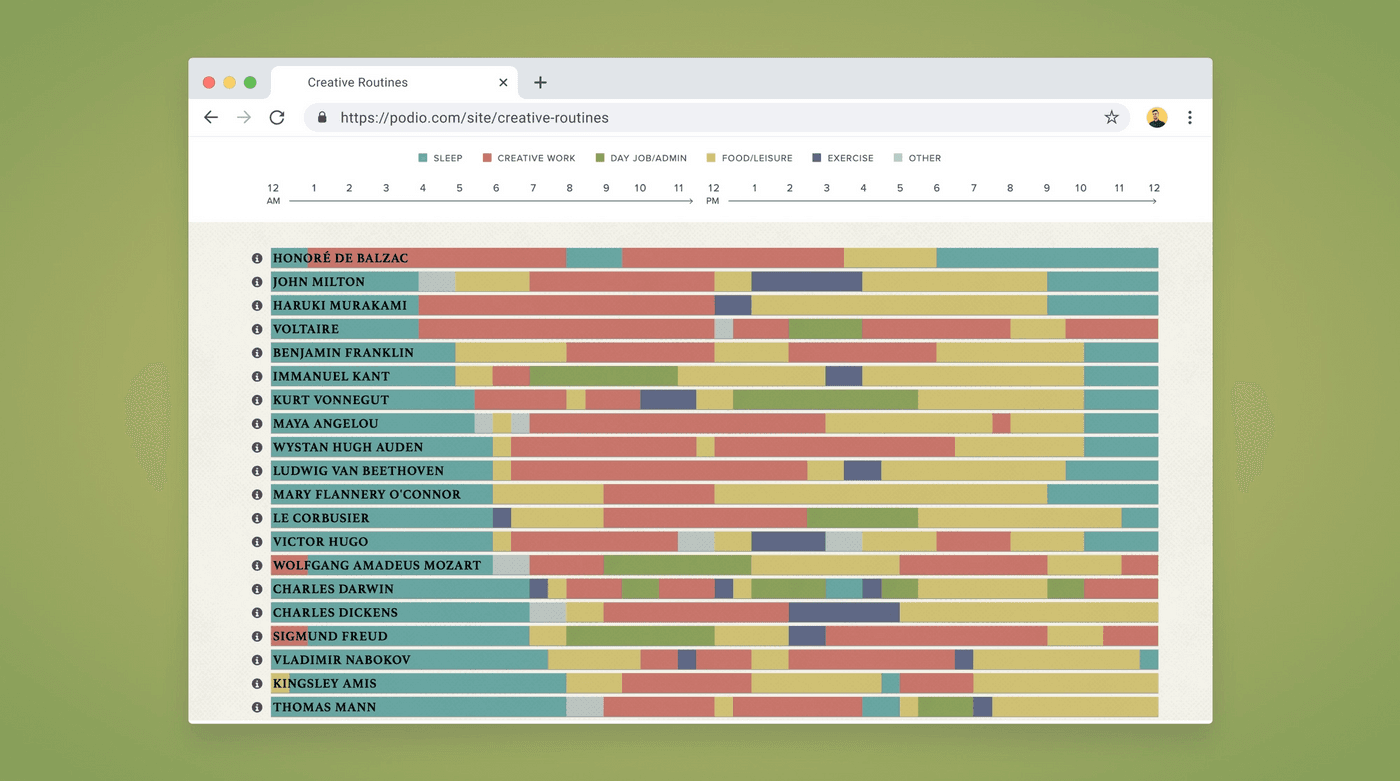
In comparison, VG added headings to each of their sections, and the heading levels reflect the structure of the page. When browsing the headings menu in VoiceOver, I can tell that <em>&quot;Kampen om storbyene&quot;</em> (&quot;The battle for the big cities&quot;) has information for 6 different places: Oslo, Bergen, Stavanger, Trondheim, Kristiansand, and Tromsø.</p>
<img src="https://cdn.sanity.io/images/njlrbdui/production/8b7300e6ba41fc02a50deced653eb6fc88add8b2-2856x1566.png?w=1200" alt="VG's page with VoiceOver headings menu open, showing a structure with one H1, and underneath a good structure with nested H2-4s." class="small" />
<h3>Internationalization needs to be considered</h3>
<p><a href="https://valgresultat.no/valg/2023/ko">Valgresultat</a> has a language selector which lets the user switch between four different languages:</p>
<ul>
<li>English</li>
<li>Norwegian (Bokmål)</li>
<li>Norwegian (Nynorsk)</li>
<li>Northern Sami (Sámegiella)</li>
</ul>
<p>The text on the page updates to the selected language, but the language of the page never gets updated programmatically. According to the HTML <code>lang</code> code, the page is in English regardless of which language is selected.</p>
<p>Screen readers change their language and pronunciation based on the language of the content, and translation tools can base themselves on the <code>lang</code> attribute as well, so it's important that the language tag reflects the language on the page.</p>
<h2>Maps are tricky to get right, often ignored</h2>
<p>Across my client work I notice that maps are the chart type that spark the most conversation.</p>
<p>Do people want to navigate them sorted by name, continent, or value? What should the default sorting order be? Should keyboard users be able to navigate around spatially to neighboring countries? How do we visualize the data of small countries? Do we allow zoom? How does that work for keyboard users? How do we visualize borders? What are the color contrast requirements for adjacent regions?</p>
<p>All that to say: there's a lot to be considered when it comes to map accessibility. This is clear from how the different media made their maps accessible: they didn't.</p>
<h3>The election maps were lacking screen reader interaction, table alternatives, and informative text alternatives</h3>
<p>Across all the websites that used maps to visualize the election results, none provided a table alternative or direct screen reader interaction with the map.</p>
<div class="video-wrapper"><video width="100%" height="auto" controls><source src="https://cdn.sanity.io/files/njlrbdui/production/9ba80f5f9fa09968a02e905a739d70d63b9e5fed.mov" type="video/mp4"></video><p class="transcript">Video description: A bar chart and map. The screen reader announces the text labels on the bar chart, in chronological order (but reads the letters of the party names one by one), then the zoom buttons on the map are announced, and the map itself is skipped. There is no table alternative.</p></div>
<p>VoiceOver just skipped past VG's and Aftenposten's map. The zoom buttons were announced correctly, but the actual informative content was not there.</p>
<p>NRK's map was turned into an image with alt text, but the alt text only described what type of info was visualized on the map, not the actual data. NRK also made some extra effort to summarize the graph for everyone. Underneath the map they listed the parties and in how many municipalities they were in the majority.</p>
<div class="video-wrapper"><video width="100%" height="auto" controls><source src="https://cdn.sanity.io/files/njlrbdui/production/60dad0c6e6b4fdd19cc3dbdd5a0426c4c07c2314.mov" type="video/mp4"></video><p class="transcript">Video description: A map that's announced as a figure, and a text alternative is announced. However the text just describes the purpose of the graph (it's a map of Norway with the municipalities colored in the color of the party that had the most votes there). There is no table alternative. There is a list below the map, summarizing the amount of municipalities where each party is the largest.</p></div>
<p>This in a way provides a text format of the amount of color that's observable on the map, but there is no place to view a list or table with all of the municipalities and their biggest party.</p>
<h2>Public vs. private sector?</h2>
<p>Before this I was curious how the graphs of the public vs. private sector performed. While I did feel like more emphasis had been placed on accessibility and compliance on the two sources from the public sector, all the dashboards I inspected had room for improvement, including those from the public sector.</p>
<p>Currently the Norwegian public sector has to follow <a href="https://www.uutilsynet.no/wcag-standarden/wcag-standarden/86?f%5B0%5D=t2%3A129">47 WCAG success criteria</a>, the <a href="https://www.uutilsynet.no/wcag-standarden/wcag-standarden/86?f%5B0%5D=t2%3A130">private sector</a> 35. All websites are tested had some issues against those. A couple of examples:</p>
<ul>
<li>VG's map did not have a text alternative (SC 1.1.1)</li>
<li>NRK's bar charts were lacking color contrast (SC 1.4.11)</li>
<li>VG's party-colored text was lacking color contrast (SC 1.4.3)</li>
<li>Aftenposten's positive/negative numbers were lacking text contrast (SC 1.4.3)</li>
<li>NRK's map used only color to convey information (SC 1.4.1)</li>
<li>Valgresultat's language doesn't update (SC 3.1.1)</li>
</ul>
<p>Both with the <a href="https://www.uutilsynet.no/regelverk/gjeldende-regelverk-og-krav/746">current</a> and <a href="https://online-accessibility-countdown.eu/?lang=en">upcoming</a> regulations in mind, the Norwegian news media and government definitely have some work left to do.</p>
<h2>Looking for an accessibility review, training, or help with dataviz accessibility?</h2>
<p>Are you after reading this article curious about how accessible your data visualizations are? Want to onboard your team on dataviz accessibility with a training session? Or have a chat about how to incorporate accessibility work into your organization?</p>
<p>🙋🏻 I'm an independent accessibility specialist with an offering focused on dataviz accessibility. If you're interested in hiring me for an accessibility project or are wondering how we can <a href="https://fossheim.io/work/">collaborate</a>, feel free to reach out through <a href="mailto:accessibility@fossheim.io">accessibility@fossheim.io</a>.</p>

        ]]>
      </content>
    </entry>
  
    <entry>
      <title>Looking back at the past year (and a half) of accessibility work.</title>
      <link href="https://fossheim.io/writing/posts/looking-back-at-the-past-year-and-a-half-of-accessibility-work" />
      <updated>2022-12-31T19:52:00.000Z</updated>
      <id>https://fossheim.io/writing/posts/looking-back-at-the-past-year-and-a-half-of-accessibility-work</id>
      <content type="html">
        <![CDATA[
          <p>It's the end of the year, which means time to look back at what has been and write a year in review blog post about it. Because it's been silent on my blog for a while, I decided to combine it with another post that's long overdue: a recap of my first year (and a half) of freelancing.</p>
<p>In 2021, after roughly 7 years of working in tech, I decided to quit my job as a senior front-end developer in favour of starting my own company and work as an independent consultant. It was a scary decision, but has absolutely proven to be the right one.</p>
<h2>Work</h2>
<p>While having to find your own clients and plan your own work is one of the things that makes freelancing scary, it also has allowed me to find projects that are much more in line with my skills and interests.</p>
<p>I've gotten to work on some really interesting projects the past year and a half, including the following:</p>
<ul>
<li>Contributed with accessibility reviews and guidelines to the <a href="https://data.who.int/products/data-design-language">WHO Data Design Language</a>, for which I was part of <a href="https://truth-and-beauty.net/projects/who">Truth &amp; Beauty's team</a>.</li>
<li>Accessibility and front-end consulting for a long-term and repeat client: I assist with fixing accessibility bugs, implement and review new features, and help build internal accessibility documentation and knowledge.</li>
<li>Performed accessibility reviews for different products and websites. For example, I audited on all of <a href="https://www.finn.no">FINN.no</a>'s data visualizations, and provided the designers and developers with guidance, documentation and tools to implement the fixes and make improvements. I also reviewed all of the <a href="https://stateofjs.com/en-us/">State of JS</a> and <a href="https://stateofcss.com/en-us/">State of CSS</a> graphs, based on <a href="https://chartability.fizz.studio">Chartability</a>.</li>
<li>Accessibility talks and training: including at <a href="https://graphichuntersshow.nl">SHOW conference</a>, <a href="https://www.youtube.com/watch?v=b-DvfAc52mg">FINN.no UX Design Evenings</a>, Little Miss Robot's Product Design Meetup <em>(hosted @ my old university, almost felt like being back in school)</em>, and more. I also started doing internal accessibility training, office hours, and Q&amp;As with some clients.</li>
<li>Wrote an essay on screen reader accessible data visualizations as part of The Urban Institute's <a href="https://www.urban.org/sites/default/files/2022-12/Do%20No%20Harm%20Guide%20Centering%20Accessibility%20in%20Data%20Visualization.pdf">Do No Harm Guide on Centering Accessibility In Data Visualizations</a>. The report has 9 different essays by different folks in the dataviz accessibility field.</li>
</ul>
<p>I also implemented a whole lot of new features across projects. Most of those were written in React and TypeScript, but I also had a couple of fun projects that combined <a href="https://www.11ty.dev">Eleventy</a>/<a href="https://www.sanity.io">Sanity</a> as well.</p>
<h2>Accessibility Observations</h2>
<h3>1. Many people actually do want to prioritize accessibility.</h3>
<p>Throughout my career (almost 10 years at the time of writing this post) I've frequently come across people who just <em>refused</em> to care about accessibility. My main experience was always having to advocate <em>hard</em> for it.</p>
<p>I remember leaving a comment about changing a <code>&lt;div&gt;</code> (with a clickhandler and styled like a button) to an actual <code>&lt;button&gt;</code> on a PR and the developer refusing to address it because they felt accessibility wasn't important enough. Or another time having to justify myself to a manager for spending time on making a color scheme more accessible. The conversation with him took longer than the actual work.</p>
<p>However, the past year and a half I've mainly come across the opposite: people who are looking to improve their accessibility skills, who ask a lot of questions, and who are excited to deliver an accessible quality product from the start, rather than moving fast and breaking things.</p>
<h3>2. The tech industry faces a lot of accessibility blockers.</h3>
<p>The enthusiasm for accessibility work doesn't necessarily translate into accessible products, though. One of the most asked questions I get after talks is still some variation of &quot;how do I convince my boss to let me work on accessibility?&quot; (_and a blog post about this is coming soon_™).</p>
<p>But when talking to project managers, I also often hear similar struggles: they're trying to plan around a deadline someone else has set or work within a budget they didn't decide on.</p>
<p>Amongst the type of companies that contact me are also design agencies and consultancies, where the time and money the team can spend on accessibility work also depends on the budget they received from their clients.</p>
<p>On top of that, I feel like there are a lot of accessibility knowledge gaps in the industry. Bootcamps and college degrees don't always touch upon the topic, so not everyone enters the workforce knowing about it. Learning new skills also takes time and energy, and if you want to follow a course or book, also money. Doing this after work and out of own pocket isn't achievable for everyone (and shouldn't be the expectation), but how much learning can be done on the job really depends on the company.</p>
<p>Long story short: there are a a lot of things that may block accessibility efforts, even if we have good intentions or come prepared. We can't necessarily control our circumstances, but we can control how we prepare for them and respond to them.</p>
<h3>3. Accessibility bugs are more often caused by broken processes than broken code.</h3>
<p>Yes, a lot of accessibility issues are caused by how the code is written (or how the product is designed), but the fact that inaccessible features make it into a live version that's released to users, that's typically an issue with our processes.</p>
<p>Most people do some sort of quality control of their products before pushing them out. Depending on the size of the company or poject that could be anything from a designer taking a quick look at what the developer built, or a detailed process involving multiple code reviews, and automatic and manual tests.</p>
<p>Some of the most common issues I come across are:</p>
<ul>
<li><strong>Missing or unclear alt text</strong>: Missing alt text can be picked up by linters, unit tests, and automatic testing tools such as Axe and Lighthouse. It can also be viewed in the browser through the inspector (developer tools), or by using a screen reader on the page.</li>
<li><strong>Divs used as buttons, without the appropriate roles, labels, or keyboard controls.</strong> Most issues related to semantics will be flagged by linters and automatic testing tools, but this is also something that can be flagged in code reviews. The behavior can be tested manually by using the keyboard in the browser.</li>
<li><strong>Elements disappearing/blocking the view when zooming in.</strong> This can be tested during and after development by zooming in to the browser when doing manual tests. Designers can also document how the page should behave on zoom/resize.</li>
<li><strong>Lack of color contrast</strong>. This can be tested by design tool plugins (eg. Able, Stark), automated testing tools, and web-based color contrast checkers.</li>
</ul>
<p>If a lot of those bugs are created while building, it can be an indication the team needs accessibility training (or hire more accessibility-focused engineers/designers). But if they make it into production, in my experience it usually means one or more of those things:</p>
<ol>
<li>There wasn't enough testing/quality assurance in general.</li>
<li>The testing and quality assurance didn't include accessibility.</li>
<li>Accessibility issues were flagged, but fixes deprioritized.</li>
<li>Fixes for the bugs were prioritized, but no one's available to fix them.</li>
<li>There's no way to discover or track accessibility issues.</li>
</ol>
<h3>4. Progress over perfection: small improvements can go a long way.</h3>
<p>It's not always possible to fix all accessibility issues a website has at once, and we may not alwyas find the best solution on the first or second try. If we try to fix everything in one go, we risk ending up fixing nothing at all.</p>
<p>If there's a limited accessibility budget, it can be more productive to do a high-level review of the product and help the team understand how to fix and prevent the issues, rather than holding out from doing anything until someone wants to set resources aside for a full in-depth WCAG audit (which may never happen).</p>
<p>Some of the &quot;smallest&quot; accessibility issues to solve can also be some of the largest blockers. I've come across menus where each menu item was labelled <em>&quot;image&quot;</em> and none of the pages had unique titles. From a technical point of view, that's a small mistake with an easy fix (add a text label to the icons). But for screen reader users this made the app unusable.</p>
<p>The more of those seemingly small issues get fixed, the deeper the conversation around accessibility can be, and the more useful user feedback can be collected.</p>
<h2>Looking into 2023.</h2>
<p>I'm mainly hoping to continue what I started in 2023: do a good mix of projects, with a focus on accessibility. That means front-end/accessibility consulting work, accessibility reviews, documentation, and training. I especially want to streamline and strengthen my auditing and training offering.</p>
<p>I have also set time aside for building accessibility tools for my company to start using (stay tuned 👀), and am also planning on writing and building in the open a whole lot more.</p>
<p>For example, I'm currently building a customizable links page:</p>
<ul>
<li>Preview: <a href="https://links.fossheim.io">links.fossheim.io</a></li>
<li><a href="https://github.com/sarahfossheim/links.fossheim.io">GitHub repo</a></li>
</ul>
<p>I genuinely had a good year in 2022. I got to spend a lot of time with my wife and dogs, recovered from burnout and CPTSD, and had a fully-booked year of interesting clients. I hope I'm not jinxing it by writing this post, but I wouldn't mind another year like this ❤️</p>
<p>Happy New Year!</p>

        ]]>
      </content>
    </entry>
  
    <entry>
      <title>Building an accessible theme picker with HTML, CSS and JavaScript.</title>
      <link href="https://fossheim.io/writing/posts/accessible-theme-picker-html-css-js" />
      <updated>2022-12-21T18:07:00.000Z</updated>
      <id>https://fossheim.io/writing/posts/accessible-theme-picker-html-css-js</id>
      <content type="html">
        <![CDATA[
          <p>In the recent refresh of my website’s design I implemented different theming options. It’s now possible to choose between six different color schemes when reading my blog.</p>
<p>The need for more than just a light theme and dark theme came from the fact that personally, when I get bad migraines and headaches, low contrasting colors feel easier on my eyes, so I wanted to at least add a dark low-contrast option in addition to a regular light and dark theme.</p>
<p>Once the support for the first two themes was added, providing more options became really straightforward, so it was easy to let myself have some fun creating different themes!</p>
<img src="https://cdn.sanity.io/images/njlrbdui/production/31075c2c77f9bde05ebd64d5a9ab66034b52db99-2858x1378.png?w=1200" alt="Theme selector in the footer of Fossheim.io. Title is &quot;Pick a theme&quot;, and the different theme options are &quot;non-binary&quot;, &quot;trans&quot;, &quot;aurora&quot;, &quot;dimmed&quot;, &quot;gray&quot; and &quot;neon&quot;." class="small" />
<p>I’ve received a lot of positive feedback on the theme switcher, and implementing light/dark modes and high contrast themes has been a recurring accessibility task across several of the projects I’ve been involved in, so I figured it was time for a write-up on how to implement a theme switcher like this.</p>
<p>In this tutorial, we’ll use:</p>
<ul>
<li>HTML</li>
<li>CSS</li>
<li>JavaScript (vanilla)</li>
</ul>
<h2>What we’ll be building</h2>
<p>At the end of this tutorial, we'll have an example with four different themes that can instantly be activated through a group of toggle buttons in the interface, and our choice will be remembered through <code>localStorage</code>.</p>
<p>You can find the final code on my <a href="https://github.com/sarahfossheim/theme-switcher">theme-switcher GitHub repo</a>, and all the demos used in this tutorial are bundled in a <a href="https://codepen.io/collection/OLMmdg?cursor=eyJjb2xsZWN0aW9uX2lkIjoiT0xNbWRnIiwiY29sbGVjdGlvbl90b2tlbiI6bnVsbCwibGltaXQiOjQsIm1heF9pdGVtcyI6MTEsIm9mZnNldCI6OCwicGFnZSI6Mywic29ydF9ieSI6InBvc2l0aW9uIiwic29ydF9vcmRlciI6IkFzYyJ9">Theme Switcher collection on my CodePen</a> as well.</p>
<div class="large"><iframe height="450" style="width: 100%;" scrolling="no" title="Theme Switcher Demo - Cleaned Up" src="https://codepen.io/fossheim/embed/WNyBwMy?default-tab=result" frameborder="no" loading="lazy" allowtransparency="true" allowfullscreen="true">
  See the Pen <a href="https://codepen.io/fossheim/pen/WNyBwMy">
  Theme Switcher Demo - Cleaned Up</a> by Sarah Fossheim (<a href="https://codepen.io/fossheim">@fossheim</a>)
  on <a href="https://codepen.io">CodePen</a>.
</iframe></div>
<h2>Variable styling with CSS.</h2>
<p>Let's start by getting our CSS ready to support themes.</p>
<p>We’ll need to use <a href="https://developer.mozilla.org/en-US/docs/Web/CSS/Using_CSS_custom_properties">CSS variables (or custom properties)</a> to make changing out colors across components easier.</p>
<p>Let's say we start with a CSS file that looks like this:</p>
<pre class="small"><code>body { 
  background: linear-gradient(#A4F3A2, #00CC66);
  color: #034435;
} 

.callout { 
  background: #034435; 
  color: #A4F3A2; 
} 

.footer { 
  background: #A4F3A2;
  border-top: 2px solid #034435;
}</code></pre>
<p>We can add a <a href="https://developer.mozilla.org/en-US/docs/Learn/HTML/Howto/Use_data_attributes">custom data attribute</a> on the <code>html</code>:</p>
<pre class="small"><code>&#x3C;html data-selected-theme="pink"&#x3E;
  ...
&#x3C;/html&#x3E;</code></pre>
<p>And use that to overwrite the colors for each theme. If we continued with the CSS from above, without adding variables, we'd have to do something along these lines:</p>
<pre class="small"><code>/* variables.css */
body { 
  background: linear-gradient(#A4F3A2, #00CC66);
  color: #034435;
} 

.callout { 
  background: #034435; 
  color: #A4F3A2; 
} 

.footer { 
  background: #A4F3A2;
  border-top: 2px solid #034435;
}

/* pink.css */
[data-selected-theme="pink"] body { 
  background: linear-gradient(#DFB2F4, #F06EFC);
  color: #463546; 
} 

[data-selected-theme="pink"] .callout { 
  background: #463546;
  color: #DFB2F4;
}

[data-selected-theme="pink"] .footer { 
  background: #DFB2F4;
  border-top: 2px solid #463546;
}</code></pre>
<p>For a small tutorial example this might still seem like a feasible approach, but it would become really difficult to keep track of over time. The larger the website or component library, the more properties we'd need to remember to manually overwrite for each new theme. So in come ✨ CSS variables ✨, which we can set on  <code>:root</code> like this:</p>
<pre class="small"><code>:root {
  --color-background: #A4F3A2; 
  --color-text: #034435; 
  --color-accent: #00CC66;
}</code></pre>
<p>We can then use those variables everywhere else in the CSS.</p>
<pre class="small"><code>body {
  background: linear-gradient(
    var(--color-background), 
    var(--color-accent)
  ); 
  color: var(--color-text); 
}

.callout { 
  background: var(--color-text); 
  color: var(--color-background); 
} 

.footer { 
  background: var(--color-background);
  border-top: 2px solid var(--color-text);
}</code></pre>
<p>This means that instead of having to update the styling of each element individually, we can now limit ourselves to only overwriting the variables that are defined in the <code>:root</code> :</p>
<pre class="small"><code>:root {
  --color-background: #A4F3A2; 
  --color-text: #034435; 
  --color-accent: #00CC66;
}

[data-selected-theme="pink"] { 
  --color-background: #DFB2F4;
  --color-text: #463546;
  --color-accent: #F06EFC;
}
</code></pre>
<p>This looks a lot tidier already! 🥳</p>
<p>We can now relatively quickly scale up the amount of themes we support, without having to change anything inside the individual components.</p>
<pre class="small"><code>:root, 
[data-selected-theme="green"] { 
  --color-background: #A4F3A2; 
  --color-text: #034435; 
  --color-accent: #00CC66; 
}

[data-selected-theme="blue"] {
  --color-background: #55dde0;
  --color-text: #2B4150;
  --color-accent: #00D4E7;
} 

[data-selected-theme="pink"] { 
  --color-background: #DFB2F4;
  --color-text: #463546;
  --color-accent: #F06EFC;
}

[data-selected-theme="orange"] {
  --color-background: #FA7D61;
  --color-text: #1E1E24;
  --color-accent: #F3601C;
}</code></pre>
<p>Here, we have written the CSS support for our different themes, and we can switch between them by manually updating the <code>data-selected-theme</code> property on the <code>body</code> of the page to our different theme class names.</p>
<div class="large"><iframe height="500" style="width: 100%;" scrolling="no" title="Theme Switcher Demo - Text Only" src="https://codepen.io/fossheim/embed/oNyRbKv?default-tab=css%2Cresult&editable=true" frameborder="no" loading="lazy" allowtransparency="true" allowfullscreen="true">
  See the Pen <a href="https://codepen.io/fossheim/pen/oNyRbKv">
  Theme Switcher Demo - Text Only</a> by Sarah Fossheim (<a href="https://codepen.io/fossheim">@fossheim</a>)
  on <a href="https://codepen.io">CodePen</a>.
</iframe></div>
<p>Now we will need to create a component that lets us switch themes directly from the UI instead.</p>
<h2>Creating a theme selector component in HTML.</h2>
<p>There are several ways you could go about implementing theming like this. For example, GitHub has a place in the setting where it’s possible to select a color theme by using radio buttons.</p>
<img src="https://cdn.sanity.io/images/njlrbdui/production/c580d093f4ad1709a34fdd8dd8f94c950e9bec6e-1578x1198.png?w=1200" alt="Grid of 9 radio buttons with a label and an image next to them, showing the different color theme options in GitHub: light default, high contrast, light protanopia & deuteranopia, light tritanopia, dark default, dark high contrast, dark protanopia & deuteranopia, dark tritanopia, dark dimmed. The first option (light default) is selected." class="small" />
<p>I decided to go for a group of <code>&lt;button&gt;</code> elements. It’s how I designed them visually, so it makes sense to match that pattern in the semantics.</p>
<p><a href="https://tink.uk/perceived-affordances-and-the-functionality-mismatch/">Léonie Watson</a> has an excellent article explaining why an element’s visuals and semantics should match, but in short: different elements <em>(buttons, radio buttons, links, etc)</em> have their own keyboard and screen reader controls, and we want to make sure the actual interaction available lines up with the user’s expectation.</p>
<div class="large"><iframe height="540" style="width: 100%;" scrolling="no" title="Theme Switcher Demo - Nothing selected" src="https://codepen.io/fossheim/embed/QWxRNwa?default-tab=result&editable=false" frameborder="no" loading="lazy" allowtransparency="true" allowfullscreen="true">
  See the Pen <a href="https://codepen.io/fossheim/pen/QWxRNwa">
  Theme Switcher Demo - Nothing selected</a> by Sarah Fossheim (<a href="https://codepen.io/fossheim">@fossheim</a>)
  on <a href="https://codepen.io">CodePen</a>.
</iframe></div>
<h3>Communicating the selected theme.</h3>
<p>Now we have our buttons, but we don’t have anything in place yet to indicate which theme is selected. We’re using the green by default, so we can already pre-select that button by adding <code>aria-pressed=&quot;true&quot;</code>.</p>
<pre class="small"><code>&#x3C;div class="theme-switcher"&#x3E;
  &#x3C;button aria-pressed="true"&#x3E;Green&#x3C;/button&#x3E;
  &#x3C;button aria-pressed="false"&#x3E;Blue&#x3C;/button&#x3E;
  &#x3C;button aria-pressed="false"&#x3E;Pink&#x3C;/button&#x3E;
  &#x3C;button aria-pressed="false"&#x3E;Orange&#x3C;/button&#x3E;
&#x3C;/div&#x3E;</code></pre>
<p>The <code>aria-pressed</code> tells assistive technology whether or not a button is checked. For example, VoiceOver will read the above selected button as:</p>
<p><em>Green, selected, toggle button</em></p>
<img src="https://cdn.sanity.io/images/njlrbdui/production/026eb28e86932538af9221537f9293ba78e50c5f-1704x1038.png?w=1200" alt="Two VoiceOver boxes: &quot;Green, selected, toggle button&quot; and &quot;Blue, toggle button&quot;" class="small" />
<p>We can use the same <code>aria-pressed</code> property in the CSS to style the selected button differently:</p>
<pre class="small"><code>button[aria-pressed="true"] { 
  background: var(--color-text);
  color: var(--color-background);
}</code></pre>
<div class="large"><iframe height="540" style="width: 100%;" scrolling="no" title="Theme Switcher Demo - No JS" src="https://codepen.io/fossheim/embed/NWzVxZv?default-tab=html%2Cresult&editable=true" frameborder="no" loading="lazy" allowtransparency="true" allowfullscreen="true">
  See the Pen <a href="https://codepen.io/fossheim/pen/NWzVxZv">
  Theme Switcher Demo - No JS</a> by Sarah Fossheim (<a href="https://codepen.io/fossheim">@fossheim</a>)
  on <a href="https://codepen.io">CodePen</a>.
</iframe></div>
<h2>Updating the selected theme with JavaScript.</h2>
<p>So now comes the fun part: making the buttons interactive using JavaScript. When we activate a button <em>(using click, space, or enter)</em>, we want:</p>
<ul>
<li>The class name on the body to update with the corresponding theme.</li>
<li>The button’s <code>aria-pressed</code> property to be set to <code>true</code>.</li>
<li>All other theme buttons to be toggled off (<code>aria-pressed=”false”</code>).</li>
<li>The choice to be saved for next time we visit the page.</li>
</ul>
<h3>Reacting to button clicks.</h3>
<p>We’ll first need to detect which button has been clicked. We can do so by selecting all the theme buttons on the page, and then looping through them and adding a <code>click</code> event listener to each of them.</p>
<pre class="large"><code>/* Logs the clicked button */
const handleThemeSelection = (event) =&#x3E; {
  console.log('button clicked', event.target);
}

/* Selects all buttons */
const themeSwitcher = document.querySelector('.theme-switcher');
const buttons = themeSwitcher.querySelectorAll('button');

/* Adds the handleThemeSelection as a click handler to each of the buttons */
buttons.forEach((button) =&#x3E; {
   button.addEventListener('click', handleThemeSelection);
});</code></pre>
<p>Because we used the <code>&lt;button&gt;</code> element, the <code>click</code> event will also be called when using the <code>space</code> and <code>enter</code> key to activate it.</p>
<h3>Adding theming info to the buttons.</h3>
<p>If we interact with the buttons on our page, we’ll notice that we can indeed detect the selected element this way.</p>
<div class="large"><iframe height="540" style="width: 100%;" scrolling="no" title="Theme Switcher Demo - Track click" src="https://codepen.io/fossheim/embed/QWxRNjQ?default-tab=js%2Cresult" frameborder="no" loading="lazy" allowtransparency="true" allowfullscreen="true">
  See the Pen <a href="https://codepen.io/fossheim/pen/QWxRNjQ">
  Theme Switcher Demo - Track click</a> by Sarah Fossheim (<a href="https://codepen.io/fossheim">@fossheim</a>)
  on <a href="https://codepen.io">CodePen</a>.
</iframe></div>
<p>But it doesn’t give us much we can use in the code to update the themes. So before we continue, now is a good time to add some more custom properties to our HTML.</p>
<pre class="small"><code>&#x3C;div class="theme-switcher"&#x3E;
  &#x3C;button data-theme="green" aria-pressed="true"&#x3E;Green&#x3C;/button&#x3E;
  &#x3C;button data-theme="blue" aria-pressed="false"&#x3E;Blue&#x3C;/button&#x3E;
  &#x3C;button data-theme="pink" aria-pressed="false"&#x3E;Pink&#x3C;/button&#x3E;
  &#x3C;button data-theme="orange" aria-pressed="false"&#x3E;Orange&#x3C;/button&#x3E;
&#x3C;/div&#x3E;</code></pre>
<h3>Updating the theme.</h3>
<p>Now we can actually target the <code>data-theme</code> value in our click handler:</p>
<pre class="small"><code>const handleThemeSelection = (event) =&#x3E; {
  const theme = event.target.getAttribute('data-theme');
  console.log(theme);
}</code></pre>
<p>And use it to update the <code>data-selected-theme</code> property programatically. The following code will be enough to get the color scheme to update:</p>
<pre class="large"><code>const handleThemeSelection = (event) =&#x3E; {
  const theme = event.target.getAttribute('data-theme');
  document.documentElement.setAttribute("data-selected-theme", theme);
}

const themeSwitcher = document.querySelector('.theme-switcher');
const buttons = themeSwitcher.querySelectorAll('button');

buttons.forEach((button) =&#x3E; {
   button.addEventListener('click', handleThemeSelection);
});
</code></pre>
<p>If we click on the different options now, the styling of the page indeed updates, but the state of the buttons is still unchanged. Even if we select the pink theme, the default green options still is shown as active instead.</p>
<div class="large"><iframe height="540" style="width: 100%;" scrolling="no" title="Theme Switcher Demo - Track clicked theme 2/x" src="https://codepen.io/fossheim/embed/gOKJrWW?default-tab=result" frameborder="no" loading="lazy" allowtransparency="true" allowfullscreen="true">
  See the Pen <a href="https://codepen.io/fossheim/pen/gOKJrWW">
  Theme Switcher Demo - Track clicked theme 2/x</a> by Sarah Fossheim (<a href="https://codepen.io/fossheim">@fossheim</a>)
  on <a href="https://codepen.io">CodePen</a>.
</iframe></div>
<h3>Updating the button properties.</h3>
<p>We need to reflect this change in our button group as well. When clicking a button, we can set its <code>aria-pressed</code> attribute to <code>true</code>:</p>
<pre class="small"><code>target.setAttribute('aria-pressed', 'true');</code></pre>
<p>This will select the newly clicked button, but still won’t update the <code>aria-pressed</code> value of whichever color themes were selected previously, meaning several buttons can be selected at the same time.</p>
<div class="large"><iframe height="540" style="width: 100%;" scrolling="no" title="Theme Switcher Demo - Track clicked theme 3/x" src="https://codepen.io/fossheim/embed/gOKJrxR?default-tab=result" frameborder="no" loading="lazy" allowtransparency="true" allowfullscreen="true">
  See the Pen <a href="https://codepen.io/fossheim/pen/gOKJrxR">
  Theme Switcher Demo - Track clicked theme 3/x</a> by Sarah Fossheim (<a href="https://codepen.io/fossheim">@fossheim</a>)
  on <a href="https://codepen.io">CodePen</a>.
</iframe></div>
<p>To fix this we'll want to reset all <code>aria-pressed</code> buttons to <code>false</code>. Before updating our clicked button's value, we can first select the button that was still active:</p>
<pre class="small"><code>const prevBtn = document.querySelector('[data-theme][aria-pressed="true"]');</code></pre>
<p>And then set <code>aria-pressed</code> to <code>false</code>:</p>
<pre class="small"><code>const prevBtn = document.querySelector('[data-theme][aria-pressed="true"]');
prevBtn.setAttribute('aria-pressed', false);</code></pre>
<p>Because we targeted <code>[aria-pressed=&quot;true&quot;]</code> to style our selected state, we don’t need to do anything else to update the styling.</p>
<div class="large"><iframe height="540" style="width: 100%;" scrolling="no" title="Theme Switcher Demo - Track clicked theme 4/x" src="https://codepen.io/fossheim/embed/WNyBwEJ?default-tab=result" frameborder="no" loading="lazy" allowtransparency="true" allowfullscreen="true">
  See the Pen <a href="https://codepen.io/fossheim/pen/WNyBwEJ">
  Theme Switcher Demo - Track clicked theme 4/x</a> by Sarah Fossheim (<a href="https://codepen.io/fossheim">@fossheim</a>)
  on <a href="https://codepen.io">CodePen</a>.
</iframe></div>
<h3>Saving the choice.</h3>
<p>Our theme selector works! 🥳</p>
<p>The final step will be to remember our choice, so we don’t need to re-select the theme each time we visit the page.</p>
<h4>Updating the local storage.</h4>
<p>We can save the user selected theme in the local storage using the <code>localStorage.setItem()</code> function when clicking the button.</p>
<pre class="large"><code>const handleThemeSelection = (event) =&#x3E; {
  const theme = event.target.getAttribute('data-theme');
  document.documentElement.setAttribute("data-selected-theme", theme);
  
  const prevBtn = document.querySelector('[data-theme][aria-pressed="true"]');
  prevBtn.setAttribute('aria-pressed', false);
  event.target.setAttribute('aria-pressed', 'true');
  
  localStorage.setItem('selected-theme', theme);
}</code></pre>
<p>On page load, we can then check which theme has been stored in the local storage by calling:</p>
<pre class="small"><code>const savedTheme = localStorage.getItem('selected-theme');</code></pre>
<p>If a theme has been saved, we'll need to:</p>
<ol>
<li>Unselect the default selected button</li>
<li>Select the button that matches the saved theme</li>
<li>Change the <code>data-selected-theme</code> to the saved theme</li>
</ol>
<p>In order to avoid performing unnecessary actions, we'll only execute this code when the saved theme is different from the default theme:</p>
<pre class="large"><code>const savedTheme = localStorage.getItem('selected-theme');
const defaultTheme = "green";

if (savedTheme && savedTheme !== defaultTheme) {
  const prevBtn = document.querySelector('[data-theme][aria-pressed="true"]');
  prevBtn.setAttribute('aria-pressed', false);
  
  document.querySelector(`[data-theme="${savedTheme}"]`)
    .setAttribute('aria-pressed', true);
  
  document.documentElement
    .setAttribute("data-selected-theme", savedTheme);
}</code></pre>
<div class="large"><iframe height="540" style="width: 100%;" scrolling="no" title="Theme Switcher Demo - Track clicked theme 4/x" src="https://codepen.io/fossheim/embed/eYKaZGo?default-tab=result" frameborder="no" loading="lazy" allowtransparency="true" allowfullscreen="true">
  See the Pen <a href="https://codepen.io/fossheim/pen/eYKaZGo">
  Theme Switcher Demo - Track clicked theme 4/x</a> by Sarah Fossheim (<a href="https://codepen.io/fossheim">@fossheim</a>)
  on <a href="https://codepen.io">CodePen</a>.
</iframe></div>
<h3>Code cleanup</h3>
<p>There is still some repeated code. The way the <code>aria-pressed</code> and <code>data-selected-theme</code> are updated after loading the page and after clicking a button is more or less the same. So we can move this part into its own function.</p>
<pre class="large"><code>const applyTheme = (theme) =&#x3E; {
  const target = document.querySelector(`[data-theme="${theme}"]`);
  
  document.documentElement
    .setAttribute("data-selected-theme", theme);
  
  document.querySelector('[data-theme][aria-pressed="true"]')
    .setAttribute('aria-pressed', 'false');
  
  target.setAttribute('aria-pressed', 'true');
};</code></pre>
<p>The same function can then be called when clicking an option (from within <code>handleThemeSelection</code>), and when loading the page.</p>
<pre class="small"><code>const handleThemeSelection = (event) =&#x3E; {
  const target = event.target;
  const isPressed = target.getAttribute('aria-pressed');
  
  /* if clicked theme is different from current theme */
  if(isPressed !== "true") {
    const theme = target.getAttribute('data-theme');        
    applyTheme(theme);
    localStorage.setItem('selected-theme', theme);
  }
}</code></pre>
<pre class="small"><code>const savedTheme = localStorage.getItem('selected-theme');

/* if saved theme is different from current theme */
if(savedTheme && savedTheme !== defaultTheme) {
  applyTheme(savedTheme);
}</code></pre>
<h2>Final result</h2>
<p>And done! We have a basic theme switcher, that works with keyboard navigation and screen reader!</p>
<div class="large"><iframe height="540" style="width: 100%;" scrolling="no" title="Theme Switcher Demo - Cleaned Up" src="https://codepen.io/fossheim/embed/WNyBwMy?default-tab=result" frameborder="no" loading="lazy" allowtransparency="true" allowfullscreen="true">
  See the Pen <a href="https://codepen.io/fossheim/pen/WNyBwMy">
  Theme Switcher Demo - Cleaned Up</a> by Sarah Fossheim (<a href="https://codepen.io/fossheim">@fossheim</a>)
  on <a href="https://codepen.io">CodePen</a>.
</iframe></div>
<h2>Resources</h2>
<p>The code for this tutorial is available through my <a href="https://github.com/sarahfossheim/theme-switcher">theme-switcher GitHub repo</a>, and all the demos used in this tutorial are bundled in a <a href="https://codepen.io/collection/OLMmdg?cursor=eyJjb2xsZWN0aW9uX2lkIjoiT0xNbWRnIiwiY29sbGVjdGlvbl90b2tlbiI6bnVsbCwibGltaXQiOjQsIm1heF9pdGVtcyI6MTEsIm9mZnNldCI6OCwicGFnZSI6Mywic29ydF9ieSI6InBvc2l0aW9uIiwic29ydF9vcmRlciI6IkFzYyJ9">Theme Switcher collection on my CodePen</a> as well.</p>
<ul>
<li><a href="https://lea.verou.me/2022/07/button-group/">What's the best way to mark up an exclusive button group?</a> by <a href="https://lea.verou.me/about/">Lea Verou</a></li>
<li><a href="https://tink.uk/perceived-affordances-and-the-functionality-mismatch/">Perceived affordances and the functionality mismatch</a> by <a href="https://tink.uk/about-leonie/">Léonie Watson</a></li>
<li><a href="https://developer.mozilla.org/en-US/docs/Web/Accessibility/ARIA/Attributes/aria-pressed">MDN: aria-pressed</a></li>
<li><a href="https://developer.mozilla.org/en-US/docs/Web/CSS/Using_CSS_custom_properties">MDN: Using CSS custom properties (CSS variables)</a></li>
</ul>
<p>I'd love to see the result if you end up using my tutorial to add a theme selector to your website 🎨✨</p>

        ]]>
      </content>
    </entry>
  
    <entry>
      <title>How to create a screen reader accessible graph like Apple&#39;s with D3.js</title>
      <link href="https://fossheim.io/writing/posts/apple-dataviz-a11y-tutorial" />
      <updated>2021-03-22T18:17:17.053Z</updated>
      <id>https://fossheim.io/writing/posts/apple-dataviz-a11y-tutorial</id>
      <content type="html">
        <![CDATA[
          <p>After previously writing about the accessibility of <a href="https://fossheim.io/writing/posts/apple-health-dataviz-a11y/">Apple Health’s data visualizations</a>, I felt inspired to recreate one of them with D3.js. I already covered some of the basics <a href="https://fossheim.io/writing/posts/accessible-dataviz-d3-intro/">in the form of a bar chart</a>, so this time I decided to go for a different type of graph: the activity rings.</p>
<div class="img-gallery"><img src="https://cdn.sanity.io/images/njlrbdui/production/c1edc2e86a804c1744dd3052fc2bf06ab7522646-734x1196.png?w=1600" alt="Apple Activity app: small donut charts for activity every day of the week, large donut chart for current day, bar chart for the current day broken down by the hour" /><img src="https://cdn.sanity.io/images/njlrbdui/production/8b2ba205a1bb00ddca8a4f81a712de9d371309df-734x1196.png?w=1600" alt="Apple Health app: donut chart for moving, exercising and standing, total numbers, and broken down by the hour, weekly highlights underneath" /></div>
<h2>Before we start</h2>
<p>While we will build the graph together step by step, this tutorial does require some previous knowledge or experience with <a href="https://d3js.org/">D3.js</a>. If you haven’t used D3 before, I suggest starting with some of these tutorials:</p>
<ul>
<li><a href="https://observablehq.com/@d3/gallery">Examples</a> &amp; <a href="https://github.com/d3/d3/wiki">Documentation</a></li>
<li><a href="https://wattenberger.com/blog/d3">How to learn D3.js</a></li>
<li><a href="https://www.a11ywithlindsey.com/blog/accessibility-d3-donut-charts">Accessible donut charts</a></li>
<li><a href="https://www.a11ywithlindsey.com/blog/accessibility-d3-bar-charts">Accessible bar charts</a></li>
</ul>
<h2>Part 1: Drawing the rings.</h2>
<div class="large"><iframe height="670" class="wide" scrolling="no" title="Apple Activity Bars — Starting Point" src="https://codepen.io/fossheim/embed/MWbBRrx?height=670&theme-id=light&default-tab=result" frameborder="no" loading="lazy" allowtransparency="true" allowfullscreen="true">
  See the Pen <a href='https://codepen.io/fossheim/pen/MWbBRrx'>Apple Activity Bars — Starting Point</a> by Sarah Fossheim
  (<a href='https://codepen.io/fossheim'>@fossheim</a>) on <a href='https://codepen.io'>CodePen</a>.
</iframe></div>
<p>First, we’ll need to add a container in the HTML, and <em>(optionally)</em> style the page with CSS already. Next, we’ll draw an SVG element using JavaScript:</p>
<pre class="large"><code>/* Define properties */
const width = 450;
const height = 450;
const margin = 40;

/* Add SVG inside &#x3C;div id="activity"&#x3E;&#x3C;/div&#x3E; */
const chart = d3.select('#activity').append('svg')
  .attr('width', width)
  .attr('height', height);</code></pre>
<p>Now that we have an <code>&lt;svg&gt;</code> we can start adding elements to it. First, we’ll create a group to draw the rings in, and center it within its parent (<code>&lt;svg&gt;</code>).</p>
<pre class="large"><code>const rings = chart.append('g')
  .attr('transform', `translate(${width / 2}, ${height / 2})`);</code></pre>
<p>Then we’ll need to draw our three rings for <strong>moving</strong>, <strong>exercising</strong>, and <strong>standing</strong>. For now, we’ll be using the following input data:</p>
<pre class="large"><code>const stats = [
 {
    name: 'Moving',
    value: 122,
    goal: 350,
    perc: 0.35,
    unit: 'kcal',
    color: 'hotpink'
  }, {
    name: 'Exercising',
    value: 40,
    goal: 40,
    perc: 1.00,
    unit: 'min',
    color: 'limegreen'
  }, {
    name: 'Standing',
    value: 9,
    goal: 12,
    perc: 0.75,
    unit: 'h',
    color: 'turquoise'
  }
];</code></pre>
<p>There are a few different ways to draw the rings, but I chose to drawpaths in combination with the <code>d3.arc()</code> function by looping through the stats and using the <code>perc</code> <em>(percentage)</em> to define start and stop positioning.</p>
<pre class="large"><code>rings.append('path')
    .attr('d', d3.arc()
      .innerRadius(150)
      .outerRadius(200)
      .startAngle(0)
      .endAngle(Math.PI) // full circle: Math.PI * 2
     )
    .attr('fill', 'white');</code></pre>
<p>This would give us half a donut that’s <code>200px</code> in radius (<code>400px</code> in diameter), has a band width of <code>50px</code> and a gap of <code>2px</code>.</p>
<div class="large"><iframe height="709" class="wide" scrolling="no" title="Half circle" src="https://codepen.io/fossheim/embed/Vwmqaje?height=709&theme-id=light&default-tab=result" frameborder="no" loading="lazy" allowtransparency="true" allowfullscreen="true">
  See the Pen <a href='https://codepen.io/fossheim/pen/Vwmqaje'>Half circle</a> by Sarah Fossheim
  (<a href='https://codepen.io/fossheim'>@fossheim</a>) on <a href='https://codepen.io'>CodePen</a>.
</iframe></div>
<p>When we look back at the activity rings, we can see that each ring should decrease in size, and we should have a small gap between each of the rings.</p>
<p>Concretely, this means that for each row of data, the <code>innerRadius</code> and <code>outerRadius</code> should get smaller.</p>
<img src="https://cdn.sanity.io/images/njlrbdui/production/e4fa7b10920c95d7b366ce637c5e0477057d523c-3318x1872.png?w=1400" alt="1st ring: moving: outerRadius: radius, innerRadius: radius - stroke. 2nd ring: exercising: outerRadius: radius - stroke - gap, innerRadius: radius - 2 * stroke - gap. 3rd ring: standing: outerRadius: radius - 2*stroke - 2*gap, innerRadius: radius - 3*stroke - 2*gap." class="large" />
<p>If we set our radius to <code>(width - margin) / 2</code> (so it takes up the entire space of the SVG minus a predefined margin) and the stroke/donut width to 50, the first row of data would look like this:</p>
<pre class="large"><code>rings.append('path')
    .attr('d', d3.arc()
      .innerRadius((width - margin) / 2 - 50)
      .outerRadius((width - margin) / 2)
      .startAngle(0)
      .endAngle(Math.PI * 2 * 0.35)
     )
    .attr('fill', 'hotpink');</code></pre>
<p>Because <code>Math.PI * 2</code> gives us a full circle, we can multiply it with the goal completion percentage (<code>stat.perc</code>) to calculate the correct <code>endAngle</code>.</p>
<p>For the second ring, this would have to be:</p>
<pre class="large"><code>rings.append('path')
    .attr('d', d3.arc()
      .innerRadius((width - margin) / 2 - 100 - 2)
      .outerRadius((width - margin) / 2 - 50 - 2)
      .startAngle(0)
      .endAngle(Math.PI * 2 * 1)
     )
    .attr('fill', 'limegreen');</code></pre>
<p>Which we can generalize as:</p>
<pre class="large"><code>stats.forEach((stat, index) =&#x3E; {
  rings.append('path')
      .attr('d', d3.arc()
        .innerRadius(radius - circleStroke * (index + 1) - circleSpace * index)
        .outerRadius(radius - circleStroke * index - circleSpace * index)
        .startAngle(0)
        .endAngle(Math.PI * 2 * stat.perc)
      )
      .attr('fill', stat.color);
});</code></pre>
<p>Then, we’ll need to add a similar <code>&lt;path&gt;</code> for the darker, uncompleted part of the circle. The only thing we need to do for that is set the startAngle to <code>fullCircle * stat.perc</code>, so that it starts where the bright circle ends and set the endAngle to <code>Math.PI * 2</code>. We’ll also turn down the opacity.</p>
<pre class="large"><code>stats.forEach((stat, index) =&#x3E; {
  rings.append('path')
      .attr('d', d3.arc()
        .innerRadius(radius - circleStroke * (index + 1) - circleSpace * index)
        .outerRadius(radius - circleStroke * index - circleSpace * index)
        .startAngle(0)
        .endAngle(Math.PI * 2 * stat.perc)
      )
      .attr('fill', stat.color);
      
  rings.append('path')
      .attr('d', d3.arc()
        .innerRadius(radius - circleStroke * (index + 1) - circleSpace * index)
        .outerRadius(radius - circleStroke * index - circleSpace * index)
        .startAngle(Math.PI * 2 * stat.perc)
        .endAngle(Math.PI * 2)
      )
      .attr('fill', stat.color)
      .attr('opacity', 0.25);
});</code></pre>
<p>I made a few more modifications to this and moved part of the code into a <code>drawRings</code> function, so I wouldn’t have to repeat the calculations for the inner and outer radius. You can see the full code for this part in the pen below 👇🏻.</p>
<div class="large"><iframe height="557" class="wide" scrolling="no" title="Apple Activity Bars — Starting Point" src="https://codepen.io/fossheim/embed/MWbBRrx?height=557&theme-id=light&default-tab=js,result" frameborder="no" loading="lazy" allowtransparency="true" allowfullscreen="true">
  See the Pen <a href='https://codepen.io/fossheim/pen/MWbBRrx'>Apple Activity Bars — Starting Point</a> by Sarah Fossheim
  (<a href='https://codepen.io/fossheim'>@fossheim</a>) on <a href='https://codepen.io'>CodePen</a>.
</iframe></div>
<p>If we listen to this with a screen reader, such as VoiceOver or Narrator, we won’t hear much useful. In fact, we won’t hear anything at all. That is because so far we have only drawn shapes, which doesn’t really tell a screen reader what to do.</p>
<p>In <a href="https://fossheim.io/writing/posts/accessible-dataviz-d3-intro/">my previous tutorial</a> we used <code>&lt;text&gt;</code> elements to read out the data, but for this one I decided to go for another option: the <code>aria-labelledby</code> property in combination with a <code>&lt;title&gt;</code> and <code>&lt;desc&gt;</code> element. This is inspired by how FiveThirtyEight labeled their graphs in their <a href="https://projects.fivethirtyeight.com/2020-election-forecast/">2020 presidential election forecast </a>(<a href="https://fossheim.io/writing/posts/accessible-dataviz-us-elections/">I reviewed those graphs before</a>).</p>
<p>We’ll want to:</p>
<ol>
<li>Set the role of the graph to <code>img</code>.</li>
<li>Include a <code>&lt;title&gt;</code> and <code>&lt;desc&gt;</code> inside the SVG, and give each a unique id.</li>
<li>Link the title and description to image by adding <code>aria-labelledby=”titleID descID”</code> to the graph.</li>
</ol>
<div class="large"><div class="large"><video controls class="large" width="100%"><source src="/static/video/apple-activity-rings.mp4" type="video/mp4">Sorry, your browser doesn't support embedded videos.</video></div></div>
<p><em>(<a href="https://pastebin.com/raw/3FT6r8pe">Full transcript</a>)</em></p>
<p>If we want to mimic Apple’s native behavior, the completion percentage for all three rings should be read simultaneously. Eg. <em>“Moving: 35%. Exercising: 100%. Standing: 75%“</em>.</p>
<p>To generate this text, we’ll create a function that extracts the label (<em>moving, exercising, standing</em>) and the values (<em>35%, 100%, 75%</em>) from the array with the data and then puts it in a sentence.</p>
<pre class="large"><code>const generateDescription = () =&#x3E; {
  return stats.map((stat) =&#x3E; {
    return `${stat.name}: ${stat.perc * 100}%.`;
  }).join(' ');
}</code></pre>
<p>Here we loop through the objects inside the stats array and replace each of them with a string. So after we’re finished looping through the stats, this is our output:</p>
<pre class="small"><code>[
  'Moving: 35%.',
  'Exercising: 100%.',
  'Standing: 75%.'
]</code></pre>
<p>Lastly, we’ll use <code>.join(' ')</code> at the end to create one long description, and use the output of the function to fill out the text inside the <code>&lt;desc&gt;</code> element.</p>
<pre class="large"><code>/* Create the chart. */
const chart = d3.select('#activity').append('svg')
  .attr('width', width)
  .attr('height', height)
  .attr('role', 'img') // SR support
  .attr('aria-labelledby', 'activityTitle activityDesc'); // SR support

/* Add title. */
chart.append('title')
  .text('Activity')
  .attr('id', 'activityTitle');

/* Add the description. */
chart.append('desc')
  .text(generateDescription)
  .attr('id', 'activityDesc');</code></pre>
<div class="large"><iframe height="607" class="wide" scrolling="no" title="Apple Activity Bars — Pt 2, title and description" src="https://codepen.io/fossheim/embed/YzpOZLp?height=607&theme-id=light&default-tab=js,result" frameborder="no" loading="lazy" allowtransparency="true" allowfullscreen="true">
  See the Pen <a href='https://codepen.io/fossheim/pen/YzpOZLp'>Apple Activity Bars — Pt 2, title and description</a> by Sarah Fossheim
  (<a href='https://codepen.io/fossheim'>@fossheim</a>) on <a href='https://codepen.io'>CodePen</a>.
</iframe></div>
<p><audio controls><source src="https://cdn.sanity.io/files/njlrbdui/production/93126cc264464a667bb4acb36f5ffc3687b78bf3.m4a" type="audio/mpeg">Your browser does not support the audio element.</audio></p>
<p><em>(<a href="https://pastebin.com/raw/dqmhnYrG">transcript</a>)</em></p>
<h3>Alternative: Using aria-label</h3>
<p>We can achieve the same result by using <code>aria-label</code> instead of <code>aria-labelledby</code> in combination with the same <code>generateDescription()</code> function.</p>
<pre class="large"><code>const chart = d3.select('#activity').append('svg')
  .attr('width', width)
  .attr('height', height)
  .attr('role', 'img') 
  .attr('aria-label', generateDescription());</code></pre>
<div class="large"><iframe height="400" style="width: 100%;" scrolling="no" title="Apple Activity Bars — Pt 2, alternative: aria-label" src="https://codepen.io/fossheim/embed/ExNrwLz?height=357&theme-id=light&default-tab=js" frameborder="no" loading="lazy" allowtransparency="true" allowfullscreen="true">
  See the Pen <a href='https://codepen.io/fossheim/pen/ExNrwLz'>Apple Activity Bars — Pt 2, alternative: aria-label</a> by Sarah Fossheim
  (<a href='https://codepen.io/fossheim'>@fossheim</a>) on <a href='https://codepen.io'>CodePen</a>.
</iframe></div>
<h2>Part 3: Explaining the data.</h2>
<p>So now we have three screen reader accessible rings, but visually those don’t tell us that much yet. Pink, green and blue don’t really mean anything, and don’t work well for color blind folks either.</p>
<img src="https://cdn.sanity.io/images/njlrbdui/production/40a096eb5d6cabaa59d066c15a54047b810029ec-2770x1712.png?w=1200" alt="3 progress circles (activity rings) in pink, green and blue. They have icons for moving, exercising and standing, which are circled." class="small" />
<p>Let’s start by adding icons. For the sake of simplicity, I didn’t draw or import any icons but used existing symbols as text.</p>
<pre class="large"><code>/* Define icons */
const icons = {
  moving: '↦',
  exercising: '↠',
  standing: '↟'
};

/* Inside of stats.forEach(...), 
  at the end of the loop */
rings.append('text')
    .text('icons[stat.name.toLowerCase()]')
    .attr('fill', '#000')
    .attr('transform', `translate(${circleSpace}, -${(arc.outer + arc.inner) / 2 - circleSpace * (index + 2)})`)
    .attr('font-size', '1.5rem');
});</code></pre>
<div class="large"><iframe height="666" class="wide" scrolling="no" title="Apple Activity Bars — Pt 3, Labels" src="https://codepen.io/fossheim/embed/WNogjQP?height=668&theme-id=light&default-tab=result" frameborder="no" loading="lazy" allowtransparency="true" allowfullscreen="true">
  See the Pen <a href='https://codepen.io/fossheim/pen/WNogjQP'>Apple Activity Bars — Pt 3, Labels</a> by Sarah Fossheim
  (<a href='https://codepen.io/fossheim'>@fossheim</a>) on <a href='https://codepen.io'>CodePen</a>.
</iframe></div>
<p>In addition, we should explain what the colors and symbols mean in a legend. Apple combines this explanation with statistics that show the data in a more detailed way.</p>
<p>This doesn’t just add context to the colors of the graph, but also makes the same data available in different formats, which also improves accessibility.</p>
<p>We can implement a simplified version of this by adding <code>&lt;text&gt;</code> elements containing the <code>label</code>, <code>total</code>, <code>goal</code> and <code>percentage</code> values. We’ll also need to add the corresponding icons and colors, and adjust the vertical position for each row.</p>
<pre class="large"><code>chart.append('text')
    .text(`${icons[stat.name.toLowerCase()]} ${stat.name}: ${stat.value}/${stat.goal}${stat.unit} (${stat.perc * 100}%)`)
    .attr('text-anchor', 'middle')
    .attr('transform', `translate(${width / 2}, ${radius * 2 + 20 * (index + 2)})`)
    .attr('fill', stat.color);</code></pre>
<p>The text is added directly to the <code>&lt;svg&gt;</code>, not to the same group as the <code>rings</code>, so that it can be focused when using VoiceOver.</p>
<p>Right now the icons in the legend will still be read. If we want that to prevent that from happening, we can add the <code>aria-hidden='true'</code> attribute to the icons this way:</p>
<pre class="large"><code>const legend = chart.append('text')
    .attr('text-anchor', 'middle')
    .attr('transform', `translate(${width / 2}, ${radius * 2 + 20 * (index + 2)})`)
    .attr('fill', stat.color);
  
  legend.append('tspan')
      .text(`${icons[stat.name.toLowerCase()]} `)
      .attr('aria-hidden', 'true');
  
  legend.append('tspan')
    .text(`${stat.name}: ${stat.value}/${stat.goal}${stat.unit} (${stat.perc * 100}%)`);</code></pre>
<p>Our activity graph now sounds like this <em>(<a href="https://pastebin.com/raw/qVYM3Q1y">transcript</a>):</em></p>
<p><audio controls><source src="https://cdn.sanity.io/files/njlrbdui/production/24bfd3527751981436a97555127addfc115a9fa1.m4a" type="audio/mpeg">Your browser does not support the audio element.</audio></p>
<div class="large"><iframe height="710" class="wide" scrolling="no" title="Apple Activity Bars — Pt 4, Legend" src="https://codepen.io/fossheim/embed/gOLdGQq?height=709&theme-id=light&default-tab=result" frameborder="no" loading="lazy" allowtransparency="true" allowfullscreen="true">
  See the Pen <a href='https://codepen.io/fossheim/pen/gOLdGQq'>Apple Activity Bars — Pt 4, Legend</a> by Sarah Fossheim
  (<a href='https://codepen.io/fossheim'>@fossheim</a>) on <a href='https://codepen.io'>CodePen</a>.
</iframe></div>
<h3>Alternative: Expanding the aria-label solution</h3>
<div class="large"><iframe height="674" class="wide" scrolling="no" title="Apple Activity Bars — Aria-labels" src="https://codepen.io/fossheim/embed/GRNPgxJ?height=674&theme-id=light&default-tab=js,result" frameborder="no" loading="lazy" allowtransparency="true" allowfullscreen="true">
  See the Pen <a href='https://codepen.io/fossheim/pen/GRNPgxJ'>Apple Activity Bars — Aria-labels</a> by Sarah Fossheim
  (<a href='https://codepen.io/fossheim'>@fossheim</a>) on <a href='https://codepen.io'>CodePen</a>.
</iframe></div>
<h3>Next steps.</h3>
<p>We can keep styling the graph to make it look more similar to Apple’s graphs, or apply our own styling to it. A few possible next steps could be to move the color scheme to the CSS file, replace the icons or add gradients and shadows.</p>
<p>If you’re new to working with D3.js, SVGs or (dataviz) accessibility, here are a few more articles that can help you with this:</p>
<ul>
<li><a href="https://css-tricks.com/svg-properties-and-css/">SVG properties and CSS</a></li>
<li><a href="https://www.d3-graph-gallery.com/graph/line_color_gradient_svg.html">Adding gradients onto a line chart</a></li>
<li><a href="https://www.highcharts.com/blog/tutorials/accessible-descriptions-for-interactive-charts/">How to write accessible descriptions for interactive charts</a></li>
<li><a href="https://wattenberger.com/blog/d3#animation">Add animation with D3.js</a></li>
<li><a href="https://developer.mozilla.org/en-US/docs/Web/SVG/Tutorial/SVG_and_CSS">SVG and CSS</a></li>
<li><a href="https://codepen.io/pnowell/pen/eJbaeN">Adding shadows to an SVG (demo)</a></li>
</ul>
<p>Feel free to share the results with me (you can tag me on <a href="https://twitter.com/liatrisbian">Twitter</a>) if you build something similar using this tutorial or have a different way of solving this 👀</p>
<h2>Bonus solutions:</h2>
<h3>Different type of input.</h3>
<div class="large"><iframe height="500" style="width: 100%;" scrolling="no" title="Apple Activity Bars — Pt 5, Values" src="https://codepen.io/fossheim/embed/ExNebwL?height=499&theme-id=light&default-tab=js" frameborder="no" loading="lazy" allowtransparency="true" allowfullscreen="true">
  See the Pen <a href='https://codepen.io/fossheim/pen/ExNebwL'>Apple Activity Bars — Pt 5, Values</a> by Sarah Fossheim
  (<a href='https://codepen.io/fossheim'>@fossheim</a>) on <a href='https://codepen.io'>CodePen</a>.
</iframe></div>
<h3>Navigate through the activity rings.</h3>
<p><audio controls><source src="https://cdn.sanity.io/files/njlrbdui/production/4c6ac08cf8426669bc50a943bbabc5ded6a6640a.m4a" type="audio/mpeg">Your browser does not support the audio element.</audio></p>
<p><em>(<a href="https://pastebin.com/raw/ajhF0gwW">transcript</a>)</em></p>
<div class="large"><iframe height="726" class="wide" scrolling="no" title="Apple Activity Bars — Pt 6, Alternative solution" src="https://codepen.io/fossheim/embed/wvoEpKd?height=726&theme-id=light&default-tab=js,result" frameborder="no" loading="lazy" allowtransparency="true" allowfullscreen="true">
  See the Pen <a href='https://codepen.io/fossheim/pen/wvoEpKd'>Apple Activity Bars — Pt 6, Alternative solution</a> by Sarah Fossheim
  (<a href='https://codepen.io/fossheim'>@fossheim</a>) on <a href='https://codepen.io'>CodePen</a>.
</iframe></div>
        ]]>
      </content>
    </entry>
  
    <entry>
      <title>Getting started with trans inclusive design: tools and resources</title>
      <link href="https://fossheim.io/writing/posts/trans-inclusive-design-tools" />
      <updated>2021-03-08T12:41:13.441Z</updated>
      <id>https://fossheim.io/writing/posts/trans-inclusive-design-tools</id>
      <content type="html">
        <![CDATA[
          <p>As I pointed out in my previous article about <a href="https://fossheim.io/writing/posts/excluding-non-binary-people-by-design/">Google’s discrimination against non-binary people</a>, tech doesn’t exist in a vacuum. What we create has an impact on people’s lives and affects even entire communities.</p>
<p>There’s a lot that can go wrong, and as a non-binary person I experience a lot of it on a daily basis (<a href="https://fossheim.io/writing/posts/non-binary-design/">and wrote an entire article about it a while back</a>). Having my pronouns in my profile on Twitter occasionally leads to harassment, most forms erase my identity completely, products don’t accommodate name changes, and hate speech and transphobia are everywhere.</p>
<p>While these are examples of how technology directly or indirectly causes harm to the trans community, even the seemingly <em>“minor annoyances”</em> become heavy for a community that already faces a lot of discrimination and hate related to their gender.</p>
<div class="img-gallery"><img src="https://cdn.sanity.io/images/njlrbdui/production/16b9156d6497015cea0bbcb544f5724844f99ffa-828x592.jpg?w=1600" alt="Tinder gender selector, two options: man or woman." /><img src="https://cdn.sanity.io/images/njlrbdui/production/8335e6002eb83d7b251cec80f1cdc59588e9dbf5-828x708.jpg?w=1600" alt="Facebook gender selector: male, female, custom. Select custom to choose another gender, or if you'd rather not say." /></div>
<p>It’s not <em>“just about not getting to pick our gender when signing up to Tinder”</em> when your existence is constantly denied, erased or forgotten about everywhere in society.</p>
<p>According to <a href="https://www.stonewall.org.uk/sites/default/files/trans_stats.pdf">Stonewall</a>, more than 83% of young trans people have experienced verbal abuse or harassment, over 60% have experienced threats, 65% of trans people have been discriminated against and over half can’t receive health care from their GP.</p>
<p>What this means concretely for your work is entirely dependent on what you’re working on and who you’re building on. A platform like Facebook has different needs than, let’s say, accounting software or personal blogs.</p>
<p>There’s a lot all of us can be doing, regardless of what we’re building, to ensure we’re building trans inclusive products and services.</p>
<h2>It all starts with education.</h2>
<p>We can’t keep developing products without trying to understand how they impact different people, communities or the planet as a whole.</p>
<p>That’s why I believe we need more people with a background in humanities and social sciences in tech; the anthropologists, historians, sociologists, philosophers, and so on.</p>
<p>But more importantly, we all have the responsibility to educate ourselves, continuously. After all, we can’t design trans inclusive products if we don’t know, or care, about trans people, the impact technology has on them or the struggles they face.</p>
<p>There’s a lot to cover around what it means to be trans or non-binary, what our experiences are and how technology could better accommodate to us. It almost requires its own post (and I explained some things in my article about <a href="https://fossheim.io/writing/posts/non-binary-design/">navigating the internet as a non-binary person</a>), but here’s some material to get you started with:</p>
<ul>
<li><a href="https://nonbinary.wiki/wiki/Transgender">Transgender definition (</a><a href="https://nonbinary.wiki/wiki/Main_Page">non-binary wiki</a>).</li>
<li><a href="https://nonbinary.wiki/wiki/Nonbinary">Non-binary definition (</a><a href="https://nonbinary.wiki/wiki/Main_Page">non-binary wiki</a>).</li>
<li><a href="https://www.teenvogue.com/story/what-its-like-to-be-trans-and-live-with-gender-dysphoria">What’s it like to be trans and live with gender dysphoria</a> (article).</li>
<li><a href="https://www.stonewall.org.uk/sites/default/files/trans_stats.pdf">Statistics by Stonewall</a> (pdf).</li>
<li><a href="https://www.penguinrandomhouse.com/books/611537/beyond-the-gender-binary-by-alok-vaid-menon-illustrated-by-ashley-lukashevsky/">Beyond The Gender Binary</a> (book).</li>
</ul>
<h2>Empowering trans voices.</h2>
<p>We also have to keep in mind that education doesn’t overrule lived experiences. With transphobes denying our existence and popular news writing sensationalist fake news about us already, we don’t need <em>“well-intended”</em> allies to decide how we feel.</p>
<p>No, trans inclusive design shouldn’t just be the responsibility of trans people. And yes, we need allies, and everyone should put in the work. But that means listening to our needs and experiences, and empowering and uplifting our voices.</p>
<p>Even within our own community, it’s important to include and listen to people with different backgrounds. The experiences of a white trans man will be vastly different from those of a Black trans woman, even though they’re both trans.</p>
<p>For example, I’m gay and non-binary, have C-PTSD as a result of abuse during my childhood and am an immigrant in this country. But at the same time, I’m white, have a stable income, a healthy relationship and access to affordable health care <em>(although the Norwegian system for getting hormone treatment and surgery does little to include non-binary people)</em>.</p>
<p>While I can say a lot about what it’s like to be non-binary, I also need to keep in mind I’m talking from the perspective of someone with my background, and other non-binary people’s experiences might be vastly different.</p>
<p>I recommend watching Tatiana Mac’s “<a href="https://www.youtube.com/watch?v=Hzs_8e3Xhhc&amp;t=960s&amp;ab_channel=WebConferencesAmsterdam">How Privilege Defines Performance</a>” talk, who explains it really well.</p>
<div class="large"><iframe width="560" height="666" src="https://www.youtube-nocookie.com/embed/Hzs_8e3Xhhc" frameborder="0" allow="accelerometer; autoplay; clipboard-write; encrypted-media; gyroscope; picture-in-picture" allowfullscreen></iframe></div>
<h2>Uncovering potential harm</h2>
<p>There are some really great tools out there to help us uncover what kind of harmful or unethical impact our product can have. Personally, I really like <a href="http://tarotcardsoftech.artefactgroup.com/">Tarot Cards of Tech</a> and the <a href="https://www.designethically.com/toolkit">Design Ethically toolkit</a>, but I listed a lot more similar resources on <a href="https://ethicaldesign.guide/library/tools/">EthicalDesign.guide</a>.</p>
<h3>Tarot Cards of Tech</h3>
<p><a href="http://tarotcardsoftech.artefactgroup.com/">The Tarot Cards of Tech</a> are questions designed by <a href="https://www.artefactgroup.com/">Artefact</a> to make us think about the impact and consequences of our technology.</p>
<p>The deck explores three different categories, which each have four cards with questions:</p>
<ul>
<li><strong>Scale and disruption</strong>: What can go wrong if your product becomes popular, what would disappear and how would it impact the environment.</li>
<li><strong>Usage</strong>: how can people misuse your product and how do the different use cases affect people.</li>
<li><strong>Equity and access</strong>: who are we forgetting about, how can we empower underserved groups and create a safe environment for them.</li>
</ul>
<img src="https://cdn.sanity.io/images/njlrbdui/production/2eb2292b5f6d6fb7dba4ba3bd3e1276787e5e4a7-3578x1964.png?w=1400" alt="equity and access, the forgotten: when you picture your user base, who is excluded? If they used your product, what would their experience be like? Whose perspective is missing from product development? Pretend the opposite of your assumptions about your core user are true—how does that change your product?" class="large" />
<p>The questions are quite general and I’d like to see a similar deck that covers some subjects a bit more in-depth, but they are framed in a very friendly way using accessible language <em>(the site itself is not very accessible though, unfortunately, so I recommend checking out their PDF in addition)</em>. Sometimes this work might seem intimidating, and I really like that Tarot Cards of Tech makes it very approachable.</p>
<p>Questions like <em>“When you picture your user base, who is excluded? If they used your product, what would their experience be like?”</em> and <em>“What could make people feel unsafe or exposed?”</em> can make us think about how to give people from minoritized groups a safe and fair experience.</p>
<p>And looking at what the experience would be like if the product was used entirely opposite of how it was intended helps us detect those unintended consequences and prioritize impact over intent.</p>
<div class="img-gallery"><img src="https://cdn.sanity.io/images/njlrbdui/production/ad6cfb6d4fc00d8e63577e0a4e86247a0333af7e-688x850.png?w=1600" alt="post-its that say "selling data", "advertising misinformation" and "tool for discrimination" as answers to what users are concerned about, what could be dangerous and what's the opposite than intended use" /><img src="https://cdn.sanity.io/images/njlrbdui/production/59eb91c9634dd865853997fd258c0a20d89825f6-688x850.png?w=1600" alt="answers to the forgotten card about who is excluded and how that changes things: "disabled people, Black people and people of color, trans and non-binary people", "more gender options, down-prioritize racist and transphobic search results, accessible product"" /></div>
<p>In the case of serving targeted ads based on gender, the opposite usage could be “excluding people from ads based on gender”, which is exactly what happened in Google’s case.</p>
<h3>Design Ethically Toolkit</h3>
<p>The <a href="https://www.designethically.com/toolkit">Design Ethically Toolkit</a> (by <a href="http://www.katherinemzhou.com/">Kat Zhou</a>) is a set of individual and group exercises, focused on evaluation, forecasting and monitoring.</p>
<p>One that I have found very useful before has been the <a href="https://www.designethically.com/layers">Layers Of Effect</a>, where we have to map out the primary, secondary and tertiary layers of effect.</p>
<p>The <strong>primary layer</strong> is the main use-case for the product, items in the <strong>secondary layer</strong> are aspects that don’t define the product but are known and relevant for the company, and the <strong>tertiary layer</strong> contains all the good or bad unintended consequences.</p>
<img src="https://cdn.sanity.io/images/njlrbdui/production/91400ef939f4aa87559d2be7ff15a9bf547cd0cd-2704x1478.png?w=1400" alt="facebook example, primary layer: finding friends, staying in touch; secondary: ads and data collection; tertiary: misinformation, harassment, platform of white supremacy, enabling stalkers, outing trans people." class="large" />
<p>As I wrote in my previous post <a href="https://fossheim.io/writing/posts/excluding-non-binary-people-by-design/">about Google</a>, when products cause harm we like to think of that damage as <em>“accidental”</em>, <em>“unintended”</em> or <em>“unforeseeable”</em>, but exercises like these make those issues a lot more foreseeable and preventable.</p>
<blockquote>
<p>Those with the privilege of creating products have the responsibility of defining ethical primary and secondary effects, as well as forecasting tertiary effects to ensure that they pose no significant harm.</p>
</blockquote>
<ul>
<li><strong>Kat Zhou / Design Ethically</strong></li>
</ul>
<p>Another exercise from the toolkit I’ve frequently used before is their <a href="https://www.designethically.com/dichotomy-mapping">Dichotomy Mapping</a> exercise, which is meant to highlight how positive aspects of each feature can become harmful when pushed to the extreme.</p>
<img src="https://cdn.sanity.io/images/njlrbdui/production/8345cf161483fcc7ec6afb844816c64df7526926-1932x1200.png?w=1400" alt="Grid with 3 rows (one per feature name) and two columns: harmful and beneficial." class="large" />
<p>The example they give is how Facebook’s engagement ranked newsfeed was intended to show the most relevant content from friends and family, while in reality it ends up promoting the most controversial or clickbait-y content.</p>
<p>I’ve implemented a slight variation of this before when doing research for new features, where I expanded it to the following:</p>
<ul>
<li>Good examples of similar features</li>
<li>Bad examples of similar features</li>
<li>What are the potential positive effects of our feature?</li>
<li>What are the potential negative effects, what can go wrong?</li>
<li>What could we do to prevent the negatives?</li>
</ul>
<h2>Managing and monitoring risk.</h2>
<p>I was first introduced to risk management a few years ago, when the company I was working for had to start documenting risk assessment and mitigation. I’m not sure how common it is to include ethics in the risk management process <em>(I’ve mainly seen it used with regards to “technical” safety)</em>, but it definitely should be part of it.</p>
<p>We used <a href="https://marketplace.atlassian.com/apps/5245/risk-management-for-jira?hosting=server&amp;tab=overview">Jira plugins</a>, but there are plenty of other templates and tools out there that provide similar functionality.</p>
<p>In most of them, we’re expected to fill in something along the lines of:</p>
<ol>
<li>What is the risk?</li>
<li>What causes it?</li>
<li>What’s the chance of it happening?</li>
<li>How big is its impact?</li>
<li>How will we mitigate it?</li>
</ol>
<p>The higher the chance and the larger the impact, the higher the severity of the issue. This can give us a prioritized list of the risks, and can be used to keep ourselves accountable.</p>
<h3>Monitoring Checklist</h3>
<p>The Design Ethically Toolkit has a great <a href="https://www.designethically.com/monitoring">monitoring checklist</a> as well. It has a list of questions people working on a product can use on an ongoing basis after launch.</p>
<h2>Resources</h2>
<ul>
<li><a href="https://nonbinary.wiki/wiki/Transgender">Transgender definition (</a><a href="https://nonbinary.wiki/wiki/Main_Page">non-binary wiki</a>).</li>
<li><a href="https://nonbinary.wiki/wiki/Nonbinary">Non-binary definition</a>(<a href="https://nonbinary.wiki/wiki/Main_Page">non-binary wiki</a>).</li>
<li><a href="https://www.selfdefined.app/definitions/transgender/">Transgender definition</a> (self-defined).</li>
<li><a href="https://www.selfdefined.app/definitions/non-binary/">Non-binary definition</a> (self-defined).</li>
<li><a href="https://www.teenvogue.com/story/what-its-like-to-be-trans-and-live-with-gender-dysphoria">What’s it like to be trans and live with gender dysphoria</a> (article).</li>
<li><a href="https://www.stonewall.org.uk/sites/default/files/trans_stats.pdf">Statistics by Stonewall</a> (pdf).</li>
<li><a href="https://www.penguinrandomhouse.com/books/611537/beyond-the-gender-binary-by-alok-vaid-menon-illustrated-by-ashley-lukashevsky/">Beyond The Gender Binary</a> (book).</li>
<li><a href="http://pronoun.is">pronoun.is</a> (wiki).</li>
<li><a href="https://www.instagram.com/p/CCjqgMWBKeW/?igshid=1f6mvh1tm3qk8">Why is it &quot;pronouns&quot; and not &quot;preferred pronouns&quot;</a> (instagram post).</li>
<li><a href="https://www.instagram.com/p/CCjqAVPhGi_/?igshid=1gq32gktllnv1">Why is it &quot;they are non-binary&quot; and not &quot;they identify as non-binary&quot;</a> (instagram post).</li>
<li><a href="https://medium.com/queer-design-club/your-words-matter-the-importance-of-pronouns-in-the-world-and-the-workplace-9edb92232dc5">Your Words Matter: The Importance of Pronouns in the World and the Workplace</a> (article).</li>
<li><a href="https://fossheim.io/writing/posts/non-binary-design/">Navigating the internet as a non-binary designer</a> (article).</li>
<li><a href="https://fossheim.io/writing/posts/excluding-non-binary-people-by-design/">Excluding non-binary people by design: How sign-up forms can lead to discrimination</a> (article).</li>
<li><a href="https://fossheim.io/writing/posts/ai-bias-genderify/">Thoughts on Genderify, gender discrimination, transphobia, and (un)ethical AI</a> (article).</li>
<li><a href="https://medium.com/queer-design-club/marginalized-by-design-e4ecf543dc4d">Marginalized by design</a> (article).</li>
</ul>
<h3>Design tools</h3>
<ul>
<li><a href="http://tarotcardsoftech.artefactgroup.com/">Tarot Cards of Tech</a>, a toolkit by <a href="http://artefactgroup.com/">Artefact</a>.</li>
<li><a href="https://www.designethically.com/toolkit">Design Ethically</a>, a toolkit by <a href="http://www.katherinemzhou.com/">Kat Zhou</a>.</li>
<li><a href="https://marketplace.atlassian.com/apps/5245/risk-management-for-jira?hosting=server&amp;tab=overview">Risk Management for Jira</a>, a Jira plug-in.</li>
<li><a href="https://marketplace.atlassian.com/apps/1218692/agile-risk-management?hosting=server&amp;tab=overview">Agile Risk Management</a>, another Jira plugin.</li>
<li><a href="https://www.selfdefined.app/definitions/non-binary/">Self-defined</a>, a dictionary by <a href="https://tatianamac.com/">Tatiana Mac</a>.</li>
<li><a href="https://genderphotos.vice.com/">The Gender Spectrum Collection</a>, a stock photo library by Vice.</li>
<li><a href="https://www.ethicsfordesigners.com/tools">Ethics for designers</a>, a toolkit by <a href="https://www.jetgispen.com/">Jet Gispen</a>.</li>
<li><a href="https://affecttheverb.com/collection/">Disabled and Here queer section</a>, a stock photo library by <a href="https://affecttheverb.com/">Affect</a>.</li>
</ul>

        ]]>
      </content>
    </entry>
  
    <entry>
      <title>Excluding non-binary people by design: How sign-up forms can lead to discrimination</title>
      <link href="https://fossheim.io/writing/posts/excluding-non-binary-people-by-design" />
      <updated>2021-03-01T07:30:00.000Z</updated>
      <id>https://fossheim.io/writing/posts/excluding-non-binary-people-by-design</id>
      <content type="html">
        <![CDATA[
          <p>What happens when we don’t include trans and non-binary people in our products? How do our products cause harm? Why is education so important and change so hard?</p>
<p>The Markup’s <a href="https://themarkup.org/google-the-giant/2021/02/11/google-has-been-allowing-advertisers-to-exclude-nonbinary-people-from-seeing-job-ads">discovery that Google allowed advertisers to exclude non-binary people from job and housing ads</a>, while blocking them from excluding men or women for those ads, is a great example of what happens when we don’t include or prioritize minoritized groups in our products.</p>
<h2>How Google allowed this discrimination to happen.</h2>
<p><strong>TL;DR:</strong> Careless design leads to broken features that open the door for discriminating trans and non-binary people.</p>
<p>When signing up for a Google account, users are given four gender options:</p>
<ul>
<li>Male</li>
<li>Female</li>
<li>Rather Not Say</li>
<li>Custom</li>
</ul>
<p>When picking the “custom” option, users can write their gender in a text box.</p>
<div class="img-gallery"><img src="https://cdn.sanity.io/images/njlrbdui/production/06d3a85d2246512c10fcdf64fc5a656546e5b905-1440x1330.png?w=1600" alt="Gender selection on a form, 3 radio buttons (male, female, rather not say) with 'add custom gender' button underneath" /><img src="https://cdn.sanity.io/images/njlrbdui/production/0e5bda52de602a8404474d060081e883f3db1309-1486x1608.png?w=1600" alt="Gender selection box, custom gender is chosen, pop-up with free text field for gender (non-binary entered) and 3 choices for pronouns: female, male, other" /></div>
<p>But advertisers only get three checkboxes they can use when picking an audience for their ads:</p>
<ul>
<li>Male</li>
<li>Female</li>
<li>Unknown</li>
</ul>
<p>The Markup found that everyone who picked the “rather not say” or “custom” option in their settings gets grouped within the “unknown” category for advertisers.</p>
<img src="https://cdn.sanity.io/images/njlrbdui/production/2c28fdbd476eec2f1e503b128448487022fbfffa-1162x658.png?w=1200" alt="advertiser pop-up to pick demographic targeting. Gender options for female, male, unknown. All are selected by default." class="small" />
<p>Image from <a href="https://themarkup.org/google-the-giant/2021/02/11/google-has-been-allowing-advertisers-to-exclude-nonbinary-people-from-seeing-job-ads">The Markup</a>.</p>
<p>While Google doesn’t allow ads to exclude men or women from jobs, housing, or financial products, they did allow advertisers to exclude the “unknown” category, leaving those outside of the gender binary excluded as well. All of this during a time where housing, jobs and financial aid are crucial for everyone, but even more so to those who are already more often exposed to discrimination and abuse.</p>
<h2>Alienated and erased by design.</h2>
<p>Just the way this data gets labeled already shows how much of an afterthought gender diverse people were.</p>
<p>As non-binary people, we first have to indicate that we’re “other” or “custom”, and then that information gets disregarded and Google categorizes us as “unknown”. First we’re alienated, then we’re forgotten about.</p>
<h2>We should include and prioritize the needs and safety of minoritized groups, as early in the process as possible.</h2>
<p>The data that comes out of these gender selection boxes isn’t just sitting in a database somewhere, it’s actively being used. In this case, it decides who gets to see certain ads, and Google’s lack of care for trans and non-binary people led to vulnerable groups being excluded from housing and job ads.</p>
<p>But data on gender is frequently collected and used, from targeted ads and demographic research to dating apps and medicine.</p>
<p>If we don’t include and prioritize people from minoritized groups in our design and tech practices, we risk not only collecting incomplete or incorrect data, but also processing and using it in biased and harmful ways.</p>
<p>Preventing this goes beyond just hiring more trans people or doing user tests with a diverse audience, though.</p>
<p>While trans and non-binary people would probably have flagged the potential harm behind those features, they do need to be given trust, safety and support as well.</p>
<p>Just recently, Google fired Timnit Gebru and Meg Mitchell from their ethical AI team because of <a href="https://www.wired.com/story/behind-paper-led-google-researchers-firing/">a research paper critical of AI systems that process language</a>. And meanwhile <a href="https://www.vice.com/en/article/n7vy4m/amazon-is-paying-employees-to-quit-right-before-critical-union-vote">Amazon is paying its employees to quit</a> as a way to block unionization efforts.</p>
<h2>Lack of data, visibility and accountability.</h2>
<p>As The Markup’s story pointed out as well, it’s difficult to know which ads you’re missing out on because of your gender. While we often can get information about why we’re seeing a certain ad, we can’t ask <em>“why am I not seeing this ad?”</em> for ads we’re not seeing, making it hard to hold companies accountable.</p>
<p>Similarly, if those companies analyze our data to understand what issues we’re facing on their platform but don’t have accurate data on non-binary people, they’ll easily ignore our needs.</p>
<p>I’ve participated in countless of employee satisfaction surveys where non-binary wasn’t an option at all, meaning the answers of non-binary folks are miscategorized. When companies then use that data to analyze what they need to improve upon, the issues that are trans and non-binary specific are lost because there simply is no data for it.</p>
<p>This is why data isn’t neutral or objective, but influenced by those who collect it, and later possibly further compromised by the biases of those that use it.</p>
<h2>Preventable accidents.</h2>
<p>It’s easy to label these inequalities as _“accidental” _or <em>“unintended side effects”</em>. But how accidental or innocentis this really? This isn’t the first example of Google (and other tech companies) causing harm to minoritized people, and it won’t be the last one either.</p>
<p>Even Google’s gender selection form at sign-up has received criticism for a long time (<a href="https://fossheim.io/writing/posts/non-binary-design/">I wrote about it as well</a>), and neither ethical design nor trans people are new concepts.</p>
<p>Most trans and non-binary people are all but surprised that something like this could happen, given we <em>constantly</em> experience the consequences of trans-exclusionary design.</p>
<p>As I touched upon earlier, to me this shows that either no trans or non-binary folks were involved or consulted on this <em>(which is a lack of user research as well, aka bad design)</em>, or their concerns just weren’t listened to.</p>
<p>We must, collectively, be better at including and protecting minoritized groups in our designs. After all, features and data don’t exist in a vacuum. Technology is so embedded into our society that even seemingly small features can cause real-world harm.</p>
<p><strong>Want to learn more?</strong> There's a follow-up article on the way, follow my <a href="https://www.patreon.com/fossheim">Patreon</a> to get access to it a week early 👀</p>

        ]]>
      </content>
    </entry>
  
    <entry>
      <title>What we can learn from Apple&#39;s dataviz accessibility</title>
      <link href="https://fossheim.io/writing/posts/apple-health-dataviz-a11y" />
      <updated>2021-02-21T16:52:41.337Z</updated>
      <id>https://fossheim.io/writing/posts/apple-health-dataviz-a11y</id>
      <content type="html">
        <![CDATA[
          <p>Ever since getting the Apple Watch in November, I’ve been looking at my Apple Health &amp; Activity data on a daily basis. After being disappointed by all the inaccessible graphs around the US Presidential Elections, I wanted to find out how Apple’s visualizations are handled by VoiceOver.</p>
<p>They’re an inspiration to many when it comes to visual design, so I was especially wondering if we can use them as an example for accessible data visualizations as well.</p>
<h2>Daily activity breakdown</h2>
<p>The health app has a page dedicated to activity, which visualizes movement, exercise and standing hours per day, week, month and year.</p>
<img src="https://cdn.sanity.io/images/njlrbdui/production/6317a94477c70b03e6459acb02ecc6003eee616e-1440x900.png?w=1400" alt="apple health activity breakdown: moving, exercising and standing percentage in a donut chart, total for the day for each item, and hourly breakdown bar chart underneath" class="large" />
<p>In this view, VoiceOver allows us to navigate through the graph by the hour. Each hour is a column, which includes the movement, exercise and standing values. While the labels on the axes aren’t read, that information does get added at the start of each of the columns' labels.</p>
<p>All the data is communicated clearly with pretty straightforward navigation. One thing I personally found inconvenient was having to keep moving along hour by hour even when there’s no data.</p>
<div class="large"><div class="large"><video controls class="large" width="100%"><source src="/static/video/apple-health-activity.mp4" type="video/mp4">Sorry, your browser doesn't support embedded videos.</video></div></div>
<p><em><a href="https://pastebin.com/raw/6puRSntf">Read the transcript</a>.</em></p>
<p>For example, between 1AM and 9AM the values for moving, exercising and standing are usually always zero.</p>
<p>But on the other hand Apple’s current solution is consistent: VoiceOver reads three values for each hour in the day, no matter what.</p>
<p>Whether or not consecutive blocks with no activity should be grouped is more of a screen reader usability question, for which I recommend doing user tests with blind or visually impaired folks.</p>
<img src="https://cdn.sanity.io/images/njlrbdui/production/bf965325b449c002ebd296e9d414d9730d01f943-1440x900.png?w=1400" alt="Apple watch with 3 donut charts for moving, standing and exercise, next to it an Apple Watch with the total daily activity written out, and last another Apple Watch with the daily activity broken down by hour" class="large" />
<p>The Apple Watch activity breakdown provides a similar experience. The only difference is that the values aren’t grouped, and movement, exercise and standing are read as three different graphs. Each of them is broken down by the hour, and includes the timeslot and value in the label.</p>
<h2>Activity rings</h2>
<p>The activity rings display how far you’ve gotten towards achieving your daily goals. VoiceOver pronounces the (visually hidden) label of each bar, followed by the percentage that’s visualized.</p>
<p>In the Activity app, the rings seem to have a bug <em>(or feature?!)</em> that causes the activity to be read twice, but overall I feel like this one works quite well.</p>
<div class="large"><div class="large"><video controls class="large" width="100%"><source src="/static/video/apple-activity-rings.mp4" type="video/mp4">Sorry, your browser doesn't support embedded videos.</video></div></div>
<p><em><a href="https://pastebin.com/raw/3FT6r8pe">Read the transcript</a>.</em></p>
<p>I’m personally a big fan of visualizing the same data in different formats. Not everyone processes data the same way, so providing enough alternatives makes the data both more accessible and user friendly.</p>
<div class="img-gallery"><img src="https://cdn.sanity.io/images/njlrbdui/production/c1edc2e86a804c1744dd3052fc2bf06ab7522646-734x1196.png?w=1600" alt="Apple Activity app: small donut charts for activity every day of the week, large donut chart for current day, bar chart for the current day broken down by the hour" /><img src="https://cdn.sanity.io/images/njlrbdui/production/8b2ba205a1bb00ddca8a4f81a712de9d371309df-734x1196.png?w=1600" alt="Apple Health app: donut chart for moving, exercising and standing, total numbers, and broken down by the hour, weekly highlights underneath" /></div>
<h2>ECG</h2>
<p>I was really curious about how they’d solve something like the ECG functionality on the Apple Watch with VoiceOver, since it continuously has to update the data. But the answer is actually very logical: just like physical heart rate monitors do it, by using beeping noises that change in tone and frequency. After the ECG is finished, the result gets displayed (and read by VoiceOver) as text.</p>
<div class="large"><div class="large"><video controls class="large" width="100%"><source src="/static/video/apple-watch-ecg.mp4" type="video/mp4">Sorry, your browser doesn't support embedded videos.</video></div></div>
<h2>Blood oxygen</h2>
<p>Measuring the blood oxygen also relies on sounds rather than words. There’s a beep every second for the duration of the countdown, which starts speeding up during the last few seconds. Once the timer is done, the results get focused and are browsable using VoiceOver.</p>
<img src="https://cdn.sanity.io/images/njlrbdui/production/ed0af172432ae7a6bded81e7e801a4d0886a4604-1440x900.png?w=1400" alt="blood oxygen on iphone, blue and red lines animated in the middle, time left written under" class="large" />
<h2>Watch faces</h2>
<p>One of the watch faces that I use a lot has several activity visualizations on it. It’s basically the same as the iPhone’s activity app, but much more compact. Unfortunately, it doesn’t always work very smoothly with VoiceOver.</p>
<div class="img-gallery"><img src="https://cdn.sanity.io/images/njlrbdui/production/edc0a7f11843999e6282ce626fdf86717fdec8c6-660x900.png?w=1600" alt="apple watchface: date on top, underneath activity rings and time, under that total activity stats and activity breakdown by hour" /><img src="https://cdn.sanity.io/images/njlrbdui/production/55380957e34420cc03a48be75d1a07540f5024a9-660x900.png?w=1600" alt="the same apple watch face inside an apple watch, one six hour block is selected with voiceover" /></div>
<p>The first time I tried using it, VoiceOver didn’t read the values of the activity rings and only said <em>“Activity”</em> with no further information. After opening the activity app and going back to the home screen, the values were read correctly.</p>
<p>Similarly, there are some issues with the bar chart underneath as well. The values are grouped in four six-hour intervals, which is probably because swiping through 24 hours of data on a small surface isn’t necessarily a pleasant experience. The buttons and text on the screen are also focusable by clicking on them, which is expected behavior but also tends to make navigating with VoiceOver on a bit of a challenge.</p>
<p>However, it’s never mentioned that these are 6-hour blocks, and VoiceOver only reads the <em>“00”</em>, <em>“06”</em>, _“12” _and <em>“18”</em> labels, which is a bit confusing.</p>
<div class="large"><div class="large"><video controls class="large" width="100%"><source src="/static/video/apple-watch-activity.mp4" type="video/mp4">Sorry, your browser doesn't support embedded videos.</video></div></div>
<p><em><a href="https://pastebin.com/raw/EiQN60XD">Read the transcript</a>.</em></p>
<p>The grouping also has a few bugs. In the example above, the standing hours that get read <em>(2 hours, 2 hours, 6 hours, 1 hour)</em> don’t match the visuals or text <em>(9 dots or hours)</em>. And even though the total amount of burnt calories is 453 for the day, VoiceOver consistently reads 0 calories for each block.</p>
<h2>Highlight cards</h2>
<p>One last thing I appreciate in the health app are the cards that show highlights of the data. Each graph that’s displayed in those has a short summary written on top, eg. <em>“During your last walk, your heart rate was 114–158 beats.”</em> or <em>“On average, you’re walking less this year compared to last year.”.</em></p>
<div class="img-gallery"><img src="https://cdn.sanity.io/images/njlrbdui/production/989314e7b7e69420be46d9d8bf8b3fae7e399bd8-703x688.png?w=1600" alt="summary card: heart rate recovery, in the 3 minutes after your last walk, your heart rate went down by 21 beats per minute, scatterplot underneath" /><img src="https://cdn.sanity.io/images/njlrbdui/production/7df2bd1c98266152134fa07247ed7236eb526392-703x688.png?w=1600" alt="heart rate: workout card, during your last walk, your heart rate was 114-158 beats per minute, bar chart underneath" /><img src="https://cdn.sanity.io/images/njlrbdui/production/5fe1e162733f37ef65129350e70eb3abf18b4ded-2720x1518.png?w=1600" alt="health steps highlights, showing this week compared to last, written summary, bar chart and numbers" /></div>
<p>For me personally, the summary makes it quicker to get the information I need, since I don’t have to find and read labels or process any visuals at all. But it’s also a nice addition to the graphs when listening to them with VoiceOver. The goal of the graph is to get a quick summary or highlight of the data, which isn’t easily solved by swiping through a list of numbers.</p>
<p>The graphs in the cards were read differently for different types of graphs as well, but seemed to follow a pattern: the graph wasn’t read when it served as an illustration of what was already described in the summary, but numbers bringing more detail to the summary were included.</p>
<h2>Apple’s graphs set a good example, so what can we learn from them to make our own visualizations more screen reader accessible?</h2>
<p>Whether Apple’s solution would work well for our own graphs is entirely dependent on what we’re trying to visualize, who our visualizations are for and how they want to use them. In fact, I’m quite sure Apple can still improve their graphs as well. As we improve our products, we will always find new insights, and as technology changes we will also keep finding better technical solutions to the same problems.</p>
<p>But that’s also why I think Apple’s visualizations are good to take an example of: they have a basic level of decent accessibility that can be used to get actual feedback. The data gets read by VoiceOver, and does so in a way that makes sense. Regardless of what can be improved, the graphs are both usable and testable.</p>
<p>This is a big contrast with the visualizations around the US Presidential Elections I examined in November 2020, where almost nothing was accessible to screen reader users. The main feedback people will give about a graph that reads <em>“Image”</em> over and over again will be to at the very least add alt text. Not much can be said with regards to the data experience if the data isn’t even there.</p>
<p>That’s why it’s important to have accessibility included from the start. The faster the data is accessible, the faster we can test how blind folks are using the graph and what would give them an even better experience. As long as we have that plan in place, we can start small and still end up with a good and accessible solution relatively quickly.</p>
<h2>More resources to get you started</h2>
<ul>
<li><a href="https://github.com/dataviza11y/resources">Dataviz Accessibility Resources</a></li>
<li><a href="https://fossheim.io/writing/posts/accessible-dataviz-d3-intro/">An introduction to accessible data visualizations with D3.js</a></li>
<li><a href="https://www.a11ywithlindsey.com/blog/accessibility-d3-bar-charts">Accessibility in d3 Bar Charts</a></li>
<li><a href="https://www.a11ywithlindsey.com/blog/accessibility-d3-donut-charts">Accessibility in d3 Donut Charts</a></li>
<li><a href="https://medium.com/nightingale/writing-alt-text-for-data-visualization-2a218ef43f81">Writing Alt Text for Data Visualization</a></li>
</ul>
<p>🎙 I also give talks about dataviz accessibility. My <a href="https://www.outlierconf.com/">Outlier</a> talk (together with <a href="https://twitter.com/FrankElavsky">Frank Elavsky</a> and <a href="https://twitter.com/LareneLg">Larene Le Gassick</a>) will be published in the upcoming weeks, and I’ll also be giving an introduction to design accessible graphs at <a href="https://www.deque.com/axe-con/sessions/accessible-data-visualizations-101/">axe-con</a>.</p>
<p>💌 If you’d like to book me for a talk at your company or event, you can contact me through <a href="https://twitter.com/liatrisbian">Twitter</a> or <a href="mailto:collab@fossheim.io">collab@fossheim.io</a>.</p>

        ]]>
      </content>
    </entry>
  
    <entry>
      <title>I launched a directory with ethical design resources </title>
      <link href="https://fossheim.io/writing/posts/ethical-design-guide" />
      <updated>2020-12-27T13:15:00.000Z</updated>
      <id>https://fossheim.io/writing/posts/ethical-design-guide</id>
      <content type="html">
        <![CDATA[
          <p>Tech is all around us, developing fast, and not going away. Which is why ethics should be a part of the design and engineering curriculum, and a focus for everyone working in the industry.</p>
<p>Earlier this year I wrote about what it's like <a href="/writing/posts/non-binary-design/">navigating the internet as a non-binary person</a> and <a href="/writing/posts/ai-bias-genderify/">the harm transphobic AI can cause</a>.</p>
<p>There were also stories about <a href="https://www.theverge.com/2020/2/7/21128236/gender-app-giggle-women-ai-screen-trans-social">social media apps using facial recognition failing trans people</a>, <a href="https://www.wired.com/story/algorithm-set-students-grades-altered-futures/">algorithms keeping students out of college</a>, <a href="https://twitter.com/tg_bomze/status/1274098682284163072?lang=en">software that can depixelate faces</a>, <a href="https://thegradient.pub/how-the-police-use-ai-to-track-and-identify-you/">surveillance AI</a>, fake news around COVID and the US elections, and countless more examples of tech failing the people.</p>
<p>This is nothing new, and should not be surprising. Tech isn't neutral. It's made by people and consumed by people. People write algorithms, collect training data, design websites, write code and prioritize features.</p>
<p>Countless of books, articles and even documentaries have been made about the issue, and there are plenty of resources out there that can educate us on the issues the tech industry is facing and can guide us to do better.</p>
<p>So I decided to build a directory that lists them: <a href="https://ethicaldesign.guide/">ethicaldesign.guide</a>!</p>
<img src="https://cdn.sanity.io/images/njlrbdui/production/66955639eddd629150db6e17f0f6025164defce8-3580x1970.png?w=1400" alt="Screenshot of ethicaldesign.guide: a description on top, recommended topics on the left, and resources on the right" class="large" />
<p>It's a growing directory of tools, articles, books, podcasts, and other learning resources to guide us in creating more ethical and more inclusive products. I'll be editing it continuously with new resources (<a href="https://ethicaldesign.guide/submit/">and anyone can suggest a resource</a>), so keep an eye out on the page or subscribe to the <a href="https://www.getrevue.co/profile/ethicaldesignguide">mailing list</a> to receive a monthly update on new resources and interesting reading material.</p>
<div class="img-gallery"><img src="https://cdn.sanity.io/images/njlrbdui/production/94303f74a7bd5c981f9f004db839470b2fabceae-3580x1970.png?w=1600" alt="ethicaldesign.guide/submit: Pink border around the page, instructions in the centre." /><img src="https://cdn.sanity.io/images/njlrbdui/production/27e7e670a81e8b3781edaeed364f2d9031439902-3582x1970.png?w=1600" alt="ethicaldesign.guide/about: Green border around the page, description in the centre." /></div>
        ]]>
      </content>
    </entry>
  
    <entry>
      <title>How (not) to make accessible data visualizations, illustrated by the US presidential election.</title>
      <link href="https://fossheim.io/writing/posts/accessible-dataviz-us-elections" />
      <updated>2020-11-23T17:45:00.000Z</updated>
      <id>https://fossheim.io/writing/posts/accessible-dataviz-us-elections</id>
      <content type="html">
        <![CDATA[
          <p>In the days around the 2020 US presidential elections a lot of people have been following predictions, results and exit polls quite closely. The majority of news sources published plenty of visualizations, but very few of them in an accessible format.</p>
<p>Let’s take a look at some important aspects of accessible data visualizations, based on what <a href="https://www.nytimes.com/interactive/2020/11/03/us/elections/results-president.html?action=click&amp;module=Spotlight&amp;pgtype=Homepage">The New York Times</a>, <a href="https://edition.cnn.com/election/2020/results/president?iid=politics_election_national_map#mapfilter=keyrace#mapmode=call">CNN</a>, <a href="https://projects.fivethirtyeight.com/2020-election-forecast/?cid=rrpromo">FiveThirtyEight</a>, <a href="https://www.theguardian.com/us-news/live/2020/nov/04/us-election-2020-votes-live-updates-donald-trump-joe-biden-latest-presidential-news-updates">The Guardian</a> and <a href="https://www.foxnews.com/elections/2020/general-results">Fox News</a> are doing right and wrong.</p>
<h2>Screen reader support</h2>
<p>The main visualizations across all news sources are the electoral college votes for each candidate, and a map showing the results per state.</p>
<img src="https://cdn.sanity.io/images/njlrbdui/production/1168836ad5db45b0217414f92582b62a5a9d3cf0-1944x1372.png?w=1400" alt="Map of the US with red and blue states highlighted, and a red and blue progress bar on top. From The New York Times" class="large" />
<p>Most of these graphs are built either using the <code>&lt;canvas&gt;</code> element or SVGs (Scalable Vector Graphics), which both require a bit of extra work to be made accessible. When not keeping accessibility in mind, things like this might happen:</p>
<div class="large"><iframe class="medium" id="twitter-widget-0" scrolling="no" frameborder="0" allowtransparency="true" allowfullscreen="true" class="" style="position: static; visibility: visible; width: 550px; height: 544px; display: block; flex-grow: 1;" title="Twitter Tweet" src="https://platform.twitter.com/embed/index.html?dnt=true&amp;embedId=twitter-widget-0&amp;frame=false&amp;hideCard=false&amp;hideThread=false&amp;id=1324427612723253250&amp;lang=en&amp;origin=https%3A%2F%2Ffossheim.io%2Fwriting%2Fposts%2Faccessible-dataviz-us-elections%2F&amp;theme=light&amp;widgetsVersion=ed20a2b%3A1601588405575&amp;width=550px" data-tweet-id="1324427612723253250"></iframe></div>
<p>This is an example from The Guardian (using Safari on iPhone), where VoiceOver reads every state on the map as “image”.</p>
<h3>Read all the data</h3>
<p>One option to improve a graph like The Guardian’s is to add the state name and results to each focusable element of the map by either <a href="https://www.a11yproject.com/posts/2013-01-11-how-to-hide-content/">adding visually hidden labels</a> or using the aria-label property (or alt tags when dealing with images).</p>
<p>The New York Times takes this approach with their graphs showing the percentage of votes each candidate got, but not in an accessible way.</p>
<img src="https://cdn.sanity.io/images/njlrbdui/production/860326e37e8fbf92913c91d7613a2950bd38c30d-2352x688.png?w=1400" alt="Line graphs with the percentage of votes each candidate has in different states" class="large" />
<p>VoiceOver reads through the labels on the x and y axis, and the percentage of votes, but not who those votes belong to. (see <a href="https://pastebin.com/raw/DyLfwnNt">full audio transcript</a>).</p>
<p><audio controls><source src="https://cdn.sanity.io/files/njlrbdui/production/6d23e81bffea570978a12f4c373e8d22f5aeb3cd.mp3" type="audio/mpeg">Your browser does not support the audio element.</audio></p>
<p>Adding an extra &quot;Biden&quot; and &quot;Trump&quot; (or &quot;Democrat&quot; and &quot;Republican&quot;) label to the numbers would solve this issue, and also add more visual context.</p>
<p>Fox News has a similar issue on their electoral college votes progress bars. The main progress bar for each candidate is built by grouping smaller bars representing the states they won.</p>
<p>Visually, it’s rather easy to distinguish between the two candidates’ votes. However, VoiceOver does not make any difference between them at all.</p>
<img src="https://cdn.sanity.io/images/njlrbdui/production/a7a38645bb7db70ac13c96c35ae93e6d749d486f-2452x624.png?w=1400" alt="Fox News visualization: two bars, one in blue for Biden and a much shorter one in red for Trump, representing the amount of electoral college votes for each candidate" class="large" />
<p><audio controls><source src="https://cdn.sanity.io/files/njlrbdui/production/7cbff3f55dcd4e2038da9e1f488537d63076e74a.mp3" type="audio/mpeg">Your browser does not support the audio element.</audio></p>
<p>Instead, the only information it reads is one long sequence of numbers along the lines of &quot;3 votes, 14 votes, 7 votes,&quot; etc (<a href="https://pastebin.com/raw/YdtDPhSP">full audio transcript</a>). So the context of how many votes belong to Biden, and how many to Trump, gets lost entirely.</p>
<pre class="large"><code>&#x3C;div class="bars"&#x3E;
  &#x3C;div class="bar dem state-va"&#x3E;
    13 votes
    &#x3C;div class="bar-tooltip" style="display: none;"&#x3E; 
      &#x3C;div class="name"&#x3E;Virginia&#x3C;/div&#x3E;
      &#x3C;div class="value"&#x3E;13&#x3C;/div&#x3E;
      &#x3C;div class="party"&#x3E;Declared Democrat&#x3C;/div&#x3E;
    &#x3C;/div&#x3E;
  &#x3C;/div&#x3E;
&#x3C;/div&#x3E;</code></pre>
<p>There's not much they would need to do to give the &quot;13 votes&quot; some more context for asssistive technology, most of the code is already there. Removing the <code>display: none;</code> property and instead visually hiding the tooltip would allow screen readers to read &quot;Virgina, 13, Declared Democrat&quot;.</p>
<h3>Link to an accessible data table</h3>
<p>Another option for the Fox News graph is to only read the total number of votes and link to an accessible table for the breakdown instead. That link could be provided in a caption, description or alt text, depending on the format of the graph. This is similar to how complex images are treated.</p>
<p>But it's also important to remember that while a table might make the data available for people using screen readers, it doesn't necessarily provide a good experience. The user still has to the table, and also misses out on context a graph provides.</p>
<h3>Give data a human voice by using titles and descriptions</h3>
<p>In their election forecast, FiveThirtyEight takes a different approach from most other sources.</p>
<img src="https://cdn.sanity.io/images/njlrbdui/production/8ecc60fefcadf896cea2685a8716740adcd55ae4-3570x1454.png?w=1400" alt="Two FiveThirtyEight election forecast simulations: Electoral college vote distribution for Trump, who wins in 10.4% of simulated outcomes. And Electoral college vote distribution for Biden, who wins in 89.2% of simulated outcomes." class="large" />
<p>Let’s take the outcome simulations as an example. These are split into two different visualizations, a red one for Trump and a blue one for Biden.</p>
<p>The x-axis shows the amount of electoral votes, and the y-axis the amount of simulations in which the candidate gets that amount of votes. The length and position of the bars tells us which candidate is more likely to win according to their simulations. There are a lot of blue bars on the right side of Biden’s graph, which means he won in most of their simulations.</p>
<p><audio controls><source src="https://cdn.sanity.io/files/njlrbdui/production/76a91ddb82a0b9c84aff2e4097d79302d8aaa355.mp3" type="audio/mpeg">Your browser does not support the audio element.</audio></p>
<p>Since the exact numbers aren’t as important here, VoiceOver doesn’t read or link to them and instead reads a summary of what’s displayed. In this case, it says Trump won in 10% of the simulations and Biden won in 89% of them. (<a href="https://pastebin.com/raw/51fueMYS">full transcript</a>).</p>
<pre class="large"><code>&#x3C;svg class="svg" role="img" aria-labelledby="title-biden desc-biden"&#x3E;
  &#x3C;title id="title-biden"&#x3E;&#x3C;/title&#x3E;
  &#x3C;desc id="desc-biden"&#x3E;
    Electoral college vote distribution for Biden,
    who wins in 89.2% of simulated outcomes.
  &#x3C;/desc&#x3E;
  ...
&#x3C;/svg&#x3E;</code></pre>
<p>This method works really well for FiveThirtyEight’s type of data. It doesn’t matter in exactly how many simulations Biden got 300 electoral votes, what matters is that in the majority of simulations he won the presidency.</p>
<p>Unfortunately, the graphs aren’t keyboard accessible, and sighted people still get access to more details than those using assistive technology.</p>
<p>And while on Mac using VoiceOver their solution provides a much better experience than most other election visualizations, it's also not fully accessible across platforms and browsers. When for example using Edge on Windows, Narrator does not read the title and description of the graph.</p>
<h2>Keyboard navigation</h2>
<p>When graphs are interactive, keyboard navigation should be taken into consideration as well.</p>
<p>For example, some graphs show more information or filter data when clicking or hovering. It should also be possible to achieve this without a mouse or trackpad, using only the keyboard. Almost none of the election graphs provided this functionality.</p>
<p>When using Chrome on Mac with VoiceOver, the electoral map from ABC did make it possible to navigate through the different states using the arrow keys.</p>
<div class="large"><iframe class="medium" id="twitter-widget-1" scrolling="no" frameborder="0" allowtransparency="true" allowfullscreen="true" class="" style="position: static; visibility: visible; width: 550px; height: 625px; display: block; flex-grow: 1;" title="Twitter Tweet" src="https://platform.twitter.com/embed/index.html?dnt=true&amp;embedId=twitter-widget-1&amp;frame=false&amp;hideCard=false&amp;hideThread=false&amp;id=1324403902440181761&amp;lang=en&amp;origin=https%3A%2F%2Ffossheim.io%2Fwriting%2Fposts%2Faccessible-dataviz-us-elections%2F&amp;theme=light&amp;widgetsVersion=ed20a2b%3A1601588405575&amp;width=550px" data-tweet-id="1324403902440181761"></iframe></div>
<p>But it’s also important to note that this isn’t something that works across all screen readers or browsers. Safari and FireFox on Mac had a less optimal experience and on iPhone the navigation didn’t work at all.</p>
<p>And as <a href="https://twitter.com/FrankElavsky?ref_src=twsrc%5Etfw%7Ctwcamp%5Etweetembed%7Ctwterm%5E1324471343002255361%7Ctwgr%5E&amp;ref_url=https%3A%2F%2Fpublish.twitter.com%2F%3Fquery%3Dhttps3A2F2Ftwitter.com2FFrankElavsky2Fstatus2F1324471343002255361widget%3DTweet">Frank Elavsky</a> explains really well on <a href="https://twitter.com/FrankElavsky/status/1324475334247395328">Twitter</a>, there are a lot of problems with both VoiceOver and keyboard navigation with NVDA (Windows) on Chrome and IE.</p>
<div class="large"><iframe class="medium" id="twitter-widget-2" scrolling="no" frameborder="0" allowtransparency="true" allowfullscreen="true" class="" style="position: static; visibility: visible; width: 550px; height: 678px; display: block; flex-grow: 1;" title="Twitter Tweet" src="https://platform.twitter.com/embed/index.html?dnt=true&amp;embedId=twitter-widget-2&amp;frame=false&amp;hideCard=false&amp;hideThread=true&amp;id=1324461517194973185&amp;lang=en&amp;origin=https%3A%2F%2Ffossheim.io%2Fwriting%2Fposts%2Faccessible-dataviz-us-elections%2F&amp;theme=light&amp;widgetsVersion=ed20a2b%3A1601588405575&amp;width=550px" data-tweet-id="1324461517194973185"></iframe></div>
<div class="large"><iframe class="medium" id="twitter-widget-3" scrolling="no" frameborder="0" allowtransparency="true" allowfullscreen="true" class="" style="position: static; visibility: visible; width: 550px; height: 743px; display: block; flex-grow: 1;" title="Twitter Tweet" src="https://platform.twitter.com/embed/index.html?dnt=true&amp;embedId=twitter-widget-3&amp;frame=false&amp;hideCard=false&amp;hideThread=true&amp;id=1324463032328548352&amp;lang=en&amp;origin=https%3A%2F%2Ffossheim.io%2Fwriting%2Fposts%2Faccessible-dataviz-us-elections%2F&amp;theme=light&amp;widgetsVersion=ed20a2b%3A1601588405575&amp;width=550px" data-tweet-id="1324463032328548352"></iframe></div>
<div class="large"><iframe class="medium" id="twitter-widget-4" scrolling="no" frameborder="0" allowtransparency="true" allowfullscreen="true" class="" style="position: static; visibility: visible; width: 550px; height: 673px; display: block; flex-grow: 1;" title="Twitter Tweet" src="https://platform.twitter.com/embed/index.html?dnt=true&amp;embedId=twitter-widget-4&amp;frame=false&amp;hideCard=false&amp;hideThread=true&amp;id=1324471343002255361&amp;lang=en&amp;origin=https%3A%2F%2Ffossheim.io%2Fwriting%2Fposts%2Faccessible-dataviz-us-elections%2F&amp;theme=light&amp;widgetsVersion=ed20a2b%3A1601588405575&amp;width=550px" data-tweet-id="1324471343002255361"></iframe></div>
<h2>Accessible colors</h2>
<p>Color is another important aspect to keep in mind when designing data visualizations. Not enough color contrast can make visualizations and text hard to read, and only relying on color can make the experience for color blind visitors very confusing.</p>
<p>This is a simulation (Monochromacy/Achromatopsia) of The New York Times their main map. Suddenly it's no longer possible to tell which states are Democrat (originally blue) or Republican (originally red):</p>
<img src="https://cdn.sanity.io/images/njlrbdui/production/1f495c13446e6b432aa1df03f1b5cce295df4992-775x580.png?w=1400" alt="Simulation of The New York Times' election map for full color blindness: everything is the exact same gray, it's no longer possible to tell which state is Democrat or Republican" class="large" />
<p>Patterns can be used in addition to colors, although depending on the type of graph and amount of different colors that can become quite distracting.</p>
<p>Very busy visualizations aren’t accessible either, so an alternative is to pick colors with high contrast, or adding additional text labels with context. For example, this map could also have either the candidate or party names listed in addition to the state name.</p>
<h3>Brightness</h3>
<p>Another important factor to keep in mind is the brightness or intensity of the color. Very bright colors affect readability, and also make it much harder to focus. For some users it can also <a href="https://ukhomeoffice.github.io/accessibility-posters/autism">cause anxiety or pain</a>.</p>
<p>CNN uses a very bright variation of red and blue throughout their election results page. In addition, they also use a relatively bright yellow to label the battleground states in some of their tables.</p>
<img src="https://cdn.sanity.io/images/njlrbdui/production/e9e5e239eb6c1fd87d6e79c21a0da92815b37a28-2556x1604.png?w=1400" alt="CNN's election results: lots of cards with bright blue, bright red and bright yellow colors. It contains the state name, label (battleground state), number of electoral votes, projected winner, votes per candidate, percentage of votes per candidate, follow button, read more button, last updated time, and animated next refresh time" class="large" />
<h2>Make data easy to find and understand</h2>
<p>Accessibility and usability go closely together. Making data visualizations accessible isn’t just about meeting the technical requirements or making them compatible with assistive technology. It also means making them easy to understand for everyone. Everyone consumes information differently, which is something important to keep in mind.</p>
<p>Adding explanations or conclusions in clear language can be beneficial for people with anxiety, while dyslexic people might prefer visuals over numbers.</p>
<p>FiveThirtyEight’s election forecast does a pretty good job at explaining their graphs. Each graph has a title and description with context, and most of them have a side note with more information about the data or type of visualization.</p>
<img src="https://cdn.sanity.io/images/njlrbdui/production/8ecc60fefcadf896cea2685a8716740adcd55ae4-3570x1454.png?w=1400" alt="Two FiveThirtyEight election forecast simulations: Electoral college vote distribution for Trump, who wins in 10.4% of simulated outcomes. And Electoral college vote distribution for Biden, who wins in 89.2% of simulated outcomes." class="large" />
<p>On top of that, the graphs also have more labels and explanations directly where relevant. The outcome simulations don’t just show the numbers, they also have labels that indicate which candidate is more likely to win. They also highlight some important points, for example the 270 electoral votes threshold.</p>
<p>The Guardian has cards for each of the key states to watch that contain a map, the vote count and breakdown, and an explanation for why the state is important to the election. They were one of the few sources that had an overview like that per state without hiding it behind hover functionality.</p>
<img src="https://cdn.sanity.io/images/njlrbdui/production/5c92a5fa2c5e322fe2c16550f7ba3370f162c74d-2636x1754.png?w=1400" alt="The Guardian's election results: grid of cards. Each card contains: state name, US map with state highlighted, electoral college votes, when the polls closed, how much is left to count, votes for each candidate, percentage of votes for each candidate, and why the results of that state matter" class="large" />
<p>At the same time, these cards do contain a lot of information and text, and they all end up looking more or less the same. While the colors are not as bright as those in CNN’s graphs, the view still becomes a bit too cluttered and can be painful on the eyes.</p>
<p>The electoral college votes play a big role in the election. Getting to that information easily is crucial, especially as more results come in and people start calculating which scenarios can still happen. The Guardian’s cards do provide that information, although it gets a bit lost in between all the other content.</p>
<p>The Guardian, and CNN, have the same information available when hovering over a state on their map as well, although not in a keyboard or screen reader accessible way.</p>
<img src="https://cdn.sanity.io/images/njlrbdui/production/f8f8b8f48385131b23e30126a751c70eaab0a95b-2244x1244.png?w=1400" alt="CNN's election map. The mouse is hovering over Nevada, and a pop-up shows a card with Nevada's voting info, containing the same info as in their card overview" class="large" />
<p>The New York Times has a separate map for the electoral college votes, where each state is represented by a number of circles representing the amount of votes. While it visualizes the distribution of votes more precisely than a regular map, it doesn’t write out the number anywhere in an accessible way.</p>
<img src="https://cdn.sanity.io/images/njlrbdui/production/3d32b5426f45854725a05a850f4ea394725fbd0e-2200x1428.png?w=1400" alt="The New York Times' election map. The electoral college view is shown, where each state is made out of the same amount of circles as it has electoral college votes" class="large" />
<p>The only map that has the numbers available without needing to hover is Fox News. They write the number of votes underneath the state name. For the states that are too small, they write the number of votes next to the map. This is an easier way of getting the exact number than the other news sites provided, and could even be combined with The New York Times map.</p>
<img src="https://cdn.sanity.io/images/njlrbdui/production/309b2ffd6700875c2a68ccdc5a3a53cc1caa5220-2076x1308.png?w=1400" alt="Fox News' election map. Each state is either red or blue, and contains the state code and number of electoral votes available. For states whose surface area is too small for a label, the state and number of electoral votes are written next to the map" class="large" />
<p>Unfortunately, the map from Fox news isn’t screen reader accessible either. VoiceOver reads the entire map as an image without alt text, and then just moves on to the next section. And while they kept the map relatively clean, there's still a lot going on visually <em>(that white text on the bright red background, for example)</em>, which in combination with the legend not being easy to spot can feel overwhelming for some as well.</p>
<h2>How to continue from here</h2>
<p>If you’d like to learn more about making graphs like these accessible, I suggest to start by reading the following resources:</p>
<ul>
<li><a href="https://medium.com/nightingale/data-visualization-accessibility-where-are-we-now-and-whats-next-b2c9eeac4e8b">Data Visualization Accessibility: Where Are We Now, and What’s Next?</a></li>
<li><a href="https://towardsdatascience.com/data-visualization-and-accessibility-three-recommended-reads-and-top-tips-9c5e862b464e">Data Visualization and Accessibility: Three Recommended Reads and Top Tips</a></li>
<li><a href="https://www.deque.com/blog/creating-accessible-svgs/">Creating accessible SVGs</a></li>
<li><a href="https://www.visualisingdata.com/2019/08/five-ways-to-design-for-red-green-colour-blindness/">Five Ways To Design For Red-Green Colour-Blindness</a></li>
<li><a href="https://accessibility.digital.gov/visual-design/data-visualizations/">Data visualization accessibility</a></li>
<li><a href="https://uxdesign.cc/making-data-visualization-accessible-a-case-study-e5fb41ac62ad">Making data visualization accessible: a case study</a></li>
<li><a href="https://guides.library.cornell.edu/c.php?g=898087&amp;p=6489216">Data Visualization: Methods, Tools, Resources: Accessibility and Design</a></li>
<li><a href="https://fossheim.io/writing/posts/accessible-dataviz-design/">An Intro To Designing Accessible Data Visualizations</a></li>
<li><a href="https://fossheim.io/writing/posts/accessible-dataviz-d3-intro/">An Introduction To Accessible Data Visualizations With D3.js</a></li>
<li><a href="https://keen.io/blog/accessibility-in-data-vis/">Accessibility Considerations In Data Visualization Design</a></li>
<li><a href="https://www.sarasoueidan.com/blog/accessible-data-charts-for-khan-academy-2018-annual-report/">Case Study: Implementing Accessible Data Charts for the Khan Academy 2018 Annual Report</a></li>
<li><a href="https://medium.com/nightingale/accessibility-is-at-the-heart-of-data-visualization-64a38d6c505b">Why Accessibility Is at the Heart of Data Visualization</a></li>
<li><a href="https://simplyaccessible.com/article/7-solutions-svgs/">7 solutions for creating more accessible SVGs</a></li>
</ul>
<p>Or if you want to learn more about accessibility in general:</p>
<ul>
<li><a href="https://www.w3.org/WAI/standards-guidelines/wcag/">WCAG (Web Content Accessibility Guidelines)</a></li>
<li><a href="https://www.a11yproject.com/">The Accessibility Project</a></li>
<li><a href="https://www.solidstart.info/">Solid Start</a></li>
<li><a href="https://webaim.org/projects/million/">WebAIM Million</a></li>
<li><a href="https://ashleemboyer.com/three-starting-points-for-making-accessible-digital-content">Three Starting Points for Making Accessible Digital Content</a></li>
<li><a href="https://www.a11ywithlindsey.com/blog/beginning-demystify-aria">Beginning to Demystify ARIA</a></li>
<li><a href="https://simplyaccessible.com/article/listening-web-part-three-working-screen-readers/">Listening to the web, part three: working with screen readers</a></li>
<li><a href="https://www.a11ymatters.com/">Accessibility Matters</a></li>
</ul>

        ]]>
      </content>
    </entry>
  
    <entry>
      <title>Thoughts on Genderify, gender discrimination, transphobia, and (un)ethical AI.</title>
      <link href="https://fossheim.io/writing/posts/ai-bias-genderify" />
      <updated>2020-07-29T11:15:00.000Z</updated>
      <id>https://fossheim.io/writing/posts/ai-bias-genderify</id>
      <content type="html">
        <![CDATA[
          <p>Earlier this week Genderify, an AI-driven platform that “identifies” users’ gender based on their name, launched and listed themselves on ProductHunt. They received <strong>a lot</strong> of very valid criticism both on ProductHunt and other social media, but I think they’re worthy of some more criticism from me on here as well.</p>
<p>Let’s start by taking a closer look at what Genderify really does. This is what they state on their ProductHunt page:</p>
<p><em>Genderify is an AI-based platform that instantly identifies the person’s gender by their name, username, or email. Our system can check an unlimited number of names, usernames, and emails to determine even the false ones and most incomprehensible combinations.</em></p>
<p>In practice, this means that you can enter any name, username or email address, and their platform will return two numbers: how confident they are that the person is male or female.</p>
<img src="https://cdn.sanity.io/images/njlrbdui/production/bf695a644b298a454f93aeec3e26640143243b43-1962x1056.png?w=1400" alt="Search field of Genderify's website showing we searched for the name Riley. The results show two percentages: 4% likely to be male, 96% likely to be female" class="large" />
<p>They make those predictions using data they obtained from publicly available governmental sources, and information from social networks.</p>
<img src="https://cdn.sanity.io/images/njlrbdui/production/0b947cb81338bca6d49cb48a9d6db196509ff08b-1598x474.png?w=1200" alt="Screenshot of Genderify'ss Q&A page. The question is how they collect data. They answer the following: We use integrated multi-source data to deliver the most accurate results. We combine the data from publicly available governmental sources with the information obtained from the social networks to ensure the best possible matches. Each name is added to our database by verifying the data obtained from different sources." class="small" />
<p>They’re not clear how they obtained this information though, or which social networks they’re talking about, so it’s hard to go into detail about their training data, but they definitely did start with a biased dataset, even <a href="https://twitter.com/genderify/status/1288241503488204800">admitting so themselves on Twitter</a>.</p>
<img src="https://cdn.sanity.io/images/njlrbdui/production/d7f140216cc782b2c46e679abada1b6d9ba7b50a-1476x260.png?w=1200" alt="Tweet by Genderify that says the following: Thanks for the feedback, since AI is trained on existing data, this is an excellent example to show bias is in the data available around us." class="small" />
<p>Most surveys, sign-up forms and government data don’t include genders outside of the binary. As I talked about in <a href="https://fossheim.io/writing/posts/non-binary-design/">a previous article</a>, the majority of forms only offer two options: male or female, entirely erasing non-binary people from their training data.</p>
<p>Then there’s also the issue that whether names are considered <em>“male”</em>, <em>“female”</em> or <em>“neutral”</em> is dependent on country, culture and language. It’s unclear how those are all represented in the datasets they used, but there’s a good chance that it’s heavily skewed towards the American perspective, if that’s where the majority of their data is collected.</p>
<p>So that biased, incorrect and incomplete dataset is what will decide which gender a user has based on their name or email address. What could possibly go wrong?</p>
<p>As of now, their AI only outputs numbers for two options, male and female. By doing so they not only erase, but also misgender, everyone outside of the gender binary.</p>
<p>A non-binary person will be given a male or female label based on their name. Even if they have a name that to most people in their culture is considered neutral, the system will still say they’re “most likely male” or “most likely female”.</p>
<p>This is very similar to giving people only two options to choose from on a form, which is already bad, with the difference being that an automated guess takes all choice away from the user and just assumes gender, making Genderify even worse.</p>
<p>Being misgendered is harmful enough already as it is, we don’t need tech companies to provide it as a service.</p>
<p>They are consistent though, as their predictions are wildly inaccurate for everyone, and don’t just affect trans and non-binary people. Some <a href="https://twitter.com/seldo/status/1288151563588919297">men got classified as women</a>, <a href="https://twitter.com/leamiserables/status/1288225862119313409">Hillary Clinton was assumed to be a man</a>, <a href="https://twitter.com/schock/status/1288241823543169030">so was Oprah Winfrey</a>, <a href="https://twitter.com/liatrisbian/status/1288184469082517504">trash is considered male</a> and <a href="https://twitter.com/downziggurat/status/1288240128909905920">male is considered female</a>. I also tried to run the same name <em>(Mathilde)</em> once by itself, and once with a last name included <em>(Mathilde Fossheim)</em>. Mathilde was labeled as a woman (85%), Mathilde Fossheim was labeled as a man (77%).</p>
<img src="https://cdn.sanity.io/images/njlrbdui/production/47f67d34219b89cfb85d832e0abf40d7a89b7eaa-1800x900.png?w=1200" alt="Screenshot of the results for Mathilde (85% chance of being a woman) versus Mathilde Fossheim (77% chance of being a man)" class="small" />
<p>And as was pointed out by several Twitter users, they give very biased and sexists results for personality traits and professions as well. <a href="https://twitter.com/schock/status/1288243807369256960">Adding a Dr. title to someone’s name instantly changes their assumed gender from female to male</a>, <a href="https://twitter.com/_alialkhatib/status/1288179135211114497">nurse is labeled as female while doctor is labeled as male</a>, <a href="https://twitter.com/RWerpachowski/status/1288232561592991750">wise is male and pretty is female</a>, and the list goes on.</p>
<p>It’s not particularly clear what they expect people to use this API for, since in general it’s cheaper, easier and more accurate to just ask people their gender (or even better, to not collect any gender information at all).</p>
<p>Some are suggesting their service could mainly be “useful” for automating marketing and advertising, but there focusing on gender can again lead to reinforcing stereotypes.</p>
<p>But nothing is restricting their software from being used for other purposes. They praise themselves for having an easy to use API, starting from as low as $10 after the free trial expires. This means anyone can set it up and run an analysis on any dataset they have access to.</p>
<p>In those instances, being mislabeled by the system could for example mean being addressed with the wrong pronouns, losing access to information (<a href="https://www.theverge.com/2020/2/7/21128236/gender-app-giggle-women-ai-screen-trans-social">think of the “women only” app that used facial recognition to determine whether you were allowed access</a>), or facing discrimination based on assumed gender.</p>
<p>They now also provide the option to correct them if they mislabeled anyone, saying they’re <em>“going to improve [their] gender detection algorithms for the LGBTQ+ community”.</em></p>
<img src="https://cdn.sanity.io/images/njlrbdui/production/8a8d25f2903fa67b62001fcbd4ecc4e8557a9597-1890x988.png?w=1400" alt="Screenshot of Genderify's new hompage, where after getting the results for a name there's an extra input box saying: Don't agree with the results, suggest yours. In the screenshot non-binary is entered as a correction for the name Sarah" class="large" />
<p>This means that at some point they could even try to predict whether someone is more likely to be non-binary or trans based on their name. Given the harassment trans people already face (<a href="https://www.lgbtqnation.com/2020/07/trump-supporter-starts-kill-transgenders-chant-rally/">just earlier a Trump rally chanted to “Kill transgenders!”</a>), providing free software to anyone that wants to try and identify them is outright dangerous.</p>
<p>Products like Genderify are harmful. They’re built on top of biased and inaccurate data, by people who seem to have no interest in risk management or the societal impact of their product, and released for basically no cost into the open for anyone to use.</p>
<p>I talked a lot about Genderify in this article, but the same criticism goes for a lot of other tech products. In 2017, researchers tried to <a href="https://medium.com/@blaisea/do-algorithms-reveal-sexual-orientation-or-just-expose-our-stereotypes-d998fafdf477">build an AI that based on pictures predicts if someone’s gay</a>, and just as recent as June 2020 a <a href="https://twitter.com/tg_bomze/status/1274098682284163072?lang=en">tool to depixelate faces was released</a>. Then there’s also the examples of <a href="https://www.propublica.org/article/machine-bias-risk-assessments-in-criminal-sentencing">law enforcement using racist AI</a>, <a href="https://venturebeat.com/2020/06/12/researchers-find-racial-discrimination-in-dynamic-pricing-algorithms-used-by-uber-lyft-and-others/">racist AI being used for dynamic pricing</a> and <a href="https://www.academia.edu/1975319/Missed_Connections_What_Search_Engines_Say_About_Women">racist search engines</a>, and the list goes on.</p>
<p>We really need to do better as an industry, and make ethics and risk management a larger priority. We can’t keep building unethical, discriminatory, racist, sexist, homophobic and transphobic products. If it’s not ethical, inclusive and accessible, it’s not innovation.</p>
<p>More reading material:</p>
<ul>
<li><a href="https://www.goodreads.com/book/show/34762552-algorithms-of-oppression">Algorithms of oppression</a> (book)</li>
<li><a href="https://www.goodreads.com/book/show/34964830-automating-inequality">Automating inequality</a> (book)</li>
<li><a href="https://www.goodreads.com/book/show/42527493-race-after-technology">Race after technology</a> (book)</li>
<li><a href="https://www.goodreads.com/book/show/28186015-weapons-of-math-destruction?ac=1&amp;from_search=true&amp;qid=dN1hL0r66S&amp;rank=1">Weapons of math destruction</a> (book)</li>
<li><a href="https://www.goodreads.com/book/show/38212110-technically-wrong">Technically wrong</a> (book)</li>
<li><a href="https://www.wired.com/story/how-surveillance-reinforced-racism/">How surveillance has always reinforced racism</a> (article)</li>
<li><a href="https://www.coursera.org/learn/data-science-ethics">Data science ethics</a> (course)</li>
<li><a href="http://tarotcardsoftech.artefactgroup.com/">Tarot cards of tech</a> (tool)</li>
</ul>
<div class="large"><hr /></div>
<p><em>Edit 1</em>: At the time of writing more issues related to Genderify popped up. For example, <a href="https://twitter.com/MarieChatfield/status/1288154244047163392">they show a list of live requests</a> (including full names and gender prediction) on the front page of their website, making it disappointing with regards to privacy as well.</p>
<img src="https://cdn.sanity.io/images/njlrbdui/production/f9fff8d17334f1fa151a159d49bf8184881cd88f-2306x1180.png?w=1400" alt="Screenshot of a table on Genderify's website showing all the recent searches, including name (firsr column), male percentage (second column) and female percentage (third column)" class="large" />
<p><em>Edit 2</em>: A bit more research into their company also showed that they’re owned by <a href="https://smartclick.ai/">SmartClick</a>, an Armenian company creating AI solutions for a wide range of industries, <a href="https://smartclick.ai/industries/">creating products that predict tax fraud</a> and <a href="https://twitter.com/GameDadMatt/status/1288355360806379521">face obstruction detection systems</a>. <a href="https://twitter.com/GameDadMatt">@GameDadMatt</a> on Twitter <a href="https://twitter.com/GameDadMatt/status/1288355353692758016">posted his research</a> into their company as well.</p>
<p><em>Edit 3</em>: Genderify is meanwhile removed from Twitter, ProductHunt and SmartClick’s LinkedIn profile, and the website seems to be taken offline as well. No official statement has been made by them yet, and it’s unclear whether they killed the product entirely, or will still be selling it to their customers, or re-release it later under a different name again.</p>
<p>Either way, this kind of tech is harmful, both because of its own biases and the possibility it gives third parties to cause (un)intentional harm to minoritized communities.</p>

        ]]>
      </content>
    </entry>
  
    <entry>
      <title>Navigating the internet as a non-binary designer</title>
      <link href="https://fossheim.io/writing/posts/non-binary-design" />
      <updated>2020-07-16T10:45:00.000Z</updated>
      <id>https://fossheim.io/writing/posts/non-binary-design</id>
      <content type="html">
        <![CDATA[
          <p>Earlier I wrote a <a href="https://twitter.com/liatrisbian/status/1281978736318001152?s=21">twitter thread</a> about small things designers can do to make their products more inclusive for trans and non-binary people. It’s a topic quite close to my heart, since I am non-binary myself, so I want to address some of the points in a proper post as well.</p>
<p>As I mentioned in the tweets, there’s more to trans/non-binary inclusive design than what will be discussed in this post, and there’s more to inclusive and ethical design practices than just gender issues. This will be an overview of things that can be done at relatively small cost, but will have a positive impact for gender diverse people.</p>
<p>But let’s first take a closer look at what it actually means to be non-binary. In short, <a href="https://www.selfdefined.app/definitions/non-binary/">non-binary is an umbrella term for genders that fall outside of the male/female gender binary</a>. This includes several things, such as having no gender, multiple genders, a gender different than or between male and female, and culturally specific genders (such as two-spirit).</p>
<p>A lot of us use gender neutral pronouns (such as they/them), but it’s also common and perfectly valid for non-binary people to use binary pronouns (he or she), <a href="https://www.selfdefined.app/definitions/neopronouns/">neopronouns</a>, or a combination of different pronouns.</p>
<p>In my case, being non-binary means I am neither a man nor a woman, and exclusively use gender neutral pronouns (singular they/them).</p>
<p>I will include more resources explaining non-binary identities at the bottom of this post. For now, let’s get back to the topic of non-binary inclusive design.</p>
<h2>Forms and data collection</h2>
<p>Forms and surveys, both physical and digital ones, are notorious for excluding non-binary people.</p>
<p>Most often, they only have two gender options: male or female. Always presented as radio buttons or drop down menus, meaning only one gender can be chosen, and usually made obligatory, meaning a choice has to be made.</p>
<p>As a non-binary person, there’s no good outcome for me there. Either I lie and misgender myself as a woman, or I lie and misgender myself as a man.</p>
<img src="https://cdn.sanity.io/images/njlrbdui/production/16b9156d6497015cea0bbcb544f5724844f99ffa-828x592.jpg?w=1200" alt="Tinder's gender selector: two options, man or woman" class="small" />
<p><em>Gender options on the Tinder iOS app. We want to find friendships or love that accept and respect our identities, but there’s no option for non-binary people to specify our gender. We have to list ourselves as a man or as a woman. Either way, we’re misrepresented from the start, opening the door for misgendering, harassment and abuse later on.</em></p>
<p>Fortunately, some forms do include a third option. Unfortunately, that third option is often “Rather not say”. I would very much like to say my gender, it’s just not possible.</p>
<p>Another option that’s often used is “Other”. While I assume that one exists because of the combination of good intentions (making sure people who fall outside the gender binary can answer) and technical limitations (both internationalization and limiting the amount of possible responses), it can easily come across as dehumanizing.</p>
<p>Society already emphasizes a lot that we’re different, falling outside the norms of binary cis women and men, so having to label ourselves as “other” online as well can feel rather damaging.</p>
<img src="https://cdn.sanity.io/images/njlrbdui/production/8335e6002eb83d7b251cec80f1cdc59588e9dbf5-828x708.jpg?w=1200" alt="Facebook's gender selector: three options, man, woman or custom" class="small" />
<p><em>The three genders according to Facebook: Female, Male, Custom.</em></p>
<img src="https://cdn.sanity.io/images/njlrbdui/production/a6cea1e816c0e6a7f797f5ba67d298be8bb927a1-828x1200.jpg?w=1200" alt="Gmail's gender selector: three options, man, woman or custom, and three options for pronouns: male, female, other" class="small" />
<p><em>A similar situation over at Gmail. After choosing a “custom” gender, I had to choose whether my pronouns were male or female (gendering pronouns for someone who doesn’t gender themself feels wrong too; better would be to show an example), or other. There’s no information if “other” in this context means they/them, and there’s also no opportunity to actually write down my pronouns myself instead.</em></p>
<p>A better way would be to include a lot more gender options along with a “write in” or “not listed here” open text field. By calling the missing options “not listed”, the responsibility is also put on the designer/platform (they didn’t list us), rather than on the people filling in the form (we’re too “other”).</p>
<p>Another option is to just go for an open text field from the start, and make everyone write down their gender. Autocomplete suggestions can be used to discourage spelling mistakes, and with some post-processing of the data similar answers (eg “female”, “woman”, “women”, “womxn”) can be grouped as well.</p>
<p>Additionally, when offering different options, it’s also wise to consider going for checkboxes, rather than radio buttons or drop downs, allowing people to select several genders, rather than the one they most identify with.</p>
<p>But the way gender is asked for on forms doesn’t just exclude or harm non-binary folks, often the issues extend to binary trans people as well.</p>
<p>The following example comes from an <a href="https://www.surveygizmo.com/resources/blog/how-to-write-survey-gender-questions/amp/">article from 2016 about how to ask for gender in surveys</a>, but is one I’ve come across <em>in the wild</em> on products as well.</p>
<img src="https://cdn.sanity.io/images/njlrbdui/production/62e4373cbed16439ca4e0f112728b98834b71134-401x305.png?w=1200" alt="Example of a gender selector on a survey, the options are: male, female, transgender male, transgender female, gender variant, not listed, prefer not to say" class="small" />
<p>By putting “female” and “transgender female” against each other, it’s implied that trans women aren’t real women (and same for trans men), or at the very least that they’re not “normal” women and men.</p>
<p>There’s not many instances where you’ll need to specifically know whether someone is a trans man or a cis man, for example. If you’re creating an interface for a doctor’s office, it might be useful for the doctor to know in order to call in their patients for the correct examinations.</p>
<p>Another example of where it could be useful to ask, is when collecting demographics data for research where the differences in answers between trans and cis people might be important (for example, a survey about online harassment).</p>
<p>In those cases, the example above could be adapted to:</p>
<ul>
<li>Cis woman</li>
<li>Cis man</li>
<li>Trans woman</li>
<li>Trans man</li>
<li>...</li>
</ul>
<p>Or alternatively, whether the respondent is cis or trans can be a follow-up question.</p>
<h3>Do you even need to know gender?</h3>
<p>The best way of avoiding most of these issues is by not asking for gender (or pronouns, or title) if you don’t actually need to known them for a specific and valid reason. For example Instagram uses they/them for everyone by default.</p>
<p>If you do need to ask, start by answering the following questions for yourself: why do you need to know this data, and how is it going to be used?</p>
<p>This will usually give you some more insights in what exactly you should ask the user, and which format the input should have. Gender and pronouns are not interchangeable - for example, as I mentioned earlier, not all non-binary people use they/them pronouns. Trans people their gender doesn’t match their gender assigned at birth. Gender and chromosomes/body parts aren’t interchangeable either.</p>
<p>Be specific, ask only what you need to know, and explain what the data will be used for.</p>
<h3>Allowing for change</h3>
<p>Gender, pronouns, titels and names might change over time, and it’s important to keep this in mind when designing and developing products.</p>
<p>When I changed my last name in 2019, I experienced first hand how difficult or even impossible it is to update my name in some systems. We use Jira at work, and despite having changed my name what feels like a million times in their settings, my old name I initially signed up with keeps being displayed.</p>
<p>And because it’s taking a while to receive an updated passport, there are still some services where I cannot sign up using my new legal name, but also cannot make or receive payments because my username doesn’t match my legal name, causing an administrative nightmare.</p>
<p>I also heard from trans people who, for a long time after changing their name in their account settings on Netflix, kept receiving promotional emails using their old name.</p>
<h3>One form can cause a lot of harm</h3>
<p>The examples above, and non-inclusive forms in general, can cause harm in several ways.</p>
<p>First of all, whether it’s non-binary people not having an option, or trans women not being classified as women, people end up being excluded and demonized. We’re either not represented at all, misrepresented, or invalidated.</p>
<p>In the Tinder example, where non-binary people might be shown as a wrong gender to potential new partners, the platform also puts all responsibility on its non-binary users to come out to their new matches, correct their pronouns and explain their identity. It’s tiring to constantly have to correct and educate those around us. Tinder had a good opportunity to take some of that burden away from us, but chose not to.</p>
<p>But in the age of big data, there’s more risks attached to misrepresentation in forms. The data we collect gets used and analyzed, and often fed into algorithms. Broken data leads to broken algorithms. And an entire group being erased from data collection leads to an entire group being erased from its analysis. Non-binary people are already invisible enough in society, forgotten about, underrepresented or not recognized as a real and valid identity. Our voices shouldn’t be erased even more.</p>
<p>A good example of this is a survey I had to take at some point in my career. The company I worked for at the time wanted to poll how we were doing, and what we thought about our work culture. The first question, obligatory to answer, was asking about our gender. There were only two options to choose from, male and female.</p>
<p>Further on we were asked if we thought the company was a safe place for queer people (sidenote, we were not asked about our sexuality either), and if we experienced discrimination based on our gender identity.</p>
<p>My answer, along with the answers of other non-binary employees, blended in together with those of men and women. Later on, both the external company conducting the survey and internal management patted themselves on the back: the company received a near top-score for gender equality, and almost no one reported feeling unwelcome because of their gender or sexuality.</p>
<p>Except with the majority of the company being cis and straight, and the answers of queer people not being represented correctly, an “almost perfect score” sounds a lot less perfect. How can they know that non-binary people experience harassment if they don’t even give us a proper voice?</p>
<h2>Language matters</h2>
<p>Being a non-binary person in tech, I often am wrongly put on “women in tech to follow” lists. While it’s a nice sentiment, who doesn’t like some validation for their work, it puts us in an uncomfortable position. First of all, because I’m not a woman. It’s misgendering me. But pointing that out, no matter how politely, also opens the door to a lot of (verbal) abuse.</p>
<p>And similarly, a lot of events and communities try to show they’re inclusive by saying they’re open for “women and non-binary people”.</p>
<p>For non-binary people like me, it feels bad to always be grouped together with women, especially because I often get misgendered as one. So to me, it’s never clear whether people will actually welcome me for who I am, a non-binary person who’s neither a man nor a woman, and respect my identity, or if they will look at me as a woman or a “woman-lite”.</p>
<p>And for some non-binary women the division between “women” and “non-binary people” can be experienced as harmful as well.</p>
<p>So while the intention behind “women and non-binary people” might*** be good, the language can actually end up excluding more people than includes, and create unsafe and unwelcoming spaces.</p>
<p>*<em>sometimes it’s also just a meaningless phrase to seem more inclusive without having to put in the work.</em></p>
<p>The same goes for language used when advertising products. “Menstrual products” is more inclusive than “feminine hygiene”, similar to how “people who menstruate” in context is more inclusive than “women”; because not all women menstruate and not all those who menstruate are women.</p>
<div class="large"><iframe class="medium" id="twitter-widget-0" scrolling="no" frameborder="0" allowtransparency="true" allowfullscreen="true" class="" style="position: static; visibility: visible; width: 550px; height: 382px; display: block; flex-grow: 1;" title="Twitter Tweet" src="https://platform.twitter.com/embed/index.html?dnt=true&amp;embedId=twitter-widget-0&amp;frame=false&amp;hideCard=false&amp;hideThread=false&amp;id=1281978760758284293&amp;lang=en&amp;origin=https%3A%2F%2Ffossheim.io%2Fwriting%2Fposts%2Fnon-binary-design%2F&amp;theme=light&amp;widgetsVersion=ed20a2b%3A1601588405575&amp;width=550px" data-tweet-id="1281978760758284293"></iframe></div>
<h2>Representation, harassment, discrimination and a lot more.</h2>
<p>In this post I only highlighted a few challenges and and possible solutions. Non-binary and trans people are still underrepresented, both in the design and tech industry, in our research, and in the content published on our platforms. We‘re underpaid, discriminated against and face harassment. Just the other day I had to block someone on Twitter for harassing me and a non-binary friend of mine about our identity.</p>
<p>There’s a lot more to dive into in follow-up posts, but until then I suggest checking out the following resources:</p>
<ul>
<li><a href="https://alistapart.com/article/trans-inclusive-design/">Trans inclusive design</a></li>
<li><a href="https://www.selfdefined.app/definitions/non-binary/">Non-binary definition</a></li>
<li><a href="https://www.selfdefined.app/definitions/transgender/">Transgender definition</a></li>
<li><a href="https://medium.com/national-center-for-institutional-diversity/nonbinary-identities-and-individuals-in-research-community-and-the-academy-e2b8a3f23684">Non-binary identities in the research community</a></li>
<li><a href="https://www.stonewall.org.uk/about-us/blog/10-ways-step-ally-non-binary-people">10 Ways to be a better ally to non-binary people</a></li>
<li><a href="https://www.them.us/story/this-is-what-gender-nonbinary-people-look-like/amp#click=https://t.co/5xqnm15T2E">This is what non-binary people look like</a></li>
<li><a href="https://www.invisionapp.com/inside-design/designing-products-gender-inclusion/">Designing products for gender inclusion</a></li>
<li><a href="https://medium.com/queer-design-club/marginalized-by-design-e4ecf543dc4d">Marginalized by design</a></li>
<li><a href="http://pronoun.is/">http://pronoun.is</a></li>
<li><a href="https://www.instagram.com/p/CCjqgMWBKeW/?igshid=1f6mvh1tm3qk8">Why is it &quot;pronouns&quot; and not &quot;preferred pronouns&quot;</a></li>
<li><a href="https://www.instagram.com/p/CCjqAVPhGi_/?igshid=1gq32gktllnv1">Why is it &quot;they are non-binary&quot; and not &quot;they identify as non-binary&quot;</a></li>
<li><a href="https://www.instagram.com/p/CCROKKXpA3-/?igshid=valux41hji5e">Things not to say to a trans person</a></li>
<li><a href="https://twitter.com/NBWeek">Non-binary awareness week on Twitter</a></li>
<li><a href="https://twitter.com/bihistory/status/1282977182051074048?s=21">What does it mean to be non-binary (via Twitter)</a></li>
</ul>
<h2>International Non-Binary Day and Non-Binary Awareness Week</h2>
<p>I’d also like to end this post on a positive note. While navigating the internet as a non-binary person brings up uncomfortable, painful and sometimes abusive situations, the internet has been a massive help for me as well to help me come to terms with my gender identity.</p>
<p>There’s a lot of information out there, hashtags that are meant to raise awareness and uplift non-binary voices, and even an entire <a href="https://queerdesign.club/">community of queer designers</a> and <a href="https://twitter.com/tgdintech">transgender and gender diverse people in tech</a>.</p>
<p>And as I’m writing this post, it’s International Non-Binary People’s Day, as a part of Non-Binary Awareness Week. It’s great to see effort being put into raising awareness and visibility, and I’m really damn proud to be non-binary.</p>

        ]]>
      </content>
    </entry>
  
    <entry>
      <title>An introduction to accessible data visualizations with D3.js</title>
      <link href="https://fossheim.io/writing/posts/accessible-dataviz-d3-intro" />
      <updated>2020-05-20T09:15:00.000Z</updated>
      <id>https://fossheim.io/writing/posts/accessible-dataviz-d3-intro</id>
      <content type="html">
        <![CDATA[
          <p>Data visualizations can be great to communicate complex data in an easy way. Unfortunately, there's a lot that can go wrong when it comes to accessibility. A few weeks ago I decided to navigate one of the highest listed <a href="https://www.worldometers.info/coronavirus/country/norway/">COVID-19 dashboards</a> with VoiceOver, and I barely could make it past the first graph before closing my browser in frustration.</p>
<p><audio controls><source src="https://cdn.sanity.io/files/njlrbdui/production/db862a3023438831e2e40b133d85a226f4b7cb12.mp3" type="audio/mpeg">Your browser does not support the audio element.</audio></p>
<p>But they're barely alone in this - and I can't really blame them either. I have guaranteed made similar mistakes in the past, as most D3.js tutorials out there don't mention accessibility, and a lot of visualization libraries built upon D3.js are inaccessible by default.</p>
<p>Data is everywhere, and it should be accessible for all. So I decided to start writing my own series about it!</p>
<p>This first tutorial will be quite broad, but we will go into more detail in upcoming posts. You will need to have a basic understanding of D3.js to follow along; but don't worry, an intro to D3.js series is in the make as well.</p>
<h2>Starting point</h2>
<p>For this tutorial, we'll start with a simple bar chart that visualizes the amount of unique visitors a website had in the last week. Days where the visitor count is 100 or lower will have to be highlighted as bad.</p>
<div class="large"><iframe height="660" class="wide" scrolling="no" title="Inaccessible graph (D3.js)" src="https://codepen.io/fossheim/embed/GRpYvJN?height=652&amp;theme-id=light&amp;default-tab=result" frameborder="no" allowtransparency="true" allowfullscreen="true">
  See the Pen <a href='https://codepen.io/fossheim/pen/GRpYvJN'>Inaccessible graph (D3.js)</a> by Sarah Fossheim
  (<a href='https://codepen.io/fossheim'>@fossheim</a>) on <a href='https://codepen.io'>CodePen</a>.
</iframe></div>
<p>There are a few issues with this graph:</p>
<ol>
<li>The colors of the bars and text don't have enough contrast with the background</li>
<li>The colors used become less distinguishable for colorblind people</li>
<li>The meaning of the colors is not explained</li>
<li>We don't know the scale of the y-axis, or what's visualized here</li>
<li>There are no values mentioned</li>
</ol>
<ul>
<li>This doesn't communicate the exact amount of visitors to anyone, there's only a visual indication of which days have more visitors than others</li>
<li>Assistive technology (screen readers) won't have any values to communicate to the user either, so blind people and people with low vision won't get any information out of this</li>
</ul>
<p>We'll go through these issues step-by-step, and will transform this in a graph that's a lot more accessible already. Note that this is a fairly basic graph, with a small amount of data and no interactions. The more functionality and complexity we add, the more we'll have to think of.</p>
<h2>Colors</h2>
<p>Let's start by picking colors that meet the contrast guidelines (AA or AAA ratio), and still look different enough for different types of color blindness. Personally, I prefer using <a href="https://www.figma.com/">Figma</a> for this, since I already use it in the design-phase as well. Usually I'll copy-paste the colors in a separate frame and run the <a href="https://www.figma.com/community/plugin/734693888346260052/Able-%E2%80%93-Friction-free-accessibility">Able</a> and <a href="https://www.figma.com/community/plugin/733343906244951586/Color-Blind">Color Blind</a> plugin on it.</p>
<p>If you don't use any program that supports this or just prefer working from the browser, <a href="https://chrome.google.com/webstore/detail/colorblinding/dgbgleaofjainknadoffbjkclicbbgaa/related?hl=en">Colorblinding</a> and <a href="https://chrome.google.com/webstore/detail/wcag-color-contrast-check/plnahcmalebffmaghcpcmpaciebdhgdf/related?hl=en">WCAG Color Contrast Checker</a> are chrome extensions with the same functionality.</p>
<p>For the sake of simplicity, I went for a standard darker blue/red solution, which is safe both when it comes to colorblindness and contrast. You can use tools like <a href="http://khroma.co/generator/">Khroma</a>, <a href="https://coolors.co/contrast-checker">Coolors</a> or <a href="http://colorsafe.co/">Colorsafe</a> to help you create accessible palettes.</p>
<div class="large"><iframe height="650" class="wide" scrolling="no" title="Inaccessible graph - improvement 1: colors (D3.js)" src="https://codepen.io/fossheim/embed/oNjaeRZ?height=265&amp;theme-id=light&amp;default-tab=result" frameborder="no" allowtransparency="true" allowfullscreen="true">
  See the Pen <a href='https://codepen.io/fossheim/pen/oNjaeRZ'>Inaccessible graph - improvement 1: colors (D3.js)</a> by Sarah Fossheim
  (<a href='https://codepen.io/fossheim'>@fossheim</a>) on <a href='https://codepen.io'>CodePen</a>.
</iframe></div>
<p>If you want to be extra safe, or can't avoid using colors that meet the guidelines when it comes to colorblindness, you can also add patterns to your graphs. Make sure to not overdo it and go for calm patterns, otherwise the graph might become too busy on the eyes as well.</p>
<p>We can add patterns as a background by creating a <code>&lt;pattern&gt;</code> element inside an SVG. We'll need to give the pattern an id, width and height. Inside the <code>&lt;pattern&gt;</code> we can draw any SVG object we want. Then, in the object we want to add a background pattern to, we can set the fill to <code>url(#idOfOurPattern).</code></p>
<pre class="large"><code>&#x3C;pattern id="dots" x="0" y="0" width="3" height="3" patternUnits="userSpaceOnUse"&#x3E;
  &#x3C;rect fill="#5D92F6" x="0" y="0" width="3" height="3"&#x3E;&#x3C;/rect&#x3E;
  &#x3C;circle fill="#11419B" cx="1" cy="1" r="1"&#x3E;&#x3C;/circle&#x3E;
&#x3C;/pattern&#x3E;</code></pre>
<pre class="large"><code>.bar {
  fill: url(#dots)
}</code></pre>
<div class="large"><iframe height="650" class="wide" scrolling="no" title="Inaccessible graph - improvement 2: patterns (D3.js)" src="https://codepen.io/fossheim/embed/qBOJPNm?height=265&amp;theme-id=light&amp;default-tab=result" frameborder="no" allowtransparency="true" allowfullscreen="true">
  See the Pen <a href='https://codepen.io/fossheim/pen/qBOJPNm'>Inaccessible graph - improvement 2: patterns (D3.js)</a> by Sarah Fossheim
  (<a href='https://codepen.io/fossheim'>@fossheim</a>) on <a href='https://codepen.io'>CodePen</a>.
</iframe></div>
<h2>Explaining the colors by adding a legend</h2>
<p>We're using different colors in the graph, which can be tricky when it comes to accessibility. But it's also a general UX issue to address.</p>
<p>Not everyone will see color the same way (for example, because of colorblindness) and colors carry different meanings to different people and cultures. So it won't be obvious to all users that in our example a red bar means less than 100 people visited our site that day. That's where legends come into play.</p>
<p>Let's start by adding a group (<code>&lt;g&gt;</code>) and assign it to the <code>legend</code> constant.</p>
<pre class="small"><code>const legend = chart.append("g");</code></pre>
<p>We'll also need to add either an <code>aria-label</code> attribute, or a <code>&lt;title&gt;</code> accompanied by a <code>aria-labelledby</code> attribute, so assistive technology can give the user some more information about what's being read.</p>
<pre class="large"><code>const legend = chart.append("g").attr("aria-label", "Legend");</code></pre>
<p>Alternatively, we can display a visual title:</p>
<pre class="large"><code>const legend = chart.append("g");
legend.append("text")
	.text("Legend")
	.attr("x", margin.left / 2)
	.attr("y", margin.top)
	.attr("class", "legendTitle");</code></pre>
<p>Once we have created the legend group, we can add the rectangles and text fields to it.</p>
<pre class="large"><code>// First color: blue with dots
legend.append("rect")
  .attr("fill", "url(#dots)")
  .attr("width", 13)
  .attr("height", 13)
  .attr("rx", 2)
  .attr("x", margin.left / 2)
  .attr("y", margin.top);

// First color: explanation
legend.append("text")
  .text("Over 100 daily visitors")
  .attr("x", margin.left / 2 + 20)
  .attr("y", margin.top + 10);

// Second color: red with lines
legend.append("rect")
  .attr("fill", "url(#lines)")
  .attr("width", 13)
  .attr("height", 13)
  .attr("rx", 2)
  .attr("x", margin.left / 2)
  .attr("y", margin.top + 30);

// Second color: explanation
legend.append("text")
  .text("Under 100 daily visitors")
  .attr("x", margin.left / 2 + 20)
  .attr("y", margin.top + 40);</code></pre>
<p>Screen readers read the DOM elements in the order that they appear in your code. So in my example, I added the code for the legend on top, before the code for the x-axis, because of two reasons:</p>
<ol>
<li>That's where it is visually positioned as well, making it the most logical for people who both listen and look at the visuals</li>
<li>It's good to know the background information about the graph before diving into the numbers</li>
</ol>
<div class="large"><iframe height="650" class="wide" scrolling="no" title="Inaccessible graph - improvement 3: legends (D3.js)" src="https://codepen.io/fossheim/embed/dyYgVzJ?height=650&amp;theme-id=light&amp;default-tab=result" frameborder="no" allowtransparency="true" allowfullscreen="true">
  See the Pen <a href='https://codepen.io/fossheim/pen/dyYgVzJ'>Inaccessible graph - improvement 3: legends (D3.js)</a> by Sarah Fossheim
  (<a href='https://codepen.io/fossheim'>@fossheim</a>) on <a href='https://codepen.io'>CodePen</a>.
</iframe></div>
<h2>Labeling the data</h2>
<p>We still have no clue what kind of values we're actually looking at. We can see that Monday had around half the amount of visitors as Sunday had, but don't know the exact amounts.</p>
<p>We'll need to add the values on top of the bars, and label the y-axis to indicate what the unit of our data is (in our case unit is the amount of unique visitors).</p>
<p>For each row in our data, this will print the amount of visitors:</p>
<pre class="large"><code>chart.selectAll(".label")
  .data(data)
  .enter().append("text")
  .text(row =&#x3E; row.visitors);</code></pre>
<p>Those labels should be positioned centered above each bar. To achieve that, we'll first set the <code>text-anchor</code> attribute to <code>middle</code>, so the centre of the text element is used to calculate its coordinates.</p>
<pre class="large"><code>chart.selectAll(".label")
  .data(data)
  .enter().append("text")
  .text(row =&#x3E; row.visitors)
	.attr("text-anchor", "middle");</code></pre>
<p>Next, we'll set the <code>x</code> coordinate to the same one as the bar. Since the bar in our example is <code>10px</code> wide, and want the text to be centered, we'll need to move the text an additional <code>(10/2)px</code> to the right. The <code>y</code> coordinate should be a few pixels less than the bar's <code>y</code> coordinate as well.</p>
<pre class="large"><code>chart.selectAll(".label")
  .data(data)
  .enter().append("text")
  .text(row =&#x3E; row.visitors)
	.attr("text-anchor", "middle")
	.attr("x", (row, index) =&#x3E; x(index + 1) + 5)
  .attr("y", row =&#x3E; y(row.visitors) + margin.top / 2 - 5)
	.attr("class", "label");</code></pre>
<p>That should do it for the values. Finally, we can add the label to the y-axis like this:</p>
<pre class="large"><code>chart.append("text")
  .text("Amount of unique visitors")
  .attr("class", "yAxis")
  .attr("transform", "rotate(-90)")
  .attr("text-anchor", "middle")
  .attr("x", -height / 2 - margin.top)
  .attr("y", margin.left / 2 + 5);</code></pre>
<div class="large"><iframe height="650" class="wide" scrolling="no" title="Inaccessible graph - improvement 4: labels (D3.js)" src="https://codepen.io/fossheim/embed/rNOqYQr?height=265&amp;theme-id=light&amp;default-tab=result" frameborder="no" allowtransparency="true" allowfullscreen="true">
  See the Pen <a href='https://codepen.io/fossheim/pen/rNOqYQr'>Inaccessible graph - improvement 4: labels (D3.js)</a> by Sarah Fossheim
  (<a href='https://codepen.io/fossheim'>@fossheim</a>) on <a href='https://codepen.io'>CodePen</a>.
</iframe></div>
<h2>Labeled data and screen readers</h2>
<p>We're almost there. Visually speaking, this is a lot more accessible already. But let's use VoiceOver and listen to what people using screen readers will hear.</p>
<p><audio controls><source src="https://cdn.sanity.io/files/njlrbdui/production/09be4e3a13826e672b9d9e708f1a4e436cc4a22e.mp3" type="audio/mpeg">Your browser does not support the audio element.</audio></p>
<p>We're hearing everything correctly, exactly as displayed. But there are some improvements to be made. VoiceOver first reads all the days on the x-axis, then moves over to reading all the values above the bars.</p>
<p>We're getting access to all the information, and because we're only dealing with 7 points of data it's not impossible to keep track of which value maps to which day. But the larger our dataset becomes, the harder it becomes to follow.</p>
<p>There are a lot of different ways we can solve this, and we will definitely dive deeper into this during the next tutorials. But for now, let's look at two different solutions:</p>
<h3>Solution A: Add the labels and the ticks to the same element</h3>
<p>One option could be to restructure the code, and group the days and values inside one element. The way our D3 code is structured right now, this will be the output in HTML:</p>
<pre class="small"><code>&#x3C;svg&#x3E;
	&#x3C;g class="legend"&#x3E;&#x3C;/g&#x3E;

	&#x3C;!-- x-axis --&#x3E;
	&#x3C;text&#x3E;Mon&#x3C;/text&#x3E;
	&#x3C;text&#x3E;Tue&#x3C;/text&#x3E;
	&#x3C;text&#x3E;Wed&#x3C;/text&#x3E;
	...
	
	&#x3C;!-- y-axis --&#x3E;
	&#x3C;text&#x3E;Amount of unique visitors&#x3C;/text&#x3E;

	&#x3C;!-- bars --&#x3E;
	&#x3C;rect&#x3E;&#x3C;/rect&#x3E;
	...

	&#x3C;!-- labels --&#x3E;
	&#x3C;text&#x3E;100&#x3C;/text&#x3E;
	&#x3C;text&#x3E;172&#x3C;/text&#x3E;
	&#x3C;text&#x3E;92&#x3C;/text&#x3E;
	...
&#x3C;/svg&#x3E;</code></pre>
<p>A better experience could be if VoiceOver read our graph like this: <em>&quot;Amount of unique visitors on Monday: 100, Tuesday: 172, Wednesday: 92, ...&quot;.</em> This connects each day on the x-axis with the value of each graph at once, making it easier to follow along.</p>
<p>Instead of first looping through our data to draw the values on the x-axis and later on looping through the data a second time to draw the labels above the graphs, we will only loop through our data once and append a group to it.</p>
<pre class="large"><code>const ticks = chart.selectAll(".tick")
  .data(data)
  .enter().append("g")
  .attr("class", "tick");</code></pre>
<p>This will output <code>&lt;g&gt;&lt;/g&gt;</code> for each point in the dataset. Then, we can call <code>ticks.append()</code> twice, once to add the x-axis labels and once to add the values.</p>
<pre class="large"><code>ticks.append("text")
  .text((data) =&#x3E; data.day)
  .attr("x", function(row, index) { return x(index + 1) + 5; })
  .attr("y", height + margin.top)
  .attr("width", 30)
  .attr("text-anchor", "middle");

ticks.append("text")
  .text(row =&#x3E; row.visitors)
	.attr("text-anchor", "middle")
	.attr("x", (row, index) =&#x3E; x(index + 1) + 5)
  .attr("y", row =&#x3E; y(row.visitors) + margin.top / 2 - 5)
  .attr("class", "label");</code></pre>
<p>This will output the following HTML:</p>
<pre class="small"><code>&#x3C;g&#x3E;
  &#x3C;text&#x3E;Mon&#x3C;/text&#x3E;
  &#x3C;text&#x3E;100&#x3C;/text&#x3E;
&#x3C;/g&#x3E;
&#x3C;g&#x3E;
  &#x3C;text&#x3E;Tue&#x3C;/text&#x3E;
  &#x3C;text&#x3E;172&#x3C;/text&#x3E;
&#x3C;/g&#x3E;
&#x3C;g&#x3E;
  &#x3C;text&#x3E;Wed&#x3C;/text&#x3E;
  &#x3C;text&#x3E;92&#x3C;/text&#x3E;
&#x3C;/g&#x3E;
...</code></pre>
<p>If we also move the label of the y-axis to be drawn before ticks, this dataset will read a lot more naturally already.</p>
<div class="large"><iframe height="650" class="wide" scrolling="no" title="Accessible graph - improvement 5: labels (D3.js)" src="https://codepen.io/fossheim/embed/gOaBogW?height=265&amp;theme-id=light&amp;default-tab=result" frameborder="no" allowtransparency="true" allowfullscreen="true">
  See the Pen <a href='https://codepen.io/fossheim/pen/gOaBogW'>Accessible graph - improvement 5: labels (D3.js)</a> by Sarah Fossheim
  (<a href='https://codepen.io/fossheim'>@fossheim</a>) on <a href='https://codepen.io'>CodePen</a>.
</iframe></div>
<h3>Solution B: Adding more context to the labels</h3>
<p>The above solution reads quite naturally, but also comes with a limitation for large datasets where not each bar will have a corresponding label on the x-axis. Sometimes we don't want to label each and every point on the x-axis, especially when dealing with larger datasets.</p>
<img src="https://cdn.sanity.io/images/njlrbdui/production/c32d26202b0f0285ca20f2100b38d832c7ed7f08-2600x780.png?w=1200" alt="bar chart with a lot of bars on the x-axis, but not an equal amount of labels" class="small" />
<p>So let's explore another possibility as well. In this solution, the screen reader will read the x-axis as it originally did <em>(&quot;Monday, Tuesday, Wednesday, Thursday, Friday, Saturday, Sunday&quot;).</em> Then it will read the y-axis label. And when it gets to the labels above the bars, it will repeat the x-value of each of them.</p>
<p>In our example, this would sound like <em>&quot;X-axis: days of the week. Monday, Tuesday , ... . Y-axis: Amount of unique visitors. Monday: 100. Tuesday: 172. Wednesday: 92. ...&quot;</em>.</p>
<p>We don't have to touch the code for the x-axis this time, but instead we will modify the code for the bar-labels. Let's start by adding them to one text element called <code>barLabels</code>.</p>
<pre class="small"><code>const barLabels = chart.selectAll(".label")
  .data(data)
  .enter().append("text");</code></pre>
<p>Next, we'll re-add our label that reads the value from the y-axis. We'll use the <code>tspan</code> element for this, and append it to the <code>barLabels</code>.</p>
<pre class="large"><code>barLabels.append("tspan")
  .text(row =&#x3E; row.visitors)
	.attr("text-anchor", "middle")
	.attr("x", (row, index) =&#x3E; x(index + 1) + 5)
  .attr("y", row =&#x3E; y(row.visitors) + margin.top / 2 - 5);</code></pre>
<p>But before it reads this value, we also want it to read the corresponding value on the x-axis. We can copy-paste the code from above, but change <code>row =&gt; row.visitors</code> to <code>row =&gt; row.day</code>.</p>
<pre class="large"><code>/* Shows the corresponding value from the x-axis (day of the week). */
barLabels.append("tspan")
  .text(row =&#x3E; row.day)
	.attr("text-anchor", "middle")
	.attr("x", (row, index) =&#x3E; x(index + 1) + 5)
  .attr("y", row =&#x3E; y(row.visitors) + margin.top / 2 - 5)
	.attr("class", "xLabel");

/* Shows the corresponding value from the y-axis (# visitors). */
barLabels.append("tspan")
  .text(row =&#x3E; row.visitors)
	.attr("text-anchor", "middle")
	.attr("x", (row, index) =&#x3E; x(index + 1) + 5)
  .attr("y", row =&#x3E; y(row.visitors) + margin.top / 2 - 5)
	.attr("class", "yLabel");</code></pre>
<p>This <em>sounds</em> good, but now we have one visual label too many. Screen readers repeating the label makes sense, so that people can keep track of the data. But showing it twice isn't necessary, and in this case adds extra clutter to the visualization.</p>
<p>We can't add anything like <code>display: none;</code> or <code>visibility: hidden</code> to our <code>xLabel</code>, as those properties also hide the element from screen readers.</p>
<p>A possible workaround is to change the <code>x</code> and <code>y</code> positioning in order to move it out of the frame.</p>
<pre class="large"><code>/* Shows the corresponding value from the x-axis (day of the week). */
barLabels.append("tspan")
  .text(row =&#x3E; row.day)
	.attr("text-anchor", "middle")
	.attr("x", -width)
  .attr("y", -height)
	.attr("class", "xLabel");

/* Shows the corresponding value from the y-axis (# visitors). */
barLabels.append("tspan")
  .text(row =&#x3E; row.visitors)
	.attr("text-anchor", "middle")
	.attr("x", (row, index) =&#x3E; x(index + 1) + 5)
  .attr("y", row =&#x3E; y(row.visitors) + margin.top / 2 - 5)
	.attr("class", "yLabel");</code></pre>
<div class="large"><iframe height="650" class="wide" scrolling="no" title="Accessible graph - improvement 6: labels (D3.js)" src="https://codepen.io/fossheim/embed/dyYgJBW?height=265&amp;theme-id=light&amp;default-tab=result" frameborder="no" allowtransparency="true" allowfullscreen="true">
  See the Pen <a href='https://codepen.io/fossheim/pen/dyYgJBW'>Accessible graph - improvement 6: labels (D3.js)</a> by Sarah Fossheim
  (<a href='https://codepen.io/fossheim'>@fossheim</a>) on <a href='https://codepen.io'>CodePen</a>.
</iframe></div>
<h2>Possible other improvements</h2>
<p>Another good practice is to add a title and description to your graphs. This is something that can be done in pure HTML, like this:</p>
<div class="large"><iframe height="825" class="wide" scrolling="no" title="Accessible graph - improvement 7: extra improvements (D3.js)" src="https://codepen.io/fossheim/embed/ZEbqreb?height=265&amp;theme-id=light&amp;default-tab=result" frameborder="no" allowtransparency="true" allowfullscreen="true">
  See the Pen <a href='https://codepen.io/fossheim/pen/ZEbqreb'>Accessible graph - improvement 7: extra improvements (D3.js)</a> by Sarah Fossheim
  (<a href='https://codepen.io/fossheim'>@fossheim</a>) on <a href='https://codepen.io'>CodePen</a>.
</iframe></div>
<p>We can also add a label to the x-axis, similar to the the one next to the y-axis. Especially when the values on the x-axis are numbers it's advised to add an x-axis that mentions the unit.</p>
<p>It's also good practice to add ticks on the y-axis in addition to the labels above the bars.</p>
<div class="large"><iframe height="825" class="wide" scrolling="no" title="Accessible graph - improvement 8: extra improvements (D3.js)" src="https://codepen.io/fossheim/embed/eYpPMwL?height=265&amp;theme-id=light&amp;default-tab=result" frameborder="no" allowtransparency="true" allowfullscreen="true">
  See the Pen <a href='https://codepen.io/fossheim/pen/eYpPMwL'>Accessible graph - improvement 8: extra improvements (D3.js)</a> by Sarah Fossheim
  (<a href='https://codepen.io/fossheim'>@fossheim</a>) on <a href='https://codepen.io'>CodePen</a>.
</iframe></div>
<p>It's also advisable to add the same data in an (accessible!) table elsewhere on your page as well, or provide a link to another page that lists the data in a table.</p>
<h2>The result</h2>
<p>We started with a graph that looked fine, but had a lot of accessibility issues. After going through all the steps in this tutorial, we ended up with a graph that still looks good, but is a lot more accessible. And it took about the same time as it would take us to make the inaccessible version of the graph!</p>
<p>This will be an ongoing series. Upcoming tutorials will focus on different types of graphs, large datasets, complex visualizations and custom functions.</p>
<p>If there's a specific topic, type of visualization, or question you want me to bring up, you can let me know by messaging me on Twitter (<a href="https://twitter.com/liatrisbian">@liatrisbian</a>). If you enjoy this kind of content, consider <a href="https://www.buymeacoffee.com/fossheim">buying me a coffee</a> or <a href="https://www.patreon.com/fossheim">becoming a patron</a>.</p>
<h2>More resources</h2>
<ul>
<li><a href="https://www.a11ywithlindsey.com/blog/accessibility-d3-bar-charts">Accessibility with Lindsey: Accessible bar charts</a></li>
<li><a href="https://www.a11ywithlindsey.com/blog/accessibility-d3-donut-charts">Accessibility with Lindsey: Accessible donut charts</a></li>
<li><a href="https://css-tricks.com/accessible-svgs/">Accessible SVG elements on CSS-tricks</a></li>
<li><a href="https://accessibility.digital.gov/visual-design/data-visualizations/">Accessible data visualizations</a></li>
<li><a href="https://www.w3.org/WAI/tutorials/images/complex/">Complex images</a></li>
<li><a href="https://fossheim.io/writing/posts/accessible-dataviz-design/">Designing accessible data visualizations</a></li>
<li><a href="https://webaim.org/articles/voiceover/">Using VoiceOver to evaluate web accessibility</a></li>
<li><a href="https://blog.interactivethings.com/how-does-this-data-sound-945ed27a1a95">How does this data sound? Data visualizations and VoiceOver</a></li>
</ul>

        ]]>
      </content>
    </entry>
  
    <entry>
      <title>Re-creating a Macintosh with gradients and box-shadows</title>
      <link href="https://fossheim.io/writing/posts/css-macintosh" />
      <updated>2020-04-18T08:15:00.000Z</updated>
      <id>https://fossheim.io/writing/posts/css-macintosh</id>
      <content type="html">
        <![CDATA[
          <p>You might have seen my CSS <a href="https://fossheim.io/writing/posts/css-polaroid-camera/">Polaroid camera</a> and a <a href="https://fossheim.io/writing/posts/showcase-css-abatron803/">calculator</a> already, and now I re-created another iconic product: Apple's Macintosh, released in 1984.</p>
<div class="large"><iframe height="835" class="wide" scrolling="no" title="macintosh.css" src="https://codepen.io/fossheim/embed/oNjxrZa?height=834&amp;theme-id=light&amp;default-tab=result" frameborder="no" allowtransparency="true" allowfullscreen="true" loading="lazy">
  See the Pen <a href='https://codepen.io/fossheim/pen/oNjxrZa'>macintosh.css</a> by Sarah Fossheim
  (<a href='https://codepen.io/fossheim'>@fossheim</a>) on <a href='https://codepen.io'>CodePen</a>.
</iframe></div>
<p>The process I followed to recreate it is pretty much the same as described in the <a href="https://fossheim.io/writing/posts/css-polaroid-camera/">polaroid tutorial</a>, so I suggest reading that one as well to get a full overview.</p>
<h2>Identifying components and setting specifications</h2>
<p>The first thing I always do is taking a step back from coding and using either Figma or pen and paper to break down the photograph into different components that I can later translate into HTML elements.</p>
<p>I try to minimize the amount of elements I use to the actual physical components of the product (the monitor on top, which contains the screen and the logo, etc). But sometimes you'll need an extra wrapper or child component to finetune the styling.</p>
<p>When it comes to the styling, tools like Figma or Sketch can be really helpful. I draw rectangles on top of the image to measure sizing and use the color picker to select all the right colors.</p>
<img src="https://cdn.sanity.io/images/njlrbdui/production/d1695a27c53b26a2dc586631e915eaafd9c46f51-3342x1872.png?w=1400" alt="Macintosh opened in Figma, circles and squares drawn on top of it to pick the colors from" class="large" />
<p><strong>Tip: Use subtle gradients rather than background colors</strong>. Especially if you want things to look more photorealistic, it can pay off to avoid flat colors. Even if it looks something only has one color, if you use the color picker you'll notice the color on the bottom might be slightly lighter or darker than on top.</p>
<p>You can use <code>background-image: linear-gradient()</code> or <code>background-image: radial-gradient()</code> for this. Don't overdo it though, harsh gradients will probably not look good.</p>
<h2>Gradients vs. box-shadows</h2>
<p>I generally try to stick to the following rules:</p>
<ul>
<li>Use gradients to style surfaces or create patterns</li>
<li>Use box-shadows to create depth and outlines</li>
</ul>
<p>However, if you look at my CSS you'll notice I often used a wrapper with conic-gradient backgrounds to create shadow. That's because some of the shadows in the picture are at a certain angle or needed a smoother transition, which is easier achieved by using gradients instead of shadows.</p>
<div class="large"><iframe height="835" class="wide" scrolling="no" title="macintosh.css" src="https://codepen.io/fossheim/embed/oNjxrZa?height=834&amp;theme-id=light&amp;default-tab=css,result" frameborder="no" allowtransparency="true" allowfullscreen="true" loading="lazy">
  See the Pen <a href='https://codepen.io/fossheim/pen/oNjxrZa'>macintosh.css</a> by Sarah Fossheim
  (<a href='https://codepen.io/fossheim'>@fossheim</a>) on <a href='https://codepen.io'>CodePen</a>.
</iframe></div>
<p><strong>Conic gradients are not fully supported yet!</strong> Always add either a linear-gradient and/or background color as fallback.</p>
<pre class="large"><code>background-color: blue; /* Shown if neither gradients are supported */
background-image: linear-gradient(blue, pink); /* Shown if conic gradients are not supported */
background-image: conic-gradient(blue, pink); /* Shown if conic gradients are supported */</code></pre>
<h2>A great way to learn CSS while having fun</h2>
<p>If you're new to front-end development or want to brush up your CSS skills, I can really recommend just finding a design you like and trying to recreate it. Whether it's a poster, a website, a piece of furniture or an old Macintosh; practice makes perfect.</p>
<p>While making something like this, you will:</p>
<ul>
<li>Think about how to break down a CSS and translate it into HTML components</li>
<li>Practice absolute vs. relative vs. static positioning</li>
<li>Discover the possibilities of background gradients</li>
<li>Have to think about cross-browser issues and fallbacks</li>
<li>Become faster at writing CSS <em>(you could even give yourself a time limit as an extra challenge)</em></li>
</ul>
<p>If you've made something similar, especially after following my tutorials, feel free to send me the result on <a href="https://twitter.com/liatrisbian">twitter</a> or any other social media platform I'm on. I'd love to see what other people come up with. ❤️</p>

        ]]>
      </content>
    </entry>
  
    <entry>
      <title>Recommended reads on ethics, big data and equality in tech</title>
      <link href="https://fossheim.io/writing/posts/resources-ethics-tech-books" />
      <updated>2020-04-15T12:45:00.000Z</updated>
      <id>https://fossheim.io/writing/posts/resources-ethics-tech-books</id>
      <content type="html">
        <![CDATA[
          <h2><a href="https://www.goodreads.com/book/show/28186015-weapons-of-math-destruction?ac=1&amp;from_search=true&amp;qid=dN1hL0r66S&amp;rank=1">Weapons of Math Destruction</a> by Cathy O'Neil</h2>
<p>I've always had a strong interest in both UX and everything data science related, but reading this book in 2017 helped me realize I really wanted to work at the intersection of the two, and it has been a great motivation to read more on the subject of ethical AI.</p>
<p>The book illustrates how algorithms can, intentionally or unintentionally, harm minoritized groups and provides plenty of examples - from teachers getting fired by automated systems that look at student performance, to incarceration of black people caused by using historical biased data, or payday loans targeting poor communities.</p>
<p>If you're directly or indirectly working on algorithms and big data, or just have an interest in the subject, this is a must-read. It's written in a really accessible and easy-to-understand format, but still goes into enough detail. You don't need much (or any) prior knowledge on the subjects she tackles to understand what it's about.</p>
<p>In short, it's one of my favorite books, and I actually go back to it quite often to re-read specific examples as context for the products I'm working on. It's definitely worth your time and money. Easy, relatively fast read that provides tons of insights by using concrete examples.</p>
<h2><a href="https://www.goodreads.com/book/show/38212110-technically-wrong">Technically Wrong</a> by Sara Wachter-Boettcher</h2>
<p>This one is very similar to Weapons of Math Destruction, in the sense that it's an easy and accessible intro to (in)equality and ethics in technology and design, using lots of real-life examples.</p>
<p>But where Weapons of Math Destruction focuses more on algorithms and big data, Technically Wrong takes a more general approach and also tackles diversity in the tech industry. She covers a broad range of issues, from racist and sexist apps, to the issue with blaming the lack of diversity in tech on a &quot;pipeline problem&quot;.</p>
<p>You don't need to have a specific background to get value out of this book, there's a lot of useful insights for designers, engineers, managers and everyone else working in STEM fields.</p>
<p>Having read a lot on the topic already, there was not a lot of new ideas or principles I learned from Technically Wrong, but it did provide a lot of extra examples I wasn't aware of, and explained familiar concepts very thoroughly.</p>
<p>I think it provides the most value and insights to <em>newbies</em>, but even if you're not, it's definitely worth giving it a read.</p>
<h2><a href="https://www.goodreads.com/book/show/34762552-algorithms-of-oppression">Algorithms of Oppression</a> by Dr Safiya Umoja Noble</h2>
<p>Algorithms of Oppression is another book about how algorithms can further oppress already minoritized groups, but focuses more on one specific aspect of it: racism in search engines.</p>
<p>It's written by an associate professor in the departments of Information Studies and African American Studies at UCLA, and starts by describing a specific scenario: she wanted to entertain her nieces with content made for black girls one afternoon, but upon googling &quot;black girls&quot; the results only provided her with porn.</p>
<p>From that perspective she goes further in-depth on how the algorithms behind search engines enforce and often even encourage racism. Google is the main the focus in the book, but it also explains how for example Yelp's search and review algorithms have had a negative impact on communities.</p>
<p>While I thought the book was really interesting, and definitely recommend it, I did find the language a bit more difficult and specialized than the first two books I mentioned. I read the majority of Weapons of Math Destruction on a plane, and Technically Wrong during my commute to work, but for Algorithms of Oppression I needed to set aside focused reading time.</p>
<p>That's absolutely not a bad thing. But the fact that it requires a bit more brain power to read makes me believe it might be more suitable for those who are already interested and are motivated to read through something a bit more advanced, rather than those who are looking for a quick and easy first introduction to the subject.</p>
<h2>To be read</h2>
<p>I have more similar books in my backlog. It will take me a while to get through them all since I don't set enough time aside to read, and also have a huge list of fiction books I want to get through, but I'll probably do another write up once I finished a few more of them.</p>
<ul>
<li><a href="https://www.goodreads.com/book/show/42527493-race-after-technology">Race After Technology</a> by Ruha Benjamin <em>(currently reading)</em></li>
<li><a href="https://www.goodreads.com/book/show/40653223-rage-inside-the-machine">Rage Inside the Machine</a> by Robert Elliott Smith</li>
<li><a href="https://www.goodreads.com/book/show/37823717-how-to-be-less-stupid-about-race">How to Be Less Stupid About Race</a> by Crystal Marie Fleming</li>
<li><a href="https://www.goodreads.com/book/show/40265832-how-to-be-an-antiracist">How to Be an Antiracist</a> by Ibram X. Kendi</li>
<li><a href="https://www.goodreads.com/book/show/41975945-future-ethics">Future Ethics</a> by Cennydd Bowles</li>
<li><a href="https://www.goodreads.com/book/show/12114079-ethics-technology-and-engingeering">Ethics, Technology, and Engingeering</a> by Ibo van de Poel, Lamber Royakkers</li>
<li><a href="https://www.goodreads.com/book/show/39947737-artificial-unintelligence">Artificial Unintelligence</a> by Meredith Broussard</li>
<li><a href="https://www.goodreads.com/book/show/34964830-automating-inequality">Automating Inequality</a> by Virginia Eubanks</li>
<li><a href="https://www.goodreads.com/book/show/26195941-the-age-of-surveillance-capitalism">The Age of Surveillance Capitalism</a> by Shoshana Zuboff</li>
<li><a href="https://www.goodreads.com/book/show/51151807-design-justice?ac=1&amp;from_search=true&amp;qid=Fayt59jvZe&amp;rank=1">Design Justice</a> by Sasha Costanza-Chock</li>
</ul>
<p>I also recommend checking out <a href="https://twitter.com/MiaD">Mia Dand</a>'s monthly book chats on Twitter for more recommendations on ethics in AI.</p>

        ]]>
      </content>
    </entry>
  
    <entry>
      <title>Creating a similar post component with Eleventy</title>
      <link href="https://fossheim.io/writing/posts/eleventy-similar-posts" />
      <updated>2020-04-01T08:30:00.000Z</updated>
      <id>https://fossheim.io/writing/posts/eleventy-similar-posts</id>
      <content type="html">
        <![CDATA[
          <p>When updating my portfolio design, I wanted to create a component that automatically displays similar posts at the bottom of each blog post. Because I couldn't find any tutorials on how to achieve that, I thought it would be a good idea to share my solution.</p>
<img src="https://cdn.sanity.io/images/njlrbdui/production/038b70f67a896ebfce24023137adafaa521c3368-2012x1148.png?w=1400" alt="two similar blog posts in big colored containers at the bottom of each of my posts" class="large" />
<p>There's different ways of defining similar posts, but I decided to go for a simple first version: posts are considered similar to each other if they have one category or more in common. For some posts this list can grow quite long, so I limited the component to only show the two posts with the highest number of common categories.</p>
<h2>Filtering posts</h2>
<p>The main functionality for this feature is added in the Eleventy config file (most likely called <code>.eleventy.js</code>), where we'll create a custom filter.</p>
<pre class="small"><code>eleventyConfig.addLiquidFilter("similarPosts", (collection, path, categories) =&#x3E; {});</code></pre>
<p>The way filters are defined is dependent on which templating language you're using, in my case Liquid. Other variations can be found in the Eleventy <a href="https://www.11ty.dev/docs/filters/">filter documentation</a>.</p>
<p>The filter will receive three inputs:</p>
<ul>
<li><code>collection</code>: the collection of posts that should be filtered</li>
<li><code>path</code>: the path to the active post</li>
<li><code>categories</code>: the categories of the active post</li>
</ul>
<p>We only want to return posts that have at least one category in common, which I solved this way:</p>
<pre class="large"><code>eleventyConfig.addLiquidFilter("similarPosts", (collection, path, categories) =&#x3E; {
    return collection.filter((post) =&#x3E; {
        return post.data.categories.filter(Set.prototype.has, new Set(categories)).length &#x3E;= 1;
    });
});</code></pre>
<p>This will return a list of posts that have at least one category in common. However, the current post is included in this list as well. We don't want to display the post we're looking at in its own list of similar posts, so it has to be filtered out:</p>
<pre class="large"><code>eleventyConfig.addLiquidFilter("similarPosts", (collection, path, categories) =&#x3E; {
  return collection.filter((post) =&#x3E; {
    return post.data.categories.filter(Set.prototype.has, new Set(categories)).length &#x3E;= 1
      && post.data.page.inputPath !== path;
  });
});</code></pre>
<p>This returns the correct list of similar posts, but not yet sorted by similarity. Using the same way of detecting overlapping categories as above, we can now sort our posts as well:</p>
<pre class="large"><code>categories) =&#x3E; {
  return collection.filter((post) =&#x3E; {
    return post.data.categories.filter(Set.prototype.has, new Set(categories)).length &#x3E;= 1
      && post.data.page.inputPath !== path;
  }).sort((a, b) =&#x3E; {
    return b.data.categories.filter(Set.prototype.has, new Set(categories)).length - a.data.categories.filter(Set.prototype.has, new Set(categories)).length;
  });
});</code></pre>
<p>Which after some code clean-up looks like this:</p>
<pre class="large"><code>const getSimilarCategories = function(categoriesA, categoriesB) {
  return categoriesA.filter(Set.prototype.has, new Set(categoriesB)).length;
}

module.exports = function(eleventyConfig) {
  ... // Other configs
  eleventyConfig.addLiquidFilter("similarPosts", function(collection, path, categories){
    return collection.filter((post) =&#x3E; {
      return getSimilarCategories(post.data.categories, categories) &#x3E;= 1 && post.data.page.inputPath !== path;
    }).sort((a,b) =&#x3E; {
      return getSimilarCategories(b.data.categories, categories) - getSimilarCategories(a.data.categories, categories);
    });
  });
}</code></pre>
<h2>Liquid component</h2>
<p>Now the only thing left is connecting this to our blog post component. I use Liquid templates, but the principle is the same when using other templating languages.</p>
<pre class="large"><code>{% assign similar = collections.sortedPosts | similarPosts: page.inputPath, categories %}
&#x3C;ul&#x3E;
  {% for post in similar limit: 2 %}
    &#x3C;li&#x3E;
      &#x3C;a href="{{ post.url }}"&#x3E;{{ post.data.pageTitle }}&#x3C;/a&#x3E;
    &#x3C;/li&#x3E;
  {% endfor %}
&#x3C;/ul&#x3E;</code></pre>
<h2>More sources</h2>
<ul>
<li><a href="https://www.11ty.dev/docs/tutorials/">Eleventy tutorials</a></li>
<li><a href="https://www.11ty.dev/docs/filters/">Eleventy filters</a></li>
<li><a href="https://www.filamentgroup.com/lab/build-a-blog/">Building a blog with Eleventy</a></li>
<li><a href="https://shopify.github.io/liquid/">Liquid documentation</a></li>
<li><a href="https://piccalil.li/course/learn-eleventy-from-scratch/">Learn Eleventy from scratch</a></li>
<li><a href="https://dev.to/lauragift21/getting-started-with-eleventy-4ofg">Getting started with Eleventy</a></li>
<li><a href="https://www.zachleat.com/web/eleventy-tutorial-level-2/">Making a simple website with Eleventy</a></li>
<li><a href="https://tatianamac.com/posts/beginner-eleventy-tutorial-parti/">Beginner's Guide to Eleventy</a></li>
</ul>

        ]]>
      </content>
    </entry>
  
    <entry>
      <title>How to create an accordion hover effect with box-shadows</title>
      <link href="https://fossheim.io/writing/posts/css-box-shadow-animation" />
      <updated>2020-03-13T16:45:00.000Z</updated>
      <id>https://fossheim.io/writing/posts/css-box-shadow-animation</id>
      <content type="html">
        <![CDATA[
          <p>In this tutorial we'll use the <code>box-shadow</code> property to create a layered card component, and animate it on hover.</p>
<div class="large"><iframe height="420" class="wide" scrolling="no" title="Rainbow stacked cards 2" src="https://codepen.io/fossheim/embed/MWwOBwx?height=265&amp;theme-id=light&amp;default-tab=result" frameborder="no" allowtransparency="true" allowfullscreen="true">
  See the Pen <a href='https://codepen.io/fossheim/pen/MWwOBwx'>Rainbow stacked cards 2</a> by Sarah Fossheim
  (<a href='https://codepen.io/fossheim'>@fossheim</a>) on <a href='https://codepen.io'>CodePen</a>.
</iframe></div>
<h2>The box-shadow property explained</h2>
<p>To add shadows to a box we'll need to specify several things in the <code>box-shadow</code> property:</p>
<ul>
<li><code>x-offset</code>: Position on the x-axis. A positive value moves the shadow to the right, a negative value moves the shadow to the left. <em>(required)</em></li>
<li><code>y-offset</code>: Position on the y-axis. A positive value moves the shadow to the bottom, a negative value moves the shadow to the top. <em>(required)</em></li>
<li><code>blur</code>: How much blur the shadow should have. The higher the value, the softer the shadow. The value is set to 0px, meaning no blur, by default. <em>(optional)</em></li>
<li><code>spread</code>: How much larger the shadow should be compared to the component. A positive value makes the shadow larger than the box, a negative value makes the shadow smaller. <em>(optional)</em></li>
<li><code>color</code>: Which color the shadow should have. The default value is the text color. <em>(optional, required for Safari)</em></li>
<li><code>inset</code>: The position of the shadow. By default the shadow is outside the box. Setting inset moves it to the inside. <em>(optional)</em></li>
</ul>
<pre class="large"><code>box-shadow: [x-offset] [y-offset] [blur] [spread] [color] [inset];</code></pre>
<p>For example:</p>
<div class="large"><iframe height="438" class="wide" scrolling="no" title="CSS Box-shadows: 3 examples" src="https://codepen.io/fossheim/embed/poJdVEg?height=438&amp;theme-id=light&amp;default-tab=result" frameborder="no" allowtransparency="true" allowfullscreen="true">
  See the Pen <a href='https://codepen.io/fossheim/pen/poJdVEg'>CSS Box-shadows: 3 examples</a> by Sarah Fossheim
  (<a href='https://codepen.io/fossheim'>@fossheim</a>) on <a href='https://codepen.io'>CodePen</a>.
</iframe></div>
<p>You can read more about box-shadows on <a href="https://www.w3schools.com/cssref/css3_pr_box-shadow.asp">W3Schools</a> or <a href="https://css-tricks.com/almanac/properties/b/box-shadow/">css-tricks</a>. My <a href="https://fossheim.io/writing/posts/css-polaroid-camera/">CSS-only polaroid camera</a> is built using box-shadows as well.</p>
<h2>The card component</h2>
<p>We don't need to write any additional HTML to add the stacked cards in the background. We'll start our tutorial with the following code:</p>
<pre class="large"><code>&#x3C;div class="card"&#x3E;
    &#x3C;p&#x3E;Similar post&#x3C;/p&#x3E;
    &#x3C;h2&#x3E;How I recreated a Polaroid camera with CSS gradients only&#x3C;/h2&#x3E;
&#x3C;/div&#x3E;</code></pre>
<div class="large"><iframe height="540" class="wide" scrolling="no" title="White and blue card component" src="https://codepen.io/fossheim/embed/MWwOXRz?height=533&amp;theme-id=light&amp;default-tab=css,result" frameborder="no" allowtransparency="true" allowfullscreen="true">
  See the Pen <a href='https://codepen.io/fossheim/pen/MWwOXRz'>White and blue card component</a> by Sarah Fossheim
  (<a href='https://codepen.io/fossheim'>@fossheim</a>) on <a href='https://codepen.io'>CodePen</a>.
</iframe></div>
<h2>Translating cards into shadows</h2>
<img src="https://cdn.sanity.io/images/njlrbdui/production/d51ce21894d4615caf748b0625620038a7aa4bbb-2078x1060.png?w=1400" alt="Static version of the rainbow card component: a white box with blue border, with green, yellow, orange and red bordered boxes behind it" class="large" />
<p>We want to stack 4 cards behind our component, each with the same border width (3px) and same background (white) but a different position and border color.</p>
<p>This means we'll need to draw 8 shadows: one for each color/border, and one for each white fill.</p>
<img src="https://cdn.sanity.io/images/njlrbdui/production/a24a5110d063a876c9db9f76df7ca24ec020d1a3-3206x1902.png?w=1200" alt="The rainbow boxes with numbers from 1-8 on each shadow (1 on the first white, 2 on green, 3 on second white, 4 on yellow, and so on)" class="small" />
<h3>Adding the first background card</h3>
<p>We'll start by adding the first green caed behind the component. Let's take a look at its requirements:</p>
<ul>
<li>Move 10px to the right</li>
<li>Move 10px to the top</li>
<li>No blur</li>
<li>Same size as container (no spread)</li>
<li>Green color (#5CBD3F)</li>
</ul>
<p>This translates into CSS like this:</p>
<pre class="small"><code>box-shadow: 10px -10px 0 0 #5CBD3F;</code></pre>
<div class="large"><iframe height="420" class="wide" scrolling="no" title="White and blue card component, green background card" src="https://codepen.io/fossheim/embed/vYOWroy?height=265&amp;theme-id=light&amp;default-tab=css,result" frameborder="no" allowtransparency="true" allowfullscreen="true">
  See the Pen <a href='https://codepen.io/fossheim/pen/vYOWroy'>White and blue card component, green background card</a> by Sarah Fossheim
  (<a href='https://codepen.io/fossheim'>@fossheim</a>) on <a href='https://codepen.io'>CodePen</a>.
</iframe></div>
<h3>Combining shadows to create fills and borders</h3>
<p>Next, we have to draw a white shadow on top of the green one to mimic the white fill of the box.</p>
<p>The border should be 3 pixels thick, so the white shadow should be 3px smaller than the colored one on each side. We can do this by setting a negative spread:</p>
<pre class="small"><code>box-shadow: 10px -10px 0 -3px white;</code></pre>
<p>When adding several shadows, the one that's listed first will be rendered on top. So our code will now look like this:</p>
<pre class="small"><code>box-shadow: 10px -10px 0 -3px white, 
  10px -10px 0 0 #1FC11B;</code></pre>
<div class="large"><iframe height="420" class="wide" scrolling="no" title="White and blue card component, green background card 2" src="https://codepen.io/fossheim/embed/xxGPJxb?height=265&amp;theme-id=light&amp;default-tab=css,result" frameborder="no" allowtransparency="true" allowfullscreen="true">
  See the Pen <a href='https://codepen.io/fossheim/pen/xxGPJxb'>White and blue card component, green background card 2</a> by Sarah Fossheim
  (<a href='https://codepen.io/fossheim'>@fossheim</a>) on <a href='https://codepen.io'>CodePen</a>.
</iframe></div>
<p>Repeat the same process three more times for the other colors, and keep moving the shadows 10px upwards and to the right.</p>
<pre class="large"><code>box-shadow: 10px -10px 0 -3px white, 10px -10px 0 0 #1FC11B, /* Green */
    20px -20px 0 -3px white, 20px -20px 0 0 #FFD913, /* Yellow */
    30px -30px 0 -3px white, 30px -30px 0 0 #FF9C55, /* Orange */
    40px -40px 0 -3px white, 40px -40px 0 0 #FF5555; /* Red */</code></pre>
<div class="large"><iframe height="420" class="wide" scrolling="no" title="Rainbow stacked cards" src="https://codepen.io/fossheim/embed/GRJOBRE?height=265&amp;theme-id=light&amp;default-tab=css,result" frameborder="no" allowtransparency="true" allowfullscreen="true">
  See the Pen <a href='https://codepen.io/fossheim/pen/GRJOBRE'>Rainbow stacked cards</a> by Sarah Fossheim
  (<a href='https://codepen.io/fossheim'>@fossheim</a>) on <a href='https://codepen.io'>CodePen</a>.
</iframe></div>
<h2>Adding the hover animation</h2>
<p>Now that the design is in place, the only thing left to do is adding the hover animation.</p>
<img src="https://cdn.sanity.io/images/njlrbdui/production/dc38c728f04f848993ec0acb1447a9c95942bfc6-960x479.gif?w=1400" alt="Animated gif of the rainbow accordion" class="large" />
<p>All the cards will have to move from their original position to the position of the red card in the back. The first step is to change the position of our component.</p>
<pre class="large"><code>.card {
  position: relative;
  top: 0;
  left: 0;
  transition: left 1s, top 1s;
}

.card:hover {
  top: -40px;
  left: 40px;
}</code></pre>
<div class="large"><iframe height="420" class="wide" scrolling="no" title="Rainbow stacked cards" src="https://codepen.io/fossheim/embed/wvaPxam?height=335&amp;theme-id=light&amp;default-tab=result" frameborder="no" allowtransparency="true" allowfullscreen="true">
  See the Pen <a href='https://codepen.io/fossheim/pen/wvaPxam'>Rainbow stacked cards</a> by Sarah Fossheim
  (<a href='https://codepen.io/fossheim'>@fossheim</a>) on <a href='https://codepen.io'>CodePen</a>.
</iframe></div>
<p>The shadows still move along with the component because the offset is still the same. All the shadows have to move towards the same position as the box, meaning their horizontal and vertical offset has to be set to 0.</p>
<pre class="large"><code>.card {
  position: relative;
  top: 0;
  left: 0;
  transition: box-shadow 1s, left 1s, top 1s;
}
.card:hover {
  box-shadow: 0 0 0 -3px white, 0 0 0 0px #1FC11B,
    0 0 0 -3px white, 0 0 0 0px  #FFD913,
    0 0 0 -3px white, 0 0 0 0px  #FF9C55,
    0 0 0 -3px  white, 0 0 0 0px  #FF5555;
  top: -40px;
  left: 40px;
}</code></pre>
<p>This gives us our desired end result:</p>
<div class="large"><iframe height="420" class="wide" scrolling="no" title="Rainbow stacked cards 2" src="https://codepen.io/fossheim/embed/MWwOBwx?height=265&amp;theme-id=light&amp;default-tab=result" frameborder="no" allowtransparency="true" allowfullscreen="true">
  See the Pen <a href='https://codepen.io/fossheim/pen/MWwOBwx'>Rainbow stacked cards 2</a> by Sarah Fossheim
  (<a href='https://codepen.io/fossheim'>@fossheim</a>) on <a href='https://codepen.io'>CodePen</a>.
</iframe></div>
<h2>More border effects using box-shadows</h2>
<div class="large"><iframe height="420" class="wide" scrolling="no" title="Rainbow stacked accordion animation 5" src="https://codepen.io/fossheim/embed/LYVOBRZ?height=265&amp;theme-id=light&amp;default-tab=result" frameborder="no" allowtransparency="true" allowfullscreen="true">
  See the Pen <a href='https://codepen.io/fossheim/pen/LYVOBRZ'>Rainbow stacked accordion animation 5</a> by Sarah Fossheim
  (<a href='https://codepen.io/fossheim'>@fossheim</a>) on <a href='https://codepen.io'>CodePen</a>.
</iframe></div>
<div class="large"><iframe height="420" class="wide" scrolling="no" title="Rainbow stacked accordion animation 4" src="https://codepen.io/fossheim/embed/qBdVyNZ?height=265&amp;theme-id=light&amp;default-tab=result" frameborder="no" allowtransparency="true" allowfullscreen="true">
  See the Pen <a href='https://codepen.io/fossheim/pen/qBdVyNZ'>Rainbow stacked accordion animation 4</a> by Sarah Fossheim
  (<a href='https://codepen.io/fossheim'>@fossheim</a>) on <a href='https://codepen.io'>CodePen</a>.
</iframe></div>
<div class="large"><iframe height="420" class="wide" scrolling="no" title="Rainbow stacked accordion animation 3" src="https://codepen.io/fossheim/embed/dyoZjMO?height=265&amp;theme-id=light&amp;default-tab=result" frameborder="no" allowtransparency="true" allowfullscreen="true">
  See the Pen <a href='https://codepen.io/fossheim/pen/dyoZjMO'>Rainbow stacked accordion animation 3</a> by Sarah Fossheim
  (<a href='https://codepen.io/fossheim'>@fossheim</a>) on <a href='https://codepen.io'>CodePen</a>.
</iframe></div>
<div class="large"><iframe height="420" class="wide" scrolling="no" title="Rainbow stacked accordion animation 2" src="https://codepen.io/fossheim/embed/yLNPqeZ?height=265&amp;theme-id=light&amp;default-tab=result" frameborder="no" allowtransparency="true" allowfullscreen="true">
  See the Pen <a href='https://codepen.io/fossheim/pen/yLNPqeZ'>Rainbow stacked accordion animation 2</a> by Sarah Fossheim
  (<a href='https://codepen.io/fossheim'>@fossheim</a>) on <a href='https://codepen.io'>CodePen</a>.
</iframe></div>
<div class="large"><iframe height="420" class="wide" scrolling="no" title="Rainbow borders" src="https://codepen.io/fossheim/embed/abOYqKY?height=334&amp;theme-id=light&amp;default-tab=result" frameborder="no" allowtransparency="true" allowfullscreen="true">
  See the Pen <a href='https://codepen.io/fossheim/pen/abOYqKY'>Rainbow borders</a> by Sarah Fossheim
  (<a href='https://codepen.io/fossheim'>@fossheim</a>) on <a href='https://codepen.io'>CodePen</a>.
</iframe></div>
<div class="large"><iframe height="420" class="wide" scrolling="no" title="Rainbow stacked accordion animation 6" src="https://codepen.io/fossheim/embed/abOVjJv?height=265&amp;theme-id=light&amp;default-tab=result" frameborder="no" allowtransparency="true" allowfullscreen="true">
  See the Pen <a href='https://codepen.io/fossheim/pen/abOVjJv'>Rainbow stacked accordion animation 6</a> by Sarah Fossheim
  (<a href='https://codepen.io/fossheim'>@fossheim</a>) on <a href='https://codepen.io'>CodePen</a>.
</iframe></div>
        ]]>
      </content>
    </entry>
  
    <entry>
      <title>What I&#39;ve learned from designing for experts</title>
      <link href="https://fossheim.io/writing/posts/ux-domain-experts" />
      <updated>2020-02-22T17:30:00.000Z</updated>
      <id>https://fossheim.io/writing/posts/ux-domain-experts</id>
      <content type="html">
        <![CDATA[
          <h2>Domain experts aren't always expert users</h2>
<p>It's not because someone is an expert in their field, that they are (or will become) expert users of your product. In fact, they might not even be confident with technology at all. But often people seem to assume the opposite.</p>
<p>They probably know a lot about what they'll be working with and understand the core functionality quite well. But that doesn't always mean they're familiar with your product, or the latest and greatest technology or design trends. In fact, there's a good chance they're used to doing their work using either very outdated software, excel or command line.</p>
<p>So it's still important to keep the interface clean and easy to use. And user tests, testing for both general usability and core features, should be done frequently.</p>
<h2>Experts don't know everything either</h2>
<p>In one of my previous jobs we were visualizing very specific data in a table. Our users were very familiar with the data, so at first we assumed our interface wouldn't have to focus on explaining the data to them.</p>
<p>It was true our users didn't <em>need</em> explanations to understand the data, but they were afraid of making mistakes, and were used to different software.</p>
<p>After one round of user tests it became clear they needed visual explanations of the data (color-coding, icons, labels, warnings and tooltips) to become confident using the software.</p>
<img src="https://cdn.sanity.io/images/njlrbdui/production/98296e6e08f14fcdfa8b19d6671a4d385937f5ae-2760x1500.png?w=1400" alt="On the left a table with data where nothing is explained, on the right a table with the same data, but with good and bad values highlighted" class="large" />
<p>There's also the fact that people change jobs and tools frequently, and some industries move quite fast. Your users might not be familiar with the latest tools or terminology.</p>
<p>It's good if there are in-context tooltips with more information, an on-boarding guide and documentation, but don't just rely on those either. No matter how much is at stake, there's a good chance your users will not read the manual.</p>
<h2>User experience is down-prioritized too often</h2>
<p>Especially because of misconceptions around the two previous points (assuming experts will understand everything that's going on), usability risks being down-prioritized. This isn't necessarily the fault of the designers, I've often seen management put way less design resources on the project than they should have.</p>
<p>Something else to keep in mind is that your users might be experts in their domain, but you are the expert in yours. Do listen to them when they come with requests, but try to understand why they want that specific functionality. Don't just design around their suggestions, design around their needs.</p>
<h2>Needs change as experience is gained</h2>
<p>While experts may need less help understanding the core functionalities, other needs such as speed, efficiency and automation are likely to be more important for for them.</p>
<p>Something I've heard a lot during user interviews is <em>&quot;I know how to do this manually already, why would I pay for specialized software if it's not going to do part of the work for me&quot;.</em></p>
<p>It doesn't mean all functionality should be automated, but features such as suggesting actions to the user, summarizing and highlighting data, grouping and sorting relevant info, etc. can make a big difference already.</p>
<h2>Accessibility is important, but easily forgotten about</h2>
<p>One of the worst statements I heard on the job must be <em>&quot;we don't need to focus on accessibility, our users are smart&quot;</em>. It's an incredibly ableist statement, having different accessibility needs has nothing to say about someone's intelligence, and it excludes an entire group of people from using your product.</p>
<img src="https://cdn.sanity.io/images/njlrbdui/production/a18c337c1d12ff1081e2b6ae16c723059a660364-3272x1908.png?w=1400" alt="Screenshot of the Able plugin for figma: It shows the color contrast between two selected layers" class="large" />
<p>Accessibility should be a priority both in the design and development process. There are lots of <a href="https://fossheim.io/writing/posts/accessible-design-tools/">helpful design tools</a> out there, and I recommend reading up on the <a href="https://www.w3.org/WAI/standards-guidelines/wcag/">Web Content Accessibility Guidelines</a> as well. The earlier you think about accessibility in the process, the easier it is to include.</p>
<img src="https://cdn.sanity.io/images/njlrbdui/production/2ed3184d15f59df08038d28f554c557ec057c57e-3309x1937.png?w=1400" alt="Screenshot of the color blind plugin for Figma: it shows a pop-up where the user can choose different kinds of colorblindness to simulate" class="large" />
<p>Also make sure to include disabled people, people of color, queer people and other minoritized groups in your user tests and personas - or better, <a href="https://medium.designit.com/mindset-over-matter-a-new-design-trick-for-your-toolbox-part-one-91bc5f82360f">move away form personas entirely</a>.</p>
<h2>Understanding the domain is an advantage</h2>
<p>The thing that helped me the most while designing products for admins, cancer researchers and teachers, was actually learning about their field myself as well.</p>
<p>I'm not saying you should become an expert yourself, but knowing about the fundamentals can take you a long way. Especially for products where there's a lot at risk, understanding what impact each piece of information will have is crucial.</p>
<p>An app for doctors might never end up in a patient's hands, but patients will be affected by the decisions doctors make based on your product. A confusing interface might lead to mistakes that seriously harm a patient.</p>
<h2>We should design for sub-optimal conditions</h2>
<p>No one works under perfect conditions all of the time. We don't have to look far as designers - loud open office spaces, @channel slack notifications, deadlines, reply-all emails, back-to-back meetings, overtime and a whole lot more can make work really stressful.</p>
<p>But user tests are usually not conducted under those real-life stressful conditions. In fact, they're often done off-site or in a meeting room. And if you're like me, you might even have taken snacks along or blocked out more time than you needed so you don't have to rush things, all to make the users feel more comfortable.</p>
<p>It's great to create stress-free user testing environments like that, but we should also keep in mind under which conditions our products will be used. Doing user tests or observations in the user's working environment can be really helpful for that.</p>
<p>If that isn't possible, try to dedicate part of the user interviews to understanding how they work, where they work from, and what their current pain-points are. I often ask users to walk me through a typical workday, and try to get an understanding of their full workflow (even the offline parts).</p>

        ]]>
      </content>
    </entry>
  
    <entry>
      <title>How I recreated a Polaroid camera with CSS gradients only</title>
      <link href="https://fossheim.io/writing/posts/css-polaroid-camera" />
      <updated>2020-02-01T16:15:00.000Z</updated>
      <id>https://fossheim.io/writing/posts/css-polaroid-camera</id>
      <content type="html">
        <![CDATA[
          <p>Earlier I remade the design of an <a href="https://fossheim.io/writing/posts/showcase-css-abatron803/">old calculator</a> entirely in CSS. I had a lot of fun making it, so I decided to do the same with <a href="https://eu.polaroidoriginals.com/products/onestep2-polaroid-camera">a Polaroid camera</a> this time.</p>
<img src="https://cdn.sanity.io/images/njlrbdui/production/05e7da2d9ba55198192db10e1a3f9d9f928ebc73-2500x1482.png?w=1400" alt="End result of a black and white polaroid camera (red shutter and yellow flash switch) on a light blue background" class="large" />
<p>In this tutorial I'll guide you through my process, and explain how to replicate a physical product in CSS yourself.</p>
<p>Since this is a rather large project I won't go through <em>every</em> component individually, but the full code is available on <a href="https://codepen.io/fossheim/pen/xxboBzO">CodePen</a>, <a href="https://github.com/sarahfossheim/polaroid-css">GitHub</a> and <a href="https://glitch.com/~polaroid-css">Glitch</a>.</p>
<p>I highly recommend forking it and playing around with it to understand further how each component is built.</p>
<p><strong>What you'll need:</strong></p>
<ul>
<li>A program like Figma to pick colors from an image</li>
<li>Basic knowledge of HTML/CSS</li>
<li>Understanding of CSS gradients</li>
</ul>
<p>I also recommend having some pen and paper closeby to sketch out the structure of the project. While creating the HTML and CSS I was constantly breaking down the components on paper.</p>
<h2>Step 0: Preparation</h2>
<p>First you want to find a high-quality image of the object you're going to recreate. You'll be picking colors and measuring dimensions a lot, so it's important the image has decent quality.</p>
<img src="https://cdn.sanity.io/images/njlrbdui/production/147e99ef72808b749a33fee3ffca00d694d2dcf7-1920x1330.jpg?w=1400" alt="The reference picture, the same white polaroid camera, on a white background" class="large" />
<p>This is the one I started off with. As you can see, I also went for an image that was already taken from the same angle and with the same lightning as I wanted my result to be.</p>
<h2>Step 1: Deciding the structure</h2>
<p>Once I decided which image I wanted to work with, I analyzed it and sketched out the basic structure, which will later on be translated into html.</p>
<img src="https://cdn.sanity.io/images/njlrbdui/production/3364ce5908372f08696b265589625ea6d4a92c6c-4032x2268.jpg?w=1200" alt="two pink post-its with sketches of the camera on it and component names highlighted on the side" class="small" />
<p>Keep several things in mind when doing this:</p>
<ul>
<li><strong>Physical components</strong>. If it's a physical button or item on the camera (for example the lens or the flash), you want it to be a separate component in your code too. It makes the styling easier, and allows you to add some extra features in the future. For example, you could make the flash light up when clicking the shutter.</li>
<li><strong>Colors and sizing</strong>. The camera's bottom part, where the printer is, is black and slightly wider than the top part. While it's strictly speaking maybe part of the same physical component (the body of the camera), splitting it up into a top and bottom component gives you a lot more flexibility, and makes setting the colors and sizes much easier.</li>
<li><strong>Shadows, highlights and reflections.</strong> Some components will be easier to recreate if you split them up in several subcomponents. For example the lens has some reflections on the glass that aren't visible on the rest of the material. So I split that one up in the physical part that sticks out of the camera, and the glass on top.</li>
</ul>
<img src="https://cdn.sanity.io/images/njlrbdui/production/a322b937bbe6e4bff359a376a491909310d792c0-4032x2268.jpg?w=1200" alt="Detailed sketch of the viewfinder component, with css properties highlighted in different colors" class="small" />
<p>With this in mind, the structure becomes something like this:</p>
<ul>
<li>Camera
<ul>
<li>Top
<ul>
<li>Lens</li>
<li>Viewfinder</li>
<li>Flash</li>
<li>Shutter</li>
<li>Timer</li>
<li>...</li>
</ul>
</li>
<li>Bottom
<ul>
<li>Printer</li>
<li>Logo</li>
<li>Toggle</li>
<li>...</li>
</ul>
</li>
</ul>
</li>
</ul>
<h2>Step 2: Translate the structure in HTML</h2>
<p>Once you have split up the image in different components and have the structure laid out on paper, you can quite easily translate it into HTML.</p>
<pre class="large"><code>&#x3C;div class="camera"&#x3E;
  &#x3C;div class="top"&#x3E;
    &#x3C;div class="flash"&#x3E;&#x3C;/div&#x3E;
    &#x3C;div class="timer"&#x3E;&#x3C;/div&#x3E;
    &#x3C;div class="sensor"&#x3E;&#x3C;/div&#x3E;
    &#x3C;div class="lens"&#x3E;
      &#x3C;div class="glass"&#x3E;&#x3C;/div&#x3E;
    &#x3C;/div&#x3E;
		...
	&#x3C;/div&#x3E;
	&#x3C;div class="bottom"&#x3E;...&#x3C;/div&#x3E;
&#x3C;/div&#x3E;
</code></pre>
<p>Now that we have that in place, we can get started with the CSS work and actually create something visual.</p>
<h2>Step 3: Style each component one by one</h2>
<h3>Start with the outlines</h3>
<p>I recommend starting with the larger and easier parts. In this case with the polaroid camera, starting with the top or bottom part of the body is a good idea. They have the least amount of detail and also set the structure of the camera, so they'll help you with the positioning of the other components later on.</p>
<p>Once you have the bigger pieces in place, you can move on to the other components. The order afterwards isn't too important. I worked from the bottom upwards, but it's really up to you.</p>
<p>If you're new to gradients in CSS, you probably want to continue with the items that have few details (for example the red shutter, or the white timer button) to get a hang of things before moving on to the more complex ones like the lens or the flash.</p>
<h3>Decide on sizing, positioning and colors</h3>
<p>You want to have the picture open in a program (I used Figma) where you can pick the colors and measure how large each component has to be.</p>
<img src="https://cdn.sanity.io/images/njlrbdui/production/07fc3901b7c7e1bbfe3b37340c1b40181f785a12-2314x1480.png?w=1400" alt="Figma file with colors picked for all the gradients" class="large" />
<p>The rainbow in the bottom is a good example to illustrate this with. I first drew a rectangle on top of it to measure the width and height, which I then set in the CSS. The same can be done to decide the positioning:</p>
<pre class="large"><code>.rainbow {
    display: block;
    width: 40px;
    height: 46px;
    position: absolute;
    top: 100px;
    left: 80px;
}</code></pre>
<p>It's best to go for absolute positioning for all components, except for the outer camera body which can be <code>position: relative</code>. By having them positioned absolute, the width and height of one component won't affect the positioning or sizing of other components.</p>
<p>For the colors, I drew several shapes and used the color picker to get the right color code for each part. For most of the physical components I used gradients rather than flat colors, even if the component looked more or less flat.</p>
<img src="https://cdn.sanity.io/images/njlrbdui/production/9c6e86949cb938ad32fe917532aa1b0c17db8637-2364x1482.png?w=1400" alt="Figma file with colors picked for the rainbow" class="large" />
<p>For example, the top part of the camera body has three different whites as the base layer. While it's not very noticeable, doing this does give a bit more dimension to the designs.</p>
<p>I usually pick a color from the top of the component, and another color from the bottom of the component, and then create a linear gradient based on that. Try not to pick colors that are behind shadows, because they'll easily become too dark. We'll add shadows to each component later.</p>
<p>If you're not satisfied with how it looks, you might want to add a third or fourth color, or make the contrast between the colors a bit smaller. This is a trial and error process, so you want to have the output and the code open at the same time.</p>
<h3>Layered gradients</h3>
<p>In a project like this you'll need to layer gradients within the same div. And with that I mean, layer <em>a lot of gradients.</em></p>
<p>An important thing to remember when stacking gradients is the order in which they will show. Let's take the following example:</p>
<pre class="small"><code> background-image: linear-gradient(green,blue),
  linear-gradient(red,orange),
  linear-gradient(black,white);</code></pre>
<p>The green gradient will be shown on top, the red one underneath, and the black one on the bottom. We can also decide the size, positioning and repetition of the gradient in a similar way:</p>
<pre class="large"><code>    background-size: 10px 20px, /* green/blue gradient */
    	40px 5px, /* red/orange gradient */
    	30px 35px; /* black/white gradient */
    background-position: top left, center, bottom right;
    background-repeat: no-repeat, no-repeat, repeat;</code></pre>
<p><strong>Example 1: Top body</strong></p>
<p>For the top of the body, I mainly wanted two stacked gradients:</p>
<ul>
<li>a horizontal gradient with four slightly different shades of white (picked from the top, middle and bottom of the body)</li>
<li>a vertical gradient on top of that, going from a slightly transparent white on both sides to a completely transparent white in the middle</li>
</ul>
<pre class="large"><code>linear-gradient(
    90deg,
    rgba(243,243,243,0.75),
    rgba(243,243,243,0) 15% 85%,
    rgba(243,243,243,0.75)
  ), 
  linear-gradient(#DDD9DA, #E2DEDF, #EAE8EB, #F3F1F4);</code></pre>
<p><strong>Example 2: The flash</strong></p>
<p>Now let's take a look at a more complicated component, the flash.</p>
<p>This one has a lot of gradients on top of each other: the background gradient <em>(white, light gray, black, dark gray, light gray, white)</em>, the horizontal lines <em>(transparent, light gray, white, transparent)</em>, then the vertical lines, and then a white square on the top and bottom.</p>
<img src="https://cdn.sanity.io/images/njlrbdui/production/56cb2ad771b067d2a944a61631950e0ff6e3848d-1688x1036.png?w=1200" alt="Figma file zoomed in on the lens of the camera. Next to it there are circles drawn that follow the same colors as the pattern inside the flash." class="small" />
<p>After selecting the colors for the gradient, we can translate it into CSS like this:</p>
<pre class="large"><code>  background-image: linear-gradient(#EDECEA,#F6F6F8) /*Top white square*/,
      linear-gradient(
          90deg,
          rgba(247,246,244,0) 3%,
          rgba(247,246,244,0.5) 3% 6%,
          ..., /*Repeat*/
          rgba(247,246,244,0) 95%,
          rgba(247,246,244,0.5) 95% 98%,
      ), /*Thin Vertical lines*/
      linear-gradient(
          90deg,
          rgba(186,184,185,0.1),
          rgba(247,246,244,0.65),
          rgba(186,184,185,0.1)
      ), /*Bold vertical line 1*/
      linear-gradient(
          90deg,
          rgba(186,184,185,0.1),
          rgba(247,246,244,0.65),
          rgba(186,184,185,0.1)
      ), /*Bold vertical line 2*/
      linear-gradient(
          #E3DEDA 15%,
          #AFAAA6 25% 35%,
          transparent 45%
      ), /*Horizontal lines*/
      linear-gradient(
          #F0EFED 10%,
          #B0ABA7 20%,
          #403C3B 40%,
          #2F2B2A 43%,
          #292524 45% 55%,
          #696562 65% 75%,
          #C2BFBA 82% 86%,
          #DEDAD7 90% 93%, 
          #C9C6C1 94% 96%,
          #FFFEFA 98%
      ); /*White/gray/black background*/</code></pre>
<p>If we just render this, we would only see a big white gradient on top (<code>linear-gradient(#EDECEA,#F6F6F8)</code>), because by default each gradient is set to 100% width and height and stacked on top of each other.</p>
<p>So let's measure the size of the gradient on top, and where the vertical lines should come.</p>
<pre class="small"><code> background-size: 42px 20px, /*White reflection*/
    	42px 100%, /*Thin vertical lines*/
    	3px 100%, /*Bold vertical line*/
    	3px 100%, /*Bold vertical line*/
    	100% 3px, /*Horizontal lines*/
    	100%; /*Background*/
    background-repeat: no-repeat, no-repeat, no-repeat, no-repeat, repeat, repeat, no-repeat;
    background-position: 24px top, 25px top, 22px top, 64px top, center, center, center;</code></pre>
<p>After adding reflections and shadows (which will be explained in the next section), our flash ends up looking like this:</p>
<img src="https://cdn.sanity.io/images/njlrbdui/production/3d8ac587b47e4004fa205f3822a0f6385b9b755c-2018x1362.png?w=1200" alt="flash drawn in css vs the actual flash. Both look almost identical" class="small" />
<h3>Borders, shadows and highlights</h3>
<p>After you styled your component with gradients, it's clear that something is still missing: depth, shadows and highlights. Just like we stack gradients, we can also stack shadows on top of each other.</p>
<p>It works the exact same as the gradients, the first one mentioned is the one that's layered on top.</p>
<p>In this example we end up with a red shadow on top of a blue shadow:</p>
<pre class="small"><code>box-shadow: 1px 1px 1px 1px red, 2px 2px 2px 2px blue;</code></pre>
<p>If we reverse the order, the blue shadow would be on top, hiding the red one:</p>
<pre class="small"><code>box-shadow: 2px 2px 2px 2px blue, 1px 1px 1px 1px red;</code></pre>
<p><strong>Example: White timer button</strong></p>
<p>The easiest example to show what we can do with shadows is the white timer button. When zooming in on the image we can see two things we need to create the depth:</p>
<ul>
<li>A very thin black shadow that surrounds the entire button, slightly thicker on the bottom</li>
<li>A thin white highlight that's inside the button, on top</li>
</ul>
<p>Let's start with the shadow:</p>
<pre class="small"><code>    box-shadow: 0px /*No left or right offset*/
    	0.5px /*Moved 0.5px downwards*/
    	1px /*Blur of 1px*/
    	0.5px /*Sized up with 0.5px*/
        #605C5B /*Black color*/;
</code></pre>
<p>Next, we can add the highlight. We want the highlight to be inside the button, not outside of it, so we'll use the <code>inset</code> value for this.</p>
<pre class="large"><code>box-shadow: 0px 0.5px 1px 0.5px #605C5B, /*shadow*/
1px 1px 1px #FFFBFC inset; /*highlight*/
/*1px moved down, 1px to the right, 1px blur, white color, inside the div*/</code></pre>
<p><strong>Example: Depth around the flash</strong></p>
<p>Let's go back to our more complex example, the flash. We want the component to be slightly elevated, for that we'll need a white shadow with a gray shadow underneath.</p>
<p>Afterwards, we also want some shadows inside:</p>
<ul>
<li>The gray border around the grid of white lines</li>
<li>Highlight on top</li>
<li>Highlight on the bottom</li>
<li>Shadow on top</li>
</ul>
<pre class="large"><code>box-shadow: -1px -1px 1px #BDB8B5,
  -1.5px -2.1px 0.5px #24201D,
  -4px 4px 3px 3px #F4F0EF,
  -5px 8px 8px #ABA6AA,
  0.25px 1px 1px 5px #3E3A38 inset,
  0 -6px 1px 1px #F6F6F8 inset;</code></pre>
<h3>Reflections</h3>
<p>A couple of components will need more reflections as well, like the glass inside the lens and the glass inside the viewfinder. In those cases it's worth it creating an extra div just for the glass. Let's take a look at how I solved it for the lens.</p>
<p><strong>Example: Reflection on the glass of the lens</strong></p>
<img src="https://cdn.sanity.io/images/njlrbdui/production/e6af716aa470aba8abd8a45dc2bd620102adf614-2810x1406.png?w=1400" alt="Close up of the reflection inside the camera lens in css" class="large" />
<p>If we look at the middle, we see I used 4 gradients here:</p>
<ul>
<li>A radial-gradient that fills up the full background, going from a near black to a dark purple. This is the color of the glass.</li>
<li>The top light green reflection. This is a radial gradient with a green color in the middle and a transparent color at the sides, stretched out and moved upwards so only the corner is visible.</li>
<li>The bottom dark green reflection, which works the same way as the top reflection, just a different color.</li>
<li>The light reflection in the middle, which is another radial-gradient, this time going from a light yellow to a transparent yellow.</li>
</ul>
<pre class="large"><code>background-image: radial-gradient(rgba(236, 234, 237, 0.3) 50%, transparent 60%),
    radial-gradient(rgba(193, 189, 186, 0.3) 50%, transparent 60%),
    radial-gradient(#5B5758 45%, #302C2D, #131112);
background-size: 106% 32%, 106% 25%, 100%;
background-repeat: no-repeat;
background-position: -3px -7px, bottom -8px left -3px, center;</code></pre>
<h2>Summary</h2>
<ol>
<li>Pick a component to start with</li>
<li>Measure and set the size, border-radius and positioning</li>
<li>Pick the colors and create a background gradient</li>
<li>Stack several background gradients to create depth</li>
<li>Add shadows and highlights</li>
<li>Repeat until satisfied</li>
</ol>
<h2>The end result</h2>
<div class="large"><iframe height="566" class="wide" scrolling="no" title="📸 Polaroid Camera In CSS" src="https://codepen.io/fossheim/embed/xxboBzO?height=566&amp;theme-id=light&amp;default-tab=result" frameborder="no" allowtransparency="true" allowfullscreen="true">
  See the Pen <a href='https://codepen.io/fossheim/pen/xxboBzO'>📸 Polaroid Camera In CSS</a> by Sarah Fossheim
  (<a href='https://codepen.io/fossheim'>@fossheim</a>) on <a href='https://codepen.io'>CodePen</a>.
</iframe></div>
<p>The full code is available on <a href="https://codepen.io/fossheim/pen/xxboBzO">CodePen</a>, <a href="https://github.com/sarahfossheim/polaroid-css">GitHub</a> and <a href="https://glitch.com/~polaroid-css">Glitch</a>. Open it, inspect it and play around with it. Changing some values is the best way to understand what each component is doing.</p>
<h2>More reading material</h2>
<ul>
<li><a href="https://www.w3schools.com/css/css3_gradients.asp">W3Schools: CSS3 Gradients</a></li>
<li><a href="https://cssgradient.io/">Trying out gradients with cssgradients.io</a></li>
<li><a href="https://www.tutorialrepublic.com/css-tutorial/css3-gradients.php">Tutorial: Using CSS3 gradients</a></li>
<li><a href="https://dev.to/jouanmarcel/skeuomorphic-buttons-realistic-3d-effect-5c90">Tutorial: Skeuomorphic buttons with CSS3</a></li>
<li><a href="https://fossheim.io/writing/posts/showcase-css-abatron803/">Abatron 803 calculator in CSS3</a></li>
</ul>
<h2>Show me your results!</h2>
<p>If you followed this tutorial to create an image of your own I would love to see the end-result, you can tag me on Twitter (<a href="https://twitter.com/liatrisbian">@liatrisbian</a>), Dev (<a href="https://dev.to/fossheim">@fossheim</a>), CodePen (<a href="https://codepen.io/fossheim">@fossheim</a>) or GitHub (<a href="https://github.com/sarahfossheim">@sarahfossheim</a>).</p>
<p>If you want an extra challenge, here are some fun interactions you could add to my existing code:</p>
<ul>
<li>Clicking the red shutter to make the flash light up</li>
<li>Using one of the toggles to create a &quot;night mode&quot; that changes the color of the body from <a href="https://eu.polaroidoriginals.com/products/onestep-plus-polaroid-camera">white to black</a></li>
<li>Printing a picture</li>
<li>Make the lens shift focus by rotating it</li>
</ul>

        ]]>
      </content>
    </entry>
  
    <entry>
      <title>Design of the Abatron 803 calculator replicated in CSS</title>
      <link href="https://fossheim.io/writing/posts/showcase-css-abatron803" />
      <updated>2020-01-21T13:30:00.000Z</updated>
      <id>https://fossheim.io/writing/posts/showcase-css-abatron803</id>
      <content type="html">
        <![CDATA[
          <p>Recently I came across the design of the <a href="https://www.calculator.org/calculators/Abatron_803.html">Abatron 803</a>, a calculator from 1975. I thought it looked really good, so I decided to recreate the design in HTML/CSS.</p>
<div class="large"><iframe height="1120px" class="wide" scrolling="no" title="Abatron 803 replica in CSS" src="https://codepen.io/fossheim/embed/xxbmXZq?height=1108&amp;theme-id=light&amp;default-tab=result" frameborder="no" allowtransparency="true" allowfullscreen="true">
  See the Pen <a href='https://codepen.io/fossheim/pen/xxbmXZq'>Abatron 803 replica in CSS</a> by Sarah
  (<a href='https://codepen.io/fossheim'>@fossheim</a>) on <a href='https://codepen.io'>CodePen</a>.
</iframe></div>
<p>I only used fonts from Google Fonts, so the type is not an exact match, and I also simplified the design a bit.</p>
<p>The bars on top are made with gradients as part of the calculator background:</p>
<pre class="large"><code>.calculator {
  background: linear-gradient(#C4C9C3, #C6C8C7),
      linear-gradient(
          #C6C8C7 25%,
          #484939 27%,
          #87877B 30%,
          #87877B 32%,
          #E7E7DD 33%,
          #C6C8C7 33.5%,
          ..., /* Repeat */
          #C6C8C7 98.5%
      );
  background-size: 100%, 100% 80px;
  background-position: 0 80px, top left;
  background-repeat: no-repeat;
}</code></pre>
<p>The depth of the keys is also created with gradients:</p>
<pre class="large"><code>.number {
  background: linear-gradient(90deg, #182629, #4B5556 80%);
  background-size: 100%;
  background-position: top left;

}

.number .key-content {
  background: radial-gradient(#3E4C4D, #38474A, #343E3F);
  background-size: 150% 350%;
  background-position: center center;
}</code></pre>
<p>The full code can be viewed on <a href="https://codepen.io/fossheim/pen/xxbmXZq">CodePen</a>.</p>
<p>Right now there's no functionality tied to it, since my main goal was to recreate a physical product in CSS. But I am planning on turning it into a functional calculator with JavaScript in the future.</p>
<p>Credit also has to go to the <a href="https://dribbble.com/shots/499001-Abatron-Calculator-Buttons">Avatron 903M</a> design (based on the original Abatron calculator) by Keith Sereby on Dribbble, which inspired me to make a version of the Abatron 803 in CSS.</p>

        ]]>
      </content>
    </entry>
  
    <entry>
      <title>How to add a gradient overlay to text with CSS</title>
      <link href="https://fossheim.io/writing/posts/css-text-gradient" />
      <updated>2020-01-19T16:30:00.000Z</updated>
      <id>https://fossheim.io/writing/posts/css-text-gradient</id>
      <content type="html">
        <![CDATA[
          <p>To add a gradient overlay to a text element, we need to set three different CSS properties to the text we want to style:</p>
<ul>
<li><code>background-image: &lt;gradient&gt;</code></li>
<li><code>background-clip: text</code></li>
<li><code>text-fill-color: transparent</code></li>
</ul>
<h2>Step 1: Add the gradient as a background</h2>
<p>In this example we'll use a linear gradient, which can be drawn this way:</p>
<pre class="small"><code>.gradient-text {
    background-image: linear-gradient(45deg, #f3ec78, #af4261);
}</code></pre>
<p>To make the gradient cover the full width and height of your text field, set <code>background-size: 100%</code>, which is what I did in this example.</p>
<h2>Step 2: Clipping the background to the text</h2>
<p>At this point we have our gradient in the background, and the text is displayed on top of it.</p>
<p>The next thing we want to do is setting <code>background-clip: text</code>. This will only render the background where there's text. If you test this it will seem like your gradient has disappeared completely, which is because the text is still rendered as well, and the gradient layer is hidden underneath.</p>
<p>That's why we have to set the <code>text-fill-color</code> to <code>transparent</code>. It will remove the fill from the text, making the gradient visible again.</p>
<div class="large"><iframe class="wide" height="500" scrolling="no" title="Gradient Text Overlay" src="https://codepen.io/fossheim/embed/mdyzKOg?height=295&amp;theme-id=light&amp;default-tab=result" frameborder="no" allowtransparency="true" allowfullscreen="true">
  See the Pen <a href='https://codepen.io/fossheim/pen/mdyzKOg'>Gradient Text Overlay</a> by Sarah
  (<a href='https://codepen.io/fossheim'>@fossheim</a>) on <a href='https://codepen.io'>CodePen</a>.
</iframe></div>
<h2>Step 3: Adding fallbacks</h2>
<p>Gradients as background images clipped on top of text isn't supported by all browsers, so it's important to add fallbacks. We can do this by adding a <code>background-color</code> property to the text as well.</p>
<pre class="large"><code>.gradient-text {
    background-color: #f3ec78;
    background-image: linear-gradient(45deg, #f3ec78, #af4261);
    background-size: 100%;
    -webkit-background-clip: text;
    -moz-background-clip: text;
    -webkit-text-fill-color: transparent; 
    -moz-text-fill-color: transparent;
}</code></pre>
<p>Also keep in mind that not all gradients are supported equally. For example, in some browsers conic-gradients will not show. In those cases it's also possible to add a linear-gradient as a fallback to a conic-gradient.</p>
<pre class="large"><code>.gradient-text {
    background-color: #f3ec78;
    background-image: linear-gradient(#f3ec78, #af4261);
    background-image: conic-gradient(#f3ec78, #af4261);
}
</code></pre>
<p>In this example, the text will have a conic-gradient as overlay. If that doesn't work, it will show the linear-gradient. And in browsers where linear-gradients aren't supported either, the text will be rendered as the background-color instead.</p>
<p>This also means that if you want to add an actual background to the text, you'll need to add a wrapper to the text.</p>
<pre class="large"><code>&#x3C;h1 style="background-color: black;"&#x3E;
    &#x3C;span class="gradient-text"&#x3E;This text will have a gradient on top&#x3C;/span&#x3E;
&#x3C;/h1&#x3E;</code></pre>
<h2>More examples</h2>
<div class="large"><iframe height="480" class="wide" scrolling="no" title="Gradient Text Overlay" src="https://codepen.io/fossheim/embed/wvBYEgY?height=474&amp;theme-id=light&amp;default-tab=result" frameborder="no" allowtransparency="true" allowfullscreen="true">
  See the Pen <a href='https://codepen.io/fossheim/pen/wvBYEgY'>Gradient Text Overlay</a> by Sarah
  (<a href='https://codepen.io/fossheim'>@fossheim</a>) on <a href='https://codepen.io'>CodePen</a>.
</iframe></div>
<div class="large"><iframe height="480" class="wide" scrolling="no" title="Rainbow text hover animation" src="https://codepen.io/fossheim/embed/PooBwRa?height=478&amp;theme-id=light&amp;default-tab=result" frameborder="no" allowtransparency="true" allowfullscreen="true">
  See the Pen <a href='https://codepen.io/fossheim/pen/PooBwRa'>Rainbow text hover animation</a> by Sarah
  (<a href='https://codepen.io/fossheim'>@fossheim</a>) on <a href='https://codepen.io'>CodePen</a>.
</iframe></div>
<div class="large"><iframe height="480" class="wide" scrolling="no" title="Gradient Text Overlay" src="https://codepen.io/fossheim/embed/rNaQBjw?height=521&amp;theme-id=light&amp;default-tab=result" frameborder="no" allowtransparency="true" allowfullscreen="true">
  See the Pen <a href='https://codepen.io/fossheim/pen/rNaQBjw'>Gradient Text Overlay</a> by Sarah
  (<a href='https://codepen.io/fossheim'>@fossheim</a>) on <a href='https://codepen.io'>CodePen</a>.
</iframe></div>
<h2>Extra: Scalability</h2>
<p>If (text) gradients are a big part of your branding, you could split this functionality in two parts: a class that renders your gradient as a regular background-image, and a different class to clip any background to th text.</p>
<p>The gradient:</p>
<pre class="large"><code>.gradient-brand-primary {
    background-color: #f3ec78;
    background-image: linear-gradient(45deg, #f3ec78, #af4261);
}</code></pre>
<p>The text clipping:</p>
<pre class="large"><code>.gradient-text {
    -webkit-background-clip: text;
    -moz-background-clip: text;
    -webkit-text-fill-color: transparent; 
    -moz-text-fill-color: transparent;
}</code></pre>
<p>This allows you to easily do two things:</p>
<ol>
<li>Add the same gradient or pattern to both the text and as a background to regular elements</li>
<li>Create different text overlays without having to repeat the clipping properties</li>
</ol>

        ]]>
      </content>
    </entry>
  
    <entry>
      <title>An intro to designing accessible data visualizations</title>
      <link href="https://fossheim.io/writing/posts/accessible-dataviz-design" />
      <updated>2020-01-12T18:45:00.000Z</updated>
      <id>https://fossheim.io/writing/posts/accessible-dataviz-design</id>
      <content type="html">
        <![CDATA[
          <p>Accessibility should always be a focus when designing products, and the same goes when working with data visualizations and graphs.</p>
<p>First and foremost because the <strong>full product</strong> should be accessible, but also because data visualizations often contain important information that users have to act upon. Accessible graphs also translate into better understandable graphs for everyone.</p>
<p>Currently I'm developing and designing software for the education sector, and prior to this I worked in cancer research, so I also see first-hand how accessible data impacts more than just the users.</p>
<p>For example in medical software, inaccessible or confusing graphs could lead to critical mistakes such as giving the wrong medication to a patient, and seriously harming them by doing so.</p>
<h2>10 dos and don'ts to keep in mind when designing accessible data visualizations</h2>
<ul>
<li>🚫 Don't rely on color to explain the data</li>
<li>🚫 Don't use very bright or low-contrast colors</li>
<li>🚫 Don't hide important data behind interactions</li>
<li>🚫 Don't overwhelm the user with information</li>
<li>✅ Do use accessibility tools when designing</li>
<li>✅ Do use patterns and shapes in addition to color</li>
<li>✅ Do use labels and legends</li>
<li>✅ Do translate the data into clear language</li>
<li>✅ Do provide context and explain the visualization</li>
<li>✅ Do focus on accessibility during user interviews</li>
</ul>
<p>So let's look at some of these points in a bit more detail.</p>
<h2>🚫 Don't rely on color to explain the data</h2>
<p>While color is a good way to distinguish between different types of data, relying on color alone can in fact make graphs harder, or sometimes even impossible, to understand.</p>
<p>Let's use <a href="https://podio.com/site/creative-routines">this example</a> of the daily routines of creative people.</p>
<img src="https://cdn.sanity.io/images/njlrbdui/production/ff11d35b2c23d059a76a7b428c58c3c8a8450108-2720x1518.png?w=1400" alt="Screenshot of a visualization with lots of colors" class="large" />
<p>To me, at first glance it looks like a pretty visualization, but this is what it looks like to people with deuteranopia <em>(green-blind)</em> and achromatopsia <em>(monochromacy)</em>. Some of the colors end up looking exactly the same, and without any proper labels or other visual cues it's hard to see what they actually represent.</p>
<img src="https://cdn.sanity.io/images/njlrbdui/production/1e22ea554292587635e43022e74f899aa75db004-2720x1518.png?w=1400" alt="Screenshot of a visualization as it is seen for colorblind people, where the contrast is mostly gone" class="large" />
<p>The live example does have hover effects which include that info, so the context is not completely lost, but generally speaking <a href="https://accessuse.eu/en/Content-hover-focus.html">hiding information behind hovers</a> can be bad for accessibility as well.</p>
<p>I recommend using different patterns or shapes in addition to color, and labeling the data. That way users with colorblindness will be able to spot the difference, even if the colors end up looking similar.</p>
<p>Do make sure to keep the patterns clean and simple, so they're not distracting, and don't assume everyone will understand or recognize what they mean without any explanation.</p>
<h2>🚫 Don't use very bright or low-contrast colors</h2>
<p>Colorblindness is not the only thing to keep in mind when working with color. Low contrast can make text hard to read, and very bright colors can be painful on the eyes.</p>
<p>Bright colors can also be overwhelming and cause problems for people with sensory issues (for example, people on the autism spectrum).</p>
<p>This is especially important to keep in mind when dealing with visualizing lots of information, like on analytics dashboards.</p>
<h2>🚫 Don't overwhelm the user with information</h2>
<p>Less is more and the same goes for data. There's no need to add a lot of graphs if they won't be used for anything. In that case, they will only distract and take away focus of what's actually important.</p>
<p>Before making any visualizations, try to understand both the data and how/under which circumstances it will be used. Then, design around the actions the user will take based on the data, rather than bombarding users with information they have to analyze.</p>
<p>A good example of this is Clue, the period tracking app. They have a lot of data they can visualize, but split it up in function of what the user is trying to achieve.</p>
<img src="https://cdn.sanity.io/images/njlrbdui/production/2b2c7cae7a4d2d2e08723b026f33b9a27cd81923-2720x1518.png?w=1400" alt="Screenshot of the Clue homescreen: shows where in the current cycle you are (period, ovulation, pms), when the different stages of th period are predicted to happen this cycle, and which days you logged data" class="large" />
<p>On the home screen, they highlight the current date and important events in the current cycle (bleeding/period, ovulation and fertile period). And they do so using color, symbols and words.</p>
<p>They also use a lot of whitespace everywhere, which makes the important info stand out more, and makes everything a lot calmer on the eyes as well.</p>
<p>They do use colored without labels representing the kind of data that's tracked each day, but it's possible to view more info about them by expanding the entry.</p>
<img src="https://cdn.sanity.io/images/njlrbdui/production/17442f933e64016598766da6c4a80560daf486f7-2720x1518.png?w=1400" alt="Screenshot of the Clue detailed screens: for each day it shows an overview of the data you tracked, in two different views: one with all data you could possibly track where the data you actually tracked is highlighted (you can add or remove data here) and a view where it just shows a list with all categories and symptoms you tracked (for example: 'Mood: Sensitive' and 'Bleeding: High')" class="large" />
<p>Generally speaking I'm not a fan of hiding data this way, but whether or not you had a headache three days ago is not the most important information you need to see on the first page of a period tracking app.</p>
<h2>✅ Do use accessibility tools when designing</h2>
<p>Whatever it is you're designing, I recommend using color blindness simulators. For Figma there is the <a href="https://www.figma.com/c/plugin/733343906244951586/Color-Blind">Color Blind</a> plugin, and similar ones exist for Sketch.</p>
<p>Alternatively, there are also online tools like <a href="https://www.color-blindness.com/coblis-color-blindness-simulator/">Coblis</a> where you can upload an image of your design to simulate, or the <a href="https://chrome.google.com/webstore/detail/colorblinding/dgbgleaofjainknadoffbjkclicbbgaa?hl=en">Colorblinding</a> chrome extension when developing.</p>
<p>Also check the contrast of both the colors and text used in graphs. This is especially important for labels or values you add to charts, as they often tend to be written in smaller fonts. I recommend using the <a href="https://www.figma.com/c/plugin/732603254453395948/Stark">Stark</a> plugin for this.</p>
<h2>✅ Do use labels and legends</h2>
<p>When visualizing any data, it's important to use labels and legends. Try to add the labels in context, if possible. A good example of this is Apple Health.</p>
<img src="https://cdn.sanity.io/images/njlrbdui/production/5fe1e162733f37ef65129350e70eb3abf18b4ded-2720x1518.png?w=1400" alt="Apple Health screenshot: compares the activity of the current week with the previous week, using bar charts that also include labels with the exact values and summaries" class="large" />
<p>They write the actual values on top of the bars in their charts. The bars give the users a good visual clue as to what the data means. But seeing the values written out also means that:</p>
<ul>
<li>users don't have to guess, hover or do calculations to get the exact numbers</li>
<li>don't have to fully grasp the visuals to understand what's going on</li>
</ul>
<h2>✅ Do translate the data into clear language</h2>
<p>Data visualization is more than just pretty charts. Words and language play an important role too, and putting data into human language can often make it a lot easier to understand.</p>
<p>A good real-life example I encountered a while ago is how the Google Maps app visualizes the traffic situation. We were on our way to the airport in Paris, running incredibly late because of train strikes and very few available taxis, and were stuck in a traffic jam. As a result, we were incredibly stressed, wondering if we'd be able to catch our plane or not.</p>
<p>Both my girlfriend and I had Google Maps open while in the taxi, trying to calculate when we'd arrive at the airport. And to be honest, it's the way the app communicated its data to us that actually helped me calm down and relax.</p>
<img src="https://cdn.sanity.io/images/njlrbdui/production/fcce5aa3ca119c8fbcfd5d46c4bb4f71caceb258-2720x1518.png?w=1400" alt="Google Maps screenshot showing the traffic situation with words and visualizations" class="large" />
<p>They didn't just show the map and an estimated time, and they didn't just highlight where the traffic jam was. Instead, they explained everything using symbols, graphs and full sentences. The app told us that the traffic was caused by an accident, and exactly how much time was added to our estimation because of it.</p>
<p>We didn't have to interpret any charts (despite them being there) to figure out whether the estimated arrival time was taking the accident into account or not. It was just written out for us in easy-to-understand English sentences, as if a person was explaining it to us. We even got a notification telling us something along the lines of <em>&quot;don't worry, the traffic is bad now but it's about to get better&quot;.</em></p>
<img src="https://cdn.sanity.io/images/njlrbdui/production/36b3ac28169941457bac9ecdef9dc97c7576d145-2720x1518.png?w=1400" alt="Google Maps screenshot showing the business of a restaurant with words and visualizations" class="large" />
<p>This is also in line with the <a href="https://accessibility.blog.gov.uk/2016/09/02/dos-and-donts-on-designing-for-accessibility/">designing for accessibility</a> guidelines. Amongst other things, they recommend explaining things to help people with anxiety, and writing in plain language to help people who are D/deaf or on the autism spectrum.</p>
<p>For those with dyslexia, graphs might work better than text, which Google Maps provided as well by adding bar charts with the same information.</p>
<p>Apple Health also summarizes each graph in a sentence or two, and Clue provides suggestions based on recently tracked data or reoccurring symptoms.</p>
<img src="https://cdn.sanity.io/images/njlrbdui/production/43ee59fb7cc4faa9e9c4dd6e01c781e3f5faff29-2720x1518.png?w=1400" alt="Screenshot of Clue using recently tracked symptoms or recurring patterns to give users suggestions on treatment" class="large" />
<h2>Additional tips</h2>
<ul>
<li>Keep responsiveness and design for mobile in mind. Don't hide your legends or labels to save space on smaller screens.</li>
<li>Don't rely on hover effects for explanations. This won't work well on mobile (especially if clicking on a data point already has another action tied to it), and also makes it less accessible for people who rely on screen readers or have mobility issues.</li>
<li>Continue focusing on accessibility in the development process. I will write a separate posts with tips for that, but until then I recommend reading up on the WAG guidelines. Also test for accessibility yourself by for example only using VoiceOver.</li>
<li>Be careful with animations and scroll-hijacking. A small intro or hover animation might be ok, but once your visualization relies on animations to be understood it can easily become a confusing and overwhelming experience. And blind people won't be able to get the full context (or you'll end up with a lot more development work to make screen readers explain the data differently).</li>
<li>Monitor what people look at first, how long it takes them to understand what you're trying to visualize, and how they use the insights they got out of it. Did they notice the data you wanted them to notice? What did they learn from it? Did they have to read a manual first? Etc.</li>
<li>Read up on accessibility, (mental) health and disabilities. Everyone's experience is different and unique, and products should be accessible to all.</li>
<li>Include a diverse audience in your user tests, including people with various disabilities. Your product or service will have users who are disabled, so it's important to represent those users in the design process.</li>
</ul>
<h2>Further reading</h2>
<ul>
<li><a href="https://keen.io/blog/accessibility-in-data-vis/">Accessibility considerations in data visualizations</a></li>
<li><a href="https://psmag.com/social-justice/how-to-make-visiualizations-more-accessible">The importance of accessibility in data visualizations</a></li>
<li><a href="https://fossheim.io/writing/posts/accessible-design-tools/">Tools for designing accessible interfaces</a></li>
<li><a href="https://accessibility.blog.gov.uk/2016/09/02/dos-and-donts-on-designing-for-accessibility/">Dos and don'ts on designing for accessibility</a></li>
<li><a href="https://a11yproject.com/">The accessibility project</a></li>
<li><a href="https://www.w3.org/WAI/fundamentals/accessibility-intro/">Introduction to web accessibility</a></li>
<li><a href="https://www.24a11y.com/2019/accessibility-testing-by-people-with-disabilities/">Accessibility Testing by People with Disabilities</a></li>
<li><a href="https://www.sarasoueidan.com/blog/accessible-data-charts-for-khan-academy-2018-annual-report/">Case study: accessible data chars</a></li>
</ul>

        ]]>
      </content>
    </entry>
  
    <entry>
      <title>Tools for designing good-looking accessible interfaces</title>
      <link href="https://fossheim.io/writing/posts/accessible-design-tools" />
      <updated>2019-12-21T14:30:00.000Z</updated>
      <id>https://fossheim.io/writing/posts/accessible-design-tools</id>
      <content type="html">
        <![CDATA[
          <p>It's important for me that everything I design is both accessible, ethical and user friendly. And to be fair, the three really go hand-in-hand. A product cannot be <em>friendly</em> if it's harmful or inaccessible.</p>
<p>Interfaces can be aesthetically pleasing, while also remaining accessible. And luckily, these days there are a lot of tools out there to help us achieve that!</p>
<h2>Figma plugin: Color Blind</h2>
<p><a href="https://www.figma.com/c/plugin/733343906244951586/Color-Blind">Color blind</a> for Figma is one of the best tools to test how designs look for people with different types of colorblindness.</p>
<img src="https://cdn.sanity.io/images/njlrbdui/production/2ed3184d15f59df08038d28f554c557ec057c57e-3309x1937.png?w=1400" alt="Screenshot of the color blind plugin for Figma: a menu is open where different types of color blindness can be selected" class="large" />
<p>It's free and very thorough, but the only downside is that it doesn't work for images. And you have to re-run the plugin and create new copies whenever you make changes.</p>
<img src="https://cdn.sanity.io/images/njlrbdui/production/bc96f4bedaab2626ad216891cb90eac6507a2df5-3354x1944.png?w=1400" alt="Screenshot of the color blind plugin for Figma: the same screen (colored card layout) simulated for different types of color blindness" class="large" />
<p>t's easiest to create a separate accessibility page and run the plugin from there. That way old versions can be kept for comparison without making the main &quot;working&quot; page too cluttered.</p>
<p><strong>Alternatives</strong></p>
<ul>
<li><a href="https://www.figma.com/c/plugin/732603254453395948/Stark">Stark</a></li>
<li><a href="https://whocanuse.com/">whocanuse</a></li>
</ul>
<h2>Figma plugin: Able</h2>
<p><a href="https://www.figma.com/c/plugin/734693888346260052/Able-%E2%80%93-Friction-free-accessibility">Able</a> is a great option for checking the contrast of text. Select two layers and the plugin will tell you what the values are and whether it passes <a href="https://www.w3.org/TR/WCAG20/">WCAG accessibility guidelines</a> or not.</p>
<img src="https://cdn.sanity.io/images/njlrbdui/production/a18c337c1d12ff1081e2b6ae16c723059a660364-3272x1908.png?w=1400" alt="Screenshot of the Able plugin for figma: it shows the two selected colors, their color contrast for large text and small text, the contrast ratio and a preview with text" class="large" />
<p><strong>Alternatives</strong></p>
<ul>
<li><a href="https://www.figma.com/c/plugin/733159460536249875/A11y---Color-Contrast-Checker">A11y contrast checker</a></li>
<li><a href="https://www.figma.com/c/plugin/732603254453395948/Stark">Stark</a></li>
</ul>
<h2>Color inspiration</h2>
<p>At first it might feel a bit overwhelming or intimidating when finding out your colors need more contrast, but that doesn't mean you have to go for <em>&quot;ugly&quot;</em> or <em>&quot;boring&quot;</em> colors.</p>
<p>You shouldn't pick the first high-contrast color combination that you come across. In fact, even if a color combination passes the WCAG guidelines, it still might not be fully accessible. For example a combination of very bright colors might have enough contrast, but could become painful on the eyes over time.</p>
<p>Testing colors against accessibility guidelines should happen early-on in the process, enough time should be set aside for it.</p>
<h3>Colorable</h3>
<p>I often use color palette generators in combination with Figma's accessibility plugins when deciding on color schemes. They're good for inspiration and push me to explore combinations I usually wouldn't think of.</p>
<p><a href="https://colorable.jxnblk.com/">Colorable</a> is really useful one for that. It randomizes predefined color combinations and includes pass/fail scores for the WCAG accessibility guidelines.</p>
<img src="https://cdn.sanity.io/images/njlrbdui/production/b2139648fee2a93fed683ed88a781fa44d0904c5-3346x1816.png?w=1400" alt="Colorable interface: large colored type on a colored background, the text color and background color can be set by the user, and contrast ratio and AAA/AA/AA Large/Fail label are shown" class="large" />
<p>Instead of using the randomization functionality, you can also paste your own color codes, or modify the hue, saturation and lightness.</p>
<p>The scores get live-updated accordingly, so it's a very easy and user-friendly way of experimenting with different color combinations.</p>
<h3>Khroma</h3>
<p>Another good color generator is <a href="http://khroma.co/">Khroma</a>. It generates an infinite amount of color combinations based on colors you like, and also includes values with regards to the WCAG.</p>
<img src="https://cdn.sanity.io/images/njlrbdui/production/459b986e32e37cc5664331d12c3ef6b8af29caef-3344x1820.png?w=1400" alt="Khroma screenshot: differently colored cards with colored text. The name of the colors are written on the cards, and when selecting a card it shows the hex and rgba code along with WCAG Ratio" class="large" />
<p>They do still show combinations that fail the guidelines, so make sure to always double-check the values in the info panel.</p>
<p>If in some case an accessible color scheme doesn't meet other (branding) requirements, a possibility is to create &quot;accessibility settings&quot; where people can choose a different color scheme, font or text size.</p>
<h2>More than just color</h2>
<p>This article mainly focused on tools and resources for color and contrast, but accessibility is a lot more than that.</p>
<p>Font-size, language, animations, scrolling behavior, sounds, patterns and so much more all influence how accessible something is for a wide variety of people.</p>
<p>While I haven't found any tools that can test or automate feedback on those aspects of design, I did compile a list with tips and guidelines that include those aspects as well:</p>
<ul>
<li><a href="https://accessibility.blog.gov.uk/2016/09/02/dos-and-donts-on-designing-for-accessibility/">Do and don'ts on designing for accessibility</a>.</li>
<li><a href="https://accessibility.digital.gov/">Accessibility for teams</a>.</li>
<li><a href="https://www.w3.org/TR/WCAG20/">Web Content Accessibility Guidelines</a>.</li>
<li><a href="https://stripe.com/en-no/blog/accessible-color-systems">Accessible color systems</a>.</li>
<li><a href="https://uxdesign.cc/accessibility-drives-aesthetics-5aef77b5d2aa?">Why accessibility drives aesthetics</a>.</li>
<li><a href="https://www.rgd.ca/database/files/library/RGD_AccessAbility_Handbook.pdf">AccessAbility Handbook</a>.</li>
<li><a href="https://trydesignlab.com/blog/40-tips-inclusion-accessibility-user-interface-design/">Inclusive and accessible user interfaces</a>.</li>
<li><a href="https://a11y-style-guide.com/style-guide/">a11y style guide</a>.</li>
<li><a href="https://www.perrymarshall.com/grade/">Reading grade</a>.</li>
<li><a href="https://a11yproject.com/">a11y project</a>.</li>
</ul>
<h2>For developers</h2>
<p>There are good accessibility tools out there for developers as well, but I'll write a separate list on how I work with accessibility when coding.</p>
<p>As a start, try to navigate your product with VoiceOver on, and turn off css now and then to see if your content is still understandable without it <em>(for example, where do absolutely positioned blocks of text end up when css is turned off)</em>.</p>

        ]]>
      </content>
    </entry>
  
    <entry>
      <title>How to style and animate the letters in a string using CSS</title>
      <link href="https://fossheim.io/writing/posts/react-text-splitting-animations" />
      <updated>2019-12-18T21:30:00.000Z</updated>
      <id>https://fossheim.io/writing/posts/react-text-splitting-animations</id>
      <content type="html">
        <![CDATA[
          <p>Earlier I wrote a <a href="https://fossheim.io/writing/posts/react-text-splitting">tutorial</a> on how to split text and render the letters or words as separate spans in React.</p>
<p>We will build further on that code to style and animate characters in a string with CSS. First, we'll look at how to give letters different colors, then we will animate them. The result will be an animation like this:</p>
<div class="large"><iframe height="500" class="wide" scrolling="no" title="React text splitting: animated random colors " src="https://codepen.io/fossheim/embed/vYEyJOO?height=265&amp;theme-id=light&amp;default-tab=result" frameborder="no" allowtransparency="true" allowfullscreen="true">
  See the Pen <a href='https://codepen.io/fossheim/pen/vYEyJOO'>React text splitting: animated random colors </a> by Sarah
  (<a href='https://codepen.io/fossheim'>@fossheim</a>) on <a href='https://codepen.io'>CodePen</a>.
</iframe></div>
<p>The React code we'll use for this can be found in <a href="https://fossheim.io/writing/posts/react-text-splitting">its own tutorial</a> or remixed on <a href="https://glitch.com/~text-splitting-react">Glitch</a>.</p>
<p>It's also possible to use the CSS in combination with your own custom text splitting functionality, even without React.</p>
<h2>Example 1: Alternating font colors</h2>
<p>For the first example, we'll take an input string and give the letters alternating font colors.</p>
<div class="large"><iframe height="500" class="wide" scrolling="no" title="React text splitting: random colors" src="https://codepen.io/fossheim/embed/xxbRLKM?height=498&amp;theme-id=light&amp;default-tab=result" frameborder="no" allowtransparency="true" allowfullscreen="true">
  See the Pen <a href='https://codepen.io/fossheim/pen/xxbRLKM'>React text splitting: random colors</a> by Sarah
  (<a href='https://codepen.io/fossheim'>@fossheim</a>) on <a href='https://codepen.io'>CodePen</a>.
</iframe></div>
<p>Looking at the component we made earlier, we notice it returns one span element which contains all the letters wrapped in separate span elements.</p>
<pre class="small"><code>&#x3C;span&#x3E;
    &#x3C;span&#x3E;H&#x3C;/span&#x3E;
    &#x3C;span&#x3E;e&#x3C;/span&#x3E;
    &#x3C;span&#x3E;l&#x3C;/span&#x3E;
    &#x3C;span&#x3E;l&#x3C;/span&#x3E;
    &#x3C;span&#x3E;o&#x3C;/span&#x3E;
&#x3C;/span&#x3E;</code></pre>
<p>If we call the component from within an <code>h1</code> element, then we can style all the letters by using <code>h1 span span { ... }</code>.</p>
<p>So to alternate between two colors, the following styling can be used:</p>
<pre class="small"><code>h1 span span { color: pink; }
h1 span span:nth-child(2n) { color: orange; }</code></pre>
<p>For the example in my pen above, I combined several <code>:nth-child()</code> elements to create a semi-random color pattern.</p>
<h2>Example 2: Moving in text letter by letter</h2>
<p>Our next example is using CSS animations to make text fade in character by character.</p>
<div class="large"><iframe height="500" class="wide" scrolling="no" title="React " src="https://codepen.io/fossheim/embed/abzBwrQ?height=512&amp;theme-id=light&amp;default-tab=result" frameborder="no" allowtransparency="true" allowfullscreen="true">
  See the Pen <a href='https://codepen.io/fossheim/pen/abzBwrQ'>React </a> by Sarah
  (<a href='https://codepen.io/fossheim'>@fossheim</a>) on <a href='https://codepen.io'>CodePen</a>.
</iframe></div>
<p>Let's start by adding an animation to the letters by doing this:</p>
<pre class="small"><code>h1 span span { 	animation: move-text 0.75s forwards; }</code></pre>
<p>This will give each letter an animation called <code>move-text</code> that lasts 0.75 seconds and stops at the end.</p>
<p>Inside the <code>move-text</code> animation we'll make each letter move in from the bottom and <em>land gently</em> on its final position, which we can achieve this way:</p>
<pre class="large"><code>h1 span span {
    position: relative;
    opacity: 0;
    animation: move-text 0.75s forwards;
}

@keyframes move-text {
    0% { bottom: -0.2em; opacity: 1; }
    50% { bottom: 0.2em; }
    100% { bottom: 0; opacity: 1; }
}</code></pre>
<p>However, when running this code, all letters fade in at the same time. This can be fixed this by adding a delay to our animation.</p>
<p>To make it look smooth, each animation should start a bit after the previous one.</p>
<p>We'll use the <code>index</code> value in our React component to apply an animation delay to each span:</p>
<pre class="large"><code>{this.props.copy.split("").map(function(char, index){
    const style = {"animation-delay": (0.5 + index / 10) + "s"};
    return &#x3C;span
        aria-hidden="true"
        key={index}
        style={style}&#x3E;
        {char}
    &#x3C;/span&#x3E;;
})}</code></pre>
<p>This adds a delay of 0.5s, 0.6s, 0.7s, 0.8s and so on to each animation. So each animation will start 0.1s after the previous one started, and the animation will first be started 0.5s after loading.</p>
<p>Another approach you could try is to pass in the <code>index</code> as a CSS variable. It looks a bit cleaner since it doesn't require you to write CSS inside the render function.</p>
<p>I also made this code available on <a href="https://glitch.com/@fossheim">Glitch</a>, so it's possible to remix it and build further on it yourself.</p>

        ]]>
      </content>
    </entry>
  
    <entry>
      <title>Splitting text into individual characters with React</title>
      <link href="https://fossheim.io/writing/posts/react-text-splitting" />
      <updated>2019-12-15T17:00:00.000Z</updated>
      <id>https://fossheim.io/writing/posts/react-text-splitting</id>
      <content type="html">
        <![CDATA[
          <p>Recently I needed to animate the individual characters in a heading element. I was hoping there would be a convenient css-only solution, similar to <code>:nth-child(i)</code> , but unfortunately that doesn't exist. So I decided to research how to achieve something similar, and accessible, nonetheless.</p>
<h2>HTML</h2>
<p>My first idea was to wrap each character in a separate <code>&lt;span&gt;</code> element manually.</p>
<pre class="small"><code>&#x3C;h1&#x3E;
    &#x3C;span&#x3E;T&#x3C;/span&#x3E;
    &#x3C;span&#x3E;e&#x3C;/span&#x3E;
    &#x3C;span&#x3E;x&#x3C;/span&#x3E;
    &#x3C;span&#x3E;t&#x3C;/span&#x3E;
&#x3C;/h1&#x3E;</code></pre>
<p>However, there are two issues with this approach:</p>
<ol>
<li><strong>Accessibility</strong>: by splitting the text up like this, screen readers would read each character individually, making it a painful experience for people relying on screen readers.</li>
<li><strong>Scalability</strong>: writing entire words or sentences out like that is an annoying process, that would have to be manually repeated each time, and doesn't work for text that's dynamically loaded.</li>
</ol>
<h3>An accessible and scalable solution with HTML and JavaScript</h3>
<p>I found a solution on <a href="https://css-irl.info/how-to-accessibly-split-text/">css-irl</a> that takes care of both these issues, using aria elements for accessibility, and javascript to automate the text-splitting. It takes the text you want to split up as input, and returns it like this:</p>
<pre class="small"><code>&#x3C;h1 aria-label="Text"&#x3E;
    &#x3C;span aria-hidden="true"&#x3E;T&#x3C;/span&#x3E;
    &#x3C;span aria-hidden="true"&#x3E;e&#x3C;/span&#x3E;
    &#x3C;span aria-hidden="true"&#x3E;x&#x3C;/span&#x3E;
    &#x3C;span aria-hidden="true"&#x3E;t&#x3C;/span&#x3E;
&#x3C;/h1&#x3E;</code></pre>
<p>Screen readers will read the text defined inside <code>aria-label</code> but ignore the elements marked with <code>aria-hidden=&quot;true&quot;</code>. However, when I tried this with VoiceOver on Mac, I found I also had to add a <code>role</code> element to the parent in order for it to work.</p>
<pre class="small"><code>&#x3C;h1 aria-label="Text" role="heading"&#x3E; ... &#x3C;/h1&#x3E;</code></pre>
<p>Since I do a lot of my work in React, I decided to create a similar solution inside a reusable component.</p>
<p>We know from the previous example that we have at least two pieces of variable information: the text that has to be displayed (<code>this.props.copy</code>) and the role of the element (<code>this.props.role</code>).</p>
<p>Based on that, we can start by creating a <code>SplitText</code> reusable component:</p>
<pre class="small"><code>&#x3C;SplitText copy="This is the text that will be split" role="heading" /&#x3E;</code></pre>
<p>In the render function of our <code>SplitText</code> component, we first want to render one parent element, with <code>aria-label={this.props.copy}</code> and <code>role={this.props.role}</code>. This will make screen readers read the original text.</p>
<p>Then, we need to loop through the copy, and return each element wrapped in a span element with <code>aria-hidden=&quot;true&quot;</code>. This will visually render each character of the string, but screen readers will hop over it. We can loop through the text by turning it into an array, using the <code>.split(&quot;&quot;)</code> function.</p>
<pre class="large"><code>render(){
    return(
        &#x3C;span aria-label={this.props.copy} role={this.props.role}&#x3E;
        {this.props.copy.split("").map(function(char, index){
            return &#x3C;span aria-hidden="true" key={index}&#x3E;{char}&#x3C;/span&#x3E;;
        })}
        &#x3C;/span&#x3E;
    );
}</code></pre>
<h2>Expanding on this</h2>
<p>Now we that we have the basics in place, we can also expand on this logic, and add more functionality inside <code>SplitText</code>, for example custom class names or conditional styling. I will make a second tutorial, where we'll go more into depth and look at a couple of examples.</p>

        ]]>
      </content>
    </entry>
  
    <entry>
      <title>Advent of Code 2019: Day 2 solutions in Python</title>
      <link href="https://fossheim.io/writing/posts/adventofcode19-day2" />
      <updated>2019-12-02T10:30:00.000Z</updated>
      <id>https://fossheim.io/writing/posts/adventofcode19-day2</id>
      <content type="html">
        <![CDATA[
          <p>Earlier we solved the <a href="https://fossheim.io/writing/posts/adventofcode19-day1">first day</a> of the Advent of Code 2019 challenge. Now, let's take a look at how to solve the second puzzle.</p>
<p>The problem is pretty straight-forward. We get a list of numbers, that we split up in groups of four. In a sequence of four, the first number refers to which operation we have to perform.</p>
<ul>
<li>1 = addition</li>
<li>2 = multiplication</li>
<li>99 = substraction</li>
</ul>
<p>The next two numbers give the position in the array of the two numbers we have to add or multiply with eachother. The fourht number gives the position where the result of the addition or multiplication will be assigned to.</p>
<p><a href="https://adventofcode.com/2019/day/2">Read the full problem</a>.</p>
<h2>Part 1</h2>
<p>We will have to go through the list in blocks of four. There are different ways of doing this, but for this example we'll use a for-loop:</p>
<pre class="small"><code>for index in range(0, len(arr), 4): 
  # Do the calculations here</code></pre>
<p>This will loop through the entire array, increasing the index by 4 with each loop.</p>
<p>Now, we can easily extract the next pieces of information. The operator is always on the first position of the sequence, and the two next items will tell us <strong>the position in the array</strong> of the two numbers we'll use.</p>
<pre class="small"><code>operator = arr[index]
numberA = arr[arr[index + 1]]
numberB = arr[arr[index + 2]]</code></pre>
<p>Now we can use an if-elif statement to perform the correct calculations, and assign the output to the correct position in the array.</p>
<pre class="large"><code>if operator == 99: 
  return arr[0] 
  
elif operator == 1: 
  arr[arr[index + 3]] = numberA + numberB 
    
elif operator == 2: 
  arr[arr[index + 3]] = numberA * numberB</code></pre>
<p>If we run this on the examples provided in the puzzle, it should give us the right answers.</p>
<p>However, we're not completely done with part 1 yet. The puzzle also mentions that we have to <code>replace position 1 with the value 12 and replace position 2 with the value 2</code> before running the program. If we include this before our for-loop, our program is finished and will work for the provided input sequence:</p>
<pre class="large"><code>arr[1] = 12
arr[2] = 2

for index in range(0, len(arr), 4):
  operator = arr[index]
  numberA = arr[arr[index + 1]]
  numberB = arr[arr[index + 2]]
  if operator == 99: 
    return arr[0] 
  elif operator == 1: 
    arr[arr[index + 3]] = numberA + numberB 
  elif operator == 2: 
    arr[arr[index + 3]] = numberA * numberB 

print("SOLUTION:", arr[0])</code></pre>
<p><a href="https://github.com/sarahfossheim/adventofcode19/blob/master/python/day-02/part1.py">See the full solution on GitHub</a></p>
<h2>Part 2</h2>
<p>In part 2 we replace the first and second position of the array with two variables between 0 and 99: a noun (for <code>arr[1]</code>) and a verb (for <code>arr[2]</code>). Our goal is to find the noun and verb combination that would output an array with <code>19690720</code> on the first position, and then put them in a simple formula: <code>100 * noun + verb</code>.</p>
<p>We can largely re-use the same code as in part 2, and wrap it inside two for-loops to find the noun-verb combination.</p>
<p>To make things more readable, I also moved the code from part 1 in a function:</p>
<pre class="large"><code>def process_array(input_arr): 
  arr = input_arr[:] 
  # Part 1 for-loop 
  return arr[0]</code></pre>
<p>I also made a shallow copy of the input array. T*his is because we'll be looping over the array a lot (up to <code>99*99</code> times), and we want to start each iteration with our original input array, not the modified ones.</p>
<p>The rest is pretty straight-forward. We'll nest two loops, one for the noun and the other one for the verb, assign the noun to <code>arr[1]</code> and the verb to <code>arr[2]</code> and then call our <code>process_array</code> function.</p>
<pre class="large"><code>for noun in range(100): 
  for verb in range(100): 
    input_arr[1] = noun
    input_arr[2] = verb
    
    output = process_array(input_arr)</code></pre>
<p>Then the only thing that's left to do is stop or loop if the output equals <code>19690720</code>, and put them inside of our formula.</p>
<pre class="large"><code>for noun in range(100):
  for verb in range(100): 
    input_arr[1] = noun
    input_arr[2] = verb 
    
    output = process_array(input_arr) 
    
    if output == 19690720: 
      print(100 * noun + verb) 
      break</code></pre>
<p>It's also possible to pass the noun and verb into the processing function, so it can easily be reused for both parts of the exercise.</p>
<p><a href="https://github.com/sarahfossheim/adventofcode19/blob/master/python/day-02/part2.py">See the full solution on GitHub</a></p>

        ]]>
      </content>
    </entry>
  
    <entry>
      <title>Advent Of Code 2019: Day 1 solutions in Python</title>
      <link href="https://fossheim.io/writing/posts/adventofcode19-day1" />
      <updated>2019-12-01T07:15:00.000Z</updated>
      <id>https://fossheim.io/writing/posts/adventofcode19-day1</id>
      <content type="html">
        <![CDATA[
          <p>I've been really excited to work on the <a href="https://adventofcode.com/">advent of code</a> challenges this year again. If you don't know the concept, it's basically an advent calendar with programming puzzles that gradually get more difficult. Each day has two challenges that are related to each other, and they can be solved using any coding language or software.</p>
<p>While I'm not planning to compete for points in any leaderboard, my goal for this year is to solve as many of the puzzles as possible and explain my solutions for some of the fun ones on here. I'll mainly be using Python.</p>
<p>Puzzle day 1</p>
<p>In today's puzzle, we get one input file which contains the mass of modules on a space ship. Based on this input, we are supposed to find the total fuel needed to launch the ship based on a formula.</p>
<p><a href="https://adventofcode.com/2019/day/1">Read the full problem</a>.</p>
<h3>Part 1</h3>
<p>I solved part 1 in two lines of code:</p>
<pre class="small"><code>input = np.array([input])
output = np.sum(np.floor(input / 3) - 2)</code></pre>
<p>First, we create a numpy array from the input, so we can avoid having to manually loop through each row of the input.</p>
<p>Then, we divide the array by 3, floored <em>(rounded down)</em> the result, and substracted 2.</p>
<p>👉 <a href="https://github.com/sarahfossheim/adventofcode19/blob/master/python/day-01/part1.py">View my solution on GitHub</a>.</p>
<h3>Part 2</h3>
<p>We found the amount of fuel needed to accommodate for the weight of the modules. However, the fuel also adds weight to the space ship, meaning that we need to add extra fuel to our ship, using the same formula, to make up for the extra weight the fuel added 🤯.</p>
<p>In short, for each module we'll have to keep repearting the same formula until we reach 0. Then, we just need to take the sum and we know the total amount of fuel.</p>
<p>First, we create an array from the input file that the advent of code website provided. Then, we create a new value for the total fuel, which equals zero for now.</p>
<pre class="small"><code>input_array = [...]
total_fuel = 0</code></pre>
<p>This time I did decide to go for a for-loop, although I'm looking for a way of simplifying it.</p>
<p>For each module, we want to calculate the amount of fuel needed <em>(and the amount of fuel needed for the fuel, and the amount of fuel needed for that fuel, and so on)</em> until we reach 0. We can solve this part with a while-loop.</p>
<pre class="large"><code>for module in input_array:
    while True:
        # calculate the amount of fuel needed
        if new_fuel &#x3E; 0:
            # add the amount of fuel total_fuel
        else:
            break</code></pre>
<p>Now the calculation part. This will be similar to the first part, since we're using the same formula:</p>
<pre class="small"><code>new_fuel = np.floor(new_fuel / 3) - 2</code></pre>
<p>Then the only thing left to do is adding the <code>new_fuel</code> to the <code>total_fuel</code> if it's a positive number.</p>
<pre class="large"><code>for module in input_array:
    new_fuel = mod
    while True:
        new_fuel = np.floor(new_fuel / 3) - 2
        if new_fuel &#x3E; 0:
            total_fuel += new_fuel
        else:
            break</code></pre>
<p>Outside of the for-loop we can now print the <code>total_fuel</code>, which is the output for part 2 of the exercise.</p>
<p>👉 <a href="https://github.com/sarahfossheim/adventofcode19/blob/master/python/day-01/part2.py">View my solution on GitHub</a>.</p>
<p>I will try to publish and explain as many of my solutions as possible over the next couple of weeks, if time allows it. You can also keep an eye on my GitHub account for updates.</p>

        ]]>
      </content>
    </entry>
  
</feed>
