Dataviz accessibility principles, demonstrated by the 2024 presidential election dashboards.
Posted on
In 2020 I reviewed the dataviz accessibility of the US presidential election results (spoiler: it was bad), and in 2023 I did the same with the dashboards used for the Norwegian government elections. So naturally, I had to inspect the accessibility of this year's US election graphs as well.
Just like in 2020, I discovered quite a lot of accessibility issues for all of the dashboards. Most of these were the type of issues I frequently encounter when doing dataviz accessibility audits and reviews. For example: content that's not zoomable, interaction that's not available for keyboard users, insights that don't get communicated to screen reader users, lacking text alternatives, semantic errors, or missing explanations.
This time I also ran axe DevTools at the end of the review, which picked up between 3 (NRK) and 62 (Fox News) errors against WCAG 2.1. When including tests against best practices, a total of 870 issues were found on Fox News, 206 on the Washington Post, 24 on Reuters, and 70 on NRK.
These findings aren't surprising, as according to a 2024 WebAIM study around 96% of tested home pages had accessibility issues, with an average of more than 56 errors per page.
Scope
For this article, I manually tested data visualizations on the following news websites:
At the end of the review I also ran tests with axe DevTools, to get an idea of how many issues automated tests could detect on each of the dashboards.
Note: this is an article for my blog illustrating some dataviz accessibility principles and common mistakes against them; this is not a detailed review or audit of these platforms. For that reason, I didn't test every single chart on these dashboards, and only tested certain aspects of them. For the same reason I focused on MacOS and VoiceOver (since that's my main device), and if I encountered any particularly weird behavior, I re-tested it with NVDA on Windows as well.
Is the content still accessible when zoomed in to 400%?
It should be possible to zoom up to 400% into a page and visualization without losing any functionality, and without any content being obscured.
My eyes have gotten to the age (aka: I'm over 30 🫣) where I frequently end up having to browse the web at 200% zoom, so it's an accessibility requirement I unintentionally end up testing on a lot of websites I visit.
And unfortunately, almost every single election dashboard I checked out had issues when zoomed in.
All of the dashboards had sticky or fixed headers. Some of them had double headers, and some combined their fixed headers with floating buttons or fixed footers.
When zooming up to 200% and 400%, those sticky, fixed and floating elements start taking up a lot of the page's real estate, sometimes even hiding the actual content of the page completely.
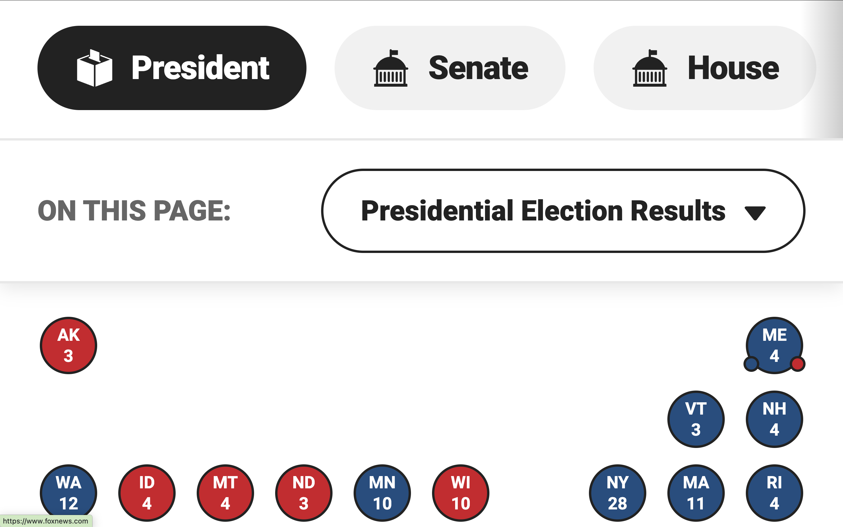

The sticky navigation bar at Fox News took up almost half of the page, and The Washington Post hid all of the page's content behind the header and footer.
Another example of this is NBC News. They didn't just have one, but three navigation bars overlayed on top of the screen, and in addition to that the table headers were also sticky.
Video description: At 200% there's a double sticky header obscuring around a third of the page. Once the user scrolls to the results table, the table's sticky header takes up almost all the rest of the view. At 400% zoom, the sticky page header takes up most of the height of the screen, only leaving a small band with content at the bottom, which gets completely blocked once the table with sticky header is reached.
NRK did it differently: no sticky navigation bars that take up all of the space, but instead a small fixed progress bar with the results itself:
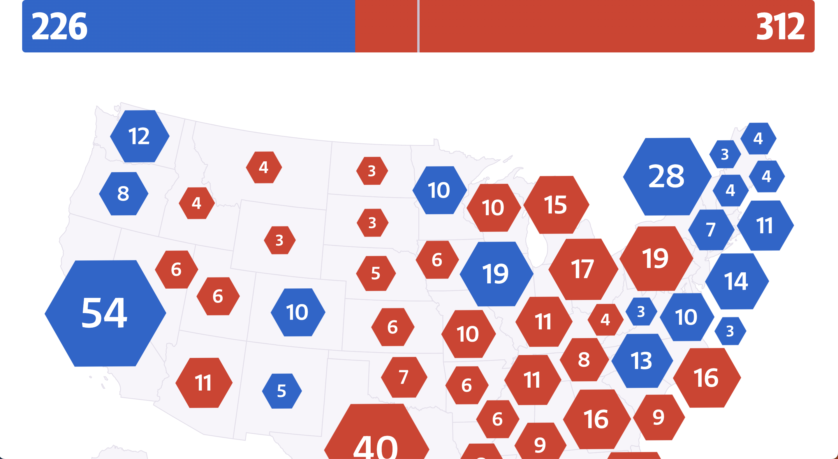
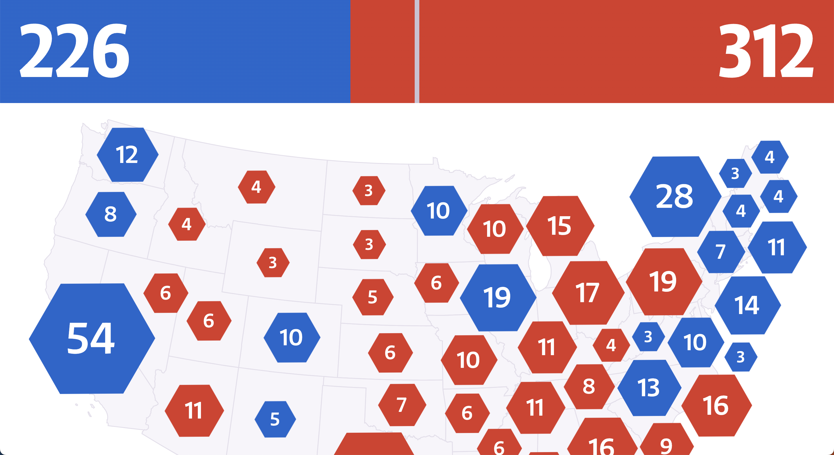
Personally, as a zoom-user, I wasn't bothered by NRK's sticky progress bar when at 200% zoom on my 13" MacBook, although it started limiting the content a bit already. But at 400%, the progress bar took up around a fifth of the height of the page, restricting the available space for the rest of the content quite a bit more.
Is data explained through more properties than just color?
All of the maps I inspected had a similar design: the states were color coded in blue (democrat), red (republican), or gray (no results yet), and swing states had an additional pattern.
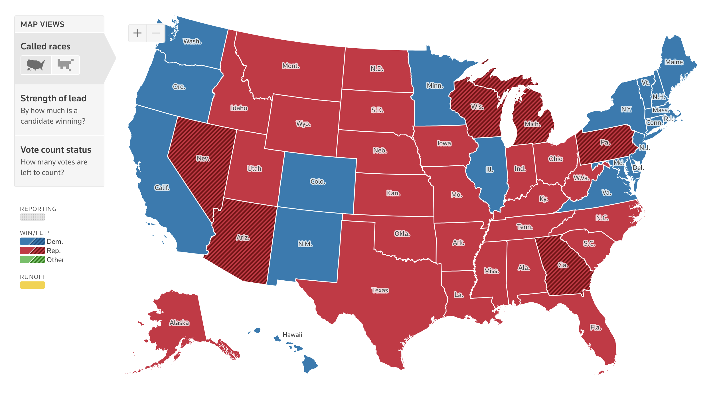
Red and blue are generally considered a "color blind friendly" combination, but for example, people with achromatopsia perceive everything in black and white/different shades of gray.
For example, on the map used on the Reuters dashboard democrat and republican states become the exact same shade of gray when using a color blindness simulator.
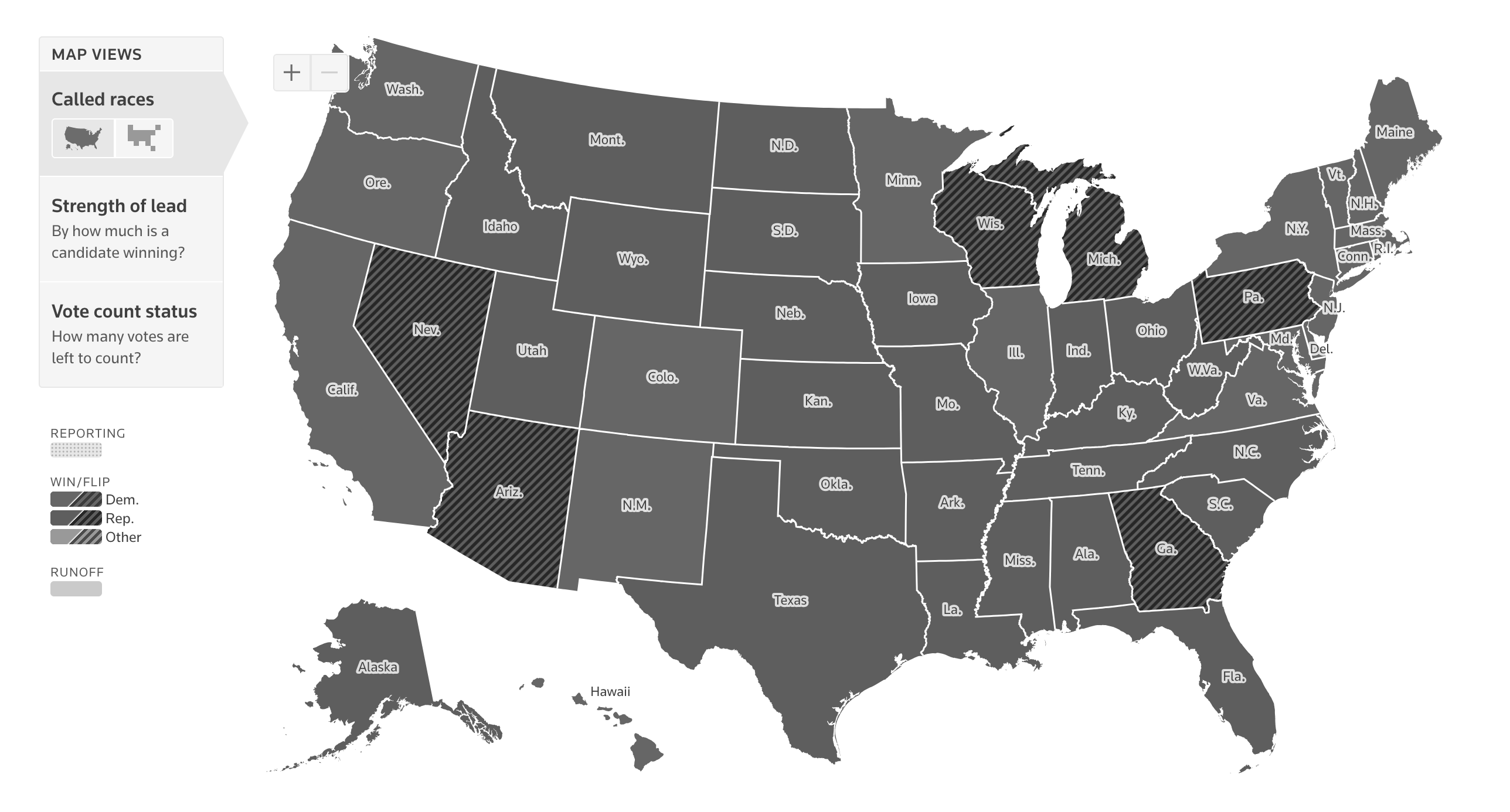
Additionally, people using monochrome displays or grayscale plugins will also not perceive the colors, and will benefit from additional cues.
Are the fallbacks accessible too?
Some might argue that there is in fact a fallback: when hovering over a state, the maps show a tooltip stating who won that state, and how many votes they received.
However, for the absolute majority of maps tested for this article, these tooltips were not keyboard or screen reader accessible.
Can all content be navigated to and interacted with through keyboard interaction?
As already brought up in the previous section, any interaction that can be performed through mouse/trackpad/touch, should also be accessible through keyboard interaction.
Lots of the election charts had some level of interaction connected to them, either tooltips that appeared on hover or new pages that opened when clicking a state, but very few made this interaction accessible by keyboard.
For example, CNN showed tooltips containing the winner and amount of votes when hovering over a state. But when using the TAB key to navigate the page, the focus indicator jumped straight past the map, to a carousel underneath.
Video description: First the user hovers over states on the map, and tooltips pop up. Then the user starts using the TAB key, and the browser's default focus indicators highlight which object is in focus, showing the map/interactive states are not part of the focus order.
Over at Reuters, the tooltips were successfully exposed when receiving keyboard focus (🎉), but the tab order was completely random.
Video description: The user repeatedly and quickly presses the tab key, shifting the focus between the different states on the map. When a state is in focus, a styled tooltip/pop-up with more info (state name, electoral votes, number of votes for each candidate, % of votes counted) appears. The states get focused in random order, going from New Mexico to South Dakota to California to Kentucky to Alabama, and so on.
The states on Bloomberg's map were focusable, but besides receiving a focus outline, nothing else happened. Pressing ENTER (one of the typical keys to activate a link or button) opened a new page where. There it was possible to find the same info as in the tooltip, but that's a lot of extra back-and-forth to get to the same data as a mouse user.
Video description: The user first hovers over the progress chart, where a tooltip shows how many votes each candidate received in each state. Afterwards the keyboard is used to tab through the interactive elements on the page, and every single small square on the progress bars (each square representing an electoral college vote) is part of the tab order. No tooltips appear. Afterwards the user keeps tabbing through the map, where the states receive focus, but also don't show a tooltip.
Another issue with keyboard navigation on Bloomberg's charts was found in the progress bars showing the electoral votes per candidate. Each bar was made out of small squares, one square representing one electoral vote. Each of the squares was wrapped in its own link (<a>), meaning all of the squares were part of the default focus order on the page and became individually focusable when pressing the TAB key. With 538 votes available, that means 538 links to tab past.
Are data, insights, trends, and patterns accessible to screen reader users?
People who use assistive technologies (like braille or screen readers) should have access to the same information, including trends, patterns, and other visually apparent features.
This can be done in a variety of ways, for example:
- Turning the chart into an image with alt text.
- Providing an accessible table alternative, close to or linked to from the visualization.
- Making the elements within the viz accessible to screen readers (eg. turning the chart into a list or table by adding roles and other ARIA).
Which method is most appropriate depends on the type of visualization, interaction attached to it, as well as the purpose, the way it will be used/conditions it will be used in, and the target audience.
Are the text alternatives useful, with relevant and accurate information, providing equal value to what's visualized?
When using the <img> element alt text can be added in the alt attribute. Elements that are turned into images by adding role="img" can have their alt text set through aria-label or aria-labelledby.
Whether or not these attributes are set is something that can be detected by automated accessibility checkers (like axe or Lighthouse), linters, or unit tests. But the quality and usefulness of the text is something that requires a human touch.
As a result, when performing accessibility reviews, I often come across images that actually have alt text, but where the alt text doesn't accurately describe the image at all or leaves out vital information. This was the case with a lot of the tested election graphs as well.
Several of the election maps I encountered were programmatically turned into an image with alt text, but left out the actual results.
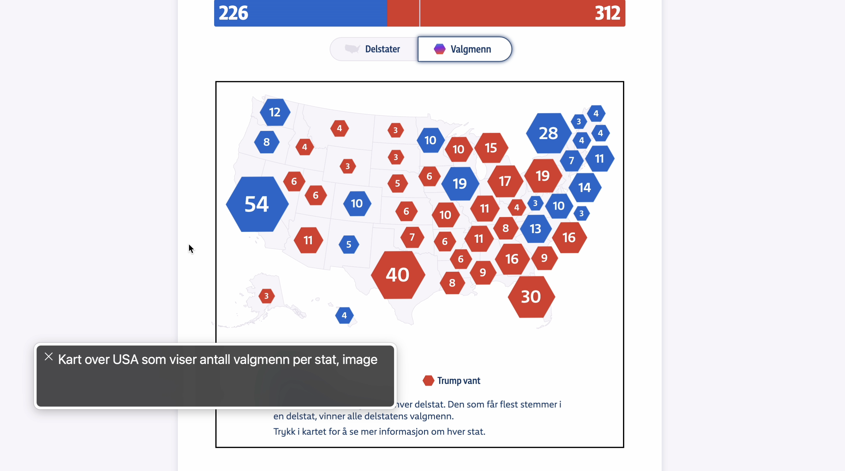
Like this example from NRK, the Norwegian state media, where the alt text of the map translates to "Map of the United States that shows the amount of electoral college votes per state".
When looking at the map, sighted users get to see which states voted for which candidate, and how red or blue the map overall looked like.
For example, I can tell at a glance that the westc oast and north east mainly voted Democrat, the center and south voted Republican, Harris won 54 electoral votes in California, while Trump got 30 of them in Flordia.
Blind people using screen readers, however, are only told there's a map with results, without any further information.
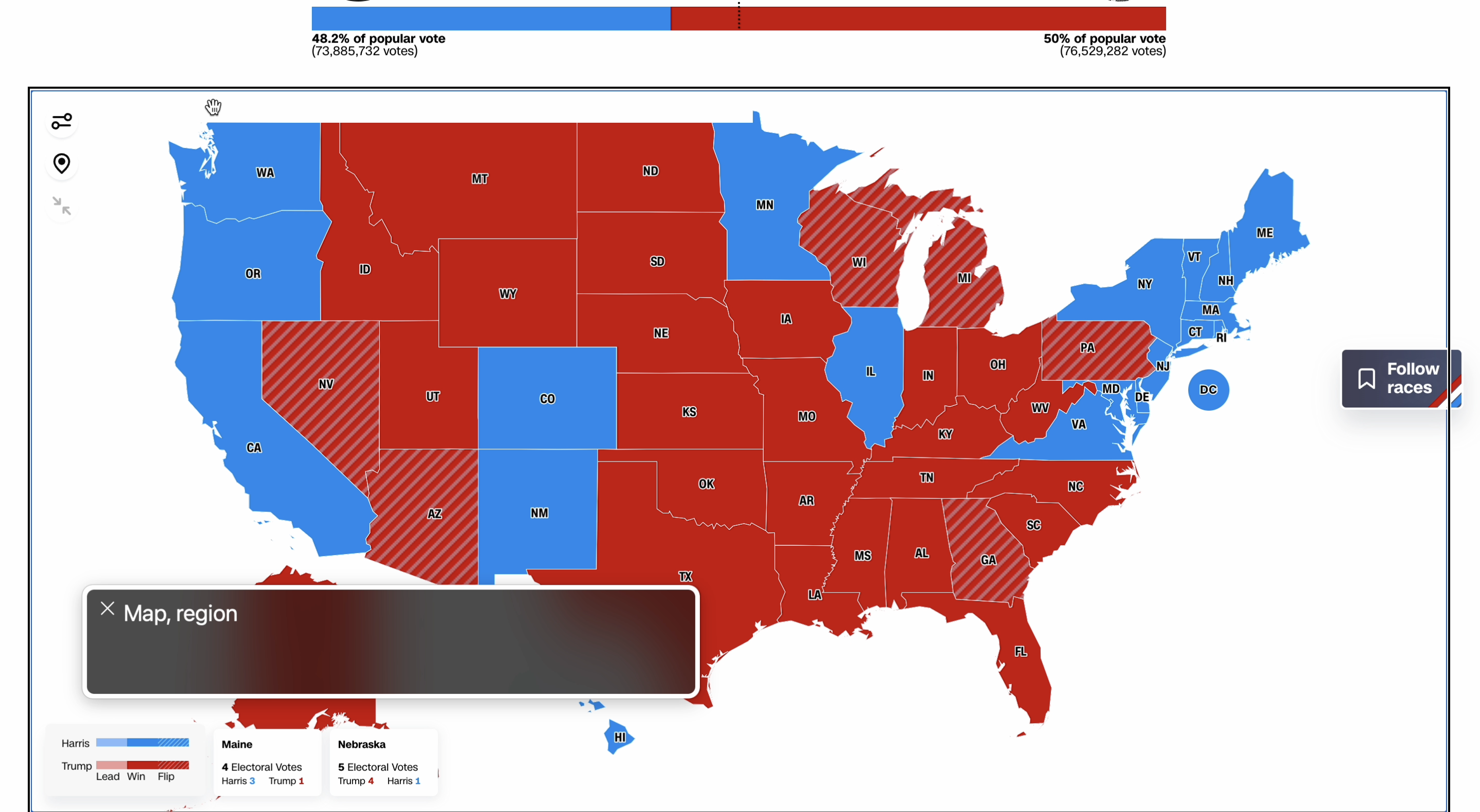
CNN used a canvas, labelled "Map", which was the only information available.
Bloomberg did something similar with their Live Prediction Market Odds line chart, where the text alternative was "Multi-series line chart showing the odds Vice President Kamala Harris and former President Donald Trump will each win the presidency. These three prediction markets will be charted: Kalshi, Polymarket and PredictIt.",. The type of data and chart was explained, but the actual results were not.
Similarly, ABC News's map announced the geographical position of the state that was focused (eg. "New Mexico. Colorado is north. Oklahoma is east. Texas is south. Arizona is west."), but did not announce the actual electoral votes (visually available as text) or winner of the state (visually available through color).
Video description: The user moves the focus around between the different states on the map using the arrow keys. Each time a state is focused, VoiceOver announces the name of the focused state along with the bordering states. Using the right arrow moves the focus to the state bordering on the east, down arrow to the state bordering south, and so on.
How are SVG elements handled in the code?
SVG elements are not accessible by default. So when creating data visualizations using SVG, additional work will always be needed to make the expeience more accessible for assistive tech users.
The Wall Street Journal showed all the states, in comparison to the amount of electoral votes they had to offer, each state represented by small squares. The squares were color coded in blue and red to represent the candidate that won the state, and on hover the distribution of votes was shown in a tooltip.
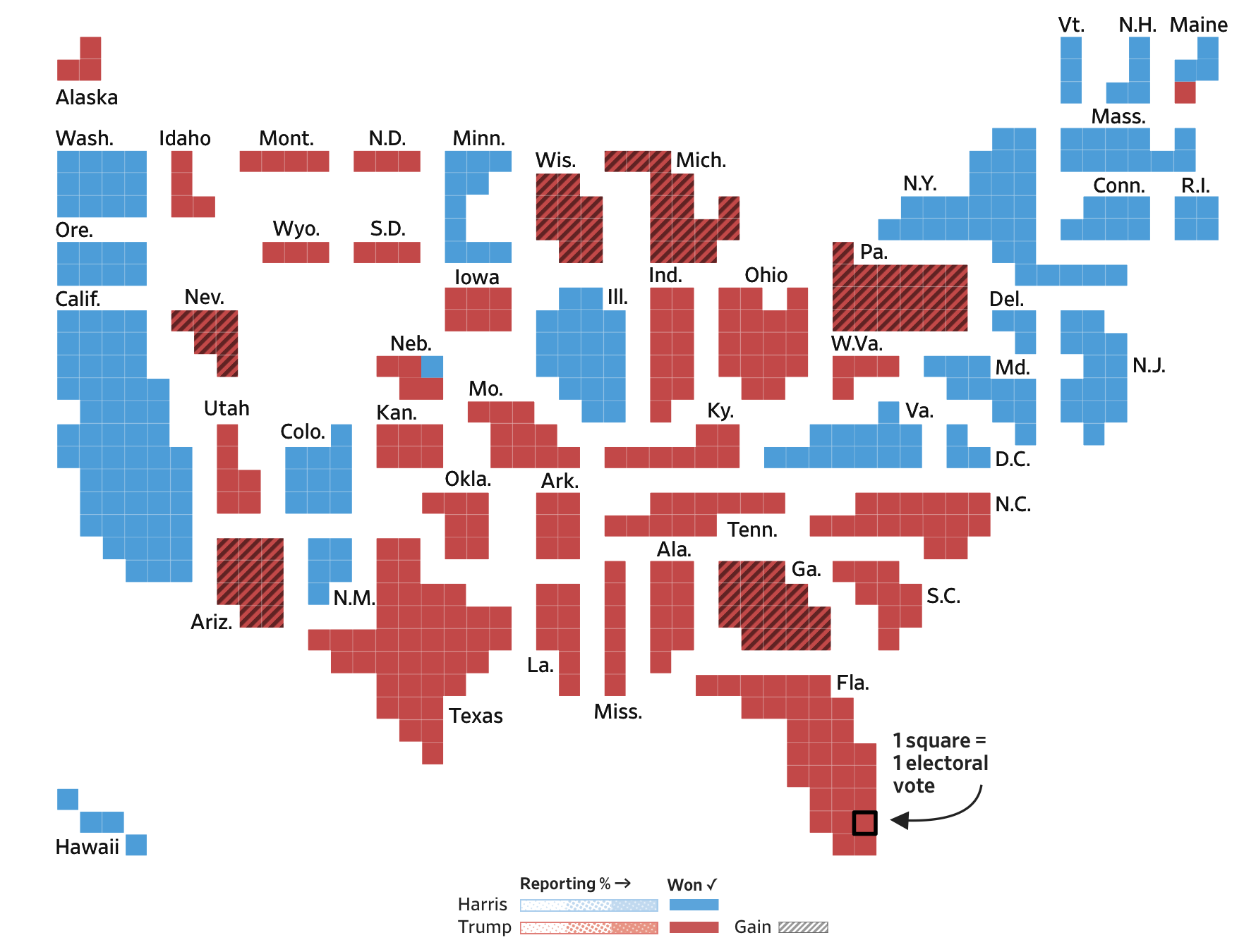
When using VoiceOver with Safari, each of the individual squares (<rect> elements) were announced as images without alt text, after which all of the text elements were announced. There was no information about who won the state or how many votes they received, and the tooltips could not be accessed with a screen reader either.
Video description: VoiceOver is used to go through the contents of the map. First VoiceOver announces a title for the map ("Cartogram of US Presidential Electoral Map. Each small block represents 1 electoral vote, with 538 total, each grouped by state. States colored by candidate leading or won. Blue indicates Democrat and red indicates Republican."), afterwards each individual little square on the map gets read as "image" without context (1 square = 1 electoral vote, so 538 squares, at elast 538 "image"s).
Because all screen readers treat SVGs slightly different, NVDA didn't announce the squares as images without alt text, it just skipped the squares, but the rest of the experience was pretty much the same: the text elements were read in the order they appeared in the DOM, and no additional info was included.
Video description: NVDA is used to go through the contents of the map. No title is announced for the map like on VoiceOver, and the graphical elements are not treated as images either. Instead, NVDA reads all the state abbreviations without any further context ("Clickable, Ala., Tenn., Miss., Fla., etc.), and some of them are there twice.
Bloomberg's map offered a similar experience. Theirs was made out of two different SVG elements, each of them containing:
- text elements (
<text>) with the state name abbreviations, as well as - color-coded squares (
<rect>) wrapped inside links (<a>), representing the amount of electoral votes.
As a result, VoiceOver on Safari announced the abbreviations for all the States, followed by a bunch of empty links.
Video description: Moving through Bloomberg's map with electoral votes with VoiceOver. First the abbreviated states on the east of the Mississippi River are announced, afterwards empty links for the clickable areas on the east, then the annotation of the Mississippi River, then the abbreviated state names on the west, and finally a group of empty links for the clickable areas on the west. The legend is made out of 3 tables.
You may notice that all of these Bloomberg examples contain two sets of text elements followed by links.
That's because the graph was made out of two SVGs: one for the states East of the Mississippi River, and one for those West of the Mississippi River. I only realized this when inspecting the code, as the grouping was not explained anywhere.
The sorting of the text elements did not match the sorting of the links, both sort orders seemed completely random, and no information about the sorting or grouping was included.
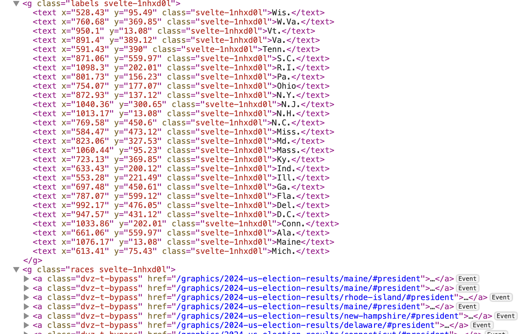
On the state-level dashboard at Bloomberg, the text labels on the "Race & Ethnicity" and "Educational Attainment" charts were read, but in an order that didn't match the visuals, and without the actual associated values.
Video description: VoiceOver reads all the elements on the chart, but without extra context and not always in a wat that makes sense. For Race & Ethnicity: "Image", "White", "Image", "Black", "Image", "Or Latino", "Hispanic", "Image", "Asian", "Image", "American", "Native", "Image", "Other", "0", "25", "25", "50%", "50%". Something similar happens with the educational background chart.
In order to make visualizations like this more accessible, the developers would at least have to:
- be mindful of the order of the elements in the DOM,
- hide duplicate and decorative elements from assistive tech, and
- provide more information (through roles,
aria, visually hidden text, etc.) for assistive tech users where needed.
Is there an accessible table alternative?
Tables are a robust, precise, and universally recognizable way of communicating data. As a result, having a table alternative is almost always a good idea, and often a necessity, especially when visualizing more than a handful of datapoints.
For something like the map overview, a table with the candidates as the column headers and the states as the row headers would be a good alternative view.
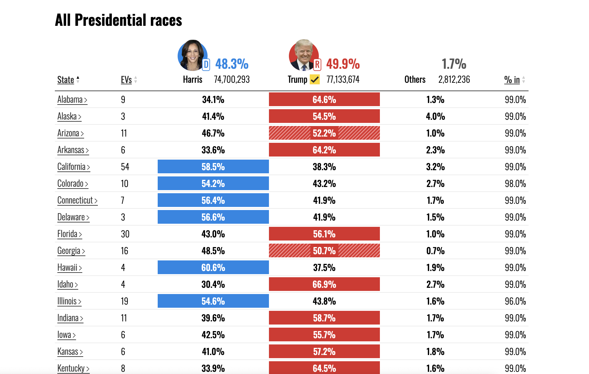
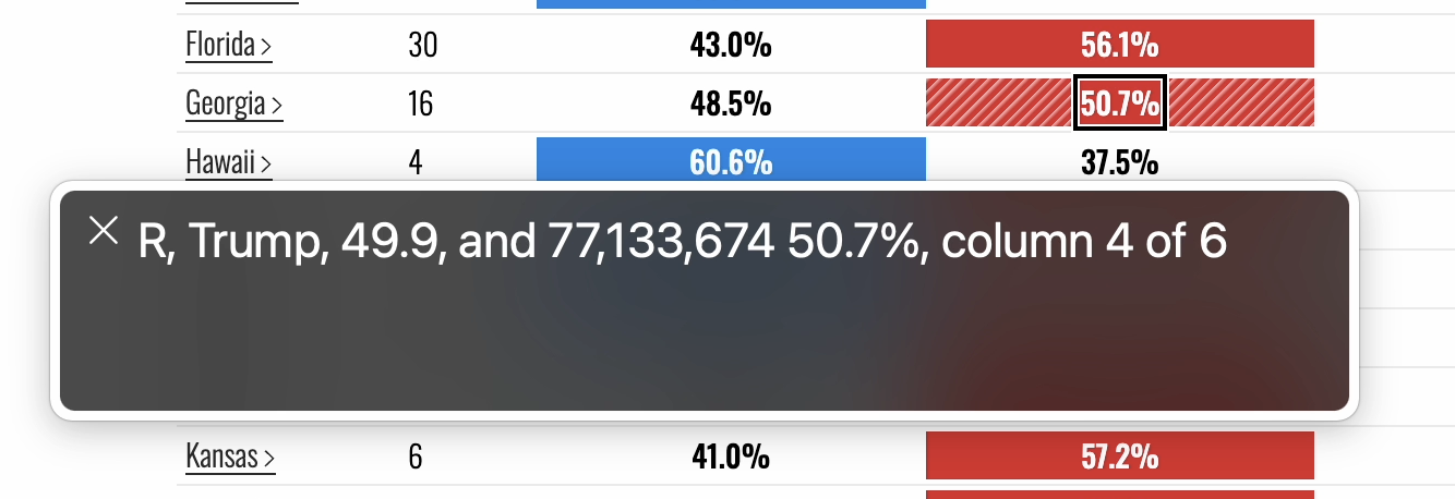
NBC did show the results in a table, although since some of the column headers contain a lot of information (candidate name, party, total amount of votes, total percentage of votes), navigating between the cells in a row can become quite verbose. Another item for improvement there could be to add row headings, so that the corresponding state gets announced when navigating the table vertically.

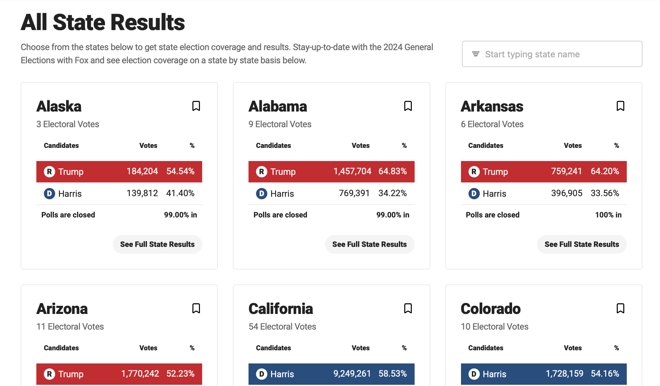
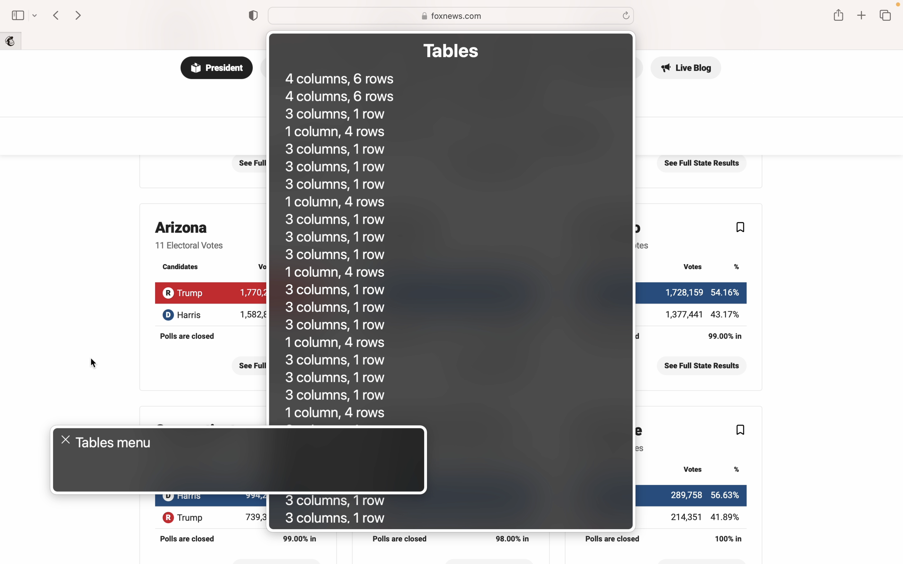
Fox News provided a list of race calls as a list of cards, each of which contained a table with the results for that sate. None of these tables had captions, and each table had three more tables nested inside, resulting in a very long list of unnamed tables in the tables VoiceOver menu.
Do the semantics match the element's functionality and visuals?
The type of HTML element used determines what kind of styling, keyboard interaction, and screen reader experience it will have by default.
For example, headings (<h1>, <h2>, etc.) give structure to the page, <button>s are focusable by keyboard and can be activated through the space or enter key, and <table> elements let screen reader users browse data two-dimensionally.
When using the "wrong" elements, or using elements differently than intended, we create a mismatch between what the element looks like and how it works, and often strip away important default styling or interaction.
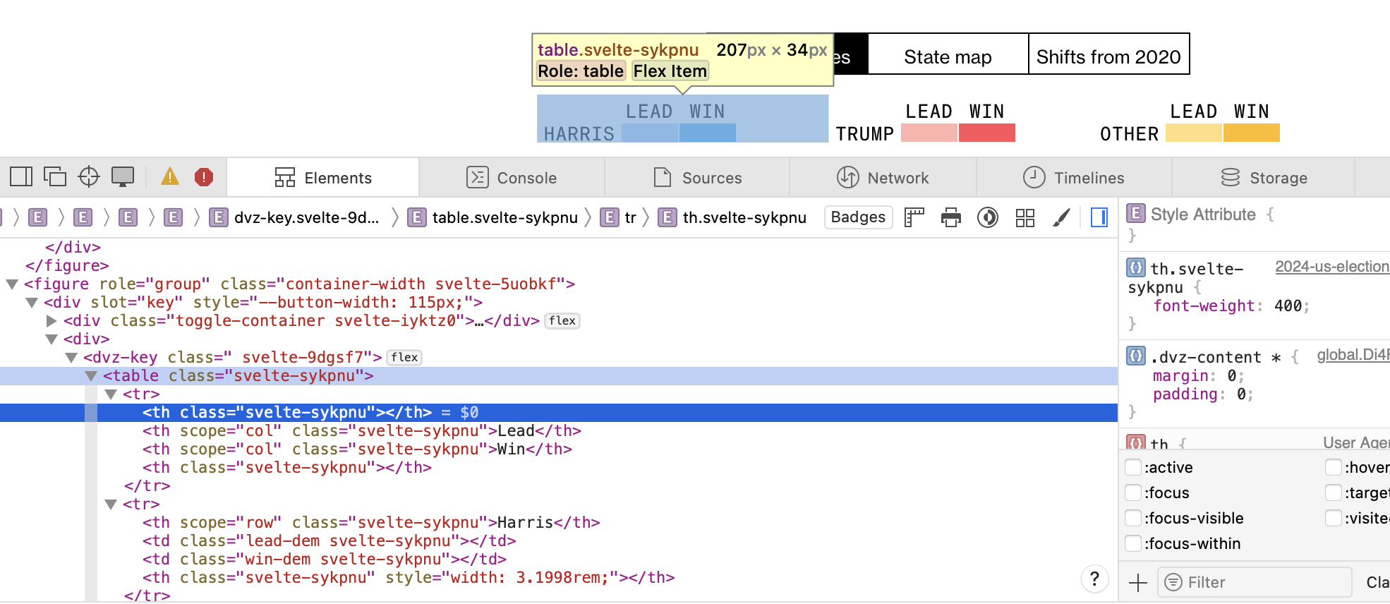
Bloomberg used the <table> markup to style their legend, even though the legend contains no data.
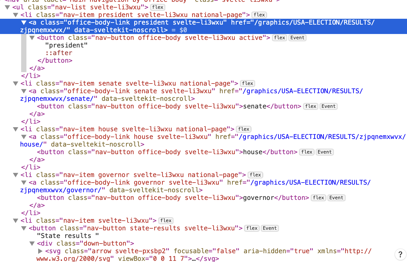
Reuters nested buttons (<button>) inside link elements (<a>), which is both invalid HTML and something that can make the interaction unpredictable. When using the keyboard, buttons can be activated through the space and enter key, links can only be opened by pressing enter.

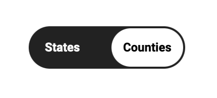
Another example is Fox News using a checkbox for something that visually looks like a toggle button group. Buttons, checkboxes, and radio buttons all have different keyboard interaction and screen reader controls.
Sighted keyboard users may expect this component to function like a button, which can be confusing when it ends up behaving like a checkbox. Additionally, while the checkbox input was programmatically linked to a label, the label didn't have any accessible name and was just given a title element.
<div class="map-toggle">
  <input id="countyToggle" type="checkbox">
  <label for="countyToggle" title="Toggle states and counties">
    <div class="map-toggle__switch" data-checked="Counties" data-unchecked="States">
      ::before
      ::after
    </div>
  </label>
</div>
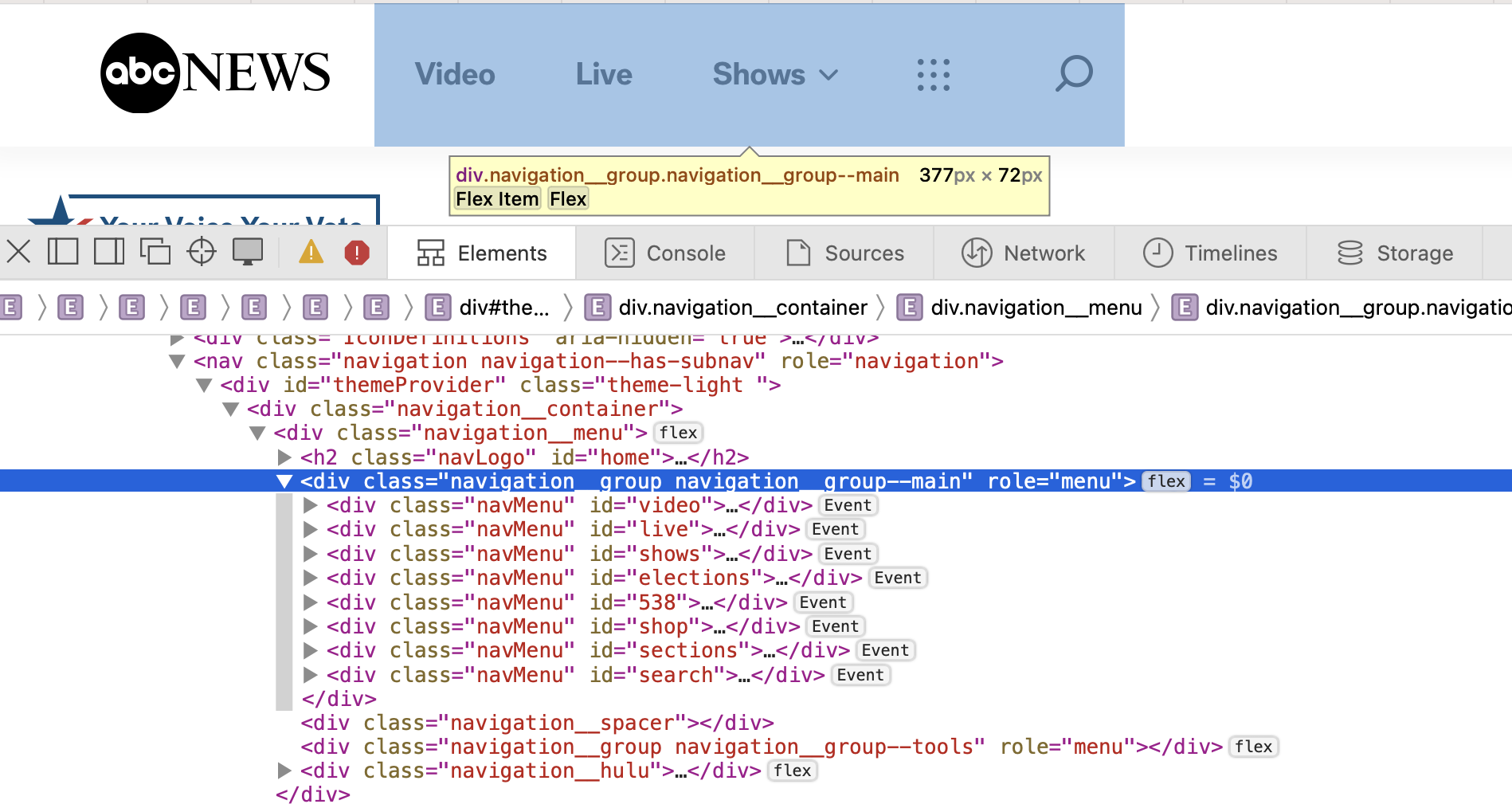
And ABC News added a role="menu" to their page navigation. The menu role is intended for action menu types of components, not site navigation (for that the <nav> element exists).
Is the chart's interaction explained?
The interaction on each of the maps may seem logical, so explaining something along the lines of "click on a state to open a dashboard with a breakdown of the state-level results" could be thought of as excessive while designing. However, almost all of the maps repsonded differently to a state being clicked on:
- NBC (US-level): opened state breakdown in a new page
- NBC (state-level): nothing on click, tooltip on hover
- CNN: zoomed in on the state and showed a breakdow next to the map
- NRK: highlighted the state and showed a beakdown below the map
- Reuters: nothing on click, tooltip on hover
- ABC (US-level): highlighted the state and showed a breakdown next to the map
- ABC (state-level): highlighted the county, breakdown updated for the county
- Fox News: zoomed in on the map, no text breakdown
- Bloomberg (US-level): opened breakdown in a new page
- Washington Post: nothing on click, tooltip on hover
So even though the maps all look similar, they behave slightly differently. This makes the interaction less predictable, and suddenly explaining the interaction makes a lot more sense.
Can I click on a state? If so, will clicking on the map trigger a tooltip? Will a new page open? Or will the map zoom in on the state? Will other visualizations on the page be updated? And can I undo this action?
Setting the right expectations avoids confusion and makes the navigation a lot smoother for everyone. And in the case of elections, it becomes one less piece of frustration and stress to what for many is already a period of heightened anxiety.
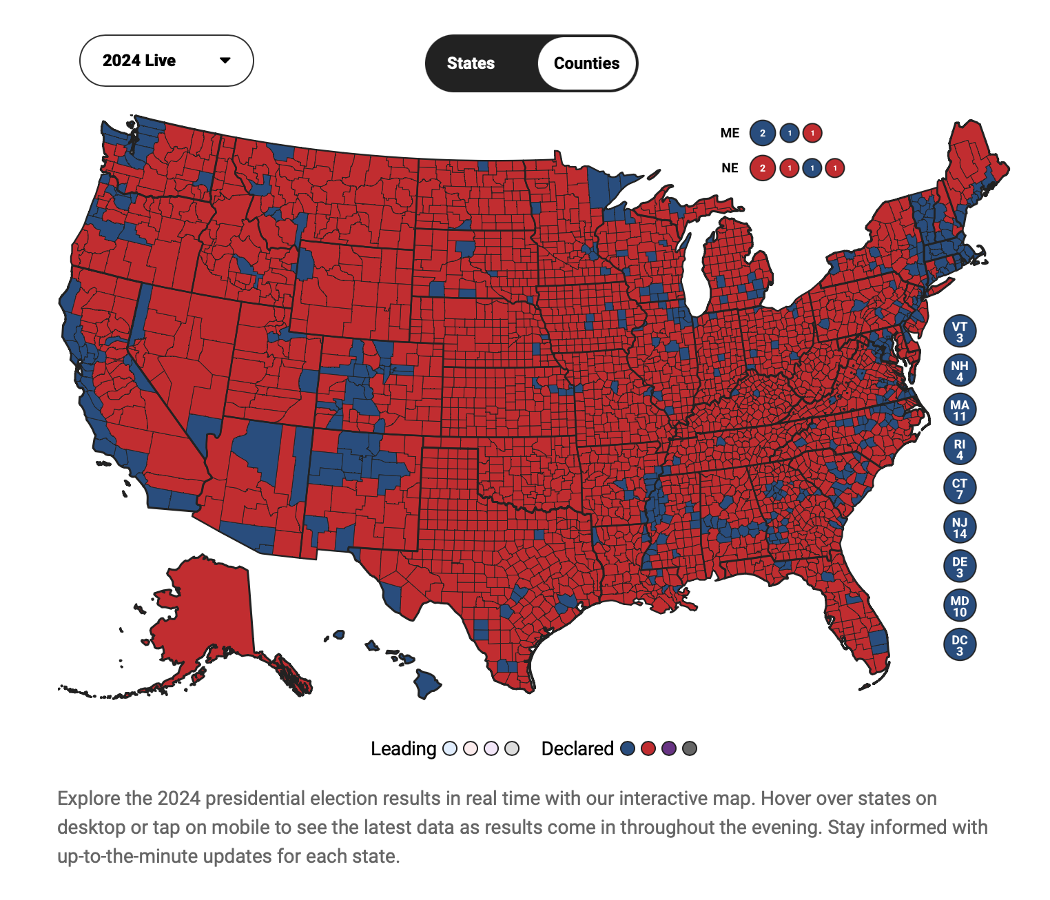
None of the maps had any information about the interaction added, aside from the one by Fox News. They wrote "Hover over states on desktop or tap on mobile to see the latest data as results come in throughout the evening." in the description underneath the map.
Are additional explanations or more context about the data and visualization needed?
An important part of making data visualizations more understandable is providing legends or other ways of explaining visual elements.
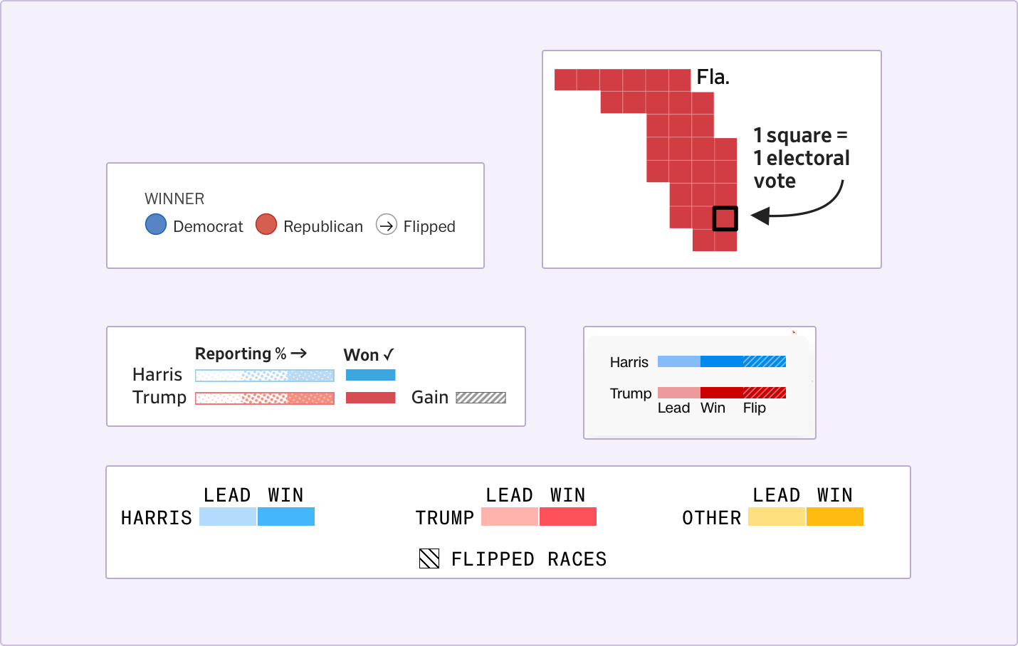
Most of the election graphs had their colors and patterns explained, and some added annotations with more info.
But there's more that goes into explaining data visualiations than explaining the visualization. Understanding what the data means and understanding the context behind it is just as important.
For non-Americans, the way the voting system works might not be very clear, and not everyone abroad (or even within the US) is up-to-date about what the candidates stood for this election, what swing states are, or which states are typically democrat/republican-leaning.
But all of this is usefull background information to have when reading the election result map. A historically democrat state voting republican for the first time means something else than a historically republican state still voting republican.
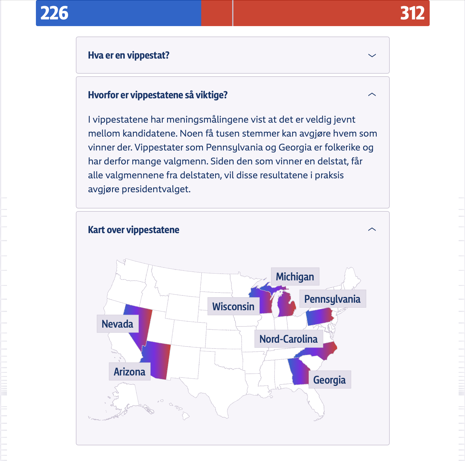
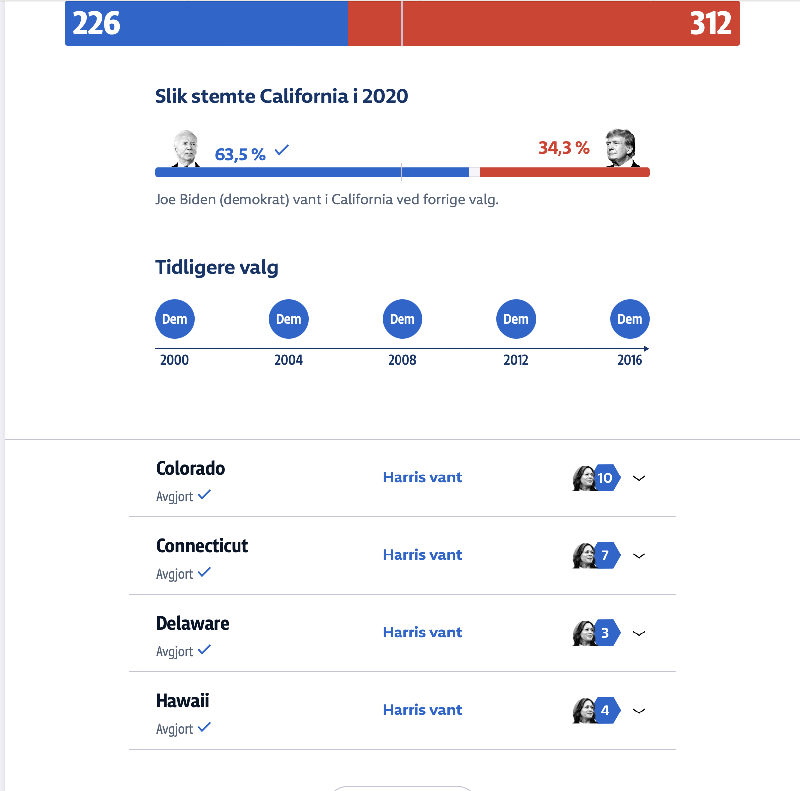
NRK, the Norwegian news, went for a solution that focused on explaining the elections and putting the results in context.
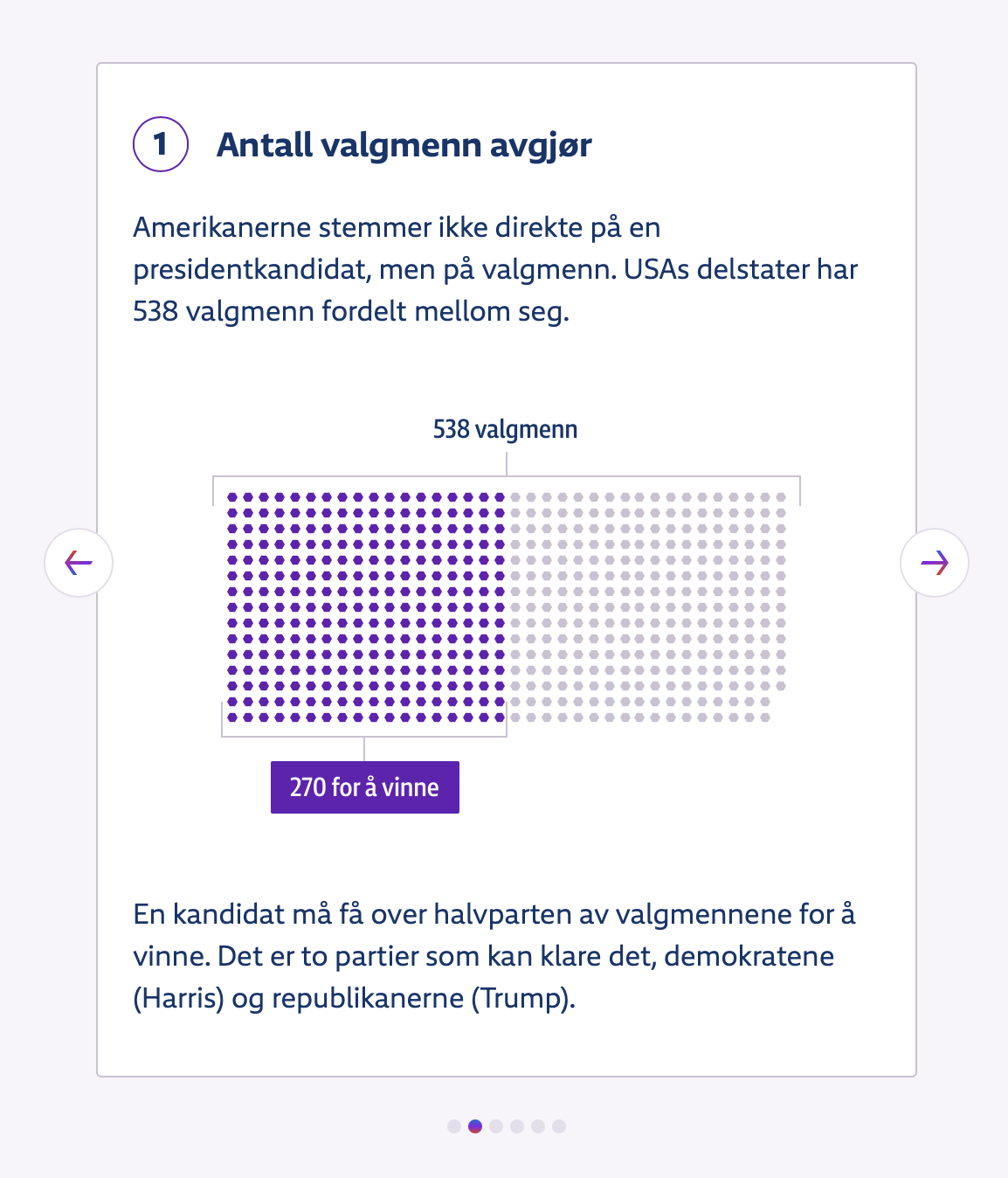
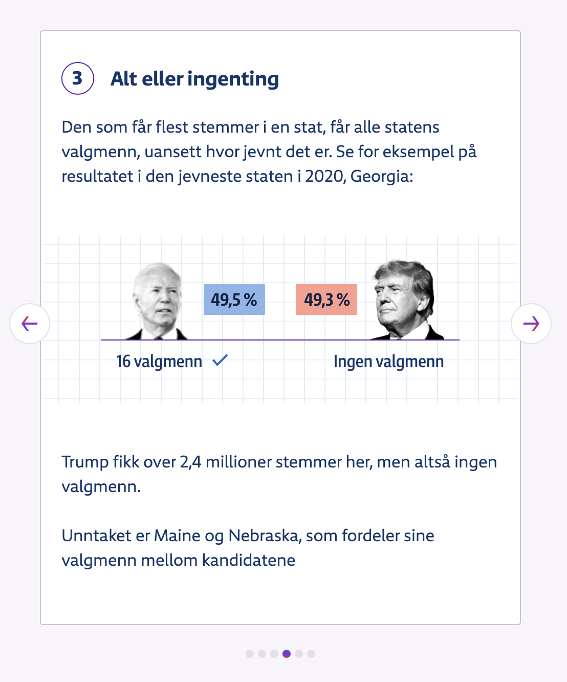
They had a carousel with cards explaining the different "technical" aspects of the election, dropdowns with background information about the different states, "frequently asked questions", video explanations, and a link to a follow-up article explaining how the outcome could affect Norway and the world.
A few final thoughts on these issues.
Comparing the outcomes of my tests from 2024 with those from 2020, it feels like not much has changed. The charts are still not accessible to people using assistive tech, interaction is not accessible to keyboard-only users, the layouts are not zoomable, there are issues with the colors, explanations are lacking, and some of the dashboards had up to 800+ automatically detectable errors.
What I don't want to do with this article, however, is putting (all) the blame on the individual contributors (aka the developers and designers) of the dashboards.
When asking my audience during workshops and talks what their biggest accessibility blockers are, I commonly get answers along the lines of "someone higher up is not letting us prioritize accessibility", "we're overworked" or "I don't know enough and am not given the time at work to learn more".
While we as developers and designers do carry a responsibility to make the products we work on as accessible as possible, accessibility is a group effort and when accessibility issues make it into production, it's typically an indicator of issues with the processes, planning, and culture within a company. For example, when automated tests pick up on 807 issues on a single page, it shows me there's no consistent accessibility testing going on.
Fox News gets over 200 million website visitors each month, CNN nearly 600 million, Reuters 35 million, and around half of the Norwegian population reads NRK daily.
Combine that with the fact that according to the CDC 1 in 4 Americans have a disability (according to WHO it's 16% worldwide), laws like the ADA and European Accessibility Act exist, and disabled people have a spending power of 13 trillion USD, there definitely should be enough financial and legal incentive for these companies to prioritize accessibility, in addition to it being a human rights issue.
And given the fact that for example Fox News made over $10 billion in revenue in 2024 and CNN made over $750 million, they have little to no excuse to not put resources towards accessibility testing, training, and remediation.
Want to learn more about dataviz accessibility, wondering how accessible your dashboards are, or looking for help with making them more accessible?
I'm a freelance accessibility specialist, and can be hired for (dataviz) accessibility reviews/audits, training, and guidance, and have occasional availability for front-end engineering projects (with a focus on accessibility) as well.
I'm also open to talk about accessibility and inclusive design at conferences, schools and meetups.
Interested in collaborating?
Check out my services, drop me a message on LinkedIn, or send me an e-mail.
Want to keep in touch?
Follow me on Mastodon or Bluesky.
Want to see birds instead?
See fossheim.photography or @fosstography.
Resources
Guidelines
- Chartability workbook
- Web Content Accessibility Guidelines (WCAG) 2.2
- WCAG 2.2 techniques & failures
Tools
- WebAIM Color Contrast Checker
- Dataviz Contrast
- VizPalette
- axe DevTools (by deque)
- axe for designers (by deque for Figma)
- AccessLint
- axe Accessibility Linter
Libraries
Dataviz accessibility tips
- Dataviz accessibility resources
- How (not) to make accessible data visualizations, illustrated by the US presidential election.
- Making charts accessible for people with visual impairments
- Dataviz accessibility review: what we can learn from the Norwegian 2023 election graphs
- Introduction to Accessible Contrast and Color for Data Visualization
- Designing for Neurodivergent Audiences
- What is "No Use of Color Alone" in Data Visualization? (with examples)
- Do No Harm Guide: Centering Accessibility in Data Visualization
- 10 Guidelines for DataViz Accessibility
- Writing Alt Text for Data Visualization
- Sortable table columns
- Accessibility and data visualization
More about accessibility
Hi! 👋🏻 I'm Sarah, a self-employed accessibility specialist/advocate, front-end developer, and inclusive designer, located in Norway.
I help companies build accessibile and inclusive products, through accessibility reviews/audits, training and advisory sessions, and also provide front-end consulting.
You might have come across my photorealistic CSS drawings, my work around dataviz accessibility, or my bird photography. To stay up-to-date with my latest writing, you can follow me on mastodon or subscribe to my RSS feed.
💌 Have a freelance project for me or want to book me for a talk?
Contact me through collab@fossheim.io.
Similar posts
Sunday, 12. January 2020
An intro to designing accessible data visualizations
Wednesday, 20. May 2020