How (not) to make accessible data visualizations, illustrated by the US presidential election.
Posted on
In the days around the 2020 US presidential elections a lot of people have been following predictions, results and exit polls quite closely. The majority of news sources published plenty of visualizations, but very few of them in an accessible format.
Let’s take a look at some important aspects of accessible data visualizations, based on what The New York Times, CNN, FiveThirtyEight, The Guardian and Fox News are doing right and wrong.
Screen reader support
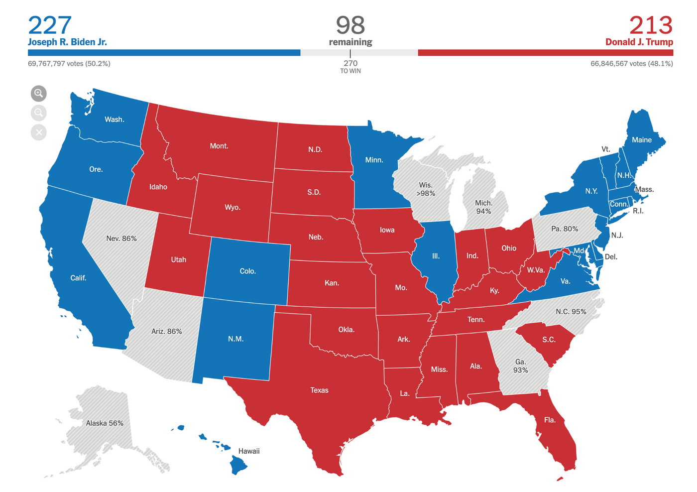
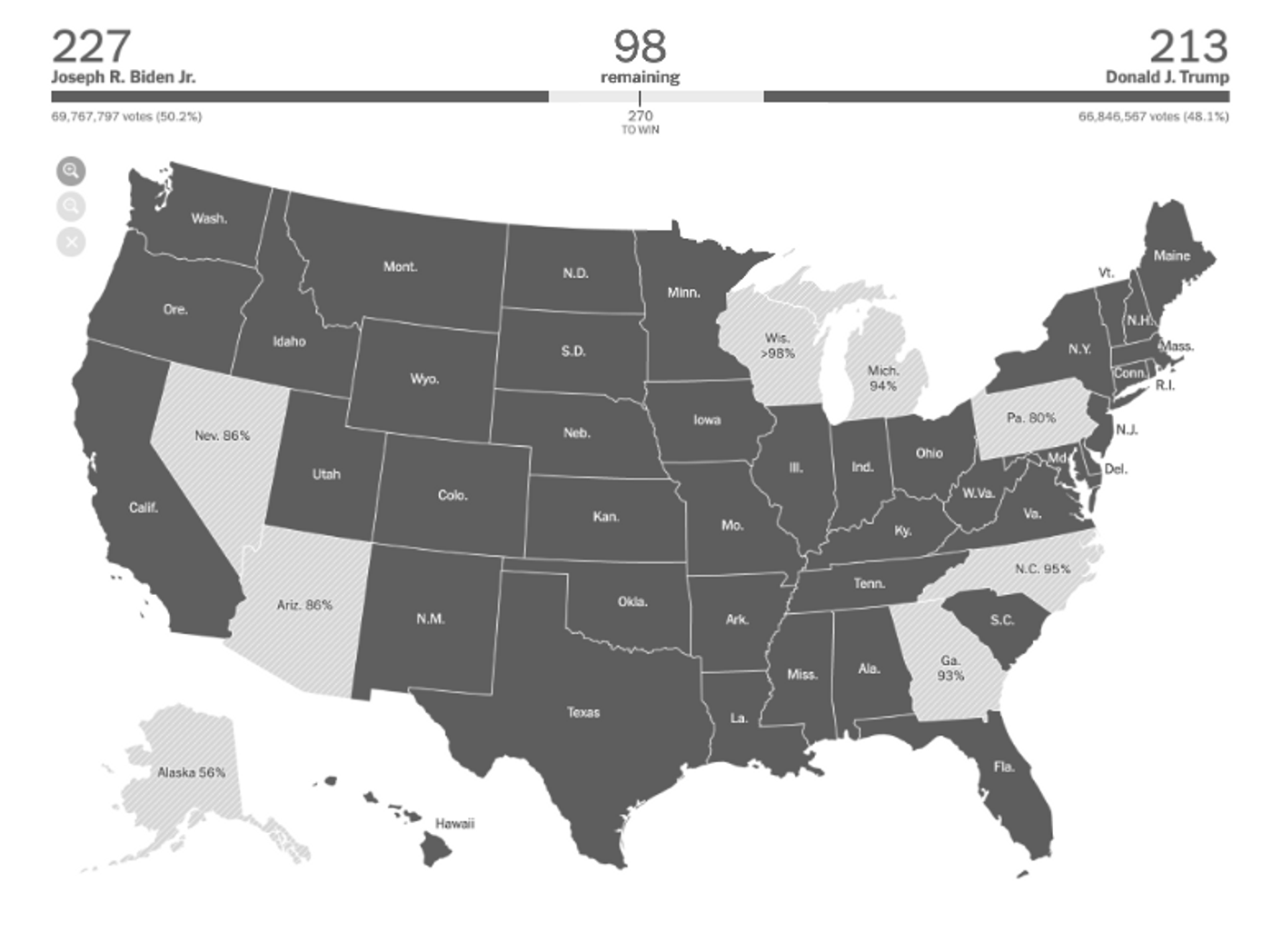
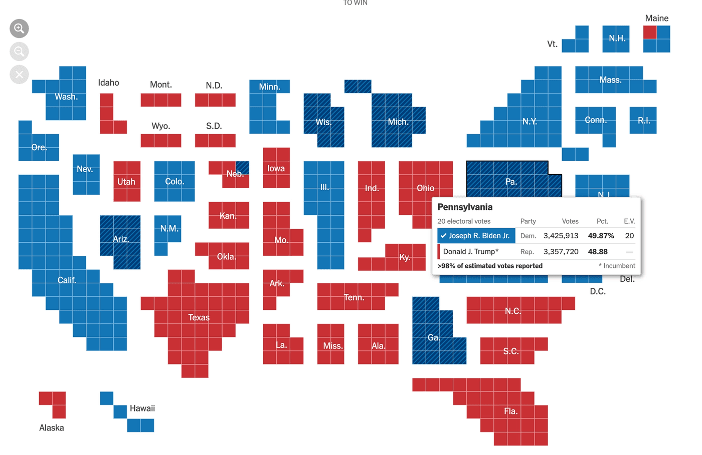
The main visualizations across all news sources are the electoral college votes for each candidate, and a map showing the results per state.
Most of these graphs are built either using the <canvas> element or SVGs (Scalable Vector Graphics), which both require a bit of extra work to be made accessible. When not keeping accessibility in mind, things like this might happen:
This is an example from The Guardian (using Safari on iPhone), where VoiceOver reads every state on the map as “image”.
Read all the data
One option to improve a graph like The Guardian’s is to add the state name and results to each focusable element of the map by either adding visually hidden labels or using the aria-label property (or alt tags when dealing with images).
The New York Times takes this approach with their graphs showing the percentage of votes each candidate got, but not in an accessible way.
VoiceOver reads through the labels on the x and y axis, and the percentage of votes, but not who those votes belong to. (see full audio transcript).
Adding an extra "Biden" and "Trump" (or "Democrat" and "Republican") label to the numbers would solve this issue, and also add more visual context.
Fox News has a similar issue on their electoral college votes progress bars. The main progress bar for each candidate is built by grouping smaller bars representing the states they won.
Visually, it’s rather easy to distinguish between the two candidates’ votes. However, VoiceOver does not make any difference between them at all.
Instead, the only information it reads is one long sequence of numbers along the lines of "3 votes, 14 votes, 7 votes," etc (full audio transcript). So the context of how many votes belong to Biden, and how many to Trump, gets lost entirely.
<div class="bars">
  <div class="bar dem state-va">
    13 votes
    <div class="bar-tooltip" style="display: none;">
      <div class="name">Virginia</div>
      <div class="value">13</div>
      <div class="party">Declared Democrat</div>
    </div>
  </div>
</div>
There's not much they would need to do to give the "13 votes" some more context for asssistive technology, most of the code is already there. Removing the display: none; property and instead visually hiding the tooltip would allow screen readers to read "Virgina, 13, Declared Democrat".
Link to an accessible data table
Another option for the Fox News graph is to only read the total number of votes and link to an accessible table for the breakdown instead. That link could be provided in a caption, description or alt text, depending on the format of the graph. This is similar to how complex images are treated.
But it's also important to remember that while a table might make the data available for people using screen readers, it doesn't necessarily provide a good experience. The user still has to the table, and also misses out on context a graph provides.
Give data a human voice by using titles and descriptions
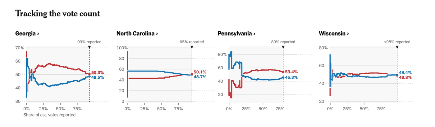
In their election forecast, FiveThirtyEight takes a different approach from most other sources.
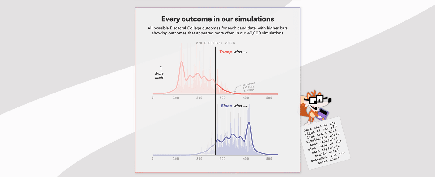
Let’s take the outcome simulations as an example. These are split into two different visualizations, a red one for Trump and a blue one for Biden.
The x-axis shows the amount of electoral votes, and the y-axis the amount of simulations in which the candidate gets that amount of votes. The length and position of the bars tells us which candidate is more likely to win according to their simulations. There are a lot of blue bars on the right side of Biden’s graph, which means he won in most of their simulations.
Since the exact numbers aren’t as important here, VoiceOver doesn’t read or link to them and instead reads a summary of what’s displayed. In this case, it says Trump won in 10% of the simulations and Biden won in 89% of them. (full transcript).
<svg class="svg" role="img" aria-labelledby="title-biden desc-biden">
  <title id="title-biden"></title>
  <desc id="desc-biden">
    Electoral college vote distribution for Biden,
    who wins in 89.2% of simulated outcomes.
  </desc>
  ...
</svg>
This method works really well for FiveThirtyEight’s type of data. It doesn’t matter in exactly how many simulations Biden got 300 electoral votes, what matters is that in the majority of simulations he won the presidency.
Unfortunately, the graphs aren’t keyboard accessible, and sighted people still get access to more details than those using assistive technology.
And while on Mac using VoiceOver their solution provides a much better experience than most other election visualizations, it's also not fully accessible across platforms and browsers. When for example using Edge on Windows, Narrator does not read the title and description of the graph.
Keyboard navigation
When graphs are interactive, keyboard navigation should be taken into consideration as well.
For example, some graphs show more information or filter data when clicking or hovering. It should also be possible to achieve this without a mouse or trackpad, using only the keyboard. Almost none of the election graphs provided this functionality.
When using Chrome on Mac with VoiceOver, the electoral map from ABC did make it possible to navigate through the different states using the arrow keys.
But it’s also important to note that this isn’t something that works across all screen readers or browsers. Safari and FireFox on Mac had a less optimal experience and on iPhone the navigation didn’t work at all.
And as Frank Elavsky explains really well on Twitter, there are a lot of problems with both VoiceOver and keyboard navigation with NVDA (Windows) on Chrome and IE.
Accessible colors
Color is another important aspect to keep in mind when designing data visualizations. Not enough color contrast can make visualizations and text hard to read, and only relying on color can make the experience for color blind visitors very confusing.
This is a simulation (Monochromacy/Achromatopsia) of The New York Times their main map. Suddenly it's no longer possible to tell which states are Democrat (originally blue) or Republican (originally red):
Patterns can be used in addition to colors, although depending on the type of graph and amount of different colors that can become quite distracting.
Very busy visualizations aren’t accessible either, so an alternative is to pick colors with high contrast, or adding additional text labels with context. For example, this map could also have either the candidate or party names listed in addition to the state name.
Brightness
Another important factor to keep in mind is the brightness or intensity of the color. Very bright colors affect readability, and also make it much harder to focus. For some users it can also cause anxiety or pain.
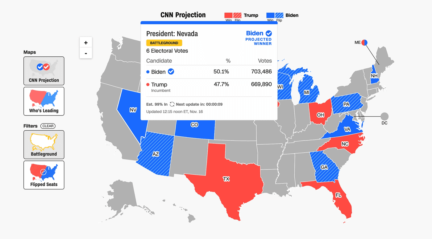
CNN uses a very bright variation of red and blue throughout their election results page. In addition, they also use a relatively bright yellow to label the battleground states in some of their tables.
Make data easy to find and understand
Accessibility and usability go closely together. Making data visualizations accessible isn’t just about meeting the technical requirements or making them compatible with assistive technology. It also means making them easy to understand for everyone. Everyone consumes information differently, which is something important to keep in mind.
Adding explanations or conclusions in clear language can be beneficial for people with anxiety, while dyslexic people might prefer visuals over numbers.
FiveThirtyEight’s election forecast does a pretty good job at explaining their graphs. Each graph has a title and description with context, and most of them have a side note with more information about the data or type of visualization.
On top of that, the graphs also have more labels and explanations directly where relevant. The outcome simulations don’t just show the numbers, they also have labels that indicate which candidate is more likely to win. They also highlight some important points, for example the 270 electoral votes threshold.
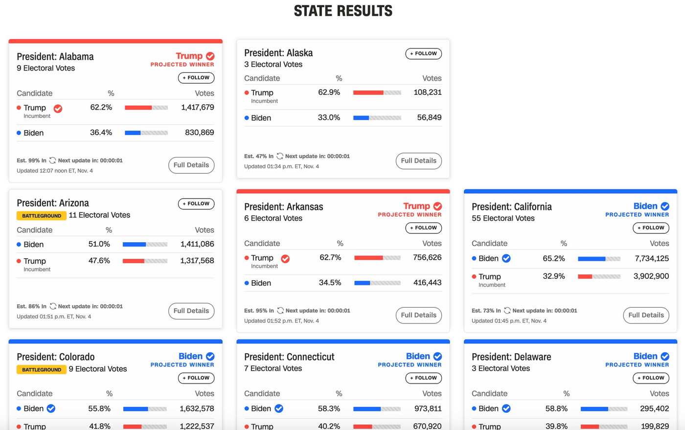
The Guardian has cards for each of the key states to watch that contain a map, the vote count and breakdown, and an explanation for why the state is important to the election. They were one of the few sources that had an overview like that per state without hiding it behind hover functionality.
At the same time, these cards do contain a lot of information and text, and they all end up looking more or less the same. While the colors are not as bright as those in CNN’s graphs, the view still becomes a bit too cluttered and can be painful on the eyes.
The electoral college votes play a big role in the election. Getting to that information easily is crucial, especially as more results come in and people start calculating which scenarios can still happen. The Guardian’s cards do provide that information, although it gets a bit lost in between all the other content.
The Guardian, and CNN, have the same information available when hovering over a state on their map as well, although not in a keyboard or screen reader accessible way.
The New York Times has a separate map for the electoral college votes, where each state is represented by a number of circles representing the amount of votes. While it visualizes the distribution of votes more precisely than a regular map, it doesn’t write out the number anywhere in an accessible way.
The only map that has the numbers available without needing to hover is Fox News. They write the number of votes underneath the state name. For the states that are too small, they write the number of votes next to the map. This is an easier way of getting the exact number than the other news sites provided, and could even be combined with The New York Times map.
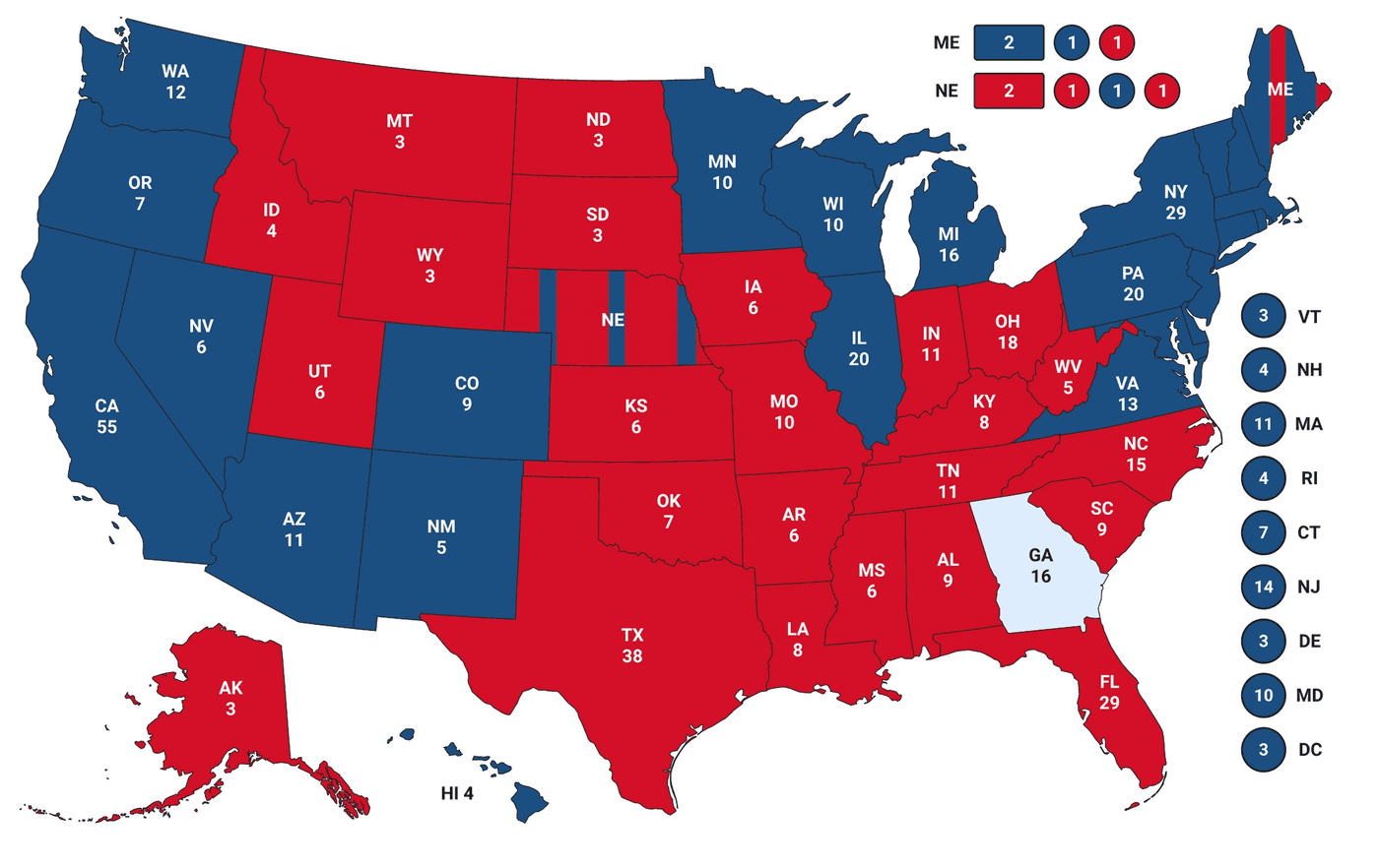
Unfortunately, the map from Fox news isn’t screen reader accessible either. VoiceOver reads the entire map as an image without alt text, and then just moves on to the next section. And while they kept the map relatively clean, there's still a lot going on visually (that white text on the bright red background, for example), which in combination with the legend not being easy to spot can feel overwhelming for some as well.
How to continue from here
If you’d like to learn more about making graphs like these accessible, I suggest to start by reading the following resources:
- Data Visualization Accessibility: Where Are We Now, and What’s Next?
- Data Visualization and Accessibility: Three Recommended Reads and Top Tips
- Creating accessible SVGs
- Five Ways To Design For Red-Green Colour-Blindness
- Data visualization accessibility
- Making data visualization accessible: a case study
- Data Visualization: Methods, Tools, Resources: Accessibility and Design
- An Intro To Designing Accessible Data Visualizations
- An Introduction To Accessible Data Visualizations With D3.js
- Accessibility Considerations In Data Visualization Design
- Case Study: Implementing Accessible Data Charts for the Khan Academy 2018 Annual Report
- Why Accessibility Is at the Heart of Data Visualization
- 7 solutions for creating more accessible SVGs
Or if you want to learn more about accessibility in general:
Hi! 👋🏻 I'm Sarah, a self-employed accessibility specialist/advocate, front-end developer, and inclusive designer, located in Norway.
I help companies build accessibile and inclusive products, through accessibility reviews/audits, training and advisory sessions, and also provide front-end consulting.
You might have come across my photorealistic CSS drawings, my work around dataviz accessibility, or my bird photography. To stay up-to-date with my latest writing, you can follow me on mastodon or subscribe to my RSS feed.
💌 Have a freelance project for me or want to book me for a talk?
Contact me through collab@fossheim.io.
Similar posts
Wednesday, 20. May 2020
An introduction to accessible data visualizations with D3.js
Saturday, 21. December 2019