Earlier I remade the design of an old calculator entirely in CSS. I had a lot of fun making it, so I decided to do the same with a Polaroid camera this time.
In this tutorial I'll guide you through my process, and explain how to replicate a physical product in CSS yourself.
Since this is a rather large project I won't go through every component individually, but the full code is available on CodePen, GitHub and Glitch.
I highly recommend forking it and playing around with it to understand further how each component is built.
What you'll need:
- A program like Figma to pick colors from an image
- Basic knowledge of HTML/CSS
- Understanding of CSS gradients
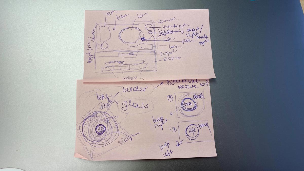
I also recommend having some pen and paper closeby to sketch out the structure of the project. While creating the HTML and CSS I was constantly breaking down the components on paper.
Step 0: Preparation
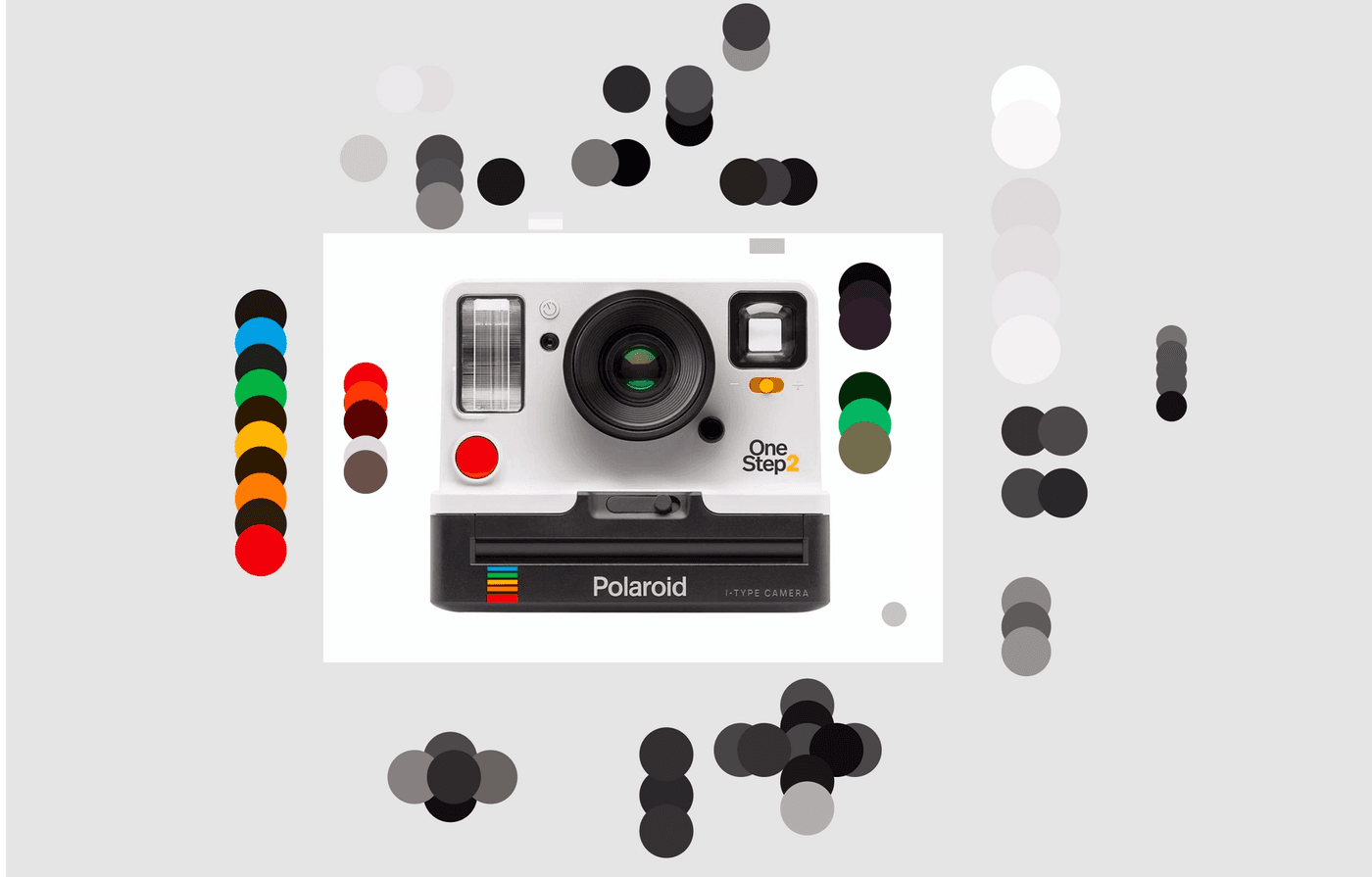
First you want to find a high-quality image of the object you're going to recreate. You'll be picking colors and measuring dimensions a lot, so it's important the image has decent quality.
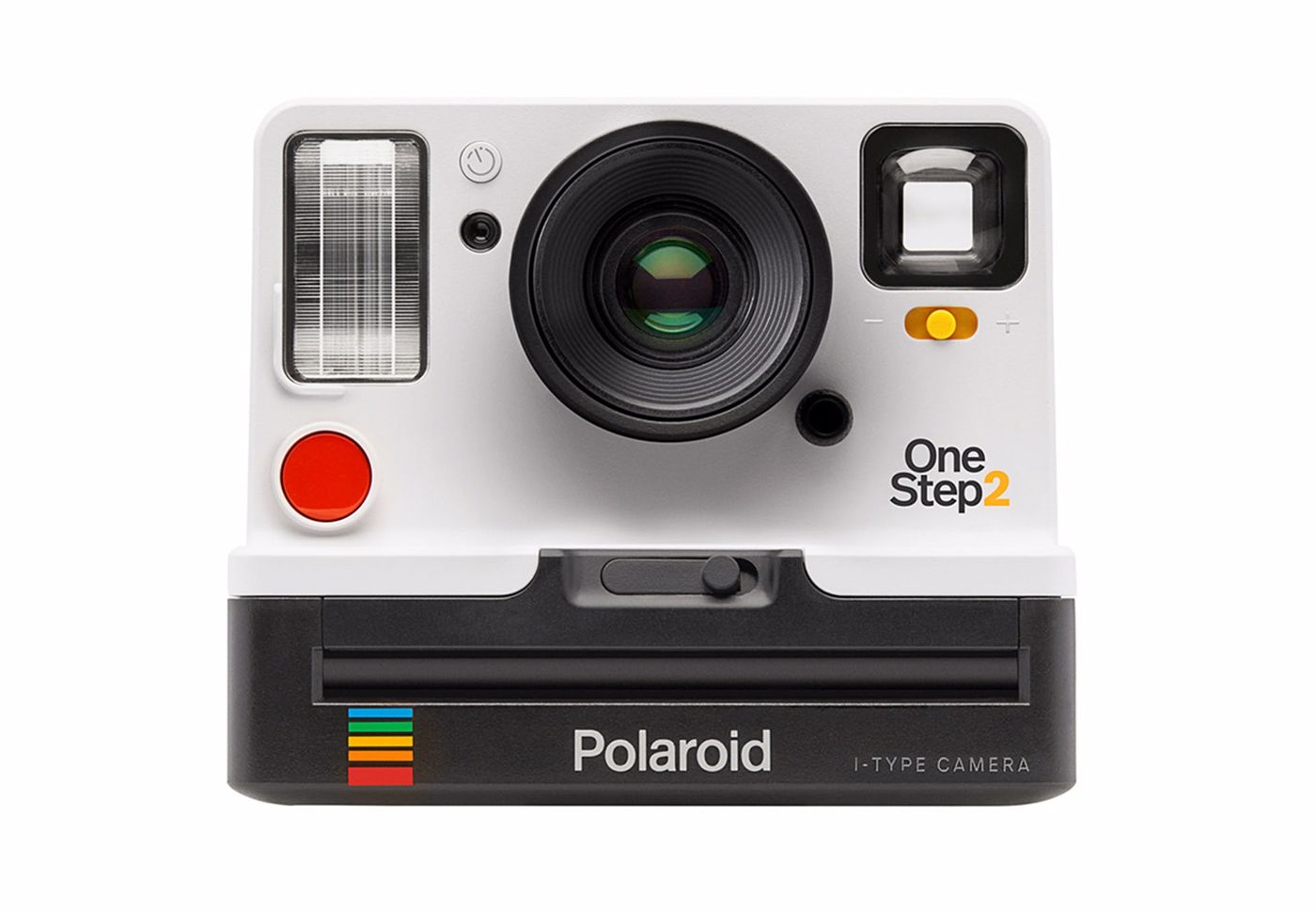
This is the one I started off with. As you can see, I also went for an image that was already taken from the same angle and with the same lightning as I wanted my result to be.
Step 1: Deciding the structure
Once I decided which image I wanted to work with, I analyzed it and sketched out the basic structure, which will later on be translated into html.
Keep several things in mind when doing this:
- Physical components. If it's a physical button or item on the camera (for example the lens or the flash), you want it to be a separate component in your code too. It makes the styling easier, and allows you to add some extra features in the future. For example, you could make the flash light up when clicking the shutter.
- Colors and sizing. The camera's bottom part, where the printer is, is black and slightly wider than the top part. While it's strictly speaking maybe part of the same physical component (the body of the camera), splitting it up into a top and bottom component gives you a lot more flexibility, and makes setting the colors and sizes much easier.
- Shadows, highlights and reflections. Some components will be easier to recreate if you split them up in several subcomponents. For example the lens has some reflections on the glass that aren't visible on the rest of the material. So I split that one up in the physical part that sticks out of the camera, and the glass on top.
With this in mind, the structure becomes something like this:
- Camera
- Top
- Lens
- Viewfinder
- Flash
- Shutter
- Timer
- ...
- Bottom
- Printer
- Logo
- Toggle
- ...
- Top
Step 2: Translate the structure in HTML
Once you have split up the image in different components and have the structure laid out on paper, you can quite easily translate it into HTML.
<div class="camera">
  <div class="top">
    <div class="flash"></div>
    <div class="timer"></div>
    <div class="sensor"></div>
    <div class="lens">
      <div class="glass"></div>
    </div>
		...
	</div>
	<div class="bottom">...</div>
</div>
Now that we have that in place, we can get started with the CSS work and actually create something visual.
Step 3: Style each component one by one
Start with the outlines
I recommend starting with the larger and easier parts. In this case with the polaroid camera, starting with the top or bottom part of the body is a good idea. They have the least amount of detail and also set the structure of the camera, so they'll help you with the positioning of the other components later on.
Once you have the bigger pieces in place, you can move on to the other components. The order afterwards isn't too important. I worked from the bottom upwards, but it's really up to you.
If you're new to gradients in CSS, you probably want to continue with the items that have few details (for example the red shutter, or the white timer button) to get a hang of things before moving on to the more complex ones like the lens or the flash.
Decide on sizing, positioning and colors
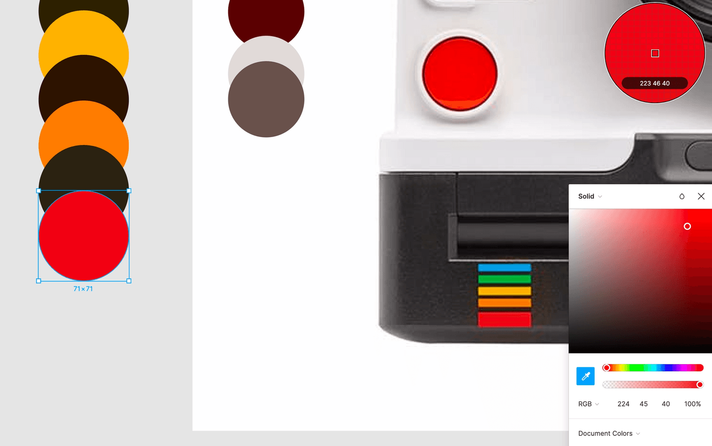
You want to have the picture open in a program (I used Figma) where you can pick the colors and measure how large each component has to be.
The rainbow in the bottom is a good example to illustrate this with. I first drew a rectangle on top of it to measure the width and height, which I then set in the CSS. The same can be done to decide the positioning:
.rainbow {
    display: block;
    width: 40px;
    height: 46px;
    position: absolute;
    top: 100px;
    left: 80px;
}
It's best to go for absolute positioning for all components, except for the outer camera body which can be position: relative. By having them positioned absolute, the width and height of one component won't affect the positioning or sizing of other components.
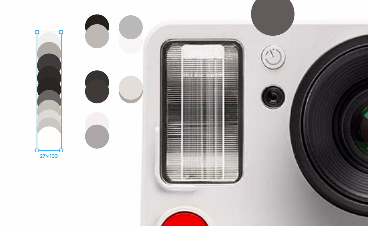
For the colors, I drew several shapes and used the color picker to get the right color code for each part. For most of the physical components I used gradients rather than flat colors, even if the component looked more or less flat.
For example, the top part of the camera body has three different whites as the base layer. While it's not very noticeable, doing this does give a bit more dimension to the designs.
I usually pick a color from the top of the component, and another color from the bottom of the component, and then create a linear gradient based on that. Try not to pick colors that are behind shadows, because they'll easily become too dark. We'll add shadows to each component later.
If you're not satisfied with how it looks, you might want to add a third or fourth color, or make the contrast between the colors a bit smaller. This is a trial and error process, so you want to have the output and the code open at the same time.
Layered gradients
In a project like this you'll need to layer gradients within the same div. And with that I mean, layer a lot of gradients.
An important thing to remember when stacking gradients is the order in which they will show. Let's take the following example:
 background-image: linear-gradient(green,blue),
  linear-gradient(red,orange),
  linear-gradient(black,white);
The green gradient will be shown on top, the red one underneath, and the black one on the bottom. We can also decide the size, positioning and repetition of the gradient in a similar way:
    background-size: 10px 20px, /* green/blue gradient */
    	40px 5px, /* red/orange gradient */
    	30px 35px; /* black/white gradient */
    background-position: top left, center, bottom right;
    background-repeat: no-repeat, no-repeat, repeat;
Example 1: Top body
For the top of the body, I mainly wanted two stacked gradients:
- a horizontal gradient with four slightly different shades of white (picked from the top, middle and bottom of the body)
- a vertical gradient on top of that, going from a slightly transparent white on both sides to a completely transparent white in the middle
linear-gradient(
    90deg,
    rgba(243,243,243,0.75),
    rgba(243,243,243,0) 15% 85%,
    rgba(243,243,243,0.75)
  ),
  linear-gradient(#DDD9DA, #E2DEDF, #EAE8EB, #F3F1F4);
Example 2: The flash
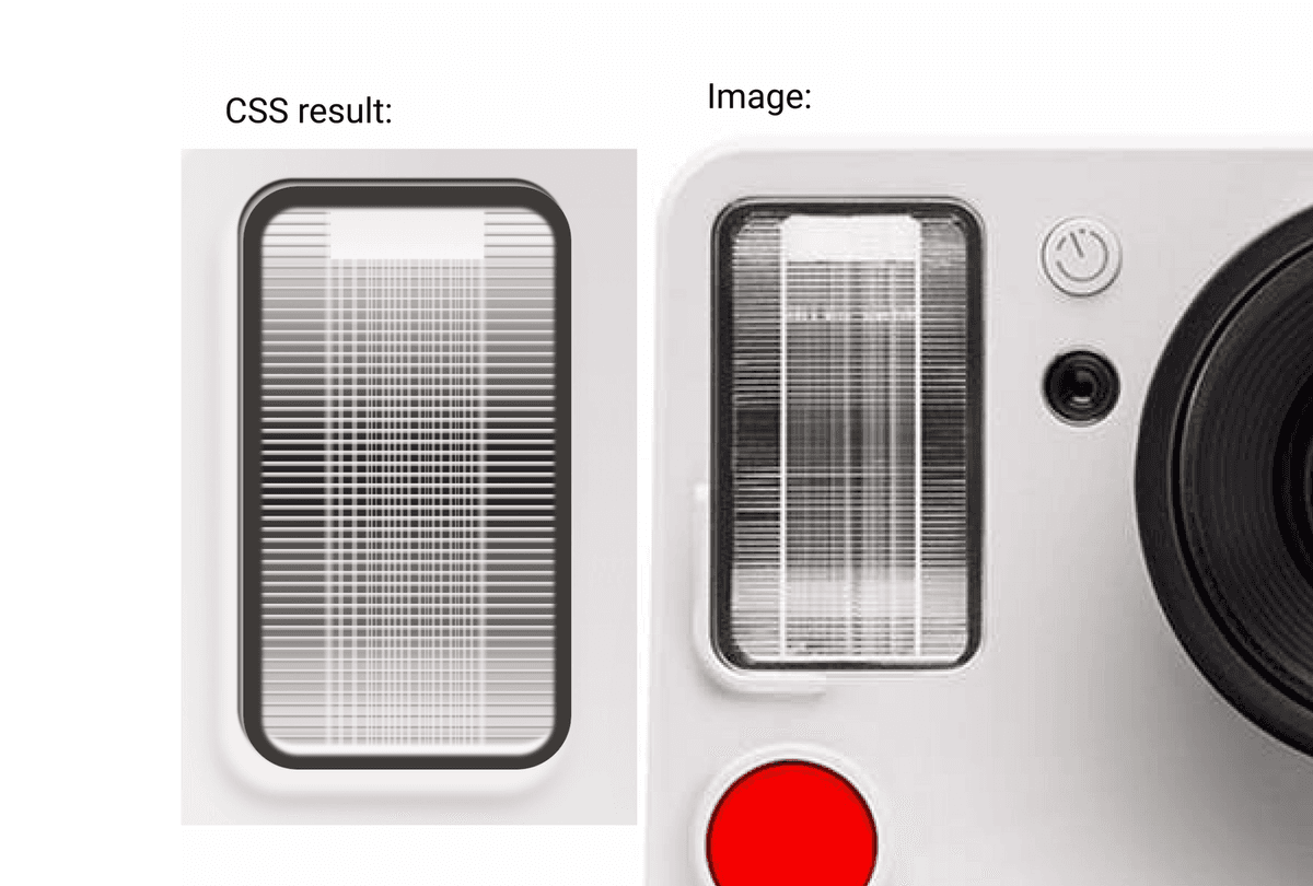
Now let's take a look at a more complicated component, the flash.
This one has a lot of gradients on top of each other: the background gradient (white, light gray, black, dark gray, light gray, white), the horizontal lines (transparent, light gray, white, transparent), then the vertical lines, and then a white square on the top and bottom.
After selecting the colors for the gradient, we can translate it into CSS like this:
  background-image: linear-gradient(#EDECEA,#F6F6F8) /*Top white square*/,
      linear-gradient(
          90deg,
          rgba(247,246,244,0) 3%,
          rgba(247,246,244,0.5) 3% 6%,
          ..., /*Repeat*/
          rgba(247,246,244,0) 95%,
          rgba(247,246,244,0.5) 95% 98%,
      ), /*Thin Vertical lines*/
      linear-gradient(
          90deg,
          rgba(186,184,185,0.1),
          rgba(247,246,244,0.65),
          rgba(186,184,185,0.1)
      ), /*Bold vertical line 1*/
      linear-gradient(
          90deg,
          rgba(186,184,185,0.1),
          rgba(247,246,244,0.65),
          rgba(186,184,185,0.1)
      ), /*Bold vertical line 2*/
      linear-gradient(
          #E3DEDA 15%,
          #AFAAA6 25% 35%,
          transparent 45%
      ), /*Horizontal lines*/
      linear-gradient(
          #F0EFED 10%,
          #B0ABA7 20%,
          #403C3B 40%,
          #2F2B2A 43%,
          #292524 45% 55%,
          #696562 65% 75%,
          #C2BFBA 82% 86%,
          #DEDAD7 90% 93%,
          #C9C6C1 94% 96%,
          #FFFEFA 98%
      ); /*White/gray/black background*/
If we just render this, we would only see a big white gradient on top (linear-gradient(#EDECEA,#F6F6F8)), because by default each gradient is set to 100% width and height and stacked on top of each other.
So let's measure the size of the gradient on top, and where the vertical lines should come.
 background-size: 42px 20px, /*White reflection*/
    	42px 100%, /*Thin vertical lines*/
    	3px 100%, /*Bold vertical line*/
    	3px 100%, /*Bold vertical line*/
    	100% 3px, /*Horizontal lines*/
    	100%; /*Background*/
    background-repeat: no-repeat, no-repeat, no-repeat, no-repeat, repeat, repeat, no-repeat;
    background-position: 24px top, 25px top, 22px top, 64px top, center, center, center;
After adding reflections and shadows (which will be explained in the next section), our flash ends up looking like this:
Borders, shadows and highlights
After you styled your component with gradients, it's clear that something is still missing: depth, shadows and highlights. Just like we stack gradients, we can also stack shadows on top of each other.
It works the exact same as the gradients, the first one mentioned is the one that's layered on top.
In this example we end up with a red shadow on top of a blue shadow:
box-shadow: 1px 1px 1px 1px red, 2px 2px 2px 2px blue;If we reverse the order, the blue shadow would be on top, hiding the red one:
box-shadow: 2px 2px 2px 2px blue, 1px 1px 1px 1px red;Example: White timer button
The easiest example to show what we can do with shadows is the white timer button. When zooming in on the image we can see two things we need to create the depth:
- A very thin black shadow that surrounds the entire button, slightly thicker on the bottom
- A thin white highlight that's inside the button, on top
Let's start with the shadow:
    box-shadow: 0px /*No left or right offset*/
    	0.5px /*Moved 0.5px downwards*/
    	1px /*Blur of 1px*/
    	0.5px /*Sized up with 0.5px*/
        #605C5B /*Black color*/;
Next, we can add the highlight. We want the highlight to be inside the button, not outside of it, so we'll use the inset value for this.
box-shadow: 0px 0.5px 1px 0.5px #605C5B, /*shadow*/
1px 1px 1px #FFFBFC inset; /*highlight*/
/*1px moved down, 1px to the right, 1px blur, white color, inside the div*/
Example: Depth around the flash
Let's go back to our more complex example, the flash. We want the component to be slightly elevated, for that we'll need a white shadow with a gray shadow underneath.
Afterwards, we also want some shadows inside:
- The gray border around the grid of white lines
- Highlight on top
- Highlight on the bottom
- Shadow on top
box-shadow: -1px -1px 1px #BDB8B5,
  -1.5px -2.1px 0.5px #24201D,
  -4px 4px 3px 3px #F4F0EF,
  -5px 8px 8px #ABA6AA,
  0.25px 1px 1px 5px #3E3A38 inset,
  0 -6px 1px 1px #F6F6F8 inset;
Reflections
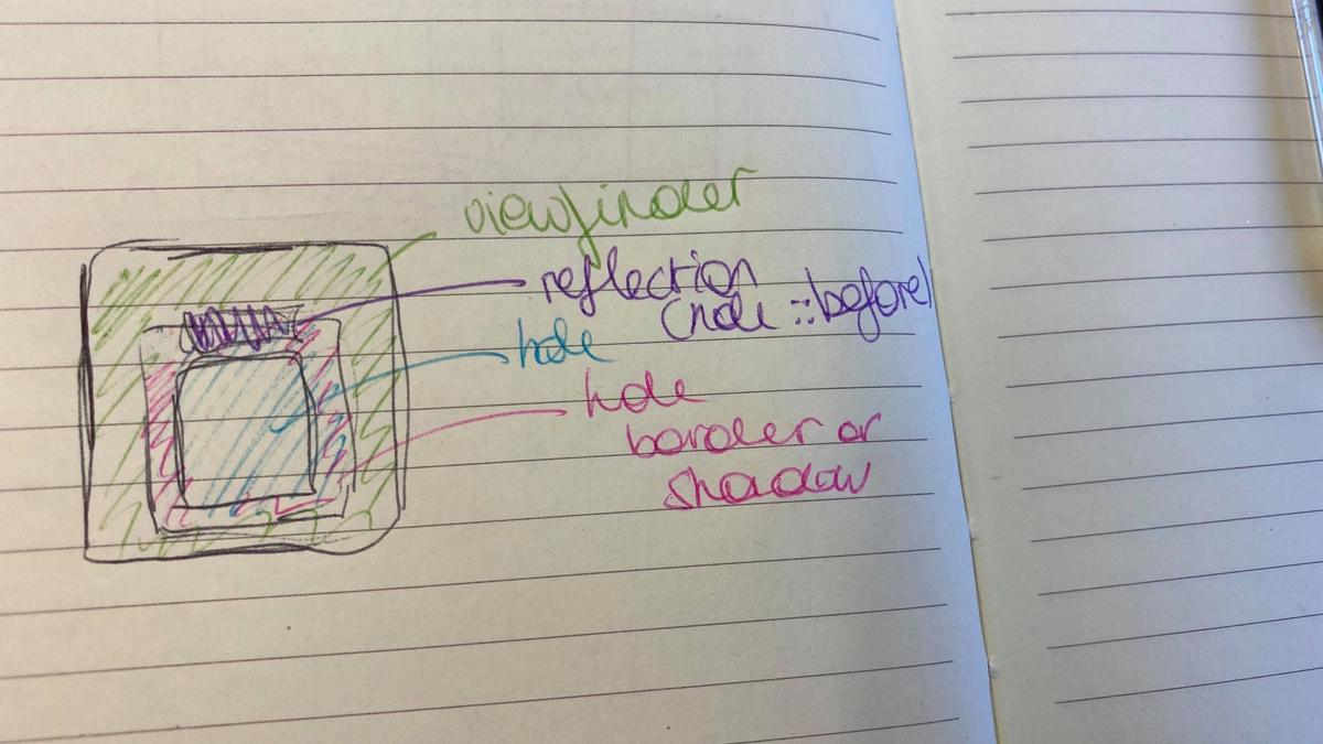
A couple of components will need more reflections as well, like the glass inside the lens and the glass inside the viewfinder. In those cases it's worth it creating an extra div just for the glass. Let's take a look at how I solved it for the lens.
Example: Reflection on the glass of the lens
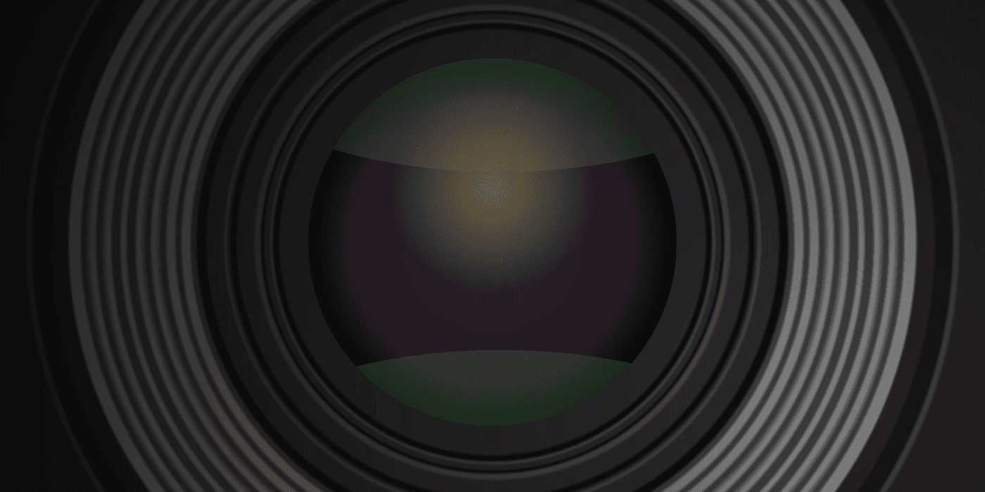
If we look at the middle, we see I used 4 gradients here:
- A radial-gradient that fills up the full background, going from a near black to a dark purple. This is the color of the glass.
- The top light green reflection. This is a radial gradient with a green color in the middle and a transparent color at the sides, stretched out and moved upwards so only the corner is visible.
- The bottom dark green reflection, which works the same way as the top reflection, just a different color.
- The light reflection in the middle, which is another radial-gradient, this time going from a light yellow to a transparent yellow.
background-image: radial-gradient(rgba(236, 234, 237, 0.3) 50%, transparent 60%),
    radial-gradient(rgba(193, 189, 186, 0.3) 50%, transparent 60%),
    radial-gradient(#5B5758 45%, #302C2D, #131112);
background-size: 106% 32%, 106% 25%, 100%;
background-repeat: no-repeat;
background-position: -3px -7px, bottom -8px left -3px, center;
Summary
- Pick a component to start with
- Measure and set the size, border-radius and positioning
- Pick the colors and create a background gradient
- Stack several background gradients to create depth
- Add shadows and highlights
- Repeat until satisfied
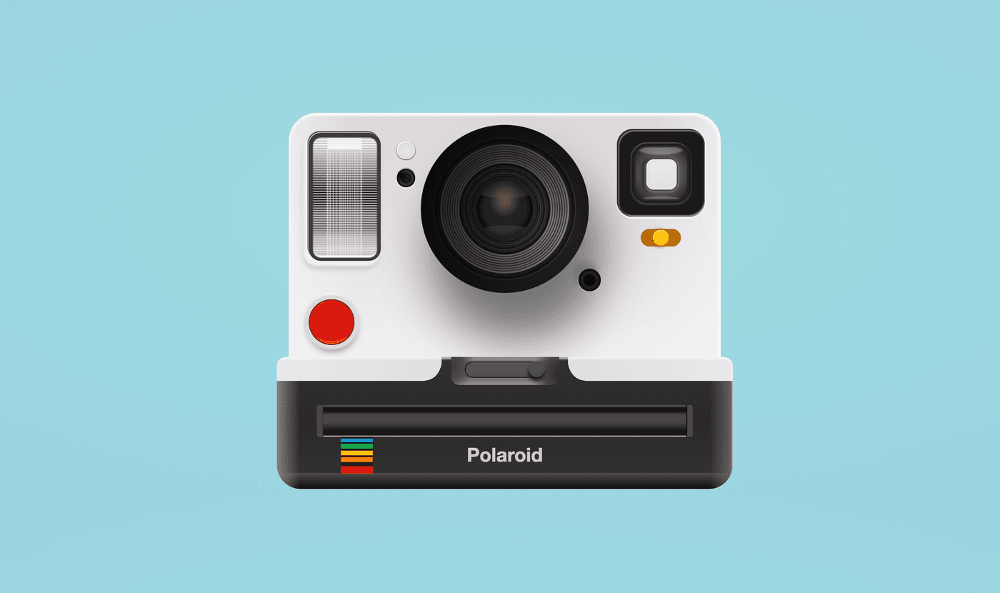
The end result
The full code is available on CodePen, GitHub and Glitch. Open it, inspect it and play around with it. Changing some values is the best way to understand what each component is doing.
More reading material
- W3Schools: CSS3 Gradients
- Trying out gradients with cssgradients.io
- Tutorial: Using CSS3 gradients
- Tutorial: Skeuomorphic buttons with CSS3
- Abatron 803 calculator in CSS3
Show me your results!
If you followed this tutorial to create an image of your own I would love to see the end-result, you can tag me on Twitter (@liatrisbian), Dev (@fossheim), CodePen (@fossheim) or GitHub (@sarahfossheim).
If you want an extra challenge, here are some fun interactions you could add to my existing code:
- Clicking the red shutter to make the flash light up
- Using one of the toggles to create a "night mode" that changes the color of the body from white to black
- Printing a picture
- Make the lens shift focus by rotating it
Hi! 👋🏻 I'm Sarah, a self-employed accessibility specialist/advocate, front-end developer, and inclusive designer, located in Norway.
I help companies build accessibile and inclusive products, through accessibility reviews/audits, training and advisory sessions, and also provide front-end consulting.
You might have come across my photorealistic CSS drawings, my work around dataviz accessibility, or my bird photography. To stay up-to-date with my latest writing, you can follow me on mastodon or subscribe to my RSS feed.
💌 Have a freelance project for me or want to book me for a talk?
Contact me through collab@fossheim.io.
Similar posts
Sunday, 15. December 2019
Splitting text into individual characters with React
Wednesday, 18. December 2019