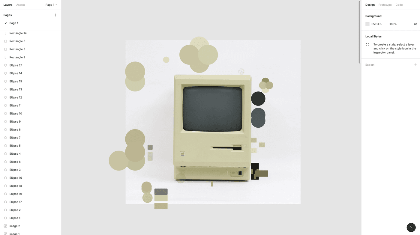
You might have seen my CSS Polaroid camera and a calculator already, and now I re-created another iconic product: Apple's Macintosh, released in 1984.
The process I followed to recreate it is pretty much the same as described in the polaroid tutorial, so I suggest reading that one as well to get a full overview.
Identifying components and setting specifications
The first thing I always do is taking a step back from coding and using either Figma or pen and paper to break down the photograph into different components that I can later translate into HTML elements.
I try to minimize the amount of elements I use to the actual physical components of the product (the monitor on top, which contains the screen and the logo, etc). But sometimes you'll need an extra wrapper or child component to finetune the styling.
When it comes to the styling, tools like Figma or Sketch can be really helpful. I draw rectangles on top of the image to measure sizing and use the color picker to select all the right colors.
Tip: Use subtle gradients rather than background colors. Especially if you want things to look more photorealistic, it can pay off to avoid flat colors. Even if it looks something only has one color, if you use the color picker you'll notice the color on the bottom might be slightly lighter or darker than on top.
You can use background-image: linear-gradient() or background-image: radial-gradient() for this. Don't overdo it though, harsh gradients will probably not look good.
Gradients vs. box-shadows
I generally try to stick to the following rules:
- Use gradients to style surfaces or create patterns
- Use box-shadows to create depth and outlines
However, if you look at my CSS you'll notice I often used a wrapper with conic-gradient backgrounds to create shadow. That's because some of the shadows in the picture are at a certain angle or needed a smoother transition, which is easier achieved by using gradients instead of shadows.
Conic gradients are not fully supported yet! Always add either a linear-gradient and/or background color as fallback.
background-color: blue; /* Shown if neither gradients are supported */
background-image: linear-gradient(blue, pink); /* Shown if conic gradients are not supported */
background-image: conic-gradient(blue, pink); /* Shown if conic gradients are supported */
A great way to learn CSS while having fun
If you're new to front-end development or want to brush up your CSS skills, I can really recommend just finding a design you like and trying to recreate it. Whether it's a poster, a website, a piece of furniture or an old Macintosh; practice makes perfect.
While making something like this, you will:
- Think about how to break down a CSS and translate it into HTML components
- Practice absolute vs. relative vs. static positioning
- Discover the possibilities of background gradients
- Have to think about cross-browser issues and fallbacks
- Become faster at writing CSS (you could even give yourself a time limit as an extra challenge)
If you've made something similar, especially after following my tutorials, feel free to send me the result on twitter or any other social media platform I'm on. I'd love to see what other people come up with. ❤️
Hi! 👋🏻 I'm Sarah, a self-employed accessibility specialist/advocate, front-end developer, and inclusive designer, located in Norway.
I help companies build accessibile and inclusive products, through accessibility reviews/audits, training and advisory sessions, and also provide front-end consulting.
You might have come across my photorealistic CSS drawings, my work around dataviz accessibility, or my bird photography. To stay up-to-date with my latest writing, you can follow me on mastodon or subscribe to my RSS feed.
💌 Have a freelance project for me or want to book me for a talk?
Contact me through collab@fossheim.io.
Similar posts
Sunday, 15. December 2019
Splitting text into individual characters with React
Wednesday, 18. December 2019