In the recent refresh of my website’s design I implemented different theming options. It’s now possible to choose between six different color schemes when reading my blog.
The need for more than just a light theme and dark theme came from the fact that personally, when I get bad migraines and headaches, low contrasting colors feel easier on my eyes, so I wanted to at least add a dark low-contrast option in addition to a regular light and dark theme.
Once the support for the first two themes was added, providing more options became really straightforward, so it was easy to let myself have some fun creating different themes!
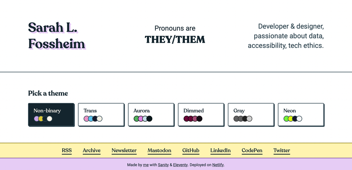
I’ve received a lot of positive feedback on the theme switcher, and implementing light/dark modes and high contrast themes has been a recurring accessibility task across several of the projects I’ve been involved in, so I figured it was time for a write-up on how to implement a theme switcher like this.
In this tutorial, we’ll use:
- HTML
- CSS
- JavaScript (vanilla)
What we’ll be building
At the end of this tutorial, we'll have an example with four different themes that can instantly be activated through a group of toggle buttons in the interface, and our choice will be remembered through localStorage.
You can find the final code on my theme-switcher GitHub repo, and all the demos used in this tutorial are bundled in a Theme Switcher collection on my CodePen as well.
Variable styling with CSS.
Let's start by getting our CSS ready to support themes.
We’ll need to use CSS variables (or custom properties) to make changing out colors across components easier.
Let's say we start with a CSS file that looks like this:
body {
  background: linear-gradient(#A4F3A2, #00CC66);
  color: #034435;
}

.callout {
  background: #034435;
  color: #A4F3A2;
}

.footer {
  background: #A4F3A2;
  border-top: 2px solid #034435;
}
We can add a custom data attribute on the html:
<html data-selected-theme="pink">
  ...
</html>
And use that to overwrite the colors for each theme. If we continued with the CSS from above, without adding variables, we'd have to do something along these lines:
/* variables.css */
body {
  background: linear-gradient(#A4F3A2, #00CC66);
  color: #034435;
}

.callout {
  background: #034435;
  color: #A4F3A2;
}

.footer {
  background: #A4F3A2;
  border-top: 2px solid #034435;
}

/* pink.css */
[data-selected-theme="pink"] body {
  background: linear-gradient(#DFB2F4, #F06EFC);
  color: #463546;
}

[data-selected-theme="pink"] .callout {
  background: #463546;
  color: #DFB2F4;
}

[data-selected-theme="pink"] .footer {
  background: #DFB2F4;
  border-top: 2px solid #463546;
}
For a small tutorial example this might still seem like a feasible approach, but it would become really difficult to keep track of over time. The larger the website or component library, the more properties we'd need to remember to manually overwrite for each new theme. So in come ✨ CSS variables ✨, which we can set on :root like this:
:root {
  --color-background: #A4F3A2;
  --color-text: #034435;
  --color-accent: #00CC66;
}
We can then use those variables everywhere else in the CSS.
body {
  background: linear-gradient(
    var(--color-background),
    var(--color-accent)
  );
  color: var(--color-text);
}

.callout {
  background: var(--color-text);
  color: var(--color-background);
}

.footer {
  background: var(--color-background);
  border-top: 2px solid var(--color-text);
}
This means that instead of having to update the styling of each element individually, we can now limit ourselves to only overwriting the variables that are defined in the :root :
:root {
  --color-background: #A4F3A2;
  --color-text: #034435;
  --color-accent: #00CC66;
}

[data-selected-theme="pink"] {
  --color-background: #DFB2F4;
  --color-text: #463546;
  --color-accent: #F06EFC;
}
This looks a lot tidier already! 🥳
We can now relatively quickly scale up the amount of themes we support, without having to change anything inside the individual components.
:root,
[data-selected-theme="green"] {
  --color-background: #A4F3A2;
  --color-text: #034435;
  --color-accent: #00CC66;
}

[data-selected-theme="blue"] {
  --color-background: #55dde0;
  --color-text: #2B4150;
  --color-accent: #00D4E7;
}

[data-selected-theme="pink"] {
  --color-background: #DFB2F4;
  --color-text: #463546;
  --color-accent: #F06EFC;
}

[data-selected-theme="orange"] {
  --color-background: #FA7D61;
  --color-text: #1E1E24;
  --color-accent: #F3601C;
}
Here, we have written the CSS support for our different themes, and we can switch between them by manually updating the data-selected-theme property on the body of the page to our different theme class names.
Now we will need to create a component that lets us switch themes directly from the UI instead.
Creating a theme selector component in HTML.
There are several ways you could go about implementing theming like this. For example, GitHub has a place in the setting where it’s possible to select a color theme by using radio buttons.
I decided to go for a group of <button> elements. It’s how I designed them visually, so it makes sense to match that pattern in the semantics.
Léonie Watson has an excellent article explaining why an element’s visuals and semantics should match, but in short: different elements (buttons, radio buttons, links, etc) have their own keyboard and screen reader controls, and we want to make sure the actual interaction available lines up with the user’s expectation.
Communicating the selected theme.
Now we have our buttons, but we don’t have anything in place yet to indicate which theme is selected. We’re using the green by default, so we can already pre-select that button by adding aria-pressed="true".
<div class="theme-switcher">
<button aria-pressed="true">Green</button>
<button aria-pressed="false">Blue</button>
<button aria-pressed="false">Pink</button>
<button aria-pressed="false">Orange</button>
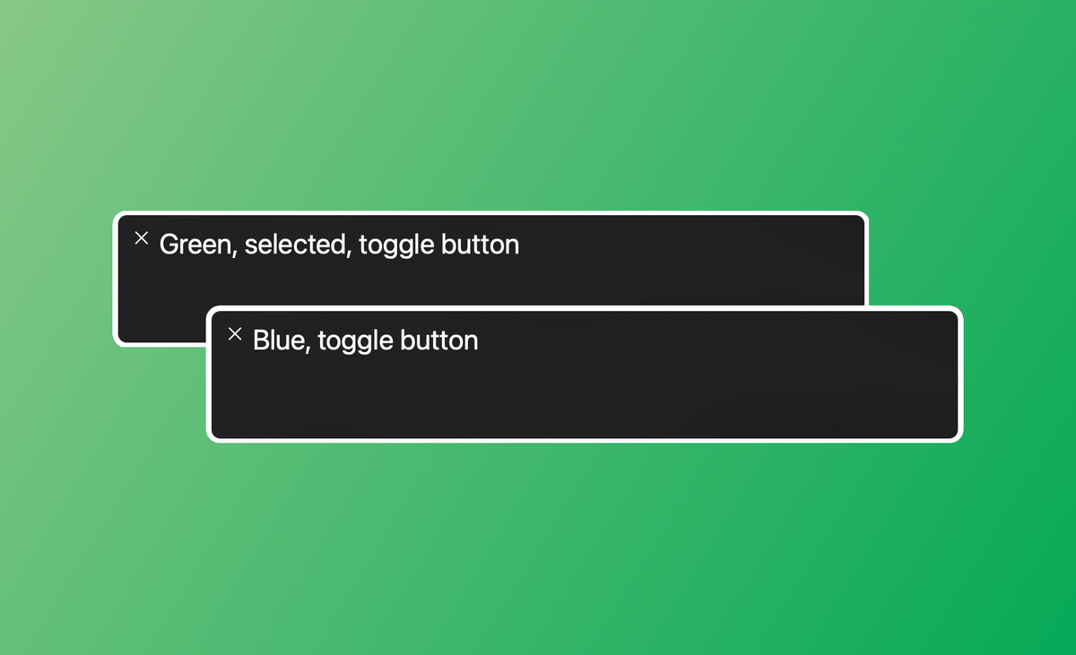
</div>The aria-pressed tells assistive technology whether or not a button is checked. For example, VoiceOver will read the above selected button as:
Green, selected, toggle button
We can use the same aria-pressed property in the CSS to style the selected button differently:
button[aria-pressed="true"] {
  background: var(--color-text);
  color: var(--color-background);
}Updating the selected theme with JavaScript.
So now comes the fun part: making the buttons interactive using JavaScript. When we activate a button (using click, space, or enter), we want:
- The class name on the body to update with the corresponding theme.
- The button’s
aria-pressedproperty to be set totrue. - All other theme buttons to be toggled off (
aria-pressed=”false”). - The choice to be saved for next time we visit the page.
Reacting to button clicks.
We’ll first need to detect which button has been clicked. We can do so by selecting all the theme buttons on the page, and then looping through them and adding a click event listener to each of them.
/* Logs the clicked button */
const handleThemeSelection = (event) => {
  console.log('button clicked', event.target);
}

/* Selects all buttons */
const themeSwitcher = document.querySelector('.theme-switcher');
const buttons = themeSwitcher.querySelectorAll('button');

/* Adds the handleThemeSelection as a click handler to each of the buttons */
buttons.forEach((button) => {
   button.addEventListener('click', handleThemeSelection);
});
Because we used the <button> element, the click event will also be called when using the space and enter key to activate it.
Adding theming info to the buttons.
If we interact with the buttons on our page, we’ll notice that we can indeed detect the selected element this way.
But it doesn’t give us much we can use in the code to update the themes. So before we continue, now is a good time to add some more custom properties to our HTML.
<div class="theme-switcher">
  <button data-theme="green" aria-pressed="true">Green</button>
  <button data-theme="blue" aria-pressed="false">Blue</button>
  <button data-theme="pink" aria-pressed="false">Pink</button>
  <button data-theme="orange" aria-pressed="false">Orange</button>
</div>
Updating the theme.
Now we can actually target the data-theme value in our click handler:
const handleThemeSelection = (event) => {
  const theme = event.target.getAttribute('data-theme');
  console.log(theme);
}
And use it to update the data-selected-theme property programatically. The following code will be enough to get the color scheme to update:
const handleThemeSelection = (event) => {
  const theme = event.target.getAttribute('data-theme');
  document.documentElement.setAttribute("data-selected-theme", theme);
}

const themeSwitcher = document.querySelector('.theme-switcher');
const buttons = themeSwitcher.querySelectorAll('button');

buttons.forEach((button) => {
   button.addEventListener('click', handleThemeSelection);
});
If we click on the different options now, the styling of the page indeed updates, but the state of the buttons is still unchanged. Even if we select the pink theme, the default green options still is shown as active instead.
Updating the button properties.
We need to reflect this change in our button group as well. When clicking a button, we can set its aria-pressed attribute to true:
target.setAttribute('aria-pressed', 'true');This will select the newly clicked button, but still won’t update the aria-pressed value of whichever color themes were selected previously, meaning several buttons can be selected at the same time.
To fix this we'll want to reset all aria-pressed buttons to false. Before updating our clicked button's value, we can first select the button that was still active:
const prevBtn = document.querySelector('[data-theme][aria-pressed="true"]');And then set aria-pressed to false:
const prevBtn = document.querySelector('[data-theme][aria-pressed="true"]');
prevBtn.setAttribute('aria-pressed', false);
Because we targeted [aria-pressed="true"] to style our selected state, we don’t need to do anything else to update the styling.
Saving the choice.
Our theme selector works! 🥳
The final step will be to remember our choice, so we don’t need to re-select the theme each time we visit the page.
Updating the local storage.
We can save the user selected theme in the local storage using the localStorage.setItem() function when clicking the button.
const handleThemeSelection = (event) => {
  const theme = event.target.getAttribute('data-theme');
  document.documentElement.setAttribute("data-selected-theme", theme);

  const prevBtn = document.querySelector('[data-theme][aria-pressed="true"]');
  prevBtn.setAttribute('aria-pressed', false);
  event.target.setAttribute('aria-pressed', 'true');

  localStorage.setItem('selected-theme', theme);
}
On page load, we can then check which theme has been stored in the local storage by calling:
const savedTheme = localStorage.getItem('selected-theme');If a theme has been saved, we'll need to:
- Unselect the default selected button
- Select the button that matches the saved theme
- Change the
data-selected-themeto the saved theme
In order to avoid performing unnecessary actions, we'll only execute this code when the saved theme is different from the default theme:
const savedTheme = localStorage.getItem('selected-theme');
const defaultTheme = "green";

if (savedTheme && savedTheme !== defaultTheme) {
  const prevBtn = document.querySelector('[data-theme][aria-pressed="true"]');
  prevBtn.setAttribute('aria-pressed', false);

  document.querySelector(`[data-theme="${savedTheme}"]`)
    .setAttribute('aria-pressed', true);

  document.documentElement
    .setAttribute("data-selected-theme", savedTheme);
}Code cleanup
There is still some repeated code. The way the aria-pressed and data-selected-theme are updated after loading the page and after clicking a button is more or less the same. So we can move this part into its own function.
const applyTheme = (theme) => {
  const target = document.querySelector(`[data-theme="${theme}"]`);

  document.documentElement
    .setAttribute("data-selected-theme", theme);

  document.querySelector('[data-theme][aria-pressed="true"]')
    .setAttribute('aria-pressed', 'false');

  target.setAttribute('aria-pressed', 'true');
};
The same function can then be called when clicking an option (from within handleThemeSelection), and when loading the page.
const handleThemeSelection = (event) => {
  const target = event.target;
  const isPressed = target.getAttribute('aria-pressed');

  /* if clicked theme is different from current theme */
  if(isPressed !== "true") {
    const theme = target.getAttribute('data-theme');
    applyTheme(theme);
    localStorage.setItem('selected-theme', theme);
  }
}
const savedTheme = localStorage.getItem('selected-theme');
/* if saved theme is different from current theme */
if(savedTheme && savedTheme !== defaultTheme) {
applyTheme(savedTheme);
}Final result
And done! We have a basic theme switcher, that works with keyboard navigation and screen reader!
Resources
The code for this tutorial is available through my theme-switcher GitHub repo, and all the demos used in this tutorial are bundled in a Theme Switcher collection on my CodePen as well.
- What's the best way to mark up an exclusive button group? by Lea Verou
- Perceived affordances and the functionality mismatch by Léonie Watson
- MDN: aria-pressed
- MDN: Using CSS custom properties (CSS variables)
I'd love to see the result if you end up using my tutorial to add a theme selector to your website 🎨✨
Hi! 👋🏻 I'm Sarah, a self-employed accessibility specialist/advocate, front-end developer, and inclusive designer, located in Norway.
I help companies build accessibile and inclusive products, through accessibility reviews/audits, training and advisory sessions, and also provide front-end consulting.
You might have come across my photorealistic CSS drawings, my work around dataviz accessibility, or my bird photography. To stay up-to-date with my latest writing, you can follow me on mastodon or subscribe to my RSS feed.
💌 Have a freelance project for me or want to book me for a talk?
Contact me through collab@fossheim.io.
Similar posts
Sunday, 15. December 2019
Splitting text into individual characters with React
Wednesday, 18. December 2019