Accessibility should always be a focus when designing products, and the same goes when working with data visualizations and graphs.
First and foremost because the full product should be accessible, but also because data visualizations often contain important information that users have to act upon. Accessible graphs also translate into better understandable graphs for everyone.
Currently I'm developing and designing software for the education sector, and prior to this I worked in cancer research, so I also see first-hand how accessible data impacts more than just the users.
For example in medical software, inaccessible or confusing graphs could lead to critical mistakes such as giving the wrong medication to a patient, and seriously harming them by doing so.
10 dos and don'ts to keep in mind when designing accessible data visualizations
- 🚫 Don't rely on color to explain the data
- 🚫 Don't use very bright or low-contrast colors
- 🚫 Don't hide important data behind interactions
- 🚫 Don't overwhelm the user with information
- ✅ Do use accessibility tools when designing
- ✅ Do use patterns and shapes in addition to color
- ✅ Do use labels and legends
- ✅ Do translate the data into clear language
- ✅ Do provide context and explain the visualization
- ✅ Do focus on accessibility during user interviews
So let's look at some of these points in a bit more detail.
🚫 Don't rely on color to explain the data
While color is a good way to distinguish between different types of data, relying on color alone can in fact make graphs harder, or sometimes even impossible, to understand.
Let's use this example of the daily routines of creative people.
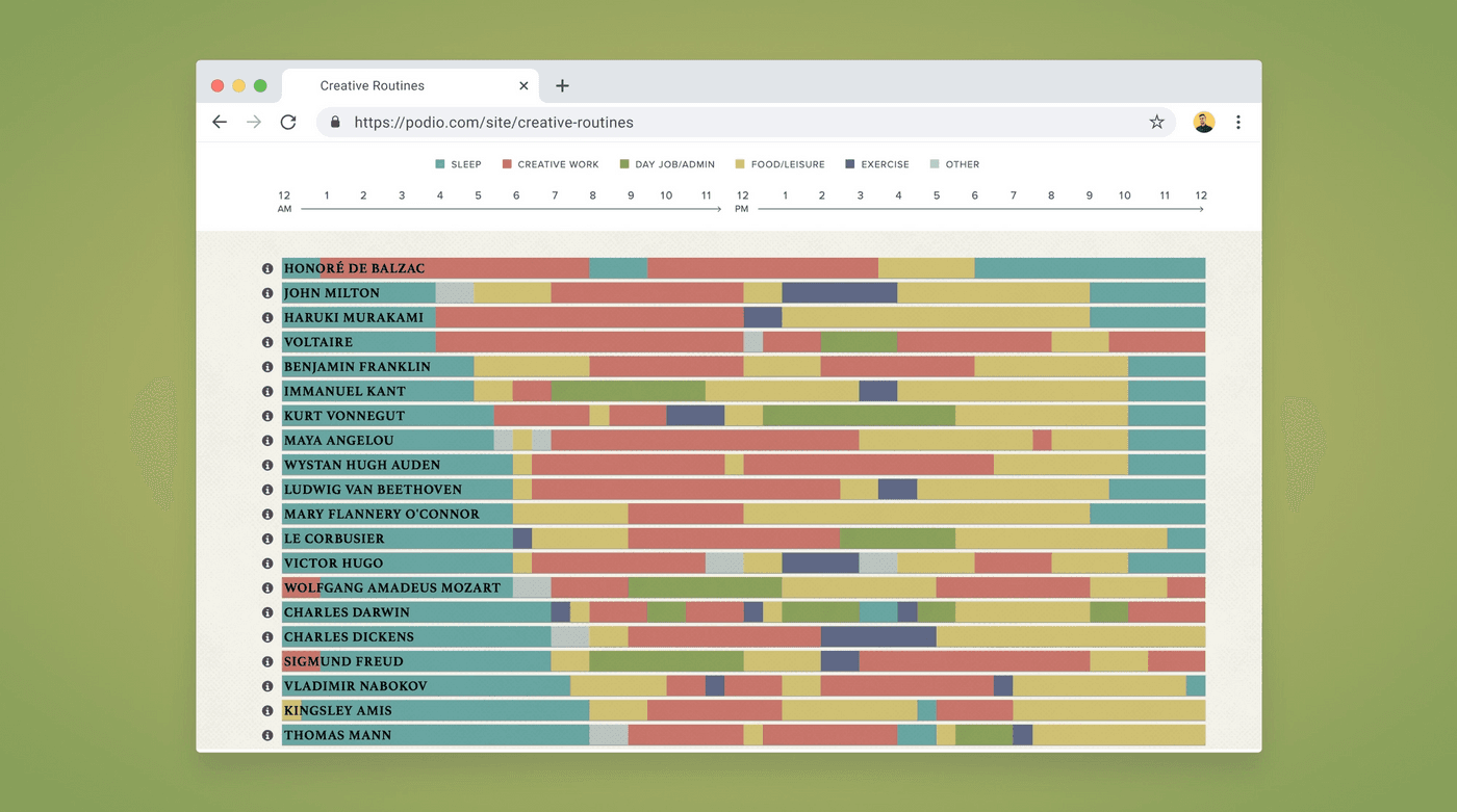
To me, at first glance it looks like a pretty visualization, but this is what it looks like to people with deuteranopia (green-blind) and achromatopsia (monochromacy). Some of the colors end up looking exactly the same, and without any proper labels or other visual cues it's hard to see what they actually represent.
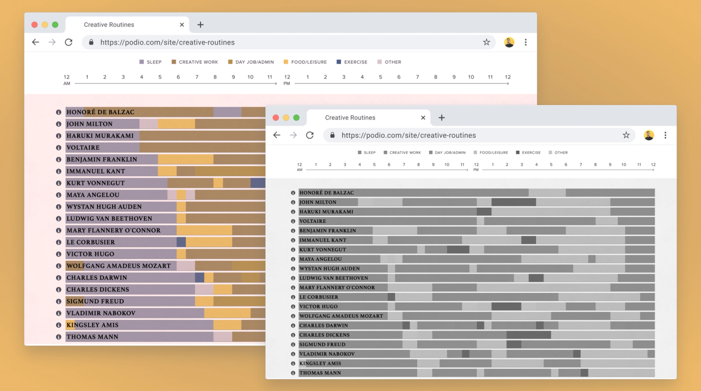
The live example does have hover effects which include that info, so the context is not completely lost, but generally speaking hiding information behind hovers can be bad for accessibility as well.
I recommend using different patterns or shapes in addition to color, and labeling the data. That way users with colorblindness will be able to spot the difference, even if the colors end up looking similar.
Do make sure to keep the patterns clean and simple, so they're not distracting, and don't assume everyone will understand or recognize what they mean without any explanation.
🚫 Don't use very bright or low-contrast colors
Colorblindness is not the only thing to keep in mind when working with color. Low contrast can make text hard to read, and very bright colors can be painful on the eyes.
Bright colors can also be overwhelming and cause problems for people with sensory issues (for example, people on the autism spectrum).
This is especially important to keep in mind when dealing with visualizing lots of information, like on analytics dashboards.
🚫 Don't overwhelm the user with information
Less is more and the same goes for data. There's no need to add a lot of graphs if they won't be used for anything. In that case, they will only distract and take away focus of what's actually important.
Before making any visualizations, try to understand both the data and how/under which circumstances it will be used. Then, design around the actions the user will take based on the data, rather than bombarding users with information they have to analyze.
A good example of this is Clue, the period tracking app. They have a lot of data they can visualize, but split it up in function of what the user is trying to achieve.
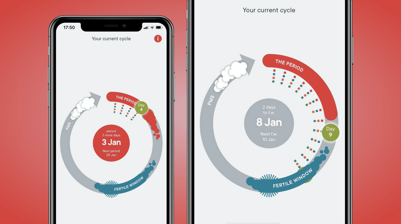
On the home screen, they highlight the current date and important events in the current cycle (bleeding/period, ovulation and fertile period). And they do so using color, symbols and words.
They also use a lot of whitespace everywhere, which makes the important info stand out more, and makes everything a lot calmer on the eyes as well.
They do use colored without labels representing the kind of data that's tracked each day, but it's possible to view more info about them by expanding the entry.
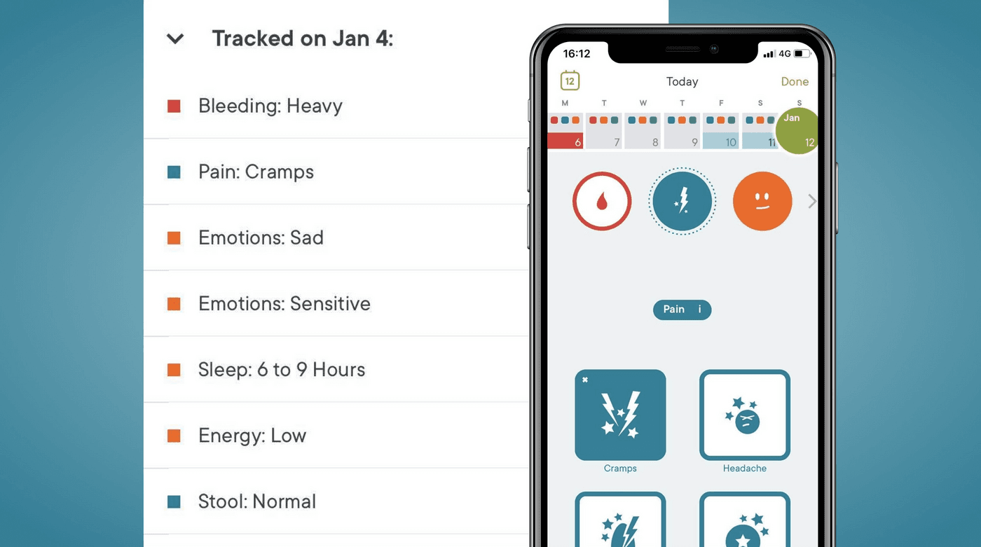
Generally speaking I'm not a fan of hiding data this way, but whether or not you had a headache three days ago is not the most important information you need to see on the first page of a period tracking app.
✅ Do use accessibility tools when designing
Whatever it is you're designing, I recommend using color blindness simulators. For Figma there is the Color Blind plugin, and similar ones exist for Sketch.
Alternatively, there are also online tools like Coblis where you can upload an image of your design to simulate, or the Colorblinding chrome extension when developing.
Also check the contrast of both the colors and text used in graphs. This is especially important for labels or values you add to charts, as they often tend to be written in smaller fonts. I recommend using the Stark plugin for this.
✅ Do use labels and legends
When visualizing any data, it's important to use labels and legends. Try to add the labels in context, if possible. A good example of this is Apple Health.
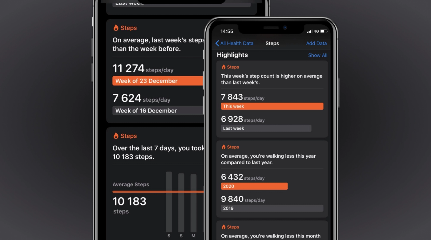
They write the actual values on top of the bars in their charts. The bars give the users a good visual clue as to what the data means. But seeing the values written out also means that:
- users don't have to guess, hover or do calculations to get the exact numbers
- don't have to fully grasp the visuals to understand what's going on
✅ Do translate the data into clear language
Data visualization is more than just pretty charts. Words and language play an important role too, and putting data into human language can often make it a lot easier to understand.
A good real-life example I encountered a while ago is how the Google Maps app visualizes the traffic situation. We were on our way to the airport in Paris, running incredibly late because of train strikes and very few available taxis, and were stuck in a traffic jam. As a result, we were incredibly stressed, wondering if we'd be able to catch our plane or not.
Both my girlfriend and I had Google Maps open while in the taxi, trying to calculate when we'd arrive at the airport. And to be honest, it's the way the app communicated its data to us that actually helped me calm down and relax.
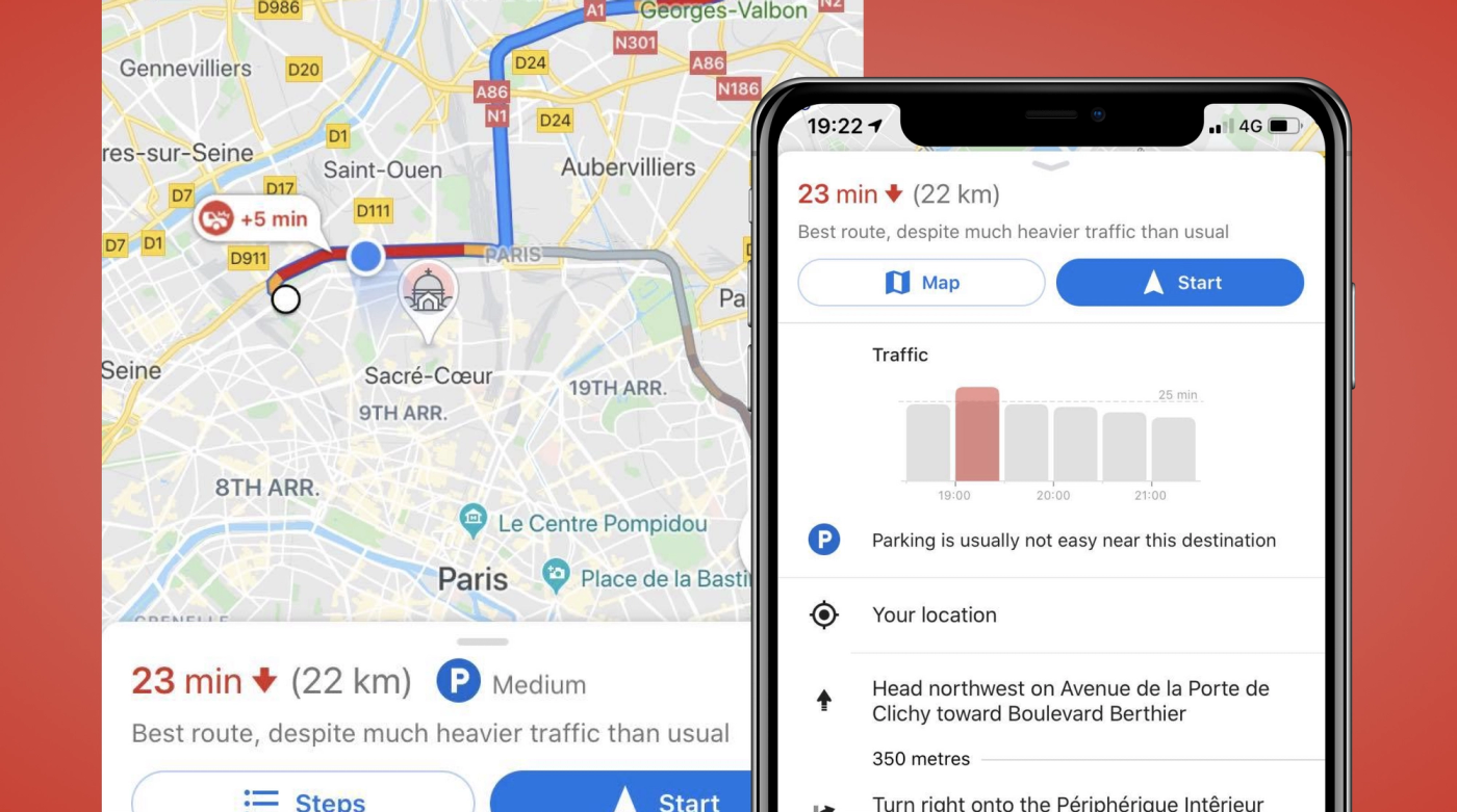
They didn't just show the map and an estimated time, and they didn't just highlight where the traffic jam was. Instead, they explained everything using symbols, graphs and full sentences. The app told us that the traffic was caused by an accident, and exactly how much time was added to our estimation because of it.
We didn't have to interpret any charts (despite them being there) to figure out whether the estimated arrival time was taking the accident into account or not. It was just written out for us in easy-to-understand English sentences, as if a person was explaining it to us. We even got a notification telling us something along the lines of "don't worry, the traffic is bad now but it's about to get better".
This is also in line with the designing for accessibility guidelines. Amongst other things, they recommend explaining things to help people with anxiety, and writing in plain language to help people who are D/deaf or on the autism spectrum.
For those with dyslexia, graphs might work better than text, which Google Maps provided as well by adding bar charts with the same information.
Apple Health also summarizes each graph in a sentence or two, and Clue provides suggestions based on recently tracked data or reoccurring symptoms.
Additional tips
- Keep responsiveness and design for mobile in mind. Don't hide your legends or labels to save space on smaller screens.
- Don't rely on hover effects for explanations. This won't work well on mobile (especially if clicking on a data point already has another action tied to it), and also makes it less accessible for people who rely on screen readers or have mobility issues.
- Continue focusing on accessibility in the development process. I will write a separate posts with tips for that, but until then I recommend reading up on the WAG guidelines. Also test for accessibility yourself by for example only using VoiceOver.
- Be careful with animations and scroll-hijacking. A small intro or hover animation might be ok, but once your visualization relies on animations to be understood it can easily become a confusing and overwhelming experience. And blind people won't be able to get the full context (or you'll end up with a lot more development work to make screen readers explain the data differently).
- Monitor what people look at first, how long it takes them to understand what you're trying to visualize, and how they use the insights they got out of it. Did they notice the data you wanted them to notice? What did they learn from it? Did they have to read a manual first? Etc.
- Read up on accessibility, (mental) health and disabilities. Everyone's experience is different and unique, and products should be accessible to all.
- Include a diverse audience in your user tests, including people with various disabilities. Your product or service will have users who are disabled, so it's important to represent those users in the design process.
Further reading
- Accessibility considerations in data visualizations
- The importance of accessibility in data visualizations
- Tools for designing accessible interfaces
- Dos and don'ts on designing for accessibility
- The accessibility project
- Introduction to web accessibility
- Accessibility Testing by People with Disabilities
- Case study: accessible data chars
Hi! 👋🏻 I'm Sarah, an independent developer, designer and accessibility advocate, located in Oslo, Norway. You might have come across my photorealistic CSS drawings, my work around dataviz accessibility, or EthicalDesign.guide, a directory of learning resources and tools for creating more inclusive products. You can follow me on social media or through my newsletter or RSS feed.
💌 Have a freelance project for me or want to book me for a talk? Contact me through collab@fossheim.io.
If you like my work, consider:
Similar posts
Wednesday, 20. May 2020
An introduction to accessible data visualizations with D3.js
Monday, 23. November 2020